
This post contains affiliate links. We may earn a commission if you click on them and make a purchase. It’s at no extra cost to you and helps us run this site. Thanks for your support!
Say hello to the Dominique typeface, a powerful, condensed sans-serif font family designed to deliver maximum visual impact with a stylish, retro-modern flair.
The Dominique typeface establishes a new standard for condensed typography in contemporary design. Rajesh Rajput crafted this specific font to solve a recurring problem for visual communicators. Designers frequently struggle to find a typeface that saves space without losing character. However, the Dominique typeface delivers personality and efficiency in equal measure. It commands attention immediately. Consequently, this font family has quickly become a vital asset for branding projects. You need tools that perform multiple functions simultaneously. Therefore, the Dominique font family deserves a closer look for your next creative endeavor.
What Distinct Qualities Define the Dominique Font Family?
Why does this specific design stand out in a saturated market? The Dominique font family offers more than just narrow letters. Most condensed fonts prioritize economy over aesthetics. Conversely, Dominique prioritizes visual rhythm. It features an eye-catching personality that works across various media. You see this character clearly in the unique curvature of its letterforms. Furthermore, the designer balanced the negative space perfectly.
This balance ensures legibility even at smaller sizes. The Dominique typeface avoids the cramped feeling common in similar fonts. Designers appreciate this attention to detail. Thus, it functions beautifully for big, bold headlines. Yet, it maintains charm in subheads. You can use it for impactful social media graphics. Alternatively, it serves elegant editorial layouts effectively. The Dominique typeface bridges the gap between display and text usage.
Exploring the versatility of 9 weights and 18 styles
Flexibility remains a crucial factor for professional designers. The Dominique typeface provides an impressive range of options. You get access to 9 distinct weights. These range from delicate thin strokes to powerful heavy blocks. Additionally, the family includes 18 styles in total. This variety allows for complex typographic hierarchies. You can pair a bold headline with a light caption easily.
Moreover, the stylistic consistency across weights is remarkable. The Dominique font family maintains its core identity in every weight. Therefore, your branding remains cohesive. You do not need to switch fonts to achieve contrast. This system streamlines your design process significantly. It empowers you to build robust visual identities. Every weight within the Dominique typeface serves a specific purpose.

The power of the variable font technology
Static font files often limit creativity on the web. Fortunately, the Dominique typeface includes a variable font file. This technology gives you complete control over weight and tone. You are not limited to the standard nine steps. Instead, you can fine-tune the thickness to the exact decimal. This capability changes how we design for responsive screens.
Designers can animate the weight changes for dynamic effects. Furthermore, using a single file reduces web page load times. The Dominique font family embraces this modern standard. Consequently, it supports performance-focused web design. You gain artistic freedom without technical penalties. This feature alone makes the Dominique typeface a smart investment.
How Can You Apply the Dominique Typeface in Projects?
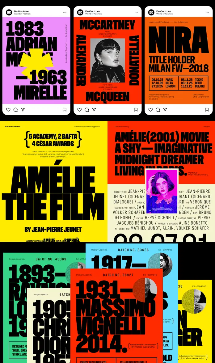
Understanding the practical application of a font helps justify the purchase. The Dominique typeface excels in high-impact environments. Specifically, it thrives in poster design and packaging. The condensed structure allows for larger font sizes in limited spaces. Thus, your message becomes the hero. Brands seeking a modern, authoritative voice should consider this font.
Social media content also benefits from this aesthetic. Users scroll quickly through feeds. Therefore, you need text that pops instantly. The Dominique font family grabs the viewer’s gaze. It works exceptionally well for overlay text on videos. Additionally, the character set supports diverse linguistic needs. This versatility extends the font’s utility beyond English-speaking markets.
Pricing and licensing for the professional creative
Value often dictates which tools we add to our library. The complete Dominique font family costs only $30 on Gumroad. This price point represents exceptional value. Comparable families often cost significantly more. For this price, you receive the full range of weights and the variable font. The license covers both web and print usage for individuals.
However, teams must purchase a license that aligns with their size. This is a standard and fair practice in the industry. Furthermore, a free trial version exists. This trial allows you to test the Dominique typeface before buying. Note that the free version has limitations. It lacks kerning and advanced typographic features. Therefore, professional work requires the full commercial license.
Comparing Dominique to other condensed options
Designers often compare the Dominique typeface to classic staples. It shares the stature of impact-style fonts but lacks their rigidity. It possesses the elegance of fashion typography but offers more weight. This unique position makes the Dominique font family rare. It feels human, not mechanical.
You can feel the designer’s hand in the curves. Other condensed fonts often feel like mathematical calculations. In contrast, Dominique feels like a piece of art. It adds warmth to corporate identities. It adds structure to artistic endeavors. This duality is its greatest strength.
Why the Dominique Typeface Belongs in Your Toolkit?
Every designer needs a reliable condensed serif or sans-serif. The Dominique typeface fills this slot perfectly. It provides a unique voice that standard system fonts lack. Moreover, the extensive character set supports professional typesetting. You get access to glyphs that elevate your typography.
The inclusion of the variable font ensures future-proofing. You are buying a tool built for modern workflows. The low cost removes the barrier to entry. Consequently, there is little reason not to try it. The Dominique font family empowers you to create bolder work. It respects the history of type while looking forward.
Enhancing user experience with legible design
Legibility dictates the success of any design project. The Dominique typeface maintains clarity even when stacked tightly. The x-height is generous. This trait improves readability. You can use it for navigation menus without issue.
Designers often fear condensed fonts for UI elements. However, Dominique breaks this stereotype. It reads well on mobile screens. The spacing between characters is thoughtful. Thus, the user experience remains smooth. You ensure your audience absorbs the information effortlessly.
Final thoughts on Rajesh Rajput’s creation
Rajesh Rajput has delivered a masterpiece with the Dominique typeface. It reflects a deep understanding of current design trends. Yet, it avoids feeling temporary or trendy. The construction is solid. The aesthetic is refined.
You will find yourself reaching for this font repeatedly. It solves layout problems. It adds style instantly. The Dominique font family is a workhorse with the soul of a display font. Therefore, it merits a place in your permanent collection. Support independent type designers by licensing the full version. The Dominique typeface will undoubtedly pay for itself in your first project.
Check out other amazing typefaces here at WE AND THE COLOR, or take a look at our selection of the 100 coolest fonts for graphic designers in 2026.
Subscribe to our newsletter!


