
This post contains affiliate links. We may earn a commission if you click on them and make a purchase. It’s at no extra cost to you and helps us run this site. Thanks for your support!
Say Hello to the Aveline Typeface! Let’s Explore How this Soft Serif Font by CarmineType Defines Modern Elegance.
Design trends currently shift away from cold minimalism toward warmth and personality. The Aveline font perfectly captures this specific moment in typographic history. CarmineType designed this typeface to bridge the gap between modern clarity and historical charm. Designers often struggle to find a typeface that conveys luxury without feeling inaccessible. Aveline solves this precise problem. It offers a hybrid approach. The letterforms possess the readability of a sans serif but retain the sophisticated soul of a serif. Consequently, it works exceptionally well for brands that need to whisper rather than shout.
What Makes the Aveline Font Essential for Contemporary Branding?
You instantly notice the gentle, intentional detailing. This is not just another standard serif found in generic libraries. The Aveline font brings a unique voice to visual identities. Furthermore, it feels human. In an era dominated by AI-generated content, human-centric design becomes invaluable. CarmineType crafted this typeface to look approachable yet high-end. Therefore, it appeals to viewers on an emotional level. This emotional connection drives engagement in branding and editorial design.
The Anatomy of a Hybrid Masterpiece
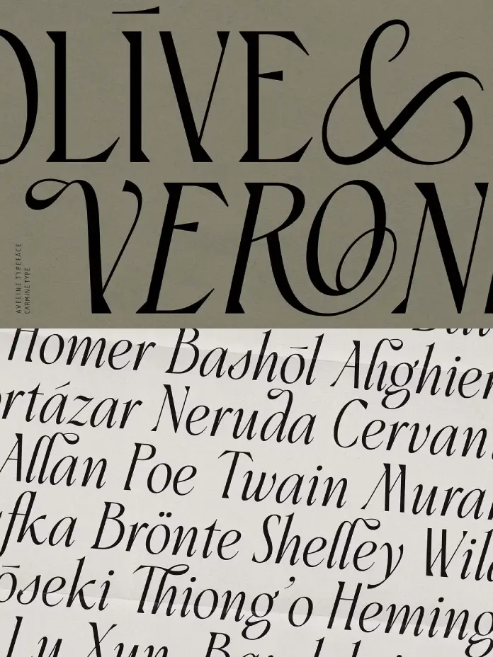
Aveline is classified technically as a soft serif with ligatures. However, that description barely scratches the surface. The Aveline font features balanced proportions that make it suitable for both display and text blocks. Most display typefaces fail when used in smaller sizes. This elegant typeface defies this common limitation. Its structure remains legible even when you reduce the scale. This versatility makes it a powerhouse for responsive web design.
CarmineType included two primary styles: Roman and Italic. The Italic style brings a sense of motion and urgency. Meanwhile, the Roman style anchors the design with stability. Together, they create a harmonious typographic system. The Aveline font also draws discreet inspiration from Victorian aesthetics. Yet, it avoids the heavy ornamentation usually associated with that era. Instead, it extracts the romance of the past and refines it for digital screens.
Unlocking Creativity with Ligatures and Alternates
The true magic of the Aveline font lies in its OpenType features. CarmineType included over 170 carefully crafted ligatures. These connections between letters transform standard text into custom wordmarks. Designers love this feature because it saves time. You do not need to draw custom lettering for a logo. You simply type with Aveline, and the ligatures do the heavy lifting.

Additionally, the font includes a vast set of alternates. These character variations allow for endless combinations. You can adjust the mood of a headline by swapping a single letter. Consequently, the font serves as a creative toolkit. It encourages experimentation. Whether you design a book cover or a perfume bottle, the typeface adapts. The Victorian-inspired alternates add a touch of romance. However, they remain subtle enough to use in modern contexts. This balance between decoration and function defines the Aveline experience.
Why Luxury Brands Are Choosing the Aveline Font
Luxury branding relies heavily on typography to convey value. The Aveline font fits this niche perfectly. Its high-contrast strokes suggest elegance, while its soft terminals imply comfort. High-end fashion labels often seek this exact combination. They need to look expensive but inviting. Aveline achieves this effortlessly.
Consider the needs of the beauty industry. Skincare and cosmetic brands require typography that feels organic and clean. The Aveline font meets these requirements with its fluid curves. It lacks the harsh edges of a geometric sans. Therefore, it mirrors the organic curves found in nature and the human body. This makes it an ideal choice for beauty packaging.
Furthermore, editorial designers find immense value here. Magazines need headers that grab attention. The Aveline font commands the page without overwhelming the photography. Its lighter weights feel airy and sophisticated. Conversely, its heavier applications provide the necessary impact for major feature stories.
Practical Tips for Using Aveline
Using a character-rich typeface requires restraint. The Aveline font offers many expressive options, but you should use them wisely. Avoid using complex ligatures for long body text. They work best in headlines or short phrases. In body copy, the standard characters ensure maximum readability.
CarmineType optimized the font for various formats. You get the standard OTF, TTF, WOFF, and WOFF2 files. This ensures the Aveline font renders crisply on all devices. Web designers will appreciate the low file size relative to the visual quality. When you implement Aveline on a website, ensure you enable standard ligatures in your CSS. This activates the font’s full potential.
Also, consider the spacing. The Aveline font possesses excellent built-in kerning. However, for large display use, you might tighten the tracking slightly. This creates a more cohesive, logo-like appearance. Experiment with the stylistic sets to find the tone that matches your specific project.
Comparing Aveline to Standard Serifs
Many designers rely on classics like Bodoni or Didot for fashion typography. While beautiful, those fonts often feel overused. The Aveline font offers a fresh alternative. It retains the high contrast of those classics but adds modern softness. It feels less rigid.
Unlike traditional serifs, Aveline functions as a hybrid. It incorporates the logic of a sans serif in its skeletal structure. This makes the Aveline font more legible on screens than many historical serifs. Digital screens often struggle with the hairline thin strokes of Didot. Aveline’s strokes maintain enough weight to avoid disappearing at low resolutions.
Moreover, the Aveline font carries a unique personality. Standard fonts often feel neutral. Aveline feels opinionated. It adds a specific flavor to the design. If you want your project to look distinctive, you choose Aveline. It tells the viewer that you care about nuances.
Licensing and Value Proposition
Professional fonts constitute an investment. The Aveline font offers significant value for its price point. You receive not just the alphabet, but a comprehensive design system. The inclusion of multilingual support covers Western, Central, and Eastern European languages. This global reach is crucial for international brands.
CarmineType frequently offers license options for desktop, web, and apps. Purchasing the Aveline font legally ensures you have the correct files and rights. Free alternatives rarely offer this level of ligature support or technical polish. When you buy Aveline, you pay for the hours of engineering behind every curve. It elevates your portfolio instantly.
Final Thoughts on This Typographic Gem
Typography dictates the voice of a brand. Choosing the right voice matters more than ever. The Aveline font speaks with sophistication, warmth, and clarity. It avoids the trap of being too trendy or too archaic. CarmineType successfully created a timeless asset.
I personally find the ligatures to be the standout feature. They turn typing into an act of design. This elegant display serif typeface invites you to play with language. It reminds us that letters are beautiful forms, not just functional tools. If you work in branding, editorial, or packaging, this font deserves a spot in your library. It provides the elegance you need with the versatility you crave.
Ultimately, the Aveline font represents the future of serif design. It respects the past but lives firmly in the present. Try it on your next project. You will likely find it becomes your go-to choice for refined elegance.
Frequently Asked Questions About the Aveline Font
What exactly is the Aveline font?
The Aveline font defines itself as a versatile hybrid serif. It sits comfortably between a clean modern sans and a charming serif. CarmineType designed it with soft terminals and balanced proportions. Consequently, it works beautifully for both large displays and smaller text blocks.
Which projects work best with the Aveline font?
This typeface thrives in environments that require elegance. Specifically, the Aveline font suits fashion branding, luxury packaging, and editorial design. It also adds a sophisticated touch to wedding invitations and beauty product labels. Therefore, if your project needs a romantic yet modern feel, Aveline fits perfectly.
How do I access the ligatures and alternates?
You can access the 170+ ligatures and alternates through any software that supports OpenType features. Programs like Adobe Illustrator, Photoshop, or InDesign make this process easy. Simply open the glyphs panel to view the options. The font allows you to customize your typography instantly with these unique characters.
Does the Aveline font support multiple languages?
Yes, CarmineType ensured broad accessibility for this typeface. The Aveline font includes extensive multilingual support for Western, Central, and Eastern European languages. This feature makes it an excellent choice for international brands. You can maintain a consistent visual identity across different regions.
Is the Aveline font optimized for web use?
Absolutely. The font family includes WOFF and WOFF2 files specifically for web usage. The Aveline font maintains its legibility on digital screens due to its distinct contrast and clear typography. Furthermore, the file sizes remain efficient for fast loading times. You can bring high-end typography to your website without compromising performance.
All images © CarmineType. Check out other trending typefaces in the Fonts section of WE AND THE COLOR or take a look at our selection of the 100 best fonts for designers in 2026.
Subscribe to our newsletter!


