
This post contains affiliate links. We may earn a commission if you click on them and make a purchase. It’s at no extra cost to you and helps us run this site. Thanks for your support!
Impacto Sans is the Perfectly Imperfect Font Your Designs Crave.
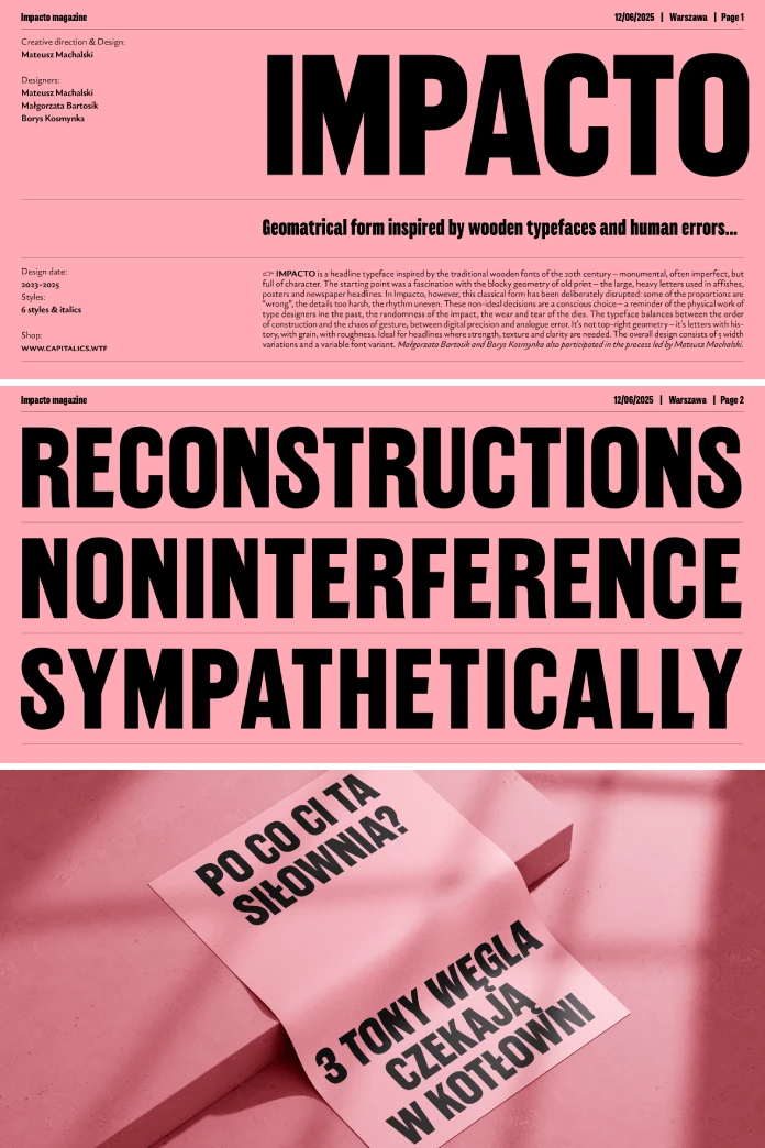
The steady march toward digital perfection has given us countless clean, precise fonts. Yet, for designers seeking to convey a more raw and authentic message, something vital can be lost in translation. The Impacto Sans font family, designed by the accomplished Mateusz Machalski, offers a powerful counter-narrative. This typeface is a bold and intentional homage to the character-rich woodblock fonts of the 20th century.
It masterfully balances digital precision with analog errors, creating a tool that feels both monumental and deeply human. For any creator looking to break free from sterile aesthetics, Impacto Sans provides a compelling and timely solution.
The Soul of the Machine: What is Impacto Sans?
At its heart, Impacto Sans is a headline typeface born from a fascination with the history of print. It channels an era when typography was a physical, tangible craft, subject to the beautiful imperfections of the human hand and the limitations of mechanical processes.
Inspired by Woodblock Typography
The design journey for Impacto Sans began with an appreciation for the heavy, block-like letters that dominated posters and newspaper headlines of the past. These traditional wooden fonts were often flawed but always full of character. Machalski, in collaboration with designers Małgorzata Bartosik and Borys Kosmynka, did not simply digitize these historical forms. Instead, they deconstructed their essence and reinterpreted it for a contemporary audience, consciously disrupting classic shapes to forge a new path.
A Deliberate Embrace of Imperfection
The true genius of the Impacto Sans font family lies in its deliberate celebration of so-called flaws. A closer look reveals that some proportions feel intentionally “wrong,” certain details appear almost too harsh, and the rhythm between letters is purposefully uneven. These are not mistakes; they are conscious, thoughtful decisions. Each quirk is a nod to the physical labor of past typesetters, the randomness of a hammer’s impact, and the gradual wear on wooden stamps. Impacto Sans exists in that fascinating territory between calculated order and expressive chaos, making it ideal for headlines that demand strength, texture, and clarity.

The Typographic Edge: Why Choose Impacto Sans?
In a sea of neutral sans-serifs, Impacto Sans provides a distinct voice that can elevate a design from merely functional to truly memorable. Its unique characteristics offer a significant creative advantage.
Beyond Geometric Purity
Many modern fonts strive for mathematical perfection. Impacto Sans, however, finds its formidable strength in its deviation from this norm. Its design tells a story. Each character seems to possess a history, embedding a layer of narrative and texture directly into your work. Using this font is not just about arranging letters; it is about injecting a sense of historical weight and analog warmth. This makes it an excellent choice for projects aiming to feel grounded, honest, and powerful.
A Voice of Strength and Authenticity
The raw, slightly rugged nature of Impacto Sans communicates confidence and authenticity. It is a font that doesn’t hide its imperfections but wears them as a badge of honor. Consequently, it is perfectly suited for branding, editorial design, and advertising where the goal is to establish trust and make a bold statement. Think craft breweries, artisanal goods, cultural institutions, or any brand that values heritage and substance over fleeting trends. How could this font change the perception of your brand?
Versatility Through Variation
Despite its strong personality, the Impacto Sans font family is a remarkably versatile tool. The overall design consists of five width variations, from Extra Condensed to Wide, offering a broad creative palette. Furthermore, the inclusion of a variable font variant allows for infinite fine-tuning, giving designers precise control over the text’s presence on the page or screen. This adaptability ensures that Impacto Sans can be tailored to fit a wide range of layouts and applications.
Practical Application: How to Use Impacto Sans Effectively
Understanding how to wield a font with such a strong character is key to unlocking its full potential. Impacto Sans shines brightest when its unique qualities are given the space to perform.
Ideal for Headlines and Display
As a headline typeface, Impacto Sans is designed to grab attention. Use it for poster designs, book covers, website headers, packaging, and editorial spreads where you need to make a powerful first impression. Its clarity and strength ensure legibility even at large sizes, while its textured details add visual interest that draws the reader in. It is less suited for long-form body text, where its strong personality could become distracting.
Pairing with Other Fonts
When combining Impacto Sans with other typefaces, contrast is your friend. To allow its personality to dominate, pair it with a clean, neutral body font. A simple, well-spaced grotesque or a classic serif can provide a quiet, readable foundation that lets the headlines sing. This juxtaposition of a “perfect” body text with an “imperfect” headline creates a dynamic and professional typographic hierarchy.
Leveraging the Variable Font
The variable version of Impacto Sans is a game-changer for digital designers. It allows for seamless adjustments in width and weight, which is perfect for creating responsive typography that adapts fluidly across different screen sizes. Imagine a website headline that subtly condenses on a mobile device to save space while expanding to a more expressive width on a desktop monitor. This level of control ensures both optimal readability and a consistent brand experience everywhere.
A Personal Reflection: The Future is Textured
In our increasingly digital world, there is a growing hunger for design that feels real and tactile. We see this in the resurgence of film photography, the appreciation for handcrafted goods, and the desire for authentic storytelling. Typography is no exception. Mateusz Machalski’s Impacto Sans font family is a brilliant response to this cultural shift. It reminds us that character is not found in flawless perfection but in the unique marks left by history and process. This font family is more than just a set of letters; it is a philosophy. It argues that our digital tools can, and should, carry the grain and soul of the analog world. For designers and brands ready to embrace a more honest and impactful aesthetic, Impacto Sans is not just a choice—it is a statement.
Check out other trending typefaces in the Fonts section here at WE AND THE COLOR, or browse our handpicked selection of popular typefaces.
Subscribe to our newsletter!


