
This post contains affiliate links. We may earn a commission if you click on them and make a purchase. It’s at no extra cost to you and helps us run this site. Thanks for your support!
Say Hello to the Allrounder Baroque Font Family, the Dynamic Serif Your Designs Need
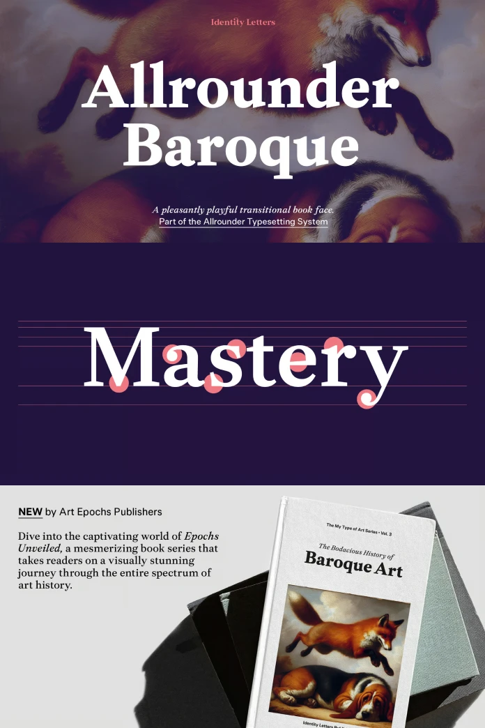
In the landscape of digital typography, a quiet revolution is underway. Designers are moving beyond sterile, neutral typefaces, seeking fonts with personality and warmth. This shift explains the renewed interest in Transitional serifs—a classification known for elegance and readability. The Allrounder Baroque font family, from the German foundry Identity Letters, perfectly captures this contemporary spirit. It is not just another serif; it is a thoughtful, dynamic tool designed for modern creative challenges. Consequently, this font feels both timeless and distinctly new.
You can purchase the complete family from these platforms:
The Allrounder Baroque font family is a member of the larger Allrounder superfamily. This connection, therefore, makes it an exceptionally versatile choice for complex projects. Designer Moritz Kleinsorge has created a typeface that honors its historical roots while serving contemporary design needs with precision. Let’s explore what makes this font family an essential addition to any designer’s toolkit.
You can purchase the complete family from these platforms:
A Modern Tribute to Typographic History
To truly appreciate Allrounder Baroque, one must understand its heritage. The font is a Transitional serif, sometimes called a “baroque” serif, bridging the gap between Old Style and Modern typefaces. This style first emerged in the mid-18th century, with John Baskerville as a key figure. Furthermore, Transitional fonts feature a more pronounced contrast between thick and thin strokes compared to their predecessors. This characteristic enhances their structure and gives them a sharp, refined appearance.

Echoes of the Masters in Every Character
Allrounder Baroque draws direct inspiration from the legendary work of Baroque-era masters like van Dijck, Fleischmann, and Baskerville. However, it is not a mere revival. Kleinsorge has infused these historical influences with a playful and dynamic quality. The font’s lush, flowing forms guide the reader’s eye across the page, creating an engaging and pleasant reading experience. This subtle energy is what sets the Allrounder Baroque font family apart from more rigid historical interpretations. What might happen if your text could not just speak, but also dance?
The Anatomy of a Playful Powerhouse
The defining visual feature of Allrounder Baroque is its medium contrast. This balance prevents the font from feeling overly dramatic, which can sometimes happen with Modern serifs like Didot or Bodoni. The result is a typeface that feels both serious and approachable. Its letterforms are generous and open, contributing to its excellent legibility, especially in long-form text. Thus, it stands as an ideal book typeface, yet its personality shines brightest in larger sizes, making it a powerful choice for headlines and branding.
The Allrounder Baroque Font: A Versatile Tool for Modern Design
A beautiful font is only useful if it performs well in real-world applications. This is where the Allrounder Baroque font family truly excels. It is designed as a workhorse, equipped to handle a wide array of design tasks with grace and efficiency. For this reason, its versatility makes it a valuable asset for any creative professional.
From Elegant Editorials to Luxury Branding
Allrounder Baroque is perfectly at home in high-end applications. Its sophisticated character makes it an excellent choice for luxury branding, where elegance and distinction are paramount. Imagine it on the packaging of a premium product or as the logotype for a high-fashion brand. Simultaneously, its readability makes it a superb choice for editorial design. Magazines, books, and annual reports would all benefit from its clear and engaging texture on the page.
A True Workhorse: Styles and Features
This font family is robust and feature-rich. It comes in 10 distinct styles, from a delicate Light to a strong Bold, each with a corresponding italic. This range provides designers with a rich typographic palette. Additionally, with over 900 glyphs per style, Allrounder Baroque offers extensive language support and a wealth of OpenType features. These include small capitals, multiple figure sets, ligatures, and stylistic alternates, allowing for truly sophisticated typesetting.
How to Use Allrounder Baroque within the Allrounder Superfamily
One of the most compelling features of the Allrounder Baroque font family is its place within the Allrounder type system. This innovative system from Identity Letters is designed to make font pairing effortless and foolproof. Indeed, it removes the guesswork from combining different typographic styles.
The Allrounder System: A Designer’s Dream
So, what is the Allrounder font system? All fonts within the Allrounder superfamily, regardless of their style (Serif, Sans-Serif, etc.), share the same vertical metrics. This means that a Regular weight of Allrounder Baroque will have the same cap height and x-height as the Regular weight of Allrounder Grotesk. This technical harmony allows designers to mix and match fonts within the same line of text without any jarring visual disruptions. The process of combining a serif with a sans-serif becomes as simple as selecting a different font from the menu.
You can purchase the complete family from these platforms:
This system is a game-changer for projects that require complex typographic hierarchies. For instance, you can seamlessly integrate Allrounder Baroque for body text with Allrounder Grotesk for subheadings or Allrounder Monument for display titles. The result is a design that is visually cohesive, professionally polished, and incredibly easy to produce. This thoughtful integration underscores a deep understanding of a designer’s workflow, making the Allrounder Baroque font family not just a typeface but a strategic design tool. Why shouldn’t your fonts work together as a perfectly coordinated team?
All images © Identity Letters. Don’t hesitate to browse WE AND THE COLOR’s Fonts category to find other recommended typefaces.
Subscribe to our newsletter!


