This post contains affiliate links. We may earn a commission if you click on them and make a purchase. It’s at no extra cost to you and helps us run this site. Thanks for your support!
Graphic Design Trends Are Splitting Into Cheap Polish and Provable Craft
Graphic design trends for 2027 reward one quality above all, and that quality is a visible source. Polish costs almost nothing now. A designer can generate a clean logo and a glossy poster in a minute, so smooth output proves little. So the most useful graphic design trends right now are the ones a generator cannot fake.
The summer of 2026 gave us a clear preview of the graphic design trends set to dominate 2027. At WWDC on June 8, 2026, Apple announced a Liquid Glass slider that runs from ultra-clear to fully tinted. Two weeks later, the Cannes Lions Design Jury gave its Grand Prix to Apple TV’s rebrand. Apple’s crew had filmed real glass letters in camera, with no CGI. Then, on August 2, 2026, the EU’s transparency rules for AI-generated content began to apply.
This guide by WE AND THE COLOR ranks ten graphic design trends by today’s visibility and by speed of growth. It also introduces six working terms. Because they are my own editorial constructs with no industry standing, you should test them before you quote them.
What Are the Biggest Graphic Design Trends for 2027?
The biggest graphic design trends for 2027 reward visible craft and punish borrowed signals. Ten of the graphic design trends carry that idea, from in-camera brand films to adjustable glass interfaces. The table later in this guide scores each one.
Four graphic design trends hold the most visible ground today. Base-and-spike color, poster-scale type, scanned texture, and rule-based identity systems lead the current output. But provenance labels and proof-of-process work have the steepest curves, with dial-ready interfaces close behind.

The Heat-and-Slope Test for Ranking Graphic Design Trends
Most lists of graphic design trends rank by taste. I rank by two numbers. Heat measures how much notable new work uses a look today. Slope, by contrast, measures how fast that share grows over the next twelve months.
A trend with high heat and a falling slope has peaked. But a trend with low heat and a steep slope deserves your attention first. I call this pairing the Heat-and-Slope Test, and it works for any set of graphic design trends.
These scores are judgment calls. I based them on this year’s award results, platform announcements, regulation dates, and color forecasts. Still, a different editor would move a few graphic design trends up or down, and I would enjoy that argument.
The 10 Graphic Design Trends for 2027, Ranked by Momentum
The order weighs both measures, with slope counting slightly more. Each entry carries its own scores and one practical test.
1. Proof-of-Process Work
Heat: medium. Slope: steep.
A handmade look no longer proves that a person made anything. AI design tools fake grain and brush texture well enough to pass at thumbnail size. So the proof has to live outside the final file.
Apple’s TV rebrand shows the model for 2027 graphic design trends. TBWA\Media Arts Lab and Optical Arts cut real glass into the Apple logo and the TV letters. Then a crew moved the lights by hand and filmed everything on camera. In the end, Apple shipped three cuts, and the longest runs twelve seconds.
The design jury gave it the Grand Prix because the work was, in its words, gloriously human-made. If a jury of that rank hands its top design prize to a logo that a crew lit by hand and filmed without CGI, then clients who once asked for the cheapest render will soon start asking for the making-of film instead.
Among the graphic design trends on this list, this one costs the least to start. So film your steps and keep your version history now. Could you prove that your last project came from your own hands?
2. The Provenance Strip in Graphic Design Trends
Heat: low. Slope: very steep.
Proof of origin will move into the layout itself. I call the result the Provenance Strip. It is a small band that lists author, date, tools, and iteration count.
Few graphic design trends have a legal deadline behind them, and this one does. Article 50 of the EU AI Act has applied since August 2, 2026. Deployers must disclose deepfakes and AI-generated text on matters of public interest. Providers whose systems launched earlier, however, have until December 2, 2026, to add machine-readable markers.
For now, those markers sit in metadata. For example, an image from ComfyUI already carries its full node graph and reopens with every parameter intact. So nothing stops a designer from printing that data on the poster.
I expect a major brand to print its process on the work itself during 2027, like ingredients on food packaging. Regulation can force a studio to disclose generation. Yet it cannot prove that a person made the work. Besides, no human-made label carries the trust of an organic label yet.
3. Range Sheets Replace Logo Files

Heat: high among large brands. Slope: rising.
Clients increasingly buy rules instead of files, and graphic design trends follow the money. For example, Apple’s icon format stores layers, and the system builds dark and tinted versions from them. SF Symbols works the same way. A designer draws the extremes, and the system interpolates every weight between them.
A flat logo file cannot do that. So I call the replacement a Range Sheet. It is a contact sheet of approved outputs, plus a few deliberately wrong combinations that mark the edges.
Motion belongs in the rules too. Some identities now specify how letters gain weight and tilt as they move. In practice, deliver a variable font and a parameter table instead of a PDF with one correct logo. Among logo design trends and graphic design trends for brand identity systems alike, this one changes what you deliver most.
4. Dial-Ready Design for Adjustable Glass
Heat: medium. Slope: steep.
Apple introduced Liquid Glass with iOS 26, and complaints about legibility began with the first beta. Then, at WWDC on June 8, Apple answered. iOS 27 adds a slider that runs from ultra clear to fully tinted. Apple also diffuses complex content behind glass panels and gives app icons separate glass layers.
Dial-ready design means testing every asset at each setting a user can reach. First, check your app icon at ultra clear and at fully tinted. Next, put your logo over a busy photo. Then measure text contrast against the WCAG minimum of 4.5:1 for body text.
I read the slider as an admission that Apple, after a full year of complaints about text on translucent panels, finally ranked legibility above visual effect, and every other platform owner who copied the glass will soon copy the dial as well. It is the first of these graphic design trends that the user controls directly. As a result, designers must now test every mark against a dial, whatever graphic design trends the client wants.
5. Base-and-Spike Color

Heat: high. Slope: rising.
Pantone named Cloud Dancer (PANTONE 11-4201) its Color of the Year for 2026. It is a warm white with the hex value #F0EEE9, and it is the first white in the program’s history. Pantone announced it on December 4, 2025, and designers split at once.
I side with the critics on the headline and with practitioners on the function. Cloud Dancer fails as a color of the year, yet it works as a base.
WGSN and Coloro, on the other hand, named Luminous Blue (Coloro code 125-28-38) their 2027 Color of the Year. Energy Orange (018-57-34) sits beside it among five key colors for spring and summer 2027.
Among current graphic design trends, color is the one clients notice first. Base-and-spike color means a quiet, warm base that carries one saturated spike in your color palette. So expect 2027 palettes to keep Cloud Dancer’s job and hand the spike to blue and orange. Also, proof off-whites on uncoated stock before the client signs off, because screens flatter them. Pantone typically announces its pick in early December, so its 2027 call arrives in about two months.
6. Scanned Texture That Records Something
Heat: high. Slope: rising.
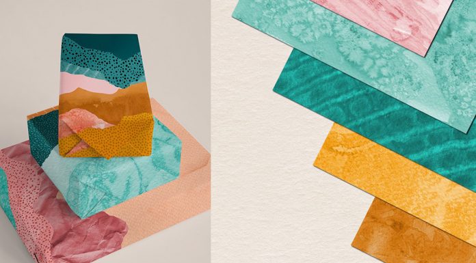
Smooth gradients dominated graphic design trends for much of the past three years. Now grain and scan texture replace them as the main surface. But many designers still apply that texture as a filter, and that is the mistake.
The lasting version records a real event, like dust on scanner glass or streaks from a dying toner cartridge. A grain overlay in Photoshop reads as a filter. By contrast, a scan of a failing office copier reads as a place and a time.
Risograph overprints have reached the mainstream, so the plain office copier comes next. In practice, scan your own materials at 600 dpi and keep the dust. Texture is the oldest of these graphic design trends, and it still has room.
7. Poster-Scale Type
Heat: high. Slope: flat to rising.
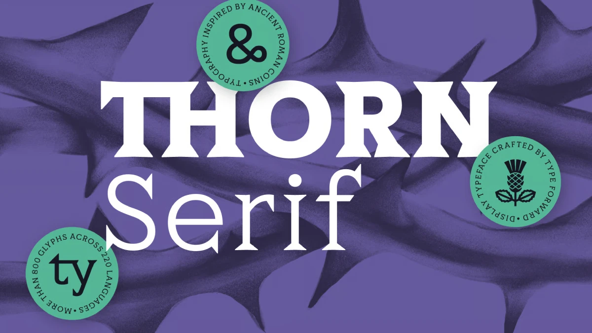
Several forecasts for 2027 name giant type as a main current among graphic design trends, and I agree. When image generation costs nothing, a headline that fills the canvas becomes the most efficient way to own a feed.
Variable fonts make it practical. Every major browser has supported them since 2018. So a brand typeface can flex in weight and width to fit any crop. My rule is blunt. If the headline does not touch two edges of the frame, it is not giant.
Type no longer offers a safe harbor from generators, though. Image models now spell most words correctly, so lettering alone proves nothing about who made the layout. This is one of the easiest graphic design trends to execute and one of the easiest to execute badly.
8. Planned Imperfection

Heat: medium. Slope: rising.
Forecasts for 2027 graphic design trends describe brands that loosen up and break their own rules on purpose. Surreal humor, meanwhile, already sits among the main visual currents of 2026.
Planned imperfection means a brand team approves the mess in advance. That keeps off-register prints and odd crops inside a boundary. It also pairs with the Range Sheet, because the deliberately wrong combinations define where the mess may go.
I guess there will be many brands that will fake this badly. Mess without rules reads as neglect. So among these graphic design trends, this one carries the highest risk of looking sloppy. Write down the rule you plan to break before you break it. Which of your brand rules could survive a joke?
9. Anti-Machine Typography
Heat: low. Slope: rising from a tiny base.
Designer Eric Lu of Mixfont in San Francisco built Ghost Font, a video typeface that hides text in motion. Hundreds of dots fill each frame. The dots that form letters drift up, and the background dots drift down.
Freeze a frame, and the text disappears. Each file also carries a static decoy message meant to mislead AI models. Lu himself admits it is no cure-all, and it is likely harder to read for viewers with visual impairments.
Expect anti-machine typography to stay niche in 2027, with uses in bot gating and protest posters. Video models, however, will close the gap as their temporal reasoning improves. Among 2027 graphic design trends, this one is my bet against lasting. I would still enjoy making it.
10. Signal Decay
Heat: very high. Slope: falling.
Some graphic design trends still dominate and already say less. I call that signal decay. When enough brands borrow a cue, it stops carrying the trust it once signaled.
Many AI companies adopted serif headlines and warm, paper-colored pages to look human. By 2027, that pairing will read as machine. Retro effects follow the same curve. Dithering, ASCII, pixel grids, and scanlines will stay around for years, but one effect alone no longer surprises anyone.
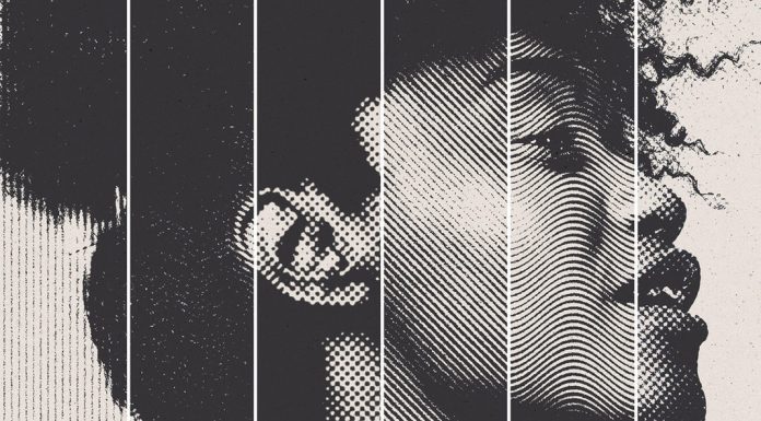
Plain grain overlays and halftone backgrounds also sit in the decay zone. My test is simple. If three competitors use a cue, assume it has decayed. This is the only entry among these graphic design trends with a falling slope.
Graphic Design Trends for 2027 at a Glance
This table sums up the ten graphic design trends, my scores, and one practical test for each.
| Rank | Trend | Heat today | Slope into 2027 | Test to run |
|---|---|---|---|---|
| 1 | Proof-of-Process Work | Medium | Steep | Can you film or scan your own steps? |
| 2 | Provenance Strip | Low | Very steep | Does the layout have room for author, date and tools? |
| 3 | Range Sheets | High among large brands | Rising | Does the identity survive ten unplanned outputs? |
| 4 | Dial-Ready Design | Medium | Steep | Does the icon hold at ultra clear and fully tinted? |
| 5 | Base-and-Spike Color | High | Rising | Does one spike color carry on a warm base? |
| 6 | Scanned Texture | High | Rising | Does the texture come from a real scan? |
| 7 | Poster-Scale Type | High | Flat to rising | Does the headline touch two edges? |
| 8 | Planned Imperfection | Medium | Rising | Is the rule you break written down? |
| 9 | Anti-Machine Typography | Low | Rising from a tiny base | Can every viewer read the effect? |
| 10 | Signal Decay | Very high | Falling | Do three competitors use the same cue? |
What Should Professional Designers Do About These Graphic Design Trends?
Professional designers do not need all ten graphic design trends at once. So pick two moves and ignore the rest until they work. I would pick Proof-of-Process Work and Range Sheets, because both change what you deliver. The other eight can wait. Four actions on graphic design trends fit into one week.
- Record your next project from the first sketch.
- Rebuild one client logo as a range sheet with ten approved outputs and three banned ones.
- Test your app icon and key marks at ultra-clear and fully tinted.
- Audit your portfolio for cues that three competitors also use.
Six Terms Coined in This Guide to Graphic Design Trends
These six terms from this guide to graphic design trends are free to reuse.
- Heat-and-Slope Test: a ranking method that scores a trend by current visibility and by growth rate.
- Provenance Strip: a layout band that lists author, date, tools, and iteration count.
- Range Sheet: a brand guideline built from approved outputs and deliberate wrong examples.
- Dial-Ready Design: assets tested at every setting of a user-controlled display option.
- Base-and-Spike Color: a quiet warm base carrying one saturated accent.
- Signal Decay: the loss of trust value in a visual cue once many brands copy it.
Frequently Asked Questions About the Graphic Design Trends of 2027
What are the top graphic design trends for 2027?
The top graphic design trends for 2027 are proof-of-process work, provenance strips, range sheets and dial-ready interfaces, followed by base-and-spike color, scanned texture, poster-scale type, planned imperfection and anti-machine typography, with signal decay marking the one look in decline.
Which graphic design trends grow fastest?
Provenance strips and proof-of-process work grow fastest, because regulation and award juries now reward visible origin. Dial-ready design follows among graphic design trends when iOS 27 reaches users later this fall.
Which graphic design trends are fading?
Borrowed signals fade first. Serif headlines on AI-company sites and plain grain overlays lose trust as more brands copy them. That is why signal decay is the only falling entry among the graphic design trends here.
How do graphic design trends affect brand identity systems?
Graphic design trends now reach brands through rules. A range sheet and a variable font let one identity absorb new graphic design trends without a full redesign.
How do I start applying graphic design trends in client work?
Start with process capture and a range sheet. Both fit existing projects, and neither depends on a look that may decay.
Will AI replace graphic designers by 2027?
I do not expect it. Generators produce frames, but designers deliver rules and process proof, and they put their name on both. So these graphic design trends favor designers who can show their judgment.
Are graphic design trends worth following?
Yes, as a stress test. Ask whether your work still holds up once anyone can copy its look. If it does not, graphic design trends are not your real problem.
What is the Color of the Year for 2027?
Color answers to a calendar among graphic design trends. WGSN and Coloro named Luminous Blue (Coloro code 125-28-38) their Color of the Year for 2027. Pantone usually announces its own pick in early December. Cloud Dancer, its 2026 choice, arrived on December 4, 2025.
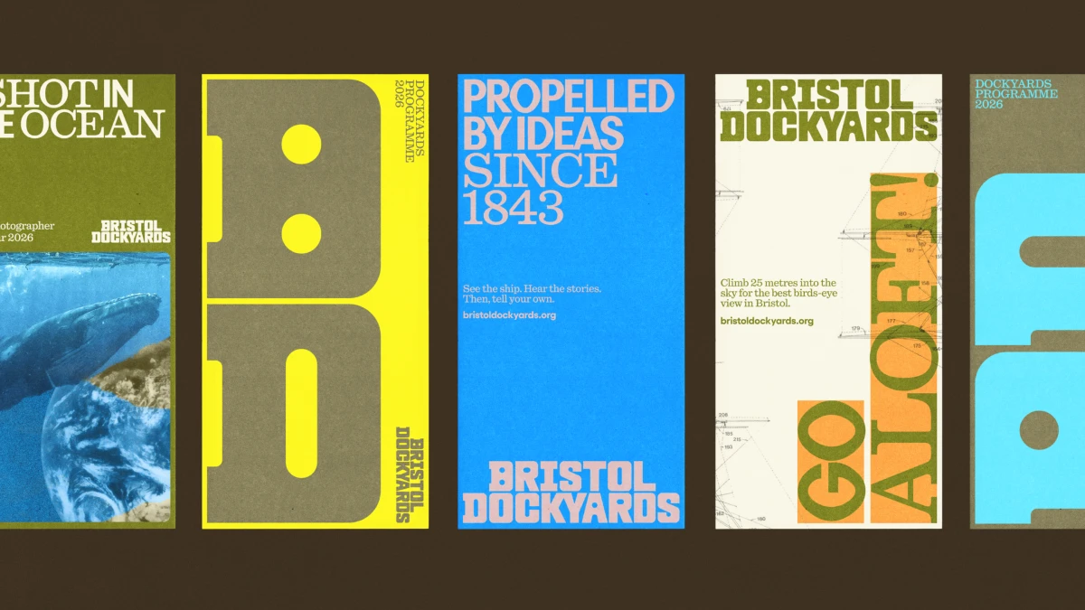
Header image © How&How (from their rebranding project of SS Great Britain to Bristol Dockyards). Browse WE AND THE COLOR’s Graphic Design category for more.
Subscribe to our newsletter!