This post contains affiliate links. We may earn a commission if you click on them and make a purchase. It’s at no extra cost to you and helps us run this site. Thanks for your support!
Thorn Serif Borrows Its Serifs From Roman Coin Dies and Ships 8 Weights in One File.
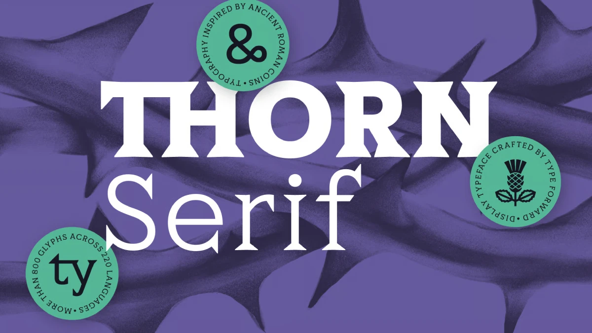
Thorn Serif sidesteps the Trajan clones that crowd wine labels and film posters. Type Forward, the Sofia studio behind it, sent me demo fonts, so I judged the letters myself. My verdict is short. Thorn Serif is the more interesting way to borrow from Rome.
The font family is available on:
Its designers, Mirela Belova and Stan Partalev, studied tiny inscriptions on Serdica coins. Serdica was the Roman city beneath modern Sofia. That research produced a display serif with thorny serifs and almost no stroke contrast. The family also ships as one variable font file with eight weights, from Hairline to Black.
Timing helps here. Roman-style display type keeps returning to packaging and editorial layouts, and Trajan from 1989 still sets the template. Thorn Serif gives designers a second template.
What Is Thorn Serif, and Why Do Roman Coins Matter?
Thorn Serif is a variable display serif family from Type Forward. Belova and Partalev founded the studio in 2020, and it works from Sofia, Bulgaria.

Put simply, Thorn Serif is a coin-derived display serif with minimal contrast, pointed serifs, and eight weights.
The coin part matters. Serdica and nearby towns minted coins with uppercase inscriptions in Latin or Greek. When the designers compared them, the same traits kept returning. Serifs also ran large and sometimes doubled. Contrast between thick and thin strokes stayed very low. Proportions also felt more even and compact than letters cut into stone.
However, coins offer capitals only. So the designers had to imagine the lowercase, the Cyrillic, the numerals, and the eight weights themselves. Thorn Serif therefore counts as a contemporary typeface with coin logic. It makes no claim to be a revival.
My thesis is simple. Struck type beats carved type for short display lines, and Thorn Serif is the clearest proof I have seen.
The font family is available on:
How Roman Coin Lettering Differs From Trajan
The Trajan Problem
Every type design student knows Capitalis Monumentalis. Its best-known digital descendant is Trajan, which Carol Twombly drew for Adobe in 1989. She based it on the inscription at the foot of Trajan’s Column in Rome. Similarly, Cinzel, an open-source face by Natanael Gama from 2012, follows the same stone logic.
Stone carving rewards balance. Carvers shaped fine terminals and controlled contrast. They also varied letter widths a lot. As a result, designers reach for Trajan whenever a brief says “authority.” Still, after more than three decades, that look feels familiar to everyone.
Thorn Serif takes the opposite route. Type Forward’s own comparison pairs Trajan’s dynamic proportions and higher contrast with the unified proportions and lower contrast of Thorn Serif, and it credits writing for Trajan’s serifs and struck shapes for the serifs of Thorn Serif, which gives designers a clear way to judge every other Roman-style face they meet.
The Coin-to-Stone Axis
I call the spectrum between those two poles the Coin-to-Stone Axis. It is an editorial construct that no industry body recognizes. To place a Roman-style typeface on it, check three things. First, measure the stroke contrast. Second, compare the letter widths. Finally, ask where the serifs come from: a pen or a punch.
| Criterion | Stone end (Trajan) | Coin end (Thorn Serif) |
|---|---|---|
| Stroke contrast | Higher | Minimal |
| Proportions | Dynamic | Unified |
| Serif origin | Writing | Struck shapes |
What Struck Metal Does to a Serif
Coin lettering follows a physical process. First, engravers cut the letters in reverse into dies. Then minters struck those dies into metal blanks. The finished coin carried raised letters, and all of it happened within a few millimeters of glyph height.
Some letters seem to come from repeated strokes. For example, the V on certain coins shows pronounced serifs at its base. Two separate stems appear to form that letter, and each stem has its own top and bottom serif marks. Where the stems meet, the serifs remain visible as separate endings.
One caveat applies. Nobody can say exactly how the engravers made each letter. Direct records of ancient minting are scarce, and a photograph cannot separate die, strike, wear, and later damage. Thorn Serif therefore reads the coins for principles instead of copying single glyphs.
How Thorn Serif Builds Capitals From Separate Stems
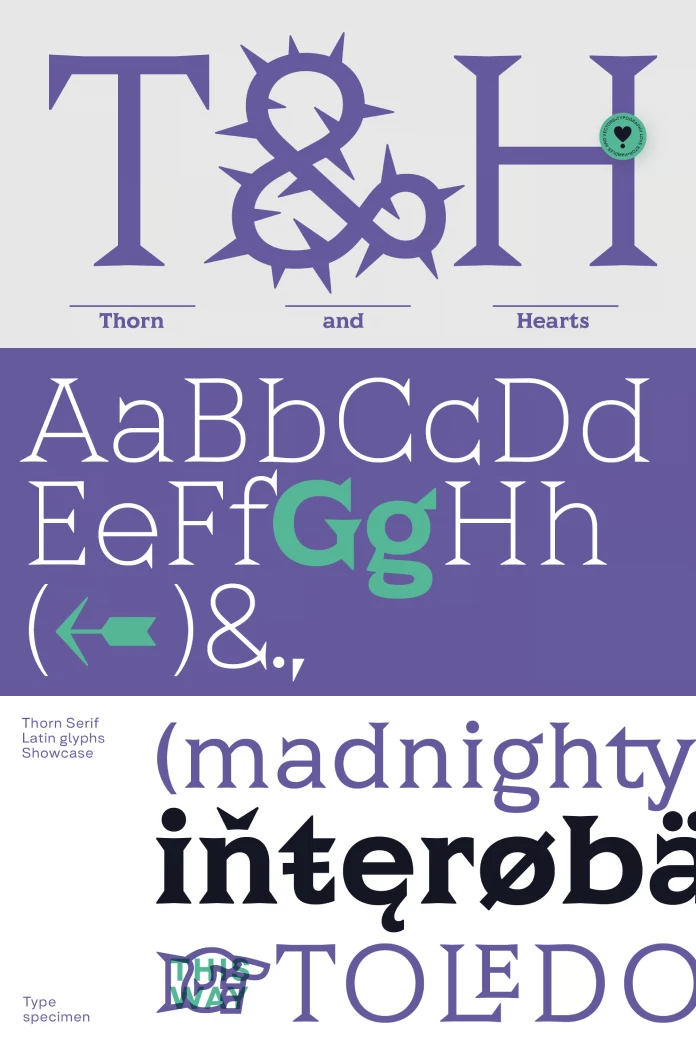
Every good typeface carries one idea you can name. In Thorn Serif, that idea is the Stem-Assembly Principle. I define it this way. A letter reads as several separate stems that meet, and the serifs show the joints instead of hiding them.
The diagonals carry the idea. On A and V, the double serifs trace the two stems that make each letter. The O stays wide and almost circular. Meanwhile, the whole family keeps the heavy serifs that first caught the designers’ attention.
Next, look at A and V in a large headline. Because the double serifs show where one stem meets another, the letters read as built rather than drawn. I think this detail is the best idea in the family.
The proportions also serve headlines. A tall x-height and short ascenders and descenders give Thorn Serif a compact structure. Lines therefore sit tight in a headline. In addition, Type Forward states that the letters keep uniform widths, which gives words a monolithic look.
How Does Thorn Serif Handle Cyrillic?
Cyrillic decides whether a display serif can serve a full market. Thorn Serif covers extended Latin and Cyrillic, and Type Forward lists support for more than 220 languages. Sofia explains the effort. One designer was born in the city, and Bulgarians use Cyrillic every day.
The coins gave no model for it. Cyrillic developed in the ninth and tenth centuries, long after those coins. So Type Forward extended the coin logic into a script the coins never used.
Take the letter Ж. Type Forward starts it from K. First, the team mirrors a second K and overlaps it on the main vertical stem to form the skeleton. Because Ж has more strokes than K, the designers thin its diagonal arms so the glyph does not look heavier than its neighbors, and then they fine-tune proportions, contrast, and serifs until the letter sits inside the same family as the Latin capitals.
The letter Б follows a similar path. It takes the bowl from B and the horizontal bar from F. Then Type Forward adjusts serif size, position, and proportions.
I call the check that applies here the Two-Script Test. Cover the labels on a specimen and ask whether one designer drew both alphabets. Shared letters like А, Е, К, М, О, and Т follow the same structural logic in every script. However, Ж and Б pass only when the designer reworks weight and serifs, and the specimen shows that rework.
The Character Ladder Inside Thorn Serif
The Character Ladder is another editorial construct. It ranks a family’s personality by how much effort a designer needs to switch that personality on. Thorn Serif has four rungs.
- Default alphabet. The coin logic works here with no settings at all.
- Typographic tools. Next come case-sensitive forms, tabular and oldstyle figures, fractions, small numerals, and ordinals.
- Stylistic alternates. Then contextual alternates and stylistic sets add forms that echo old Cyrillic inscriptions, including a rounded M.
- Ligatures and symbols. Finally, standard, discretionary, historical, and experimental ligatures appear, along with obscure symbols such as the ❣ ornament.
Where the Alternates Come From
Type Forward first checked medieval Bulgarian coins. Those coins looked interesting, but they came from a different kind of production and gave the typeface another feeling. So the search continued.
Then luck intervened. A friend found an old reference folder at a local flea market. It held loose-leaf, black-and-white specimen prints of medieval inscriptions, cataloged one per sheet.
Type Forward names two sources behind those prints. One is the tomb inscription of Mostich (Ichirgu-boila) from Great Preslav. It ranks among the oldest known Old Church Slavonic and Cyrillic epigraphic monuments. The other source is the early Cyrillic epigraphy of George the Syncellus. It comes from lead seals and stone inscriptions in tenth-century Preslav.
Those forms have no link to the Serdica coins. Still, their thick stems, large serifs, compact proportions, and pointed details felt close to Thorn Serif. The team borrowed the style and left the history behind.
The Rounded M in Practice
Nothing shows the payoff better than the rounded M. Thorn Serif’s default M uses a traditional diagonal center. In the alternate, a deep, rounded curve hangs between two upright outer stems instead of diagonals. Because Latin M and Cyrillic М share one structure, the alternate works in both scripts.
Type Forward’s ROMA specimen shows the effect. The M uses the rounded form, and the R uses another stylistic alternate. Meanwhile, the O and A keep their default forms. Type Forward did not use the tenth-century Codex Suprasliensis as a source. However, that Old Bulgarian manuscript contains a similar deep-curved M, which hints at older echoes of the form.
My take on the ladder is blunt. Rungs one and two do the daily work. The surprise arrives on rung three, and the rounded M alone justifies a stylistic-set experiment. As for rung four, I would skip the ❣ ornament.
Which Weight of Thorn Serif Fits Which Job?
Thorn Serif ships eight weights, from a sharp Hairline to a monolithic Black, all in one variable font file. On the web, that single file can serve every weight through the CSS font-weight property. Meanwhile, layout apps that support variable fonts expose a weight slider.
Type Forward states that it tuned spacing and kerning across every weight. Test that claim on your own headlines, because tuning matters most where pairs like AV and TA collide.
Hairline is the weakest use of the idea. A typeface about pressure and mass loses its argument when the strokes turn thin. So I would keep Hairline for giant sizes and nothing else.
Black, however, is where Thorn Serif feels at home. Type Forward’s showcase puts heavy weights on beer cans against purple and green. There, the letters fill the label like a stamp. Middle weights suit editorial headlines and pull quotes.
Where Thorn Serif Works and Where It Struggles
Type Forward positions Thorn Serif for headlines, branding, packaging, and editorial design. That positioning also fits the letterforms. A display serif font for packaging needs mass. Also, a coin-inspired serif with Cyrillic support gives Bulgarian labels the same voice as Latin ones.
However, long text is another story. I would not set a novel in Thorn Serif. Heavy serifs and low contrast build a wall of texture across a paragraph.
Where would you place Thorn Serif on your next brief, on a wordmark, or on a magazine opener?
Anyone who wants a Trajan alternative should weigh the trade. Thorn Serif offers grit and weight, whereas Trajan and Cinzel offer stone-carved elegance.
What Thorn Serif Signals for Display Type
These forecasts follow from the evidence above, so treat them as editorial predictions.
- Struck and pressed references will spread. Coins, seals, and stamps offer serif logic that stone cannot, so more foundries will mine them.
- Also, one-file releases will become the default for display families. Eight static files already feel heavy next to a single variable font.
- Finally, Cyrillic will move from an add-on to a launch requirement. Studios that draw on local history, as Type Forward does, will lead that move.
Thorn Serif at a Glance
| Attribute | Details |
|---|---|
| Typeface | Thorn Serif, a variable display serif |
| Foundry | Type Forward, Sofia, Bulgaria (founded 2020) |
| Designers | Mirela Belova and Stan Partalev |
| Inspiration | Roman coin lettering from Serdica, plus medieval Bulgarian inscriptions for alternates |
| Weights | Eight, from Hairline to Black |
| Format | One variable font file |
| Scripts and languages | Extended Latin and Cyrillic, more than 220 languages |
| Contrast and proportions | Minimal stroke contrast, tall x-height, short ascenders and descenders, uniform widths |
| Serifs | Pointed and carved, with double serifs on diagonals |
| Position on the Coin-to-Stone Axis | Coin end |
| OpenType features | Ligatures, stylistic sets, contextual alternates, tabular and oldstyle figures, fractions, ordinals, case-sensitive forms |
| Best for | Headlines, branding, packaging, and editorial design |
| Weak spot | Long body text |
The font family is available on:
Common Questions About the Thorn Serif Font Family
Who designed Thorn Serif?
Mirela Belova and Stan Partalev designed Thorn Serif at Type Forward, their studio in Sofia, Bulgaria.
What inspired Thorn Serif?
Roman coin lettering from Serdica inspired the main alphabet. Meanwhile, medieval Bulgarian inscription prints inspired the optional stylistic alternates.
How many weights does Thorn Serif have?
Thorn Serif has eight weights, from Hairline to Black. Also, all of them live in one variable font file.
Does Thorn Serif support Cyrillic?
Yes. Thorn Serif covers extended Latin and Cyrillic, and Type Forward lists more than 220 supported languages.
Is Thorn Serif a good Trajan alternative?
Yes, if you want coin-like weight and low contrast. However, if you want stone-carved elegance, Trajan and Cinzel stay closer.
What is Thorn Serif best for?
Type Forward recommends Thorn Serif for headlines, branding, packaging, and editorial design. I would avoid long body text.
Which OpenType features does Thorn Serif include?
Thorn Serif includes standard and discretionary ligatures, stylistic sets, contextual alternates, tabular and oldstyle figures, fractions, ordinals, and case-sensitive forms.
What is the rounded M in Thorn Serif?
The rounded M is a stylistic alternate with a deep curve between two upright stems. Type Forward drew it from medieval Bulgarian inscription prints. I have not decided yet whether it belongs in a headline about Rome.
Browse WE AND THE COLOR’s fonts category to read more reviews of trending typefaces.
Subscribe to our newsletter!