This post contains affiliate links. We may earn a commission if you click on them and make a purchase. It’s at no extra cost to you and helps us run this site. Thanks for your support!
Condensed capitals standing next to a loose, looping script sounds like a fight nobody wins. That’s the first thing I thought when I discovered the Pretty Serious font duo by Struvictory.art. But I was wrong, and I spent about a week proving myself wrong on purpose. This is a hands-on look at the Pretty Serious font duo, what it does well, where it wobbles, and why the name is basically a joke the designer is playing on you.
Despite the name, nothing about this typeface is serious. It grins at you. The condensed uppercase struts around like it owns the place, and the script lowercase trips in behind it wearing something completely different. That contrast is the entire pitch, and it’s a pitch I wanted to test against real layouts, not just a pretty preview card.
What Exactly Is the Pretty Serious Font Duo?
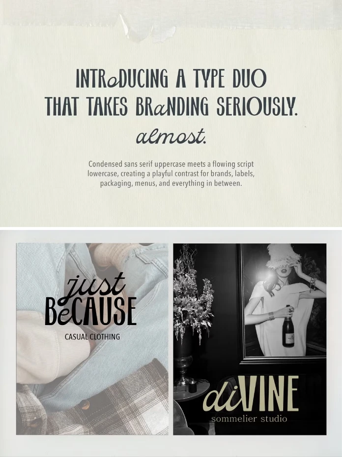
Pretty Serious is an experimental type duo from Struvictory.art, the same foundry behind Solique, which I reviewed a while back. This one pairs a condensed sans serif uppercase with a flowing script lowercase, built as one flexible system rather than two separate downloads that happen to share a folder. You can mix the two styles, lean on just one, or bounce between them inside a single word.
The foundry describes it as shifting from polished and sophisticated to casual and slightly cheeky, and honestly, that’s accurate. I’ve tested a lot of duos that promise range and deliver one mood with a costume change. This one actually moves.
It supports the major Latin-based languages too, so if your client roster includes accented characters, you’re mostly covered. I’d still recommend typing out actual client copy in the preview box before buying, because “supports most Latin languages” and “supports the exact diacritic your Polish client needs” aren’t always the same sentence.

Why I Actually Tested This Instead of Trusting the Preview Image
Preview images lie. Not maliciously, but structurally. A type foundry shows you the best six words in the best possible kerning, lit by the best possible photo, and calls it a day. I’ve been burned by that enough times to build a habit around it. Before I write about any font, I drop real client-style copy into it. Logo lockups, fake menu items, a fashion label name, the works.
So I ran the Pretty Serious font duo through three mock projects: a streetwear logo, a café menu header, and an editorial poster. I wanted to see if the “structure meets movement” idea holds up once you’re not looking at the word “Pretty” in isolation.
Spoiler: it mostly holds up. But “mostly” is doing some work in that sentence, and we’ll get to the parts that don’t.
The Dual Voice Index: A Framework for Judging Duos Like This One
Reviewing a type duo by vibes alone gets you nowhere useful. So I built a small framework for this piece, one I’ll keep using whenever a foundry sends me a duo built on contrast rather than a matched family. I’m calling it the Dual Voice Index, or DVI for short. It scores three things: how confident the structured half feels alone, how much warmth the expressive half adds, and how well the two blend without one bullying the other.
Structural Confidence Score
This measures how the uppercase half performs without any help from its script partner. Can it carry a headline solo? Pretty Serious scores high here. The condensed caps have real presence, tight tracking, and a slightly retro backbone that reminds me of old apparel tags from the ’90s. Set on its own, in all caps, it reads as confident and slightly stubborn, which is exactly what a logotype needs.
Warmth Transfer Score
This is about how much personality the script lowercase injects once you pair it with the caps. A script that’s too tame just sits there looking decorative. Pretty Serious doesn’t have that problem. The lowercase loops and connects unevenly, on purpose, and it genuinely softens whatever hard-edged word sits above or beside it. It transfers warmth well. That’s the whole reason this duo works as a system instead of two unrelated fonts shipped together.
Blend Elasticity Score
Elasticity is the trickiest part to test, because it’s about mid-word switching, not just stacking two lines. I typed “diVINE” and “BeCAUSE” style mixed-case words, similar to what’s shown in the foundry’s own marketing, and the transitions held together. Nothing looked bolted on. That said, elasticity drops a little at very small sizes, where the script strokes thin out and lose some of their swing. Keep the script portions large if you want that warmth to actually register.
Across all three scores, the Pretty Serious font duo lands solidly in the upper range of duos I’ve tested this year. It’s not flawless, and I’ll get to the flaws, but the framework confirms what my gut said on day one: this pairing earns its contrast instead of just claiming it.
How Pretty Serious Behaves in Real Layouts
Scores are nice, but layouts pay the bills. Here’s what happened when I actually built things with it.
Fashion and Apparel Branding
This is where the duo feels most at home. Condensed caps for a brand name, script for a tagline or a “since” year, and the whole thing reads like something that belongs on a denim tag. I mocked up a fictional streetwear label and the Pretty Serious font duo did the heavy lifting on its own, no extra styling needed. It has that lived-in, thrifted-jacket energy that a lot of newer apparel brands are chasing right now.
Cafés, Menus, and Packaging
Menus are unforgiving. Too much personality and nobody can find the price. I set a mock café menu using the caps for section headers and script for dish names, and it stayed readable at printed sizes. Packaging worked well too, especially on anything going for a slightly cheeky, not-too-polished vibe. If your client sells hot sauce with a pun in the name, this font duo is basically made for them.
Editorial and Poster Work
Posters gave the duo room to breathe, and it took full advantage. Big condensed headlines, a looping script pull quote underneath, plenty of negative space. This is where the Structural Confidence Score really shows up. The caps hold a wall of attention on their own before the script even enters the frame.
Where the Duo Struggles
No typeface is perfect, and I’m not going to pretend this one is. Long-form body copy is not this font’s job, and it shouldn’t be forced into that role. The script especially gets tiring past a sentence or two; it’s built for punchy words, not paragraphs. Small print sizes also chip away at the Blend Elasticity Score, as I mentioned earlier. If you’re designing a business card with tiny contact details, borrow a plain sans for that part and save Pretty Serious for the name itself.
There’s also a learning curve around pairing the two cases well. Randomly alternating uppercase and lowercase mid-word can look sloppy if you’re not deliberate about it. The foundry’s own examples make it look effortless, but effortless usually means someone tested it fifteen times first.
Pretty Serious at a Glance
| Category | Details |
|---|---|
| Foundry | Struvictory.art |
| Type | Experimental font duo (condensed sans uppercase + script lowercase) |
| Best for | Fashion branding, cafés, restaurants, packaging, editorial layouts, posters, menus |
| Language support | Major Latin-based languages |
| Structural Confidence Score | High, holds up as a standalone headline face |
| Warmth Transfer Score | High, script lowercase adds genuine personality |
| Blend Elasticity Score | Strong at display sizes, weaker at small sizes |
| Weak spot | Not built for long-form body copy |
What This Means for the Future of Experimental Type Duos
Contrast-based duos are becoming a real category, not just a novelty. I’ll make a prediction here: within the next couple of years, more foundries will move away from matched font families and toward intentionally mismatched pairs like this one. Brands want to look human, not manufactured, and a little visual tension does that job better than a perfectly tidy family ever could.
I also expect more duos to borrow the mid-word case-mixing trick the Pretty Serious font duo leans on. It’s a small technique, but it photographs well, it screens well on packaging, and it’s already all over apparel branding. Once one technique starts working on Instagram, foundries chase it fast.
My honest take, after actually building layouts with it rather than just admiring the preview, is that Pretty Serious earns its spot in a working type library. It’s not a font for every job. It’s a font for the job where your client says “make it feel a little rebellious but still professional,” which happens more often than most designers admit.
Frequently Asked Questions About the Pretty Serious Font Duo
Is the Pretty Serious font duo good for logo design?
Yes. The condensed uppercase works especially well as a standalone logotype, and the script lowercase adds a strong secondary mark or tagline option.
Does the Pretty Serious font duo work for body text?
Not really. It’s built for headlines, labels, and short bursts of text. Pair it with a plain, readable sans or serif for paragraphs.
What languages does the Pretty Serious font duo support?
It covers the most common Latin-based languages. Always test your specific accented characters in the preview box before purchasing.
Who designed the Pretty Serious font duo?
It comes from Struvictory.art, the same foundry behind other experimental releases like Solique.
What industries suit the Pretty Serious font duo best?
Fashion labels, cafés, restaurants, packaging, editorial layouts, posters, and lifestyle branding all suit it particularly well.
Check out other cool typefaces here at WE AND THE COLOR.
Subscribe to our newsletter!