This post contains affiliate links. We may earn a commission if you click on them and make a purchase. It’s at no extra cost to you and helps us run this site. Thanks for your support!
Ask ten designers which Garamond font they use, and you’ll get eleven answers. That’s not really a joke about designers being indecisive, though—guilty as charged. It’s baked into the name itself. There is no single Garamond typeface. There never really was one, not in the way people assume when they pick “Garamond” from a font menu and move on with their day.
What ships under that name today is a sprawling family of at least a dozen genuinely different designs, built across five centuries by people who never met each other. For a good chunk of the twentieth century, most of them were quietly copying the wrong original. That last part isn’t an exaggeration. It’s one of the best documented mix-ups in the history of printing, and almost nobody who drops Garamond into a book layout or a wedding invitation knows it happened.
Garamond keeps resurfacing anyway. Old-style serifs are having a real moment in editorial branding right now, and Garamond is usually the first name that comes up in that conversation, right alongside Bembo and Caslon. It’s also one of the few typefaces old enough to sit outside modern copyright entirely, which makes it a favorite raw material for AI-generated brand kits and free font bundles that want something that looks expensive without costing anything. That popularity is exactly why the confusion matters. If you’re going to use a font this often, it helps to know which one you’re actually using.
A quick definition, since this article throws the word around a lot: Garamond refers to the Roman letterforms cut by the French punchcutter Claude Garamond in the 1530s and 1540s, plus every historical and modern typeface that claims descent from them. Several of the most famous ones, it turns out, don’t descend from him at all. More on that shortly.
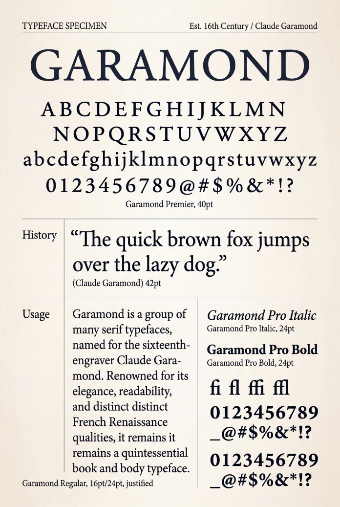
So Which Garamond Font Is the Real One?
Short answer: none of the fonts sold under that name today are direct copies of Claude Garamond’s original steel punches. And it’s not because nobody tried. It’s because the trail of evidence is a genuine mess, tangled up with a four-hundred-year-old case of mistaken identity that nobody untangled until 1926.

Here’s the condensed version. Garamond cut type in Paris in the 1500s. He died in 1561. Roughly sixty years later, a different punchcutter working in a different city produced a set of letters clearly influenced by Garamond’s style. Those later punches ended up in the French national printing office and got mislabeled with Garamond’s name sometime around the turn of the twentieth century. For decades afterward, “Garamond” mostly meant a typeface that Garamond himself never touched.
Once you know that, the modern landscape of Garamond fonts makes a lot more sense. Some are honest attempts to recreate Garamond’s actual work. Others are honest attempts to recreate the mislabeled substitute, which by now has its own century of history and its own loyal following. A few are neither, just modern designs that borrow the name because the name still sells.
Who Was Claude Garamond, Anyway?
Claude Garamond, spelled “Garamont” just as often in period documents, was born in Paris, most likely sometime between 1480 and 1510. Historians still argue over the exact year, which tells you something about how thin the paper trail is for a man this famous.
He trained as a punchcutter, apprenticing around 1510 with Antoine Augereau and later working alongside the printer and designer Geoffroy Tory. Punchcutting is a brutal, exacting craft. You carve a letterform in reverse into the tip of a steel bar, by hand, at actual type size, and if you botch the curve of a lowercase “e,” you start over. Garamond turned out to be exceptionally good at it.
His earliest Roman type, cut around 1530 for an edition of Erasmus, drew on the Roman type Francesco Griffo had cut for the Venetian printer Aldus Manutius back in 1495. Garamond refined that Venetian model into something more regular and more upright, closer to French taste at the time. In 1540, King Francis I commissioned him to cut a Greek typeface, the famous Grecs du Roi, later used for years by the royal printer Robert Estienne. From 1545 onward, Garamond worked as his own publisher too, which was unusual for a punchcutter of his era. Most stayed in the workshop and left the business side to someone else.
He died in 1561. His punches and matrices scattered across Europe afterward, picked up by foundries in Antwerp and Frankfurt. That scattering is exactly why nobody today owns one complete, undisputed set of “the” Garamond originals.
The Impostor Problem: Meet Jean Jannon
This is where the story gets interesting. Jean Jannon was a French Protestant printer working in Sedan, a fortified town near the Belgian border, starting around 1615. He cut his own typefaces, clearly working in the tradition Garamond had established two generations earlier. Jannon was genuinely skilled. Historians who’ve studied his surviving specimens single out his smallest sizes as remarkably sharp for the period.
Jannon’s punches eventually entered France’s national printing collection. By the nineteenth century, they’d picked up a new label, “Caractères de l’Université,” Characters of the University. Nobody was entirely sure where that name came from, and by 1904 the Imprimerie Nationale had begun publishing specimens of the same punches simply under the name “Garamond.”
Around the same time, the office’s director, Arthur Christian, decided the collection was Claude Garamond’s own lost work. He wasn’t working from solid documentation. He was working from reputation and a bit of wishful thinking, because “we hold the original Garamond punches” makes a far better story for a national printing house than “we hold some punches by a printer from Sedan nobody’s heard of.” The claim stuck. Type foundries across two continents built entire product lines on it, all confidently stamped “Garamond.”
The Woman Who Caught Everyone Lying
Beatrice Warde blew the whole thing open in 1926, in an essay for the British typography journal The Fleuron, edited at the time by Stanley Morison. She published it under a male pen name, Paul Beaujon, because, as she put it later, nobody in that era was ready to accept that a woman could know anything about printing.
Warde compared surviving specimens credited to Jannon against the disputed Imprimerie Nationale punches and found the match unmistakable. The famous “Garamond” at the heart of French national printing wasn’t Garamond’s work at all. It belonged to Jannon, cut roughly sixty years after Garamond’s death and mistaken for the older man’s letters for the better part of a century.
The timing could hardly have been worse for the type industry. American Type Founders had already released ATF Garamond in 1917, built directly on the Imprimerie Nationale model. Monotype followed with its own version in 1922. Both were now, technically, Jannon revivals wearing somebody else’s name. Warde’s discovery didn’t stop either company from selling their typeface. It just meant an entire generation of “Garamond” fonts carried the wrong name, and by then that name was far too commercially valuable to change.
An Editorial Framework: The Garamond Lineage Score
Here’s a way I’ve found useful for sorting through the mess, and I’ll say upfront that this isn’t an industry-standard classification. It’s a framework I built for this piece, to make sense of what “based on Garamond” actually means in each case.
Call it the Lineage Score. It ranks each Garamond revival by how directly it connects to material genuinely cut by Claude Garamond, from Tier 1 (closest) to Tier 4 (loosest).
- Tier 1, Direct-Source Revivals: Built from specimens or matrices genuinely produced by Garamond, most often the 1592 Egenolff-Berner specimen sheet printed in Frankfurt.
- Tier 2, Compound Revivals: Deliberately pair Garamond’s roman with a contemporary’s italic, most often Robert Granjon’s, treating that combination as a historically justified unit rather than a single source.
- Tier 3, Jannon-Descended: Built, knowingly or not, on the Imprimerie Nationale punches later identified as Jean Jannon’s work.
- Tier 4, Free Interpretations: Use “Garamond” as a style reference rather than a source, reworked heavily enough that the historical connection is more of a mood than a lineage.
Keep this framework in mind. It organizes everything in the next section, and it’s a faster way to answer the question most people actually have: which Garamond font sits closest to the real thing?
The Garamond Family Tree: Every Major Version Worth Knowing
Tier 3: The Jannon Line
ATF Garamond, released by American Type Founders in 1917 and drawn by Morris Fuller Benton with Thomas Maitland Cleland, kicked off the entire twentieth-century Garamond boom. It’s warm, a little irregular, and genuinely lovely on the page, even though it’s technically named after the wrong man. Once ATF’s version took off, every major foundry wanted a “Garamond” of its own.
Monotype answered in 1922 with its Series 156, designed in-house and based on the same disputed source. That’s the Garamond bundled with Microsoft Office for decades, which makes it, by sheer volume, probably the most-printed “Garamond” in human history and also one with the shakiest claim to the name.
Frederic Goudy drew a competing version for the American arm of Lanston Monotype in 1921, and he made a point of spelling it “Garamont” rather than “Garamond,” specifically to separate his design from every other foundry chasing the same disputed source. In France, the Deberny & Peignot foundry released its own “Garamont” in 1926, based on the same Imprimerie Nationale model, and it became the house typeface of Gallimard’s Bibliothèque de la Pléiade starting in 1931. Robert Hunter Middleton drew a Ludlow version the same year Monotype’s Series 156 appeared, and Linotype followed in 1936 with Garamond No. 3, an adaptation of Benton’s ATF design reworked for its typesetting machines.
Then there’s ITC Garamond, designed by Tony Stan in 1975, which took the Jannon lineage somewhere entirely new: a much bigger x-height, heavier strokes, a tighter fit, and built for advertising rather than book pages. Bitstream later condensed it into Apple Garamond, squeezed to roughly 80 percent of its normal width, which served as Apple’s corporate typeface for the better part of two decades starting in 1984. That means the first Macintosh box carried a typeface named, several generations removed, after a punchcutter who died four hundred years before Steve Jobs was born.
Tier 1 and 2: The Genuine-Article Line
Not every revival got fooled. Some type designers went looking for Garamond’s actual work and found it.
Stempel Garamond, cut by the German foundry in 1925 under Rudolf Wolf, drew on a rediscovered specimen from the Egenolff-Berner foundry in Frankfurt, preserving genuine Garamond and Granjon material from 1592. It reads noticeably heavier and more solid than most of its competitors, a difference you notice immediately if you set the same paragraph in Stempel Garamond next to Adobe Garamond.
Granjon, designed by George W. Jones for Linotype’s British branch and first shown to the trade press in 1924, deserves special mention. Beatrice Warde herself called it her favorite French Renaissance revival, precisely because it drew on authentic Garamond material rather than the Jannon punches. Jones named it after Robert Granjon instead of Garamond specifically to avoid getting lumped in with the misattributed crowd. If you want a real Garamond hiding under a different name, this is it.
Sabon, designed by Jan Tschichold between 1964 and 1967 and released jointly by Linotype, Monotype, and Stempel, is a Tier 2 compound revival by design. Tschichold built the roman from that same 1592 Egenolff-Berner specimen and paired it with Granjon’s italic, then regularized the whole family for consistency across three competing typesetting technologies at once. It’s arguably the most demanding font commission in printing history, and it still reads beautifully on a page today.
Adobe Garamond, designed by Robert Slimbach and released in 1989, was Adobe’s first historical revival and one of the first digital Garamonds built from direct study of Garamond’s actual punches, which Slimbach examined at the Plantin-Moretus Museum in Antwerp. Its italic follows Granjon. Slimbach later expanded that same research into Garamond Premier Pro, released in the mid-2000s, which adds genuine optical sizes, meaning the caption, text, subhead, and display cuts are each drawn separately rather than simply scaled, echoing how Garamond’s own contemporaries handled different point sizes by hand.
Tier 1: The Free and Open Options
You don’t need a commercial license to use an authentic Garamond. EB Garamond, released in 2011 by the Austrian designer Georg Duffner and now maintained by a small group of contributors, is a genuinely faithful open-source revival built directly on that same 1592 Egenolff-Berner specimen. It’s free, it’s on Google Fonts, and it belongs in Tier 1 right next to commercial versions costing hundreds of dollars.
Cormorant Garamond, designed by the physicist-turned-type-designer Christian Thalmann, takes a different route: a high-contrast, display-oriented reinterpretation of the Garamond model, built for headlines and pull quotes rather than dense body copy. It’s free too, also distributed through Google Fonts, and it’s become a favorite in editorial and invitation design for exactly that reason.
Garamond at a Glance
| Typeface | Designer / Foundry | Year | Lineage Tier | Best For |
|---|---|---|---|---|
| ATF Garamond | Morris Fuller Benton, Thomas M. Cleland / American Type Founders | 1917 | Tier 3, Jannon-descended | Warm, period-flavored display and text |
| Monotype Garamond | Monotype, in-house | 1922 | Tier 3, Jannon-descended | General use; the world’s most-printed Garamond via Microsoft Office |
| Goudy’s Garamont | Frederic Goudy / Lanston Monotype | 1921 | Tier 3, Jannon-descended | Distinctive, quirky book text |
| Granjon | George W. Jones / Linotype | 1924 | Tier 1, direct-source | Fine book typesetting; the most historically accurate metal-era option |
| Stempel Garamond | D. Stempel AG | 1925 | Tier 1, direct-source | Slightly heavier, sturdier book text |
| Sabon | Jan Tschichold / Linotype, Monotype, Stempel | 1967 | Tier 2, compound revival | Consistent book typesetting across formats |
| ITC Garamond | Tony Stan / ITC | 1975 | Tier 4, free interpretation | Advertising and small-format display |
| Adobe Garamond | Robert Slimbach / Adobe | 1989 | Tier 1, direct-source | Digital book and editorial text |
| Garamond Premier Pro | Robert Slimbach / Adobe | Mid-2000s | Tier 1, direct-source, optical sizes | Editorial work needing several optical sizes |
| EB Garamond | Georg Duffner, open source | 2011 | Tier 1, direct-source, free | Free, historically faithful body text |
| Cormorant Garamond | Christian Thalmann, open source | Mid-2010s | Tier 4, free interpretation, display | Free display headlines, invitations, editorial titles |
Why ITC Garamond Looks Nothing Like the Others
If you’ve ever set the same word in ITC Garamond and Adobe Garamond and wondered why they barely look related, that reaction is correct. They aren’t, not really.
Tony Stan built ITC Garamond in 1975 for a different job than book typesetting entirely. Advertising and small-format printing in the 1970s needed letters that stayed legible at tiny sizes on cheap paper, and the fix was a much bigger x-height, tighter spacing, and heavier overall weight. Those changes work, technically. They also erase most of what makes a Garamond a Garamond: the small counters, the restrained stroke contrast, the sense of a pen moving across the page rather than a machine stamping it.
It became massively popular anyway, largely through Apple’s corporate branding across the 1980s and 90s, and plenty of people who grew up seeing that condensed Bitstream version on early Mac packaging still think of it as the definitive Garamond. It isn’t. It’s the loudest one, which in branding terms usually wins regardless of accuracy.
Which Garamond Font Should You Actually Use?
I set the same paragraph in six different Garamonds while researching this piece, printed proofs of each, and read them side by side under normal desk light longer than I’d like to admit. Here’s where I landed.
For long-form book text, reach for EB Garamond or Adobe Garamond. Both stay close to Garamond’s actual proportions, both hold up cleanly at 10 or 11 point, and EB Garamond costs nothing. For editorial headlines and pull quotes where you want drama, Garamond Premier Pro’s display cut and Cormorant Garamond both deliver real contrast without turning brittle at large sizes. For a project that genuinely needs the closest thing to Garamond’s own hand, look at Granjon or Stempel Garamond, though both take a bit more hunting to license these days.
I’d steer clear of ITC Garamond and its Apple-era descendants for anything claiming historical authenticity. It’s a fine typeface on its own terms. It just isn’t doing what its name promises.
Where Garamond Goes From Here
A few predictions, offered with appropriate humility given how long this typeface has already outlived every prediction made about it.
Expect more variable Garamonds. Garamond Premier Pro already proved optical sizing matters more for this design than for most, and variable font technology makes that kind of size-specific nuance far cheaper to build and ship than it was in 2005. I’d bet on at least one major foundry releasing a fully variable Garamond soon, with weight, width, and optical size all adjustable inside a single file.
Expect the open-source side to keep growing, too. Garamond’s public-domain status makes it a low-risk pick for AI design tools generating instant brand kits, and every one of those tools needs a dependable free serif in its library. EB Garamond and Cormorant Garamond are well-placed to become the default answer, the way Georgia became the default web serif a generation ago.
And I’d put real money on at least one more archive turning up new material. The Plantin-Moretus Museum in Antwerp and various French collections still hold Garamond-adjacent specimens that haven’t been fully studied with modern imaging tools. Type historians keep finding small corrections to the records. There’s no reason to think the story stopped in 1926.
Garamond Font Questions, Answered
Is Garamond a free font?
Some versions are, some aren’t. EB Garamond and Cormorant Garamond are both free and open source, available through Google Fonts. Adobe Garamond, Garamond Premier Pro, Stempel Garamond, and most other named revivals require a commercial license. Because Claude Garamond died in 1561, nothing about his original design itself is under copyright. Any foundry is free to build and sell its own version, which is exactly why so many exist.
What’s the closest font to the original Garamond?
Granjon, Stempel Garamond, Adobe Garamond, Garamond Premier Pro, and EB Garamond all sit in Tier 1 of the framework above, built from genuine Garamond source material rather than the mislabeled Jannon punches. Among free options, EB Garamond is the most historically faithful.
Why are there so many different Garamond fonts?
Two reasons. First, Garamond’s actual punches scattered across Europe after his death in 1561, so no single archive holds a complete original source. Second, a set of later punches by Jean Jannon got mistaken for Garamond’s work for roughly a century, leading multiple major foundries to build “Garamond” typefaces on the wrong original before the mistake was corrected in 1926.
What’s the difference between Garamond and Granjon?
“Garamond” refers to Claude Garamond’s roman letterforms. Granjon is the name George W. Jones gave his 1920s Linotype revival, built from genuine Garamond material, specifically to separate it from the wave of Jannon-descended “Garamond” fonts flooding the market at the time. Confusingly, Granjon is also the surname of Robert Granjon, a contemporary of Garamond’s whose italic designs are commonly paired with Garamond romans in typefaces like Sabon and Adobe Garamond.
Is Adobe Garamond the same as Garamond Premier Pro?
No, though both come from the same designer. Robert Slimbach released Adobe Garamond in 1989 as a single-optical-size digital interpretation of Garamond’s roman and Granjon’s italic. Garamond Premier Pro, released roughly fifteen years later, expands on that research with true optical sizes for caption, text, subhead, and display use, plus a far larger glyph set.
Can I use Garamond commercially without paying for a license?
Yes, if you choose a free, open-source version. EB Garamond and Cormorant Garamond both carry the SIL Open Font License, which permits commercial use at no cost. Named commercial revivals such as Adobe Garamond or Stempel Garamond still require a paid license through their respective foundries or type marketplaces.
Browse WE AND THE COLOR’s Fonts category for more.
Subscribe to our newsletter!