Tag: font

The Polaroid Font by Funtype Co. Is a Condensed Sans Serif...
Let's be honest, type foundries from around the globe release a new condensed sans every other week, and most of them blur together after...
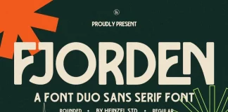
Fjorden Font Duo by Heinzel Std.
The Fjorden Font Duo Is a Rounded-and-Regular Retro Pairing Built for Bold, Confident Headlines
I put the Fjorden font duo on my desk for two...
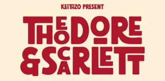
Theodore and Scarlett Font by Keithzo
I first noticed the Theodore and Scarlett font through a Creative Market notification I almost swiped away. But happily, I didn't. Something about the...
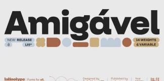
Amigável Font Family by Latinotype
With the Amigável Font Family, Latinotype Published a Geometric Sans That Solves the Alternate-Letter Problem.
Latinotype released a geometric sans that argues with itself on...
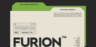
GC Furion Font Family by Glyphonic
The GC Furion Font Family Brings Precision Engineering to Futuristic Sans Design
Most "futuristic" fonts lean on one trick: sharp corners and a sci-fi label....
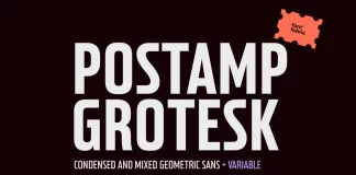
Postamp Grotesk Font Family by Fontfabric
Postamp Grotesk started as a single letter on a stamp nobody was supposed to care about. Fontfabric type designer Ivelina Martinova was flipping through...
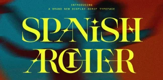
SLTF Spanish Archer Font by SilverStag
Spanish Archer breaks the usual rule about uppercase display type, and it breaks it on purpose. Most display serifs treat each letter as its...
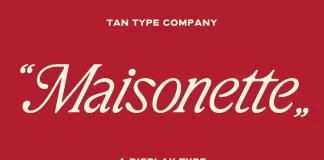
TAN Maisonette Font by TanType
A typeface either survives contact with a real layout or it doesn't. That's the test I run on every serif that crosses my desk,...
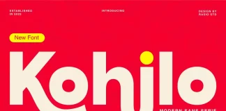
Kohilo Font by Rasio Studio
The Kohilo font caught my attention for one reason: most geometric sans serifs promise boldness but deliver stiffness. Rasio Studio built something different here....
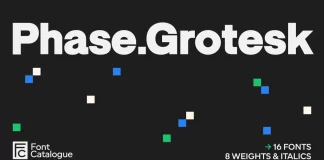
Phase Grotesk Font Family by Font Catalogue
Phase Grotesk showed up on my desktop during a brand refresh project, and it refused to behave like a normal grotesque. Most low-contrast sans-serif...
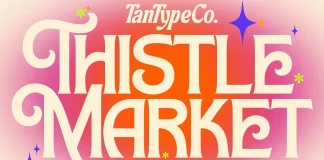
TAN Thistle Font by TanType
TAN Thistle landed on my desktop during a week I was auditing display fonts for food and market branding projects. I expected another generic...

Folkies Vantage by Jolicia Type Is the Vintage Font Duo Worth...
What Is Folkies Vantage and Why Do Designers Keep Talking About It?
Folkies Vantage is a vintage font duo from Jolicia Type. It landed on...