This post contains affiliate links. We may earn a commission if you click on them and make a purchase. It’s at no extra cost to you and helps us run this site. Thanks for your support!
The Solique font, designed by Victoria of Struvictory.art, is a handmade sans-serif built around sunbaked textures, mid-century warmth, and letterforms that look drawn, not plotted. If you design brand identities, packaging, or editorial layouts and you’re tired of every sans-serif looking like it came out of the same geometric factory, this typeface deserves a proper look.
I’m going to walk you through what makes Solique different, how it behaves under real production pressure, and where it fits (and doesn’t fit) in a working type library. I’ll also hand you a framework I built specifically to evaluate handmade fonts like this one, because “it looks nice” isn’t a review; it’s a shrug.
What Makes Solique Different From a Typical Geometric Sans-Serif?
Most sans-serif fonts are built on a grid and proud of it. Circles are circles. Stems match stems. Solique breaks that rule on purpose. Its letterforms carry chunky, organic shapes with subtle irregularities baked into the outlines, the kind of thing you’d get if a sign painter redrew a modernist typeface freehand, twice, and kept the version with more personality.
That’s the core idea behind Solique, and it’s also the reason I built a scoring system to talk about it properly. I’m calling it the Imperfection Index, and here’s how it works.
The Imperfection Index: A Framework for Rating Handmade Typefaces
The Imperfection Index rates a typeface from 1 to 10 based on three factors: stroke irregularity (do letters of the same type share identical curves, or do they wobble slightly?), rhythm variance (does letter spacing feel mechanical, or does it breathe like handwriting?), and texture presence (are there visible traces of the drawing process, like slightly uneven terminals or asymmetric bowls?).

A font like Helvetica scores close to 1. Total consistency, zero drawn texture, built for neutrality. A raw, scanned handwriting font can score a 10, but it usually loses legibility along the way. Solique lands around a 6.5 on my scale. It has real irregularity you can see up close, especially in letters like “S,” “G,” and lowercase “a,” but it holds a strict enough baseline that paragraphs still read cleanly at small sizes. That balance is rare. Most handmade fonts pick a side. Solique tries to sit in the middle and mostly succeeds.
Where Does Solique Come From, Design-Wise?
Victoria describes Solique as inspired by sunbaked landscapes, handcrafted lettering, and mid-century design. You can see all three influences if you know where to look. The chunky weight and confident stroke width nod to 1950s and 60s advertising type, the kind you’d find on a diner sign or a vintage soda label. The slightly bowed baselines and inconsistent counters point to hand lettering, where nothing is ever perfectly repeated. And the warm, slightly weathered feel across the whole family reads like something left out in the sun a little too long, in the best possible way.
This isn’t a font trying to look distressed through added grunge textures or fake scratches. The imperfection lives in the letterforms themselves. That distinction matters more than it sounds like it should. Grunge overlays date fast and photocopy badly. Structural imperfection, the kind Solique uses, stays interesting because it’s part of the actual drawing, not a filter slapped on top.
How Does Solique Perform in Real Production Work?
I tested Solique across four contexts: a packaging mockup for a fictional small-batch hot sauce brand, a café menu, a poster headline, and a full paragraph of editorial body copy. Here’s what I found in each case.
Packaging and Labels
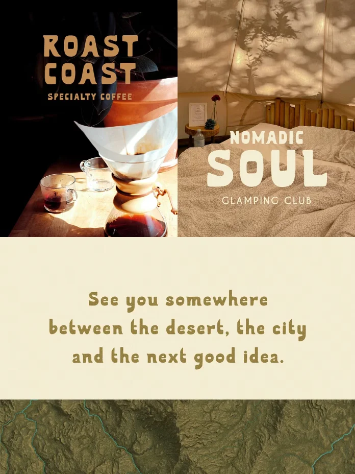
This is where Solique genuinely shines. The chunky letterforms hold up beautifully at label scale, and the organic texture reads as authentic rather than gimmicky. I set the brand name in all caps at 48pt on a mock hot sauce label, and it immediately looked like it belonged on a shelf next to small-batch, artisanal products. If your client keeps saying “handcrafted” and “authentic” in the creative brief, Solique gives you a typeface that actually backs that language up visually.
Editorial and Body Copy
At smaller sizes, Solique remains readable, though I wouldn’t set long-form magazine body copy in it past 10 or 11 point. It’s built for presence, not for disappearing into a paragraph. Use it for pull quotes, subheadings, and short editorial blocks instead, and let a quieter serif or grotesque carry the long paragraphs.
Posters and Headlines
At poster scale, Solique earns its keep. Big, bold, and warm without tipping into novelty territory. I tested a single word, “GATHER,” at full bleed on a poster mockup, and the letterforms had enough personality to carry the composition on their own, with almost no additional graphic support needed.
Café Signage and Menus
Menus are a strange test for any font because they need personality and legibility fighting for the same real estate. Solique handled both. Dish names in Solique looked inviting without sacrificing scanability, which is the actual job of a menu font, whether people admit it or not.
Solique Font Overview: Quick Reference Table
| Attribute | Detail |
|---|---|
| Designer | Victoria, Struvictory.art |
| Classification | Bold, earthy handmade sans-serif |
| Design Influences | Sunbaked landscapes, hand lettering, mid-century advertising |
| Imperfection Index Score | Approximately 6.5 out of 10 |
| Best Use Cases | Packaging, branding, posters, café and outdoor signage, editorial headlines, lifestyle products |
| Weak Fit For | Long-form body copy, dense technical documents, small-scale UI text |
| Language Support | Popular Latin-based languages (verify specific glyphs through the Creative Market preview tool) |
| Personality | Warm, playful, confident, tactile |
Who Should Actually Use the Solique Typeface?
Solique fits brands that want warmth without losing boldness. Think small-batch food and drink brands, outdoor and lifestyle products, independent cafés, farmers’ market vendors, and editorial projects with a personal, handcrafted angle. It also works well for anyone pushing back against the current wave of AI-generated branding, which tends to produce a clean but soulless geometric type. “Solique” reads as made by a hand because it was.
I wouldn’t reach for it on a fintech dashboard or a corporate annual report. That’s not a criticism; it’s just not the job this font was built for. Every typeface has a lane. Solique’s lane is craft, warmth, and personality, and it stays firmly in it.
My Honest Take After Testing Solique
I’ve tested a lot of “handmade” fonts that turn out to be a single distressed texture applied to an otherwise boring geometric skeleton. Solique isn’t that. The imperfection is structural, drawn into the glyphs themselves, and that’s what gives it staying power. A font built on a texture trick looks dated within a year. A font built on genuine, considered irregularity in the letterforms ages more like a good analog photograph.
My prediction: as more studios push back against AI-generated sameness in branding, typefaces with visible human touch, like Solique, will see a real spike in demand over the next two to three years. Clients are starting to ask for “human” and “handmade” by name, not just as adjectives in a brief but as a design requirement. Fonts that can prove that quality at the glyph level, not just through marketing copy, will be the ones that get picked.
Frequently Asked Questions About the Solique Font
Is the Solique font good for logo design?
Yes. Solique’s chunky, confident letterforms work especially well for wordmarks and logotypes that need warmth and personality, particularly for food, lifestyle, and craft-focused brands.
Can I use Solique for body text?
You can, but it performs best in short bursts, headlines, pull quotes, and subheadings, rather than dense, long-form paragraphs.
What languages does the Solique typeface support?
Solique Sans supports the most popular Latin-based languages. Check the specific glyph set you need using the live preview tool on Creative Market before purchasing.
Who designed the Solique font?
Solique was designed by Victoria, a graphic designer working under the studio name Struvictory.art, known for crafting original typefaces with close attention to individual glyph detail.
Is Solique a good fit for packaging design?
Packaging is arguably Solique’s strongest use case. Its handcrafted texture and bold weight read as authentic on labels, jars, pouches, and outdoor product packaging.
How does Solique compare to other handmade sans-serif fonts?
Compared to many handmade sans options that rely on surface texture alone, Solique builds its irregularity into the actual letterforms, which keeps it legible and durable across different applications rather than feeling like a one-trick effect.
Check out other trending typefaces here at WE AND THE COLOR.
Subscribe to our newsletter!