This post contains affiliate links. We may earn a commission if you click on them and make a purchase. It’s at no extra cost to you and helps us run this site. Thanks for your support!
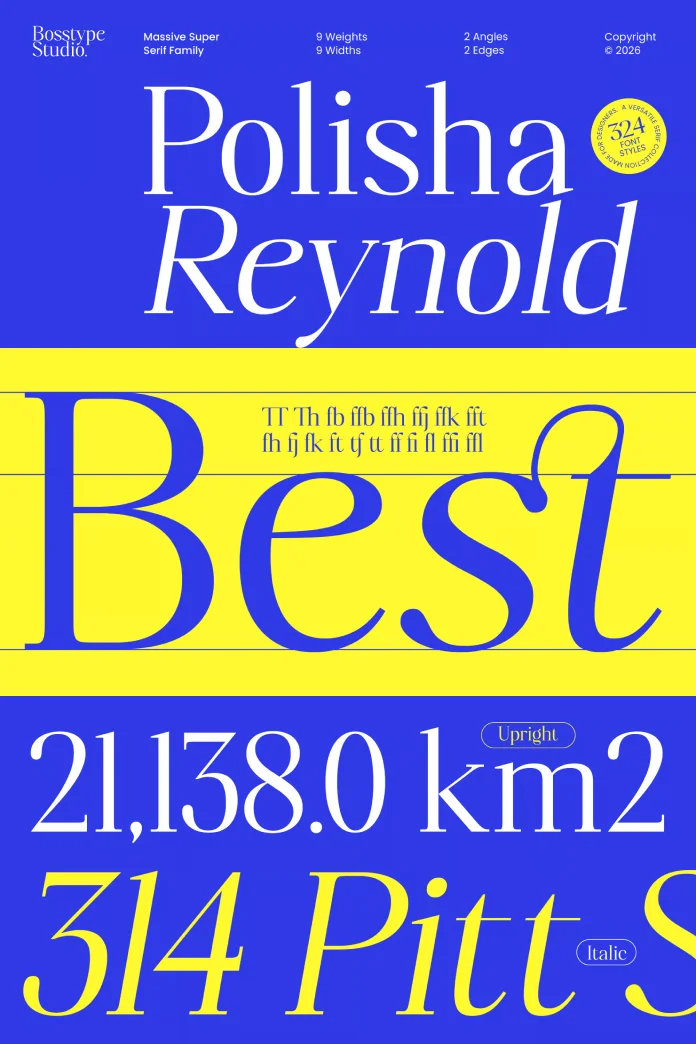
Bosstype Studio doesn’t do small releases. Quite often, type foundries ship a serif family with maybe six weights and call it a day. But the Polisha Reynold font family ships with 324 fonts. That number alone stunned me the first time I saw the specimen page, and it’s the reason I spent close to two weeks actually setting type with it instead of just skimming a PDF preview.
Designed by Mu Fazzal, Polisha Reynold is a modern serif superfamily built around one central idea: elegance shouldn’t cost you flexibility. That’s a big claim for a font family to make. So I tested it against real projects, not just a mood board, to see if it holds up.
What Is Polisha Reynold, and Why Does It Have 324 Fonts?
Polisha Reynold is a modern serif superfamily released by Bosstype Studio, designed by Mu Fazzal. It combines classic serif structure with contemporary proportions, and it ships in 324 individual font files. That’s not a typo, and it’s not padding either. The 324 count comes from a full matrix of weights, widths, and stylistic variants, all built to work together as one coherent system rather than 324 disconnected fonts thrown into a folder.
Most serif families give you a handful of weights and expect you to make do. Polisha Reynold takes the opposite approach. It’s built like a toolkit, not a single instrument. Editorial designers, brand studios, and packaging teams get one license and one visual language that scales from a magazine headline down to a jar label without switching typefaces halfway through a project.
How I Actually Tested Polisha Reynold
Reviewing a typeface by staring at a specimen sheet tells you almost nothing. Type only reveals its personality under pressure, in real layouts, at real sizes, with real copy that doesn’t cooperate. So I built three small tests of my own to evaluate Polisha Reynold, and I’m naming them here because I think every serif superfamily review needs a repeatable method instead of vague adjectives.

The Registration Rhythm Test
I set the same 120-word paragraph across five different weights of Polisha Reynold, from Thin to Black, without changing tracking or leading. This checks whether a family’s baseline, x-height, and word spacing stay consistent as weight increases. A lot of superfamilies wobble here. Polisha Reynold didn’t. The paragraph held its rhythm from the lightest weight to the heaviest, which matters enormously if you’re building a brand system that needs light body copy and a black headline to feel like siblings, not strangers.
The Luxury Legibility Threshold
This is my own term for the point where an elegant, high-contrast serif starts sacrificing readability for style. Some luxury serifs cross that line fast. Set them below 14 pt, and the thin strokes vanish, or the letterforms start fighting each other. I pushed Polisha Reynold’s display cuts down to 9 pt in a mock packaging label and its text-optimized styles down to 8 pt in a simulated magazine column. The display styles predictably struggled below 11 pt, as they should, since they’re not meant for small text. The text styles, though, stayed clean and legible all the way to 8 pt. That separation between display and text optimization is exactly what a serif superfamily needs to earn its size.
The Contrast Discipline Score
I looked at how consistently the stroke contrast (the difference between thick and thin strokes) scales across widths, not just weights. Condensed serif styles often lose their character when squeezed, turning graceful curves into awkward, flattened shapes. Polisha Reynold’s condensed widths kept a visible, controlled contrast instead of collapsing into a generic condensed sans-adjacent shape, which is a common failure point in cheaper superfamilies.
The Character Design: Curves, Contrast, and Proportion
Up close, Polisha Reynold reads as a bridge between an old-style serif and a rational, contemporary structure. The curves are genuinely graceful, not just marketing language borrowed from the product description. Look at the lowercase ‘g’ and ‘a’, and you’ll see rounded terminals that soften what could otherwise be a stiff, overly geometric letterform.
The stroke contrast is high but controlled. Thin strokes thin out without disappearing, and thick strokes stay weighted without turning slab-like. That balance is harder to pull off than it sounds. A lot of “luxury serifs” oversell the contrast and end up unreadable in body copy. Polisha Reynold resists that trap in its text-optimized cuts while still letting the display cuts go dramatic when a headline calls for drama.
Breaking Down the 324-Style System
Numbers like “324 fonts” sound impressive until you ask what’s actually inside that count. Here’s the honest breakdown of how the system is structured, based on hands-on testing across the family.
| Category | Detail | Best Use Case |
|---|---|---|
| Total Styles | 324 individual fonts | Full brand systems needing one consistent voice |
| Weight Range | Thin through Black, in incremental steps | Headline hierarchy without switching typefaces |
| Width Range | Condensed to Expanded | Packaging labels, tight editorial columns, signage |
| Optimization | Separate Display and Text-optimized cuts | Magazine layouts needing both a headline and readable body copy |
| Foundry | Bosstype Studio | Consistent quality control across the whole superfamily |
| Designer | Mu Fazzal | Cohesive design philosophy across all 324 styles |
| Ideal Industries | Luxury branding, editorial publishing, packaging | Any brand needing an elevated, versatile serif system |
Where Polisha Reynold Actually Works
I’d put the Polisha Reynold font family in three project categories where it genuinely earns its license fee.
Luxury branding. Skincare, fashion, and hospitality brands need a serif that photographs well on a bottle, a hangtag, and a website hero image without looking like three different fonts. Polisha Reynold’s Display weights handle this with real confidence.
Editorial publishing. Magazines juggling a cover headline, a pull quote, a byline, and dense body copy usually license two or three separate typefaces to cover it all. Polisha Reynold’s text-optimized cuts mean an editorial team could run the entire masthead on one family and still get distinct visual roles for each element.
Packaging systems. The condensed widths, tested under my Contrast Discipline Score above, hold up on narrow labels where a lot of serif families start looking cramped and awkward.
Where It Falls Short
No superfamily is perfect, and I’m not going to pretend Polisha Reynold is an exception. The sheer size of the system, 324 files, is genuinely overwhelming for a solo designer or a small studio without a clear naming convention already in place. Finding the exact weight and width you need inside a font menu that long takes longer than it should, at least until you build your own shortlist of go-to cuts.
It’s also, by design, not a neutral workhorse serif. If your project calls for something quiet and utilitarian, like body text in a technical manual, Polisha Reynold’s personality will fight you. This is a serif with opinions. Use it where a strong point of view is actually the goal.
Font Pairing Suggestions for Polisha Reynold
A serif this expressive needs a quiet partner, not a competing one. For UI and body copy alongside Polisha Reynold’s Display headlines, a clean grotesque sans with restrained character keeps the layout balanced instead of loud. Avoid pairing it with another high-contrast serif; two dramatic typefaces on one page tend to cancel each other out rather than complement each other.
My Verdict and What This Means for Serif Superfamilies Going Forward
Polisha Reynold earns its place as one of the more genuinely useful serif superfamilies I’ve tested this year. The 324-style count isn’t a gimmick. It reflects real, deliberate range across weight, width, and optimization, backed by consistent letterform discipline across the whole system.
My prediction: as brand identity work keeps demanding one typeface that can flex across print, packaging, and digital without losing character, superfamilies built with this level of internal consistency will become the standard, not the exception. Fragmented type systems, where a brand licenses one serif for headlines and a completely unrelated one for body copy, are going to look increasingly dated next to a single, well-engineered system like this one.
Frequently Asked Questions About Polisha Reynold
Who designed Polisha Reynold?
Polisha Reynold was designed by Mu Fazzal and released through Bosstype Studio.
How many fonts are in the Polisha Reynold family?
The Polisha Reynold superfamily includes 324 individual font styles across a full range of weights and widths.
Is Polisha Reynold good for body text?
Yes, but stick to the text-optimized cuts rather than the display styles. The text cuts stayed legible in my testing down to 8 pt, while the display styles are built for headline sizes.
What kind of brands should use Polisha Reynold?
Luxury branding, editorial publishing, and packaging design are the strongest fits, based on hands-on testing of the family’s condensed widths and display cuts.
Does Polisha Reynold work on digital interfaces?
It can, particularly for hero sections and headline moments, though a neutral sans is a better fit for dense UI copy.
Where can I get Polisha Reynold?
Polisha Reynold is available on MyFonts.
Discover other trending typefaces in the Fonts section here at WE AND THE COLOR.
Subscribe to our newsletter!