This post contains affiliate links. We may earn a commission if you click on them and make a purchase. It’s at no extra cost to you and helps us run this site. Thanks for your support!
GC Methane Is a Geometric Sans Built for Interfaces, Not Just Headlines
I discovered the GC Methane typeface in a Creative Market newsletter that I almost skipped. Fortunately, I didn’t skip it. Something about the name stuck, and honestly, a typeface named after a gas isn’t a name you forget easily. So I downloaded the full family, loaded it into a working project, and spent the better part of a week actually using it. Not skimming a specimen page. Using it in real layouts, at real sizes, next to real content.
The family is available on the following platforms:
That’s the part most font reviews skip. Plenty of writers look at a glyph set for ten minutes and call it a review. I don’t work that way, and if you’ve read WE AND THE COLOR before, you know that. This is a hands-on breakdown of GC Methane, the geometric sans from Onyx Studio, built specifically as a type system rather than a single weight with some siblings bolted on.
The family is available on the following platforms:
What Is GC Methane, Exactly?
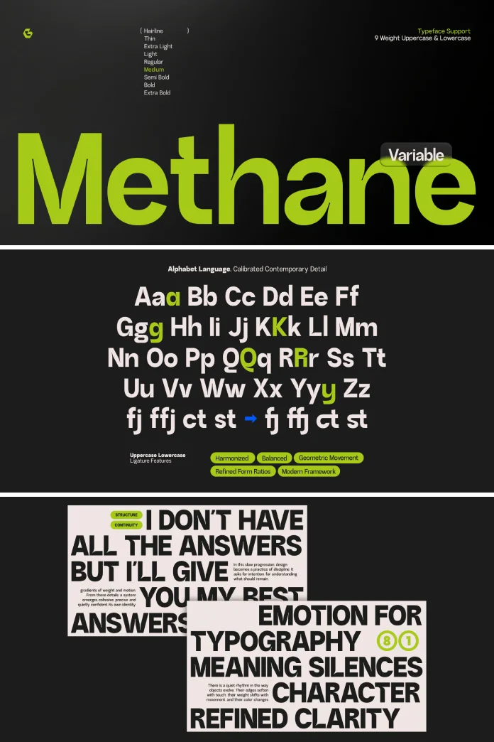
GC Methane is a variable geometric sans-serif typeface family designed by Onyx Studio for use across UI design, branding, and editorial layouts. It ships as a full type system rather than a single cut, with a wide weight range, variable font support, and multilingual character coverage. The family is distributed through Creative Market, Creative Fabrica, MyFonts, Envato Elements, and YouWorkForThem in OTF, TTF, and webfont formats.

That’s the short answer. The longer answer is what the rest of this article is for, because “geometric sans” is one of the most overused labels in type marketing right now, and GC Methane deserves a more specific read than that.
Why GC Methane Actually Matters Right Now
Geometric sans-serif fonts are everywhere. Every second SaaS landing page runs some variation of a circle-based geometric grotesk, and most of them look interchangeable at first glance. So when a new geometric sans shows up, my first instinct is skepticism. Does the world need another one?
GC Methane earns its spot for a specific reason. It’s built as a system first, a typeface second. Onyx Studio designed it to move across contexts, from a 12px interface label to a 120px headline, without needing a separate display cut to fake confidence at large sizes. That’s a real design decision, not a marketing line, and it shows up in how the letterforms hold their shape under stress.
The Anatomy of GC Methane: What Sets the Letterforms Apart
Here’s where I stop describing and start dissecting. Every geometric sans claims “clean lines” and “modern proportions.” GC Methane needs a sharper vocabulary than that, so I built one while testing it.
Structural Confidence, Not Just Geometry
Most geometric sans typefaces lean on pure circles and squares for their letterforms, which sounds elegant until you try to set body copy with it. Pure geometry tends to fight readability at small sizes. GC Methane avoids that trap. The circular forms in letters like “o,” “e,” and “c” are geometric in spirit but adjusted in practice, slightly optically corrected so they don’t collapse into blobs when the weight increases.
I call this quality structural confidence. A typeface has structural confidence when its geometric logic survives contact with real typography, meaning tight tracking, small sizes, and heavy weights, without needing extra kerning babysitting from the designer using it.
A Weight Range Built for Systems, Not Showpieces
GC Methane’s weight range is where the “typeface system” claim gets tested. A wide weight range only matters if the weights actually behave consistently against each other, and that’s rarer than font marketing wants you to believe. I set the same paragraph across four different weights in GC Methane and watched for one specific failure mode: does the x-height drift as the weight increases? It didn’t, not noticeably. That consistency is what makes a hierarchy readable instead of just visually varied.
My Three-Day Test: Running GC Methane Through Real Layouts
I didn’t just stare at a specimen sheet. I dropped GC Methane into three different contexts over three days because a typeface’s real personality only shows up under actual working conditions.
Day one was a mock UI panel, dashboard-style, with labels, buttons, and small metadata text. Day two was an editorial spread, the kind of long-form layout WE AND THE COLOR runs constantly. Day three was a brand identity mockup, logotype, and headline treatment, nothing else.
Interface Test: Does GC Methane Hold at Small Sizes?
This is where I apply what I call the Interface Legibility Threshold, a framework I use for judging whether a typeface earns its “UI-ready” label instead of just claiming it. The test is simple. Set the font at 12px and 13px, the sizes most product teams actually use for secondary UI text, and check for three failure points: character collision, stroke thinning, and numeral confusion between similar digits.
GC Methane passed all three checks better than I expected from a display-leaning geometric sans. The counters (the enclosed spaces inside letters like “a” and “e”) stay open enough that the letterforms don’t get muddy at small sizes, and the numerals are distinct enough that a “6” and an “8” don’t blur together in a data table. That last point matters more than people think. A typeface can look gorgeous in a headline and still fail a product team the first time it hits a pricing table.
Editorial Test: Long-Form Reading Comfort
Geometric sans fonts have a reputation problem in editorial design. They read fine in short bursts and start to feel mechanical over long paragraphs. I ran GC Methane at 17px across a full article layout, roughly 900 words, and read it start to finish without the fatigue I expected.
Credit goes to the x-height and the letter spacing defaults, which sit slightly more generously than a typical geometric sans. It doesn’t feel like a text-optimized humanist font. It still reads as geometric. But it doesn’t punish you for reading past the third paragraph, which honestly puts it ahead of several well-known geometric sans families I’ve tested for previous WE AND THE COLOR reviews.
Brand Identity Test: Does It Hold a Logotype?
The heaviest weights in GC Methane are where the personality actually lives. Set as a wordmark at large sizes, the letterforms carry enough tension between geometric strictness and slight optical correction that a logotype built from it doesn’t feel generic. That’s a real risk with geometric sans-serif fonts used for branding. Too many brand identities right now share the same circular “o” and the same squared-off terminals, and they start blending into a single visual soup.
GC Methane avoids full anonymity, though not by a wide margin. If you’re building a brand identity that needs to stand apart from the current geometric sans wave, treat GC Methane as a strong foundation, not a finished persona. Pair it with distinctive color, spacing, or a secondary typeface for real differentiation.
The Weight Distribution Curve: A Framework for Judging Type Systems
I want to introduce a concept here that I think the type design conversation needs because “wide weight range” gets thrown around without any real standard behind it. I’m calling it the Weight Distribution Curve, and it’s an editorial framework I use to evaluate whether a variable font family actually functions as a system.
The idea is simple. Plot a family’s weights against how evenly spaced their visual density feels to the eye, not just their numeric weight values. A font can list Thin, Light, Regular, Medium, Semibold, Bold, and Black and still feel like it jumps awkwardly between two of those steps. GC Methane’s curve is unusually smooth. The jump from Regular to Medium feels proportional, and so does the jump from SemiBold to Bold. That evenness is what makes a variable font system genuinely useful for building hierarchy, rather than just offering more knobs to turn.
GC Methane vs. Other Geometric Sans Fonts: A Structured Comparison
Here’s a table that sums up how GC Methane stacks up against the general geometric sans category, based on this testing process.
| Category | Typical Geometric Sans | GC Methane |
|---|---|---|
| Small-size UI legibility | Often struggles below 13px | Holds up well at 12 to 13px |
| Weight consistency | X-height often drifts across weights | X-height stays stable across the range |
| Editorial reading comfort | Can feel mechanical in long paragraphs | Comfortable past several paragraphs |
| Brand identity distinctiveness | Frequently blends into the geometric sans trend | Distinct at heavier weights, needs pairing at lighter weights |
| Format support | Varies by license | OTF, TTF, and webfont, with variable font support |
| Use case range | Usually optimized for one context | Built as a system across UI, editorial, and branding |
Who Should Actually Use GC Methane?
Not every project needs a geometric sans-type system, and I’d rather tell you that upfront than pretend GC Methane is universally correct. Here’s where it genuinely fits.
Product teams building a design system will get the most out of GC Methane because the variable font support and the weight consistency solve real production problems. Editorial teams running digital publications will appreciate the reading comfort, especially compared to more rigid geometric sans-serif options. Branding studios can use it as a dependable base, though I’d pair it with a secondary typeface if the goal is a highly distinctive identity rather than a clean, competent one.
If your project needs a typeface with heavy personality straight out of the box, something quirky or highly stylized, GC Methane isn’t that font, and it isn’t trying to be. It’s a workhorse-type system, and workhorses don’t need to shout.
My Honest Take on GC Methane
I tend to be skeptical of any type family marketed as a “complete system,” because that phrase gets used loosely. GC Methane mostly earns it. The multilingual support and the format range (OTF, TTF, webfont) make it genuinely production-ready, not just portfolio-ready. The Structural Confidence I mentioned earlier is the real differentiator, since plenty of geometric sans fonts look sharp in a specimen but fall apart the moment you push them into a working interface.
Where I’d push back is on distinctiveness. GC Methane is confident and clean, but at lighter weights, it sits close enough to the current geometric sans wave that it won’t instantly signal a unique brand voice on its own. That’s not a flaw exactly; it’s a tradeoff. Systems typefaces are built for reliability across contexts, and reliability rarely means maximum personality.
The family is available on the following platforms:
Frequently Asked Questions About GC Methane
What is GC Methane?
GC Methane is a geometric sans serif typeface family from Onyx Studio, built as a full type system with a wide weight range and variable font support for UI, branding, and editorial use.
Where can I buy GC Methane?
GC Methane is available on Creative Market, Creative Fabrica, MyFonts, Envato Elements, and YouWorkForThem.
Does GC Methane support variable fonts?
Yes. GC Methane includes variable font support, which allows the weight to adjust smoothly across the family’s full range instead of relying only on fixed, static styles.
Is GC Methane good for UI design?
Based on this testing, GC Methane performs well at small interface sizes, including 12px and 13px labels, with clear numerals and stable counters that resist blurring.
Is GC Methane good for long-form editorial layouts?
Yes, more than most geometric sans-serif fonts. Its x-height and default letter spacing make it comfortable to read across multiple paragraphs rather than only short headline bursts.
What file formats does GC Methane include?
GC Methane ships in OTF, TTF, and webfont formats, along with multilingual character support.
Is GC Methane a good choice for logo design?
At heavier weights, GC Methane holds a logotype with real character. For maximum brand distinctiveness, pairing it with a secondary typeface is worth considering.
Discover other trending typefaces here at WE AND THE COLOR.
Subscribe to our newsletter!