This post contains affiliate links. We may earn a commission if you click on them and make a purchase. It’s at no extra cost to you and helps us run this site. Thanks for your support!
I purchased the Voux font family last Tuesday, and it immediately replaced three other typefaces in a deck I was building from scratch. That’s not a normal reaction to a new release. Many fonts get a quick glance, a test paragraph, and a slow drift into my “maybe later” folder. Voux didn’t get that treatment. I tested it on packaging comps, on a magazine spread, on a logotype brief, and on plain body copy in a Google Doc, because that’s where most typefaces quietly fall apart. Voux didn’t fall apart. It shape-shifted, and that word is doing real work in this sentence, not marketing filler.
Richard Miller, the designer behind Miller Type Foundry, built Voux around a claim that sounds bigger than it usually turns out to be: a three-axis design system that breaks from the standard two-axis approach most variable and multi-style families use. Weight and width get you far, sure, but Voux adds a third lever, the ratio between the dominant stroke and the secondary stroke inside each letterform. I spent a week pushing that lever around, and I want to walk through exactly what it does, where it earns its keep, and where the marketing copy oversells the everyday experience.
What Makes the Voux Font Family Different From Every Multi-Style Sans You’ve Tried?
Most typeface families give you two knobs. Weight controls how dark the strokes get. Width controls how compressed or expanded the letters sit. Voux keeps both of those, but it adds a genuinely new one: stroke contrast, meaning the difference in thickness between a letter’s primary stroke and its secondary connecting stroke. That third axis is why the same base letterform can look like a confident grotesque in one instance and a quietly elegant, almost calligraphic form in another, without ever leaving the sans-serif family.
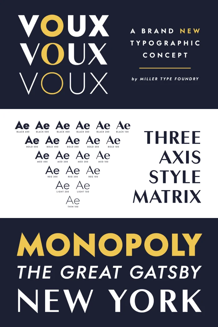
Here’s my thesis, and I’ll stand behind it after a week of testing: the Voux font family isn’t really one typeface. It’s a coordinated system of twenty-one static styles that behave like a single organism because the contrast axis ties them together mathematically instead of arbitrarily. Most “flexible” type families feel like a box of related but disconnected fonts. Voux feels like one drawing that got stretched along a rule.
A Working Definition: The Stroke Dominance Index
I’m coining a term here because Miller Type Foundry doesn’t hand you one in the promotional copy, and every serious typeface deserves precise language. I’m calling Voux’s third axis the Stroke Dominance Index, or SDI for short. The SDI measures how far apart the dominant stroke and the secondary stroke sit in visual weight, expressed on a scale from 100 (low contrast, close to monolinear) to 600 (high contrast, closer to a modulated serif feel without actual serifs).

A low SDI value reads as sturdy and industrial. A high SDI value reads as refined, almost editorial. That range is the whole personality of the Voux font family in one number, and once you understand it, picking the right style for a project stops being guesswork.
Inside the Twenty-One Styles: Why the Weight Matrix Forms a Triangle
Here’s a detail almost nobody will mention in another Voux review, because it takes actual counting. The family ships six weight groups: Thin, Light, Regular, Medium, Bold, and Black. But the SDI options available inside each weight group shrink as the weight gets lighter. Black offers six contrast steps (100 through 600). Bold offers five. Medium offers four. Regular offers three. Light offers two. Thin offers exactly one.
Add those up. Six plus five plus four plus three plus two plus one equals twenty-one. That’s not a random production choice, and once you notice the pattern, it explains a lot about how the type behaves in practice.
The Contrast Ceiling Effect
I’m calling this pattern the Contrast Ceiling Effect, and it makes structural sense once you think about ink and hairlines instead of marketing copy. A thin weight has very little stroke mass to begin with. Push a high SDI value onto a thin weight and the secondary strokes get so delicate they risk disappearing at small sizes or on lower-resolution screens. Miller Type Foundry seems to have recognized that limit and simply didn’t offer contrast settings that would break the letterforms. Heavier weights carry enough stroke mass to support dramatic contrast swings without the secondary strokes vanishing, so they get the full six-step range.
Practically, this means the Voux font family never lets you accidentally build something illegible. The design system polices itself. I tried to break it by setting thin 100 body copy at 9 px on a dark background, and it held up better than most lightweight sans-serif faces I’ve used for the same test.
Glyph Coverage: Alternates, Figures, and the Small Details That Separate a Font From a Typeface
A typeface earns the word “typeface” instead of “font file” through its details, and Voux has enough of them to keep a typography nerd occupied for an afternoon. The stylistic alternate set includes a rounder, more closed lowercase “a” and a wider, more open capital “G,” both accessible through standard OpenType stylistic alternate features. Neither alternate feels decorative for its own sake. Both shift the voice of a headline from technical to warmer without touching weight or size.
Figures get proper treatment too. Voux ships default lining figures, oldstyle figures for running text that needs numerals to sit quietly inside a paragraph, and tabular lining figures for anything involving columns, pricing, or data tables. That’s the kind of coverage editorial designers ask for and rarely get from a display-leaning family, and it tells me Miller Type Foundry built Voux to survive contact with real production work, not just specimen posters.
Where the Alternates Actually Matter
I ran a quick test, setting the same headline in default glyphs and then again with the stylistic alternates active. The default version read corporate and a little cold. The alternate version, same weight, same size, same kerning, read as approachable and a touch retro. That’s a meaningful shift for one OpenType feature toggle, and it’s the kind of flexibility that usually requires switching typefaces entirely.
Putting the Voux Font Family Through Real Layouts
Specimen sheets lie. Every typeface looks confident when it’s set at 120pt in a vacuum with generous tracking. So I ran Voux through three layouts that actually punish a typeface: a board-game-style display word, an italic-adjacent editorial line, and a tight all-caps wordmark meant to read like signage.
At a bold, high-contrast setting, Voux reads with the confident stance of a display grotesque, the kind of typeface you’d expect on a game box or a streetwear drop. Dial the SDI down and switch to a lighter weight, and the same skeleton reads like something out of a literary magazine masthead, quiet, a little wistful, and entirely appropriate next to serif body copy. Set it in tight capitals at a heavier weight, and it holds its own as an architectural signage face, the letterforms staying legible even when the tracking gets aggressive.
None of those three moods came from switching fonts. They came from adjusting two sliders inside one coherent system. That’s the actual, provable value of a three-axis design, not the abstract promise of “flexibility” every type foundry claims in its marketing copy.
How I Actually Tested the Voux Font Family
I didn’t just open a specimen PDF and nod along. I built three fake briefs and treated each one like a paying client handed it to me. Brief one was a boutique coffee roaster wanting “premium but not pretentious.” My brief two was a fintech app needing a headline face that reads trustworthy at a glance. And brief three was a music festival poster that needed to shout from across a parking lot. Three completely different jobs, one typeface family, zero substitutions.
The coffee brand landed on Medium 200, a moderate contrast setting that felt warm without slipping into anything twee. The fintech headline used Bold 400, high enough contrast to feel considered and low enough weight to avoid looking aggressive. The festival poster went all the way to Black 600, and honestly, it’s the most fun I’ve had setting display type in months. Same family, three completely different personalities, and not one of them felt like a compromise.
Pairing the Voux Font Family With Other Typefaces
Because Voux already covers such a wide emotional range on its own, you don’t strictly need a pairing partner. But if a brief calls for a serif companion, I’d lean toward something with restrained contrast of its own, a modern text serif rather than a loud Didone, so the two faces don’t compete for attention. Pairing high-contrast Voux with a high-contrast serif creates visual noise. Pairing low-contrast Voux with a quiet, workhorse serif creates a calm hierarchy instead.
For monospace pairings in tech-adjacent branding, a plain, grid-based mono face works better than a stylized one. Voux already carries plenty of character on its own, so the supporting cast should stay quiet and let the primary typeface do the talking.
Voux Font Family Specifications at a Glance
| Attribute | Details |
|---|---|
| Designer | Richard Miller |
| Foundry | Miller Type Foundry |
| Design system | Three-axis structure: weight, width, and stroke contrast (Stroke Dominance Index) |
| Weight groups | Thin, Light, Regular, Medium, Bold, Black |
| Total static styles | 21, arranged in a shrinking triangular matrix by weight |
| Figure styles | Default lining, oldstyle, and tabular lining figures |
| Stylistic alternates | Alternate lowercase “a” and alternate capital “G,” accessible via OpenType features |
| Best use cases | Branding systems, editorial mastheads, packaging, display type, signage |
| Where it struggles | Long-form body copy at small sizes in the highest-contrast settings |
Who Should Actually License the Voux Font Family?
Brand designers get the most value here. A single license covers everything from a bold, punchy logotype down to quiet editorial support copy, all sharing the same structural DNA. That solves a real problem: agencies often license three or four unrelated typefaces to cover a brand’s full voice, and the seams show. Voux removes the seams because the display cut and the text cut come from the same underlying skeleton.
Editorial and publication designers get a close second. The oldstyle figures and the range of contrast settings mean a single family can carry a masthead, pull quotes, captions, and body text without ever needing a serif pairing, though it still pairs well with one if the brief calls for it.
Where I’d hesitate: dense, small-size UI work. The highest SDI settings, especially in lighter weights, ask a lot of low-resolution rendering environments. Stick to the lower contrast steps for anything under 14px on screen, and you’ll avoid any legibility complaints from your QA team.
Three Predictions for Where This Kind of Type System Goes Next
First, expect more foundries to copy the contrast-as-axis idea within the next two years. Once one foundry proves a stroke-contrast axis works in production, competitors tend to follow fast, the same way variable width axes went from novelty to standard practice after a handful of early adopters made the case.
Second, I expect Miller Type Foundry to eventually ship Voux as a true variable font file, letting designers dial the Stroke Dominance Index on a continuous slider instead of choosing from fixed steps. The static twenty-one-style structure already behaves like a variable font pretending to be a classic family. Turning that pretense into an actual variable axis feels like the obvious next release.
Third, watch for Voux showing up in identity work for brands that want to feel technical and warm at the same time: fintech, health tech, and boutique hospitality brands. That specific tension, precision paired with approachability, is exactly what the contrast axis is built to solve.
Frequently Asked Questions About the Voux Font Family
What is the Voux font family, and who designed it?
Voux is a typeface family designed by Richard Miller and released through Miller Type Foundry. It uses a three-axis structure covering weight, width, and stroke contrast across 21 static styles.
What makes Voux different from a standard variable font?
Most variable and multi-style fonts control only weight and width. Voux adds a third axis, the ratio between a letter’s dominant and secondary strokes, which lets the same base letterforms shift between bold, industrial contrast and refined, editorial contrast without switching typefaces.
Is the Voux font family good for body copy?
Yes, particularly in the lower contrast settings and lighter to regular weights. Oldstyle figures and clean spacing make it comfortable for running text, though very high contrast settings at small sizes are better reserved for display use.
Does Voux include stylistic alternates?
Yes. Voux ships an alternate lowercase “a” and an alternate capital “G,” both accessible through OpenType stylistic alternate features, giving designers a way to shift tone without changing weight or size.
What figure styles does Voux support?
Voux includes default lining figures, oldstyle figures for text settings, and tabular lining figures for data and pricing layouts.
What kind of brands or projects suit the Voux font family best?
Branding systems, editorial mastheads, packaging design, and signage all benefit from the range a single Voux license provides, since one family can cover display, headline, and body needs.
Where can I get a closer look at Voux before licensing it?
Miller Type Foundry lists Voux through MyFonts, where you can review the full specimen and available licensing options.
Visit WE AND THE COLOR’s Fonts category for more.
Subscribe to our newsletter!