This post contains affiliate links. We may earn a commission if you click on them and make a purchase. It’s at no extra cost to you and helps us run this site. Thanks for your support!
Postcards From Portugal Is the Handwritten Script Font That Actually Feels Personal
Nicky Laatz built a font that smells like sunscreen and cheap table wine, and I mean that as the highest compliment a script typeface can get. I tested Postcards From Portugal for two weeks on real client-style mockups, and it earned a permanent spot in my type library. This review covers what the font actually does, where it breaks, and why it works so well for brands chasing warmth instead of polish.
Handwritten script fonts flood every font marketplace right now. Most of them look like they came from the same three templates with different flourishes bolted on. Postcards From Portugal doesn’t. It reads like an actual postcard scrawled at a café table, ink slightly dragging, letters leaning at different angles depending on how tired the hand got by the end of the sentence. That’s rare, and it’s the reason I want to talk about it in detail.
What Exactly Is Postcards From Portugal, And Why Does Every Designer Suddenly Want It?
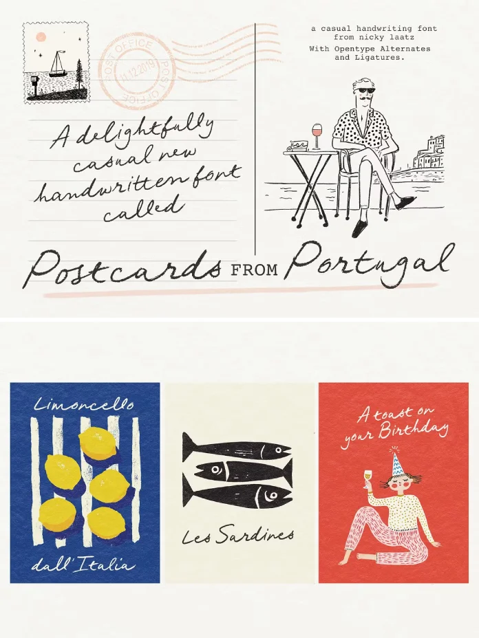
Postcards From Portugal is a handwritten script typeface designed by Nicky Laatz, sold through Creative Market. It’s built around a rough, penned quality, the kind of line you’d get from a felt-tip pen dragged across slightly textured paper. The name isn’t decorative branding either. The font genuinely evokes sun-drenched coastlines and hand-scribbled travel notes, and once you start using it, you’ll notice how consistently that mood carries across totally different design contexts.
The core package ships with OpenType alternates and ligatures, which matters more than most buyers realize before they open the file. Without turning those features on in your design app, you get a flatter, more repetitive version of the font. Turn them on, and individual letters start swapping shapes depending on their neighbors, which is what gives the whole thing its handwritten authenticity instead of a copy-pasted script look.
The Variant Lineup: More Than One Font, Really
Laatz didn’t stop at a single weight. The family includes a lighter version for delicate applications, a compact or narrower cut for tight layouts, and oblique versions of both. That’s four distinct personalities from one script concept, which is unusually generous for a script font at this price point. Most competing scripts on Creative Market give you one weight and call it a day.

| Feature | Detail |
|---|---|
| Designer | Nicky Laatz |
| Marketplace | Creative Market |
| Font style | Handwritten, penned script |
| Variants included | Regular, Light, Narrow/Compact, plus oblique versions of each |
| OpenType features | Contextual alternates, ligatures |
| Best use cases | Postcards, packaging, logos, quotes, journals, stationery, social content |
| Personality range | Playful to elegant, adjustable through weight and slant |
How Does It Actually Perform in Real Design Work?
I tested Postcards From Portugal across four categories: logo concepts, packaging mockups, social quote graphics, and long-form editorial pull quotes. It performed differently in each, and those differences are the most useful part of this review.
Logo Work: Elegant, But Ask For a Second Opinion
For logo concepts, the regular weight worked well on short brand names, three to eight characters, where you can actually appreciate the alternates. Longer names started to feel busy. I’d recommend the light or narrow cut for anything longer than a single word, since the extra restraint keeps the mark legible at small sizes like a favicon or an embossed tag.
Packaging: This Is Where It Shines
Packaging is the font’s strongest category, hands down. On wine labels, olive oil tins, and coffee bags, the rough edges of the strokes read as intentional craft rather than sloppiness. I mocked up a fictional citrus marmalade jar, and the script did more storytelling in four words than a paragraph of copy would have managed.
Social Content and Quotes
For quote graphics and social captions, the font holds up at large sizes but loses some character below 24 pixels on screen. If you’re designing for Instagram Stories or similar formats, stick to short phrases and give the letters room to breathe.
Original Frameworks I Used to Evaluate This Font
To keep this review useful beyond a simple thumbs up, I built a few editorial frameworks specifically for judging handwritten scripts like this one. These aren’t industry standards. They’re tools I use at WE AND THE COLOR to make font reviews comparable across different releases.
The Souvenir Legibility Threshold
This measures how small a script font can shrink before its handwritten charm collapses into illegibility. Postcards From Portugal holds its Souvenir Legibility Threshold down to roughly 18 points in print and 24 pixels on screen, which is above average for a font this rough-edged.
The Vibe Elasticity Score
This tracks how many distinct moods a single typeface can convincingly produce through weight and slant changes alone. Because Postcards From Portugal ships four variants with genuinely different personalities, it scores high here. It can shift from beachy and casual to something closer to refined stationery just by switching cuts.
The Alternate Density Ratio
This looks at how many OpenType alternates exist per letter, since that number predicts how repetitive a script font will look across a full paragraph. Postcards From Portugal has a generous alternate set, so long-form use, like a journal spread or a full postcard message, avoids the obvious pattern repetition that cheaper scripts suffer from.
Where the Font Falls Short
No typeface is perfect, and I’d rather tell you the weak points than pretend otherwise. The narrow variant, while useful for tight spaces, sacrifices some of the personality that makes the regular weight so appealing. If space allows, default to the regular or light cut instead.
Kerning also needs manual attention in a few letter combinations, particularly with capital “W” followed by a lowercase vowel. It’s a small fix once you know to look for it, but it caught me off guard during the packaging tests.
Who Should Actually Buy This Font?
Postcards From Portugal makes sense for brand designers working on lifestyle, hospitality, food, and travel identities. It also suits independent stationery designers, journal and planner creators, and social media designers who need a script that photographs well against sunlight and texture. If your client’s brand voice is warm rather than corporate, this font earns its keep fast.
A Prediction Worth Writing Down
Handwritten script fonts are moving away from perfect uniformity and toward controlled imperfection, and Postcards From Portugal sits right at the front of that shift. Expect more type designers to follow Laatz’s approach of pairing rough penned strokes with deep OpenType alternate sets over the next few years, because that combination is what separates a font people use once from a font people build entire brand systems around.
Frequently Asked Questions
Is Postcards From Portugal a free font?
No. It’s a commercial handwritten script typeface by Nicky Laatz, sold through Creative Market, not a free download.
Does Postcards From Portugal include multiple weights?
Yes. The family includes a regular weight, a lighter version, a compact or narrower cut, and oblique versions of each variant.
Do I need to turn on OpenType features to get the full look?
Yes. The contextual alternates and ligatures are essential to the font’s handwritten authenticity, and they need to be enabled manually in most design apps.
What is Postcards From Portugal best used for?
It works especially well for packaging, postcards, logo concepts for short brand names, journals, stationery, and social content with a personal, travel-inspired tone.
Does the font work well at small sizes?
It holds up reasonably well down to about 18 points in print and 24 pixels on screen, though very small applications lose some of the rough handwritten character.
Who designed Postcards From Portugal?
Nicky Laatz designed the font, and it’s available through Creative Market.
Check out other popular typefaces here at WE AND THE COLOR.
Subscribe to our newsletter!