This post contains affiliate links. We may earn a commission if you click on them and make a purchase. It’s at no extra cost to you and helps us run this site. Thanks for your support!
I discovered the Edition font by Funtype Co. on Creative Fabrica three weeks ago. It’s ultra-condensed, all caps, bold enough to bruise. I almost scrolled past it. I’ve tested maybe forty condensed sans-serif fonts this year alone, and most of them look identical once you squint. This one made me stop scrolling, and after two weeks of actually building layouts with it, I have opinions. Some good, some not.
What Exactly Is the Edition Font by Funtype Co.?
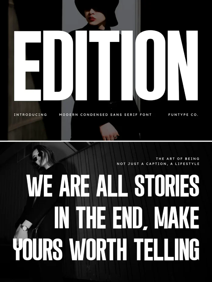
Edition is an ultra-condensed, all-caps display sans serif built for headlines that need to dominate a small space. Funtype Co., the studio behind it, has a consistent catalog on Creative Fabrica. Edition fits the same family logic. Tall x-height, tight tracking, thick strokes. It’s not a text font. Nobody’s setting a paragraph in Edition, and nobody should try.
The official description calls it a font for “strong headlines, modern posters, album covers, sports graphics, branding, and high-impact advertising.” That’s accurate, but it undersells how narrow the actual use case is. Edition isn’t a general-purpose display font. It’s a specialist tool, and specialist tools either fit your project perfectly or don’t fit at all.
How I Actually Tested the Edition Font
I didn’t just open it in a type specimen viewer and call it done. I set the Edition font into five real layouts: a fake album cover, a poster mockup, a sports graphic for a fictional league, an Instagram carousel headline, and a browser hero banner. Then I stepped back six feet from my monitor and checked what still read clearly.
I also ran what I now call the Thumbnail Legibility Test, which is my own shorthand for shrinking a headline down to 120 pixels wide and checking if it’s still legible without squinting. A lot of bold condensed fonts fail this test because the strokes merge into a gray blob at small sizes. Edition mostly passes, though not perfectly, and I’ll explain where it slips.

The Condensed Impact Threshold
Every ultra-condensed font has a point where compression stops adding punch and starts hurting readability. I call this the Condensed Impact Threshold, and it’s the single most useful lens for judging fonts like this one. Push tracking too tight, and letters collide. Push the x-height too tall, and counters close up. Edition sits close to that line without quite crossing it, at least at headline sizes above 40 points.
Below that size, though, the Edition font starts to strain. Letters like B, R, and P have counters that are already tight by design, so once you drop the point size, those shapes start to clog. If you’re setting a headline under 32 points, test it first. Don’t assume it’ll hold up just because it looked great at 80 points on your monitor.
Where the Edition Font Actually Shines
Posters and album covers are where this font earns its keep. The tall, narrow letterforms create a kind of vertical pressure on the page, and that pressure reads as energy. I mocked up a fake punk record sleeve with a single word set in Edition, nothing else on the page, and it worked immediately. No extra styling needed. That’s a good sign for any display font. If it needs five layers of effects to look interesting, it’s not doing its job.
Sports graphics are the other strong fit. Team names, score bugs, jersey numbers—all of that benefits from a font that reads instantly at a glance, and Edition does that well in caps-only headline contexts. I also tried it on a fitness brand logo mockup, and the compact width let me fit a longer brand name into a horizontal lockup that would have looked cramped in almost any wider typeface.
Branding and Advertising Use Cases
For branding, Edition works best as an accent, not a full identity system. Use it for a wordmark or a campaign headline, then pair it with something quieter for supporting text. I paired mine with a plain grotesk for body copy, and the contrast did most of the design work for me. That pairing instinct matters more with a font this loud, because two loud typefaces on one page just cancel each other out.
Where the Edition Font Falls Short
Here’s my honest complaint: it’s all caps only. There’s no lowercase set, and there’s no italic. I’m calling this limitation the Caps Lock Ceiling, and it applies to a lot of fonts in this genre, not just Edition. It restricts you to headline-only use, which is fine if that’s what you bought it for, but it means you can’t use Edition for anything that needs mixed-case nuance, like a tagline that wants to feel conversational instead of shouted.
The character set also leans toward Western European coverage rather than extensive multilingual support. If your project needs diacritics beyond the basics, check the glyph list before you commit. I ran into a missing accented character while testing a Portuguese headline mockup, which is worth knowing if your audience isn’t strictly English-speaking.
Kerning Quirks Worth Knowing
A few letter pairs need manual kerning adjustment. AV and AW pairs in particular sit a touch too close by default at large display sizes. It’s a five-second fix in any layout software, but if you’re setting type in bulk without checking each headline by eye, you’ll notice the gaps eventually.
Edition Font Pairing Recommendations
Because Edition is so dense and vertical, it needs breathing room around it. I’d avoid pairing it with another heavy display face. Instead, pair the Edition font with a light or regular weight grotesk for body text, something like a standard humanist sans with generous spacing. The contrast between tight and open does the visual work, and your eye gets a clear hierarchy without extra effort.
For a punkier pairing, try a handwritten or marker-style script as a secondary accent. That combination shows up a lot in album art and streetwear branding right now, and it plays well against Edition’s rigid structure. Avoid pairing it with another condensed sans, since two tight typefaces on one page fight for the same visual space, and neither wins.
Edition Font Summary Table
| Attribute | Details |
|---|---|
| Foundry | Funtype Co. |
| Marketplace | Creative Fabrica |
| Classification | Ultra-condensed, all-caps display sans serif |
| Best use cases | Posters, album covers, sports graphics, branding accents, ad headlines |
| Weak points | No lowercase, limited diacritic coverage, minor kerning gaps at large sizes |
| Format compatibility | OTF and TTF, works in Illustrator, Photoshop, InDesign, Procreate |
| Recommended pairing | Light or regular grotesk for body copy |
| Minimum readable size | Roughly 32 points and up for clean counters |
Is the Edition Font Worth Buying?
If you make posters, album art, or sports graphics regularly, yes. The Edition font does exactly what it promises, and it does it without needing extra styling to look finished. If you need a font for body text, taglines, or anything requiring lowercase, look elsewhere, because Edition simply wasn’t built for that job.
My prediction is that fonts like Edition will keep gaining ground through 2026 and beyond, mostly because short-form video thumbnails and Instagram covers reward type that reads instantly at a glance. Condensed, all-caps display fonts are having a real moment, and Edition is a solid, well-made entry in that category rather than a trend-chaser cashing in on it.
You can find the Edition font on Creative Fabrica, where Funtype Co. also lists related display faces if this style fits your workflow.
Frequently Asked Questions About the Edition Font
Is the Edition font free to use commercially?
No. Edition requires a paid commercial license, which you can purchase through Creative Fabrica or Funtype Co.’s own store. Free versions floating around other sites are typically personal-use only.
Does the Edition font include lowercase letters?
No, the Edition font is an all-caps display typeface. There’s no lowercase character set, so it’s meant strictly for headlines and short display text rather than body copy.
What file formats does the Edition font come in?
Edition ships in OTF and TTF formats, which work directly in Illustrator, Photoshop, InDesign, Procreate, and most standard design and print software.
What’s the best pairing font for Edition?
A light or regular weight grotesk sans serif for body text works best. It gives your layout contrast without competing against Edition’s dense, vertical structure.
Is the Edition font good for small text sizes?
Not really. Edition performs best above 32 points. Below that, the tight counters in letters like B, R, and P start to close up, making the font harder to read.
Who designed the Edition font?
Edition was designed by Funtype Co., a type studio active on Creative Fabrica known for bold, condensed display typefaces.
Check out other popular typefaces here at WE AND THE COLOR.
Subscribe to our newsletter!