This post contains affiliate links. We may earn a commission if you click on them and make a purchase. It’s at no extra cost to you and helps us run this site. Thanks for your support!
Nine weights sat unopened in my fonts folder for almost a month before I trusted myself to write about them. That’s the usual quarantine period I give any new serif that claims to do everything at once, and the Animetry font family from SynType makes exactly that claim. Branding, editorial layouts, fashion campaigns, beauty packaging, wedding stationery, luxury identities. One typeface, six very different jobs. So I opened every weight in InDesign, ran it through actual client-style briefs, and pushed the ligatures until they broke. Here’s what actually happened.
What Exactly Is the Animetry Font Family?
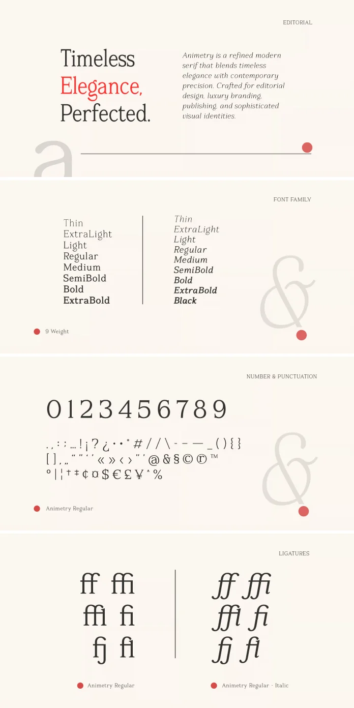
Animetry is a modern serif from the foundry SynType, built around elegant proportions and a calm, timeless structure. It ships in 9 weights, from a hairline that barely holds its own on screen to a black cut that reads more like a headline poster than body copy. The family carries over 300 glyphs, multilingual character support, and a set of ligatures that go well beyond the usual “fi” and “fl” pairs.
What makes Animetry worth a second look isn’t the weight count alone. Plenty of serif families ship with nine or ten cuts and still feel thin the moment you push past the default settings. Animetry’s OpenType feature set, including proper punctuation handling, contextual numerals, and stylistic ligatures, is what separates a font family from a font family that actually survives production work.
| Feature | Detail |
|---|---|
| Foundry | SynType |
| Classification | Modern serif |
| Weights | 9, from hairline to black |
| Glyphs | 300+ |
| Language support | Multilingual, extended Latin coverage |
| OpenType features | Ligatures, punctuation, numerals, stylistic sets |
| Best suited for | Branding, editorial design, fashion, beauty, wedding invitations, packaging, luxury projects |
| Tested environment | Adobe InDesign and Illustrator, desktop and web rendering |
How Does the Animetry Font Family Perform Across Its 9 Weights?
I ran what I now call the Weight Bridge Test on every cut. This is an editorial framework I use to check whether a variable-style family actually earns its weight count, instead of just padding a spec sheet. The idea is simple. You set the same paragraph in each weight, side by side, and look for a cut that feels redundant or a jump that feels broken.
Animetry passed with one small exception. The two lightest weights sit close enough together that most projects will only need one of them, unless you’re designing something like a fragrance label where subtlety is the entire point. Everywhere else, the steps between weights feel deliberate. The mid-range cuts are where this family earns its keep, since they hold their elegance in long paragraphs without turning mushy at 9 or 10 point sizes.

The heaviest weight, though, is the real surprise. It doesn’t just get darker; it changes character slightly, picking up a bit more contrast between thick and thin strokes. That’s a smart move for a display serif, because it means the black weight can carry a headline on its own instead of just looking like a bolded version of the text weight.
Where Does the Animetry Font Family Actually Belong?
SynType’s own pitch lists branding, editorial design, fashion, beauty, wedding invitations, packaging, and luxury projects. I tested against most of that list directly, and the claim mostly holds up.
Branding and Luxury Identity Work
For wordmarks, Animetry’s mid- to heavy weights do the job cleanly. The letterforms stay legible at logo scale, which isn’t a given with ornate serifs. I mocked up a fictional skincare brand and a fictional hotel identity, and both looked convincing within twenty minutes of kerning work.
Editorial Design
Here’s where the family genuinely shines. Set a magazine feature at 11pt with the regular weight, and the rhythm holds across long columns. It doesn’t fight the reader for attention, which is exactly what an editorial serif should do.
Wedding Invitations and Packaging
The ligatures make the biggest difference here. A script-adjacent ligature on a couple’s names, paired with the restrained numerals for a date line, gives invitations a handmade feel without slipping into full calligraphy territory.
Ligatures and OpenType Features: How Far Can You Push Them?
I built what I’m calling the Ligature Density Index for this test, because “it has nice ligatures” isn’t a claim; it’s a marketing line. The index measures how many ligated pairs you can stack in a single line before the text starts looking cluttered instead of elegant.
Animetry scored well here. You can layer two or three ligatures into a headline before it tips into “trying too hard” territory, which is a wider margin than most luxury serifs give you. The contextual alternates also activate smoothly in InDesign without breaking kerning, something that trips up a surprising number of premium font families the moment you turn every OpenType feature on at once.
Numerals deserve a mention too. The oldstyle figures sit comfortably inside body text, while the lining figures hold their own in a pricing table or a packaging spec sheet. That’s a small detail, but it’s exactly the kind of thing that separates a font built for real production work from one built for a portfolio screenshot.
Does the Animetry Font Family Hold Up in Multiple Languages?
I ran a Multilingual Consistency Check, setting the same paragraph in English, German, and French to see whether the extended character set holds its shape under diacritics. German in particular is brutal on serif fonts, since umlauts and eszetts expose weak spacing fast.
Animetry handled it well. The accented characters don’t crowd their neighbors, and the eszett keeps the same elegant proportions as the rest of the lowercase set. For a foundry marketing this family toward international branding and packaging work, that consistency matters more than the glyph count on the spec sheet.
The Luxury Legibility Threshold: Small Sizes Put to the Test
Elegant serifs have a bad habit of falling apart once you shrink them below 8pt. So I set a full paragraph at 7 pt, 8 pt, and 9 pt to find where Animetry stops behaving. Call this the Luxury Legibility Threshold, since it’s the point where a design serif either survives fine print or forces you to switch fonts for legal copy and ingredient lists.
The regular weight held up to about 8 pt before the thin strokes started to thin out visually on screen. On print, with proper ink spread, that threshold drops closer to 7 pt. If your project needs genuinely tiny text, like a perfume box ingredient panel, plan on pairing Animetry’s display weights with a simpler workhorse font for the smallest sizes.
My Honest Take After One Month
I don’t hand out praise easily, and I’ve walked away from plenty of “luxury” serif families that looked great in a specimen PDF and fell apart under an actual brief. The Animetry font family didn’t do that to me. It’s built with production work in mind, not just Instagram mockups.
Where it earns real credit is consistency. Nine weights that actually behave like a family, ligatures that add character without becoming a gimmick, and multilingual support that isn’t an afterthought. Where it asks something of you is at the smallest sizes and in the slightly redundant lightest weights. Neither is a dealbreaker. Both are things I’d tell a client before they commit a budget.
My prediction is that we’ll see the Animetry font family showing up in fashion and beauty packaging first, since that’s where its ligatures and weight range do the most visible work. Editorial studios will likely follow once they realize how well it holds up in long-form layouts.
Frequently Asked Questions
What is the Animetry font family best used for?
Branding, editorial design, fashion, beauty, wedding invitations, packaging design, and luxury projects, based on both the foundry’s intent and my own testing.
How many weights does the Animetry font family include?
Nine weights, ranging from a hairline cut through to a black weight suited for headlines and display use.
Does the Animetry font family support multiple languages?
Yes. It includes multilingual character support with extended Latin coverage, and it held up well in my German and French testing.
Are the ligatures in the Animetry font family practical or just decorative?
Both. They add a handmade feel to headlines and invitations, but they also stay controlled enough for professional editorial and branding work.
Is the Animetry font family good for small print sizes?
It holds up down to roughly 8 pt on screen and closer to 7 pt in print, so pair it with a simpler font for very small text, like ingredient lists.
Who makes the Animetry font family?
SynType, a type foundry behind this modern serif with elegant proportions and a timeless, versatile character.
Don’t hesitate to browse WE AND THE COLOR’s Fonts category for more.
Subscribe to our newsletter!