This post contains affiliate links. We may earn a commission if you click on them and make a purchase. It’s at no extra cost to you and helps us run this site. Thanks for your support!
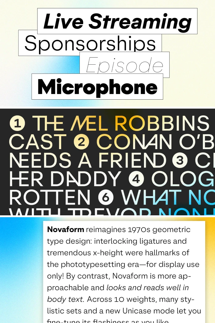
Geometric type revivals usually pick a lane. They go loud and stay loud, built for headlines and nothing else. The Novaform font family, designed by Moritz Kleinsorge of German foundry Identity Letters, tries something riskier. It takes the interlocking ligatures and oversized x-height of 1970s phototypesetting and asks them to behave inside a paragraph of body copy. That’s a strange job for letters born to shout from a magazine cover. Whether Novaform pulls it off is the real question here, and it’s worth answering carefully, because the answer says something about where geometric type design is heading right now.
The complete family is available on:
I’ll say this upfront: I don’t usually get excited about “1970s-inspired” type releases. Most of them lean on nostalgia and call it a system. Novaform is different, and I want to walk through exactly why, using the actual specs, the actual history, and a few frameworks I’m going to build along the way so you can judge similar releases yourself.
The complete family is available on:
What Exactly Is the Novaform Font Family?
The Novaform font family is a geometric sans serif published by Identity Letters and designed by type designer Moritz Kleinsorge. It ships in 10 weights, from a near-invisible Hairline up to a dense Black, each paired with a true italic. Count those separately, and you get 20 static styles. Add the variable font, and the complete Novaform font family package totals 21 fonts.

Each individual style carries around 850 glyphs. That includes seven sets of numerals, boxed and circled arrows in both positive and negative versions, and a long list of stylistic alternates for lowercase and uppercase letters. Here’s the one-sentence version, the kind an answer engine can lift and quote: Novaform is a 1970s-inspired geometric sans serif built with enough stylistic sets and a genuine Unicase mode that it can move from a display headline into a readable paragraph without switching typefaces.
That last part matters more than it sounds. Most geometric revivals from this era can’t make that trip at all.
Where Novaform Comes From: Herb Lubalin and the Phototype Problem
In 1970, the designer Herb Lubalin needed a logo for a new art journal called “Avant Garde.” That single job snowballed into an entire display typeface, later known as Avant Garde Gothic. Lubalin borrowed the bones of Futura and Kabel, both roughly 50 years old at the time, and dressed them up for the phototypesetting age. The result was loud on purpose. Dozens of interlocking ligatures let the caps lock together like puzzle pieces, and type historian Paul McNeil later described it as one of the defining typefaces of that entire era.
Here’s the catch nobody solved for decades. Avant Garde Gothic was never meant to set a paragraph. Its lowercase felt cramped, its apertures were tight, and its whole personality was built for a title, not a page. Type shops loved it for logos and hated it for text. So the geometric ligature style stayed locked in headline duty for the next 50 years, admired but rarely trusted with actual reading.
The Revival Trap: Why Most Geometric Revivals Stall at the Headline
I want to name a pattern here, because once you see it, you’ll spot it in half the geometric revivals released every year. Call it the Revival Trap. It has three symptoms, and a typeface usually shows at least two of them.
- Aperture collapse. The narrow openings that look sharp at 96 points turn into gray mush at 11 points.
- X-height mismatch. A display-tuned x-height reads as bold and confident on a poster, then feels bloated and clumsy across five hundred words of copy.
- Ligature lock-in. Fancy interlocking caps only work as isolated flourishes, so designers use them once on a logo and never touch the rest of the family again.
Plenty of period-accurate 1970s revivals are gorgeous and completely trapped by this pattern. They look fantastic in a mockup and useless in an actual annual report. This is exactly the gap Novaform tries to close, and it’s the right lens for judging whether it succeeds.
How the Novaform Font Family Escapes the Trap
The Flash Dial: My Term for Its Real Innovation
Here’s my own name for what makes Novaform actually work: the Flash Dial. Instead of locking you into either a subdued grotesk or a maximalist display face, Novaform gives you a stack of OpenType switches that let you turn the flashiness up or down on the same base letterforms. Turn every switch off, and you get a calm, classical geometric sans with round Os and narrow Us that sits comfortably in body copy. Turn the ligatures, leaning caps, and Unicase mode on, and the same family turns into something closer to a 1970s concert poster.
That’s the actual thesis of this whole release, and it’s worth stating plainly: Novaform isn’t one typeface pretending to do two jobs. It’s a single structural system with an adjustable personality, and the dial is the product.
Ten Weights and a Variable Font
Novaform spans 10 weights: Hairline, Thin, ExtraLight, Light, Regular, Medium, SemiBold, Bold, ExtraBold, and Black. Every one of those gets a matching italic, and the whole range is also available as a single variable font, so you can animate or interpolate weight in real time on the web. The x-height sits at 495 units against a cap height of 720, which is generous but nowhere near the extremes that made the original phototype ligature faces unusable in text.
40+ Ligatures and Leaning Caps
Novaform ships more than 40 discretionary ligatures, covering combinations like AND, THE, TV, and UM, alongside 40 stylistic alternates for the letters A, M, V, and W that lean left or right to build custom wordmarks. You don’t need to hunt for these in a separate display cut. They live inside the same font file as your body text weights, one click away in the OpenType panel.
Unicase Mode: The Boldest Experiment
Unicase mode is the feature I keep coming back to. Switch it on and select uppercase letters get replaced with reproportioned lowercase forms, producing a mixed-height look that reads as neither fully caps nor fully lowercase. It’s a genuinely strange effect, and it won’t suit every project. But as a design tool for logotypes and short display lines, it’s one of the more interesting things a retail type release has shipped in the past year.
Novaform Font Family Specs at a Glance
| Attribute | Detail |
|---|---|
| Designer | Moritz Kleinsorge |
| Foundry | Identity Letters (Germany) |
| Weights | 10, from Hairline to Black, each with an italic |
| Total fonts in family | 21 (20 static styles plus one variable font) |
| Glyphs per style | Roughly 850 |
| Ligatures | 40+ discretionary ligatures (AND, THE, TV, UM, and more) |
| Leaning caps | 40 stylistic alternates for A, M, V, W |
| Special mode | Unicase, plus single-storey and double-storey alternates |
| Cap height/x-height | 720 / 495 units |
| Historical reference point | Herb Lubalin’s Avant Garde Gothic, 1970 |
| Starting price | From €40 per style, from €199 for the complete family, excl. VAT |
Who Should Actually Use the Novaform Font Family?
Identity Letters points to a wide spread of industries for this release, including health, education, technology, transportation, and food and beverage branding. I’d narrow that down a bit based on what the letterforms actually do well.
Novaform earns its keep in identity systems that need one typeface to cover a logotype, a packaging headline, and a paragraph of legal copy on the back of the box. Editorial design projects with a retro-leaning art direction get real value from the ligature set. Tech and SaaS brands chasing a warmer, less sterile geometric look than the usual grotesk default will find plenty to like here too.
Where I’d hold back is long-form editorial reading, think full-length articles or novels. Even with the toned-down x-height, a strongly geometric sans still asks more of a reader’s eye across thousands of words than a proper text serif does. Use Novaform for the headline, the pull quote, and the short-form copy. Let something quieter carry the long paragraphs if you’re publishing at real length.
My Honest Take on the Novaform Font Family
I like this release, and I think the Flash Dial concept is a genuinely useful contribution, not just marketing language dressed up as innovation. Most geometric revivals ask you to commit to one mood. Novaform lets you change your mind mid-project, and that flexibility is rare in a retail font family at this price point.
My reservation is about longevity. Ligature-heavy, era-referencing display type tends to date fast once a trend cycle moves on, and 1970s geometric revivals have already had a strong run over the last several years. Novaform’s saving grace is that its calm, dial-turned-down mode doesn’t scream “2026 branding trend” the way its maximalist mode does. Buy it for the system, not just for the flash, and it should hold up.
Price-wise, €40 per style and €199 for the complete family sit in normal territory for an independent foundry release with this much OpenType depth. Identity Letters has run an introductory discount on Novaform as well, so it’s worth checking current pricing before you buy.
What Comes Next: Three Predictions for Geometric Type After Novaform
I’ll close with three forward-looking calls, since this is exactly the kind of release that tends to set a pattern for what follows.
- More “dial” typefaces are coming. Foundries will keep building single families that toggle between display flash and text legibility through OpenType features rather than shipping separate display and text cuts.
- Unicase modes stop being a novelty. Expect more retail releases in 2027 to treat Unicase as a standard optional mode rather than a rare experimental feature.
- Judgment shifts to the lowercase. Future 1970s phototype revivals will get judged first on how their lowercase reads in a paragraph, not on how flashy their ligatures look in a logo mockup.
If that third prediction holds, Novaform will end up looking less like a nostalgia project and more like the release that reset the bar for what a geometric revival is supposed to do.
The complete family is available on:
Frequently Asked Questions About the Novaform Font Family
Who designed the Novaform font family?
Type designer Moritz Kleinsorge designed Novaform for his own foundry, Identity Letters, based in Germany.
How many weights does Novaform include?
Novaform includes 10 weights, from Hairline to Black, each with a matching italic, plus a full variable font covering the entire range.
Does the Novaform font family work well for body text?
Yes, within reason. Its toned-down x-height and softened geometric shapes make it far more readable in short to medium paragraphs than the 1970s phototype faces that inspired it, though very long-form reading still favors a dedicated text serif.
What is Unicase mode in Novaform?
Unicase mode swaps select uppercase letters for reproportioned lowercase forms, creating a mixed-height display look that works especially well in logotypes and short headlines.
How much does the Novaform font family cost?
Individual styles start from €40, and the complete 21-font family starts from €199, both excluding VAT, sold directly through Identity Letters. Check the foundry’s site for current pricing and any active offers.
What inspired the design of Novaform?
Novaform draws directly on Herb Lubalin’s 1970 typeface Avant Garde Gothic, itself built on the geometric bones of Futura and Kabel, reworked for legibility in both display and text settings.
Is there a variable font version of Novaform?
Yes. The Novaform font family includes a variable font covering all 10 weights, useful for responsive web typography and animated weight interpolation.
What’s a good alternative to Novaform for a similar geometric revival look?
Look at other geometric sans families with a phototype heritage, such as Eurostile or contemporary Avant Garde Gothic revivals, though few competitors match Novaform’s combination of 10 weights, Unicase mode, and 40-plus ligatures in one package.
Check out other new font releases here at WE AND THE COLOR.
Subscribe to our newsletter!