Back in 2012, WE AND THE COLOR ran a feature on a small gingerbread company’s holiday tins. The illustrations were bright, the folk-art patterns felt handmade, and the story behind them was simple: a husband-and-wife illustration studio had been asked to give a Lebkuchen brand a packaging identity worth keeping. Nobody involved could have known that fifteen years later, the same two illustrators would still be drawing the same brand’s tins, one Christmas at a time.
This December, that partnership between Leckerlee Lebkuchen and Strohl, Inc. hits its 15th year. It also marks the 46th distinct tin design the studio has produced for the brand, plus a dedicated 15th Anniversary tin. Forty-six tins is not a number you stumble into. It’s the kind of number that tells you something about how packaging design actually works when nobody’s rushing to reinvent the wheel every quarter.
What Does It Actually Take to Keep One Leckerlee Tin Packaging Design Story Going for 15 Years?
Most seasonal packaging gets redesigned because a marketing calendar demands freshness. Leckerlee’s tins didn’t follow that logic. Eric and Christine Strohl, the illustrators behind every single tin since 2011, built something closer to a visual archive than a campaign. Each year adds a chapter. None of the older chapters get erased.
That’s rare. Ask any packaging designer how long a client relationship usually lasts, and you’ll hear numbers like two years, maybe three, before a rebrand or a new agency takes over. Leckerlee and Strohl have been at this since Barack Obama’s first term. The tins from that era still sit on collectors’ shelves next to the ones released last winter, and they still look like they belong to the same family.
I’d call this pattern design lineage, as opposed to design rotation. A design lineage keeps a recognizable through-line (color logic, typography, the brand mark) while letting the illustrated content shift freely underneath it. Design rotation, which is what most seasonal packaging does, swaps out the whole visual system every cycle and hopes shoppers notice the refresh. Leckerlee never rotated. It grew a lineage instead.
The Original 2012 Feature, and Why It Mattered
WE AND THE COLOR’s original piece covered Leckerlee’s tin as a standout example of illustrated packaging in a category usually dominated by photography or plain foil. Christmas tins, historically, lean on Santa clip art or generic snowflakes. Strohl’s early work for Leckerlee did neither.

The first tins leaned into German folk-art motifs, since Lebkuchen itself traces back to Nuremberg’s centuries-old spiced-cookie tradition. That decision set the tone for everything that followed. It gave the Strohls a visual vocabulary rooted in something real, not invented for a campaign brief.
Who Strohl, Inc. Actually Is
Eric and Christine Strohl run their studio as a two-person operation, and that detail matters more than it sounds like it should. A single illustration duo drawing every tin for 15 straight years means the brand’s visual voice never got handed off to a new creative director with different opinions. Consistency, in this case, came from continuity of authorship, not from a style guide sitting in a shared drive.
Forty-Six Tins, Five Visual Dialects
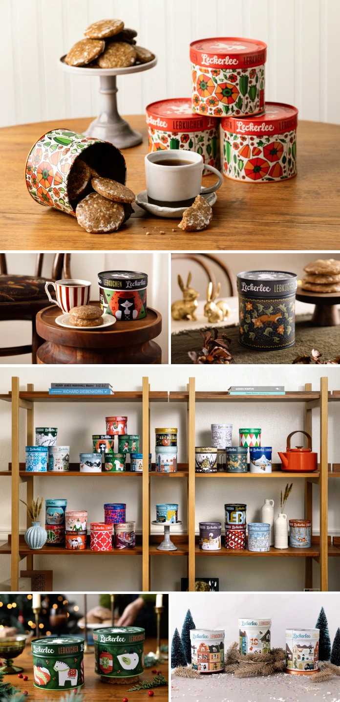
Here’s where the project gets genuinely interesting for anyone who studies packaging design as a discipline. Over 15 years, the Strohls didn’t repeat themselves. They moved through what I’ll call five visual dialects, each one a distinct stylistic language built on the same brand skeleton.
- Folk-art dialect: the earliest tins, drawing on German craft traditions, bold flat color, and pattern-based borders.
- Nutcracker and Alpine dialect: tin soldiers, mountain villages, and winter-market imagery, closer to storybook illustration.
- Botanical dialect: foxes, hares, and floral vines rendered in a William Morris-adjacent print style, with dark backgrounds and jewel-toned detail.
- Mid-century dialect: geometric nutcrackers, flat shapes, and a palette that owes more to 1960s advertising art than to Christmas cards.
- Modern dialect: minimal color-block scenes, sometimes typographic, aimed at a shopper who wants something that looks at home on a design-forward shelf.
No brand needs five dialects to succeed. Most brands would kill this idea in year two, worried it dilutes recognition. Leckerlee bet the opposite way, and the collector shelves in the photos prove the bet paid off. When you line up tins from every dialect side by side, they don’t clash. They read like siblings, not strangers.
Why Packaging Continuity Beats Constant Reinvention
I’ve looked at a lot of seasonal packaging over the years, and I’ll say this plainly: most of it is disposable by design. Brands treat the tin, the box, and the bag as a one-season vehicle, then start from zero again next year. That approach burns budget, and, more importantly, it burns memory. Shoppers don’t build an emotional relationship with packaging that keeps disappearing. Leckerlee’s tins do the opposite. Someone who bought a tin in 2015 can walk into a store in 2026 and recognize the DNA immediately, even if the illustration on the front has nothing in common with what they remember. That recognition is worth more than most rebrands ever deliver, and it costs less, since nobody’s paying an agency to start over.
There’s a business case buried in here too. Collectible packaging drives repeat purchases in a way a static design never will. Once shoppers realize a tin will look different (and equally good) next year, buying “just one more” stops feeling wasteful and starts feeling like completing a set. Leckerlee’s tin shelf, stacked forty-six designs deep, is basically a loyalty program disguised as cookware storage.
The 15th Anniversary Tin
This year’s anniversary tin breaks from the five dialects on purpose. It folds a small Leckerlee village scene into the design, complete with a “Jubiläum” banner and confetti-strewn ground, a visual nod back to the brand’s storefront rather than a purely seasonal scene. It’s less “Christmas tin” and more “here’s fifteen years, condensed into one object.” That’s a smart move. Anniversary editions that just repeat the brand’s greatest hits tend to feel like nostalgia marketing. This one tells its own small story instead.
What This Means for Brands Considering a Packaging Redesign
If you’re a founder or a creative director weighing whether to overhaul your packaging every season, Leckerlee’s 15-year run is worth studying closely. The lesson isn’t “never change your design.” It’s “change the content, protect the continuity.” Keep the brand mark stable. Keep the color logic legible from ten feet away. Let the illustration underneath do the wandering. My prediction: as more direct-to-consumer food brands compete for shelf space and social attention, this design-lineage approach will spread beyond gingerbread tins into coffee bags, tea canisters, and limited-run spirits packaging. Novelty sells once. A recognizable, evolving story sells every year after that.
Leckerlee x Strohl, Inc.: The Numbers at a Glance
| Detail | Fact |
|---|---|
| Partnership start | 2011 |
| Anniversary this December | 15 years |
| Distinct tin designs produced | 46, including the 15th Anniversary tin |
| Illustrators | Eric and Christine Strohl, Strohl, Inc. |
| Style dialects identified | Folk art, Nutcracker and Alpine, botanical, mid-century, modern |
| First feature on WE AND THE COLOR | 2012 |
| Product category | German Lebkuchen (spiced gingerbread) tins |
Frequently Asked Questions About the Leckerlee Tin Packaging Design
Who designs the Leckerlee Lebkuchen tins?
Eric and Christine Strohl of Strohl, Inc. have illustrated every Leckerlee tin since the partnership began in 2011, including the newest 15th Anniversary edition.
How many different Leckerlee tin designs exist?
As of this December, there are 46 distinct tin designs, spanning folk-art, Nutcracker and Alpine, botanical, mid-century, and modern styles.
Why did We And The Color originally cover this packaging design?
The 2012 feature highlighted Leckerlee’s tin as an example of illustrated food packaging that leaned on folk-art pattern work instead of generic holiday clip art, which stood out in a category dominated by photography and foil.
What makes this packaging partnership unusual in the design industry?
Most brand and illustrator relationships last two or three years before a rebrand. Leckerlee and Strohl, Inc. have worked together for 15 consecutive years without losing visual continuity, which is uncommon at any scale.
Is the 15th Anniversary tin part of the regular seasonal lineup?
No. It’s a special edition that references the brand’s own history and storefront, separate from the five recurring style dialects used in past seasonal releases.
All images © Strohl, Inc. Don’t hesitate to find other beautiful projects in WE AND THE COLOR’s Graphic Design, Branding, and Packaging Design categories.
Subscribe to our newsletter!