This post contains affiliate links. We may earn a commission if you click on them and make a purchase. It’s at no extra cost to you and helps us run this site. Thanks for your support!
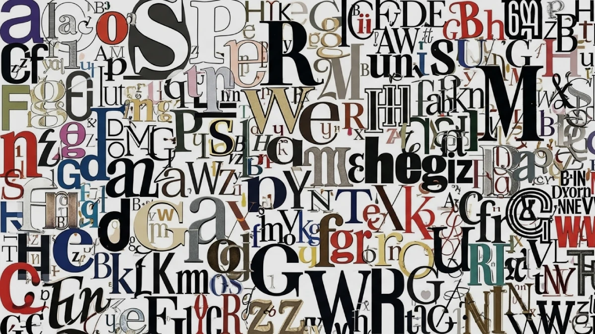
We are surrounded by text. Consequently, the letters shaping our favorite novels, guiding us on street signs, and defining the brands we love are meticulously designed. This brings us to a foundational question in the world of graphic design: Are you looking at a font or a typeface? While many use these terms interchangeably, understanding the distinction is more than mere semantics. In fact, it sharpens a designer’s eye and elevates the quality of visual communication. This article will clarify the “font or typeface” debate, explore its origins, and explain why this classic distinction remains crucial in the digital age.
The Core Distinction: Unpacking Font or Typeface
At its heart, the difference between a font and a typeface is about the relationship between the whole and its parts. A typeface is the complete design of a set of characters, while a font is a specific variation of that design. Think of it this way: Helvetica is a typeface, a distinct visual system. However, Helvetica Bold at 12-point size is a font.

What is a Typeface? The Design Itself
A typeface, which can also be called a font family, is the artistic creation—the unified design of letters, numbers, and symbols. It is the visual identity that dictates the look and feel of the text. For instance, when we talk about Garamond or Times New Roman, we are referring to typefaces. These names represent the entire family of related styles that share a common aesthetic. The typeface is the design concept, the big idea behind how the letters are formed and relate to one another.
What is a Font? The Specific Instance
A font is a specific iteration within a typeface, defined by its weight, style, and size. To illustrate, “Arial Bold 12pt” is a font. “Arial” is the typeface. Fonts can vary in attributes like bold, italic, regular, condensed, and more. In the digital world, a font is the actual file—such as a .ttf or .otf file—that you install on your computer to use a typeface. Therefore, a single typeface family can contain dozens of individual fonts.
A Journey Back in Time: The Origins of the Terms
The distinction between font and typeface has its roots in the history of printing. The word “font” comes from the Middle French word “fonte,” which means “to cast in metal.” In the era of the printing press, each font was a physical set of metal blocks for every letter, number, and symbol in a specific size and weight. A printer would have a case for 10-point Garamond Italic and a separate case for 12-point Garamond Bold. Each of these was a distinct font. The “typeface” referred to the shared design across all those cases. With the advent of digital typography, these physical limitations disappeared, and consequently, the lines between the terms began to blur for the general public.
Does the Font or Typeface Distinction Really Matter Today?
In casual conversation, using “font” when you mean “typeface” is widely accepted. However, for professionals in graphic design, web development, and branding, the distinction is significant. Precision in language demonstrates a deeper understanding of typography’s craft. Furthermore, it allows for clearer communication between designers and developers. Knowing the difference helps articulate design choices with greater accuracy. A designer doesn’t just choose a “font” for a brand; they select a versatile typeface that includes a family of fonts suitable for various applications, from headlines to body text. This thoughtful approach is a hallmark of professional design.
Choosing the Right Typeface for Your Project
Selecting a typeface is a critical decision that influences how a message is perceived. The right choice enhances readability and evokes the desired emotional response. Answering a few key questions can guide this process: What is the brand’s personality? Who is the target audience? How will the text be displayed?
Understanding Typeface Classifications
A fundamental starting point is understanding the primary classifications of typefaces. This knowledge helps narrow down the options and align the visual style with the project’s goals.
- Serif: These typefaces have small decorative strokes, or “feet,” at the ends of the main strokes of letters. Well-known examples include Times New Roman and Georgia. Serifs often convey a sense of tradition, authority, and elegance. Consequently, they are frequently used in books, newspapers, and for brands that want to appear established and reliable.
- Sans-serif: The term “sans-serif” literally means “without serifs.” These typefaces lack the small decorative strokes, resulting in a clean, modern, and minimalist appearance. Arial and Helvetica are two of the most popular sans-serif typefaces. They are praised for their high legibility on digital screens, making them a popular choice for websites and mobile apps.
How to Choose a Typeface for Branding
When it comes to branding, a typeface becomes a core component of the visual identity. The chosen typeface should align with the brand’s values and personality. For example, a luxury brand might opt for a high-contrast serif to convey elegance, while a tech startup would likely choose a clean sans-serif to appear modern and approachable. It’s also common for brands to use a combination of typefaces—one for headlines and another for body text—to create a clear visual hierarchy.
The Broader World of Typography
Understanding the difference between a font and a typeface is a gateway to the larger and fascinating world of typography. Typography is the art and technique of arranging type to make written language legible, readable, and appealing when displayed. It encompasses everything from the choice of typeface to the layout of text on a page. Mastering this discipline is essential for effective graphic design, as it plays a crucial role in conveying information and creating a cohesive visual experience.
Ultimately, while the public may continue to use “font” and “typeface” interchangeably, the distinction remains a cornerstone of typographic knowledge. Recognizing the typeface as the design family and the font as the specific member allows for a more intentional and professional approach to design. This understanding is not just about being technically correct; it is about appreciating the artistry and precision that go into crafting the letters that shape our world.
Check out WE AND THE COLOR’s Fonts category to find both timeless and trending typefaces. In addition, feel free to browse our handpicked selection of the 100 coolest typefaces for designers in 2026.
Subscribe to our newsletter!

