This post contains affiliate links. We may earn a commission if you click on them and make a purchase. It’s at no extra cost to you and helps us run this site. Thanks for your support!
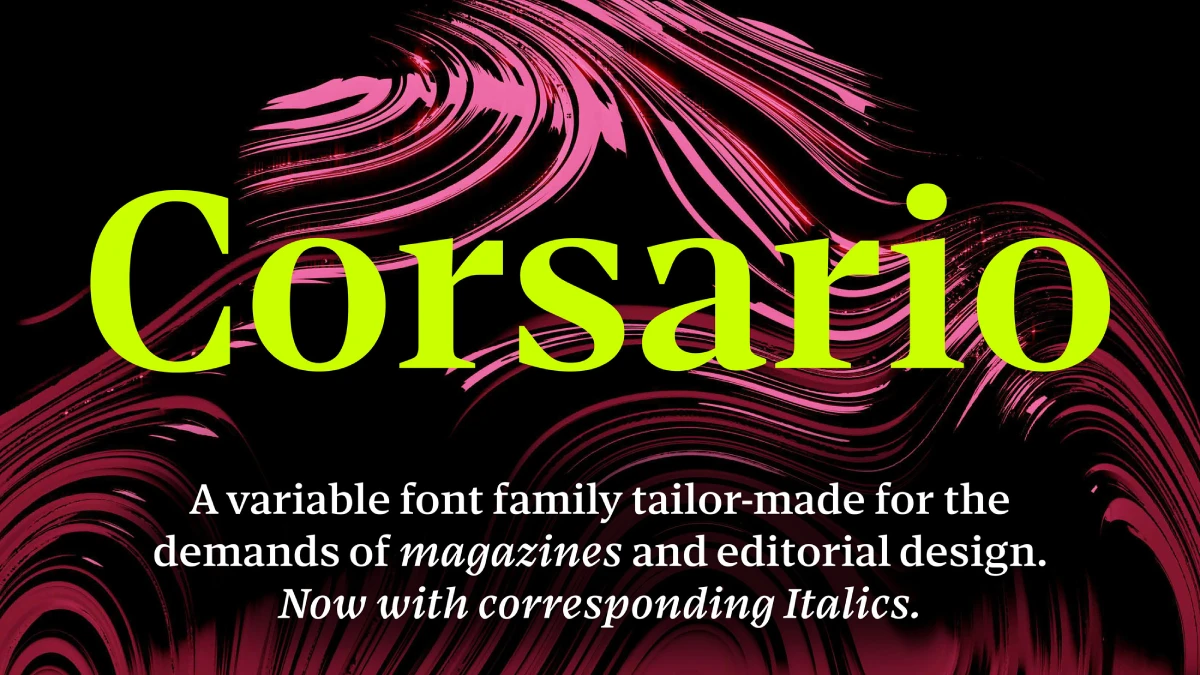
Felix Braden just released a typeface that does something many fonts refuse to attempt. Corsario handles a full magazine spread, headline to footnote, without swapping a single font file. That’s not a small claim. Most type families split display and text duties across separate products, and editors end up juggling three or four files just to get one story looking right. Corsario collapses all of that into one variable font, built around a weight axis and an optical size axis working together.
The typeface is available from:
Braden designed it over the course of 5 years through his own foundry, Floodfonts, and it launched on September 14, 2026, with 54 total styles split across upright and italic. Scroll down further to find out why that matters, who should actually care, and whether the price tag holds up.
The typeface is available from:
What Exactly Makes Corsario Different From Other Variable Fonts?
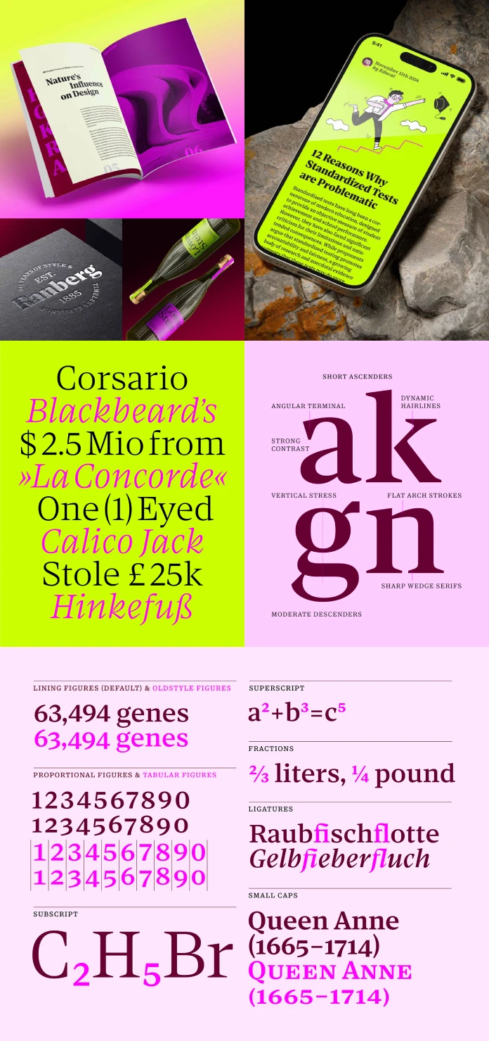
Most variable fonts only vary weight. You slide from light to black and call it a day. Corsario adds a second axis, optical size, so designers can dial in the exact proportions a specific reading context demands. Set it to a small caption size, and Corsario thickens its hairlines and simplifies its details automatically. Push it toward display sizes, and the letterforms open back up, showing off finer contrast and sharper serifs. One file. Two axes. Every size in between gets generated on the fly, rather than faked by scaling a single master up or down like most fonts still do.

Why That Matters for Magazine and Editorial Work
Editorial design is unforgiving. A typeface has to work as a 96-point headline, a 9-point caption, and everything in between, and it has to look like the same family the whole way through. Corsario was built for exactly that brief. Because the optical size axis adjusts proportions instead of just stretching a shape, small text stays sturdy and legible while big text gets to stay elegant. Editors get one file to manage instead of a folder full of near-matches.
The Typographic History Corsario Pulls From
Corsario isn’t chasing a trend. It’s rooted in nineteenth-century British type design, and it borrows selectively from three specific traditions: Transitional, Scotch, and Fatface. Braden didn’t just copy old letterforms and call it a revival. He took the structural bones of those styles and rebuilt them with contemporary proportions and cleaner geometric details.
Transitional, Scotch, and Fatface, Quickly Explained
Transitional serifs sit between old-style humanist letterforms and the sharper, more mechanical modern serifs that came later, think Baskerville-era balance. Scotch romans, a Scottish printing tradition from the same century, sharpened that contrast and added crisper serifs suited to newspaper and book printing. Fatface styles pushed the contrast even further, turning thin strokes into hairlines and thick strokes into bold, poster-ready slabs. Corsario borrows structure from all three without becoming a pastiche of any single one.
Gerard Unger’s Legibility Theory, Put Into Practice
The clearest influence on Corsario isn’t a historical typeface. It’s a person: Dutch type designer Gerard Unger, whose research on legibility shaped decades of text-focused type design. Unger favored relatively flat, horizontal shoulders on letters, which opens up counters (the enclosed or partially enclosed space inside a letter) and creates a lighter overall texture on the page. Corsario applies that same logic, especially through flattened arches on letters like n, h, and m, which emphasize horizontal movement and smooth out the reading flow.
That approach shows up most clearly in Corsario’s Caption version. At small sizes, on a low-resolution screen or in dense newspaper columns, that horizontal emphasis holds the texture together. Text stays readable even when the conditions around it are working against it.
Hairlines That Know Their Job
Corsario’s hairlines aren’t uniform across the family, and that’s deliberate. In display sizes, they thicken gradually as they approach the serifs, drawing attention to the parts of a letter that help readers recognize it fastest. In text and caption sizes, those same hairlines get consistently reinforced across the board, because at small sizes, subtlety is the enemy of legibility.
Why Optical Sizes Disappeared, and Why They’re Coming Back
Here’s a bit of type history that explains why Corsario feels almost overdue. During the lead type era, punchcutters drew each point size by hand. Smaller sizes got sturdier proportions and simpler details. Larger sizes could afford finer contrast and delicate flourishes, because at that scale, delicacy still reads clearly.
Phototypesetting killed that practice in the mid-twentieth century. Cutting individual masters for every size stopped making economic sense once a single design could just be scaled up or down mechanically. Desktop publishing inherited that compromise and never really questioned it. Most fonts you’ve used your whole career are, technically, just one size stretched to fit every context.
Variable font technology changes the math. A single file can now hold multiple optical sizes and interpolate smoothly between them, no separate masters required. Corsario uses that capability to bring the old lead-type logic back, letting expressive display styles and highly legible text sizes live inside one consistent family again.
Corsario by the Numbers
| Detail | Information |
|---|---|
| Foundry | Floodfonts |
| Designer | Felix Braden |
| Release date | September 14, 2026 |
| Format | Variable font (OpenType) |
| Axes | Weight and optical size |
| Styles included | 2 variable fonts (upright and italic), 54 styles total |
| Price | $792 for the full family |
| Adobe Creative Cloud | Free for Creative Cloud subscribers |
| Microsite | floodfonts.com/corsario |
Who Should Actually Buy Corsario?
Not every project needs a typeface this specialized. But a specific set of designers will get real, immediate use out of it.
- Magazine and editorial designers who currently manage separate display, text, and caption fonts for a single publication
- Branding studios building identity systems that need one typeface to flex across a website, a business card, and a billboard
- Self-publishers and independent magazine makers who want an editorial-grade serif without licensing five separate weights
- Newspaper and print teams working with tight column widths and low-resolution reproduction, where Corsario’s Caption cut earns its keep
- Adobe Creative Cloud subscribers who already have access and just haven’t noticed yet
My Take: This Is What Variable Fonts Were Supposed to Be
Variable fonts launched in 2016 with a lot of promise and, honestly, a lot of underuse. Most foundries treated the technology as a fancy weight slider and stopped there. Corsario is one of the first typefaces I’ve covered that treats the optical size axis as the actual point, not a bonus feature buried in the settings panel.
That’s a bet worth watching. Editorial teams have spent years compensating for flat, one-size-fits-all fonts by manually adjusting tracking and stroke weight at different sizes, which is a workaround, not a solution. Corsario removes the workaround. My prediction: within the next two or three years, optical size axes stop being a niche feature and start being an expectation for any serif marketed at editorial or publishing work. Braden and Floodfonts just gave other foundries a clear target to catch up to.
The typeface is available from:
Frequently Asked Questions About Corsario
What is Corsario?
Corsario is a variable serif typeface designed by Felix Braden and released through his foundry, Floodfonts, on September 14, 2026. It combines a weight axis with an optical size axis in a single font file.
Who designed Corsario?
Felix Braden designed Corsario. He released it through Floodfonts, the type foundry he runs himself.
Is Corsario free with Adobe Creative Cloud?
Yes. Corsario is free for anyone with an active Adobe Creative Cloud subscription. Outside of that, the full family costs $792.
How many styles does Corsario include?
Corsario ships as 2 variable fonts, one upright and one italic, which together generate 54 total styles across the weight and optical size axes.
What makes Corsario different from other editorial serif fonts?
Its optical size axis is the main differentiator. Instead of scaling one design across every size, Corsario adjusts proportions and hairline weight automatically, so caption text stays legible, and display text stays expressive within the same file.
Where can I buy Corsario?
Corsario is available through its official microsite at Floodfonts as well as MyFonts and Adobe Fonts.
Check out WE AND THE COLOR’s Fonts category for more.
Subscribe to our newsletter!