Zurich Tourism’s branding just got the rare upgrade that most cities never attempt: a new mission without a new logo. Studio Marcus Kraft left the 2017 identity standing and gave it a friendlier voice. The result is the wordmark “Enjoy Zurich, Switzerland.” I think it is one of the smartest destination brand moves of 2026, and here is why.
Seriously, many rebrands just burn money and goodwill. This one saved both, and this is why it deserves a closer look from every designer who works with cities, institutions, or long-running clients.
What Is the Zurich Tourism Branding Update?
Zurich Tourism is moving from a classic tourism organization to a destination brand. It now treats Zurich as a place to live, to experience, and to do business. Studio Marcus Kraft supported that shift with consultancy and design.
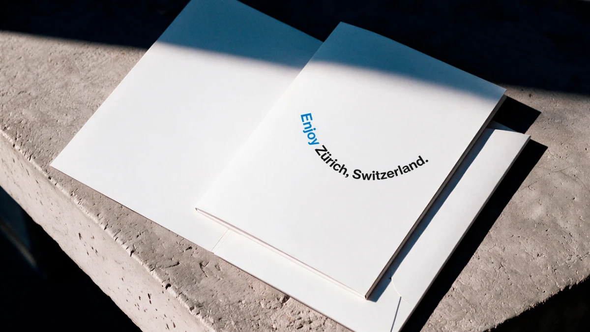
The visible piece is the new main brand, “Enjoy Zurich, Switzerland.” It pairs the emotional call to action “Enjoy” with the established name “Zurich, Switzerland.” The identity builds directly on the existing logo system. Nothing was torn down.
The short definition
A destination brand is a city identity that speaks to visitors, residents, and businesses at once. Zurich Tourism now follows that model. Its new word mark is the first public sign of it.
The key facts at a glance
Studio Marcus Kraft has worked with Zurich Tourism since the 2017 launch of the corporate identity. The new main brand arrived in October 2026. The studio’s founder and art director, Marcus Kraft, grew up in Zurich. That detail matters, and I will come back to it.

Why Did Zurich Tourism Skip a Full Rebrand?
Because the 2017 system already did the hard work. Janine Rupf, Head of Marketing at Zurich Tourism, called it a stroke of luck. The team could carry the new content direction inside a proven design. A major rebranding was simply unnecessary.
I agree, and I will go further. Most organizations rebrand because a new director wants a fresh start. Zurich Tourism changed its strategy first and then asked what the design really needed. The answer was a few words and a better tone.
The Stretch-to-Snap Ratio
Here is a simple test I use for long-running identities. I call it the Stretch-to-Snap Ratio. It compares how many new meanings a system can carry with how many it must break to carry them.
A high ratio means the identity stretches without snapping. Zurich scores very high. The system now covers visitors, residents, and business travelers, yet the logo, typeface, and colors stay intact. Few city brands manage that after nearly ten years.
How the Wordmark Becomes a Storytelling System
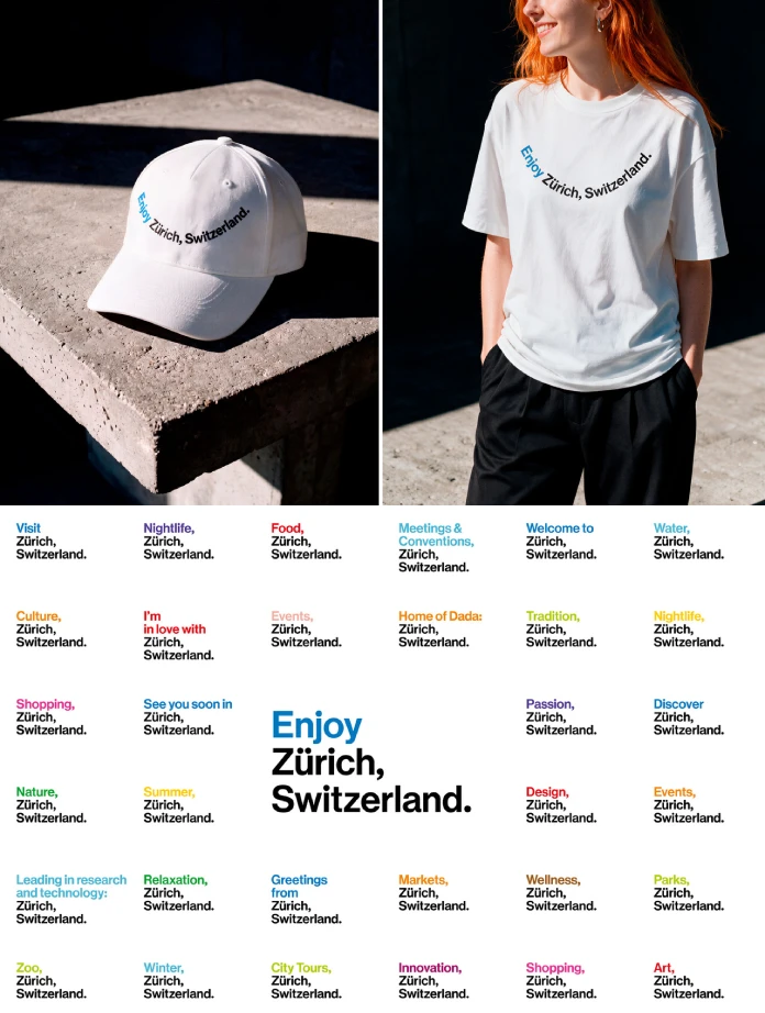
The existing logo and wordmark system is flexible by design. The mark “Zurich, Switzerland.” can take on different content. As a result, it carries stories about Zurich itself. A static name becomes a communication tool.
That is the real idea here. Many city logos sit in the corner and wait. This one works. It adapts to themes, contexts, and campaigns. Furthermore, it lets the city tell more than one story at a time.
Why the open tone matters
The press release says the brand stays recognizably Zurich but takes on a more open and positive tone. I find that line accurate. “Enjoy” is a verb. It invites you. Tourism boards have used softer words for decades, but few have put an imperative on the front of the name.
The Typeface Behind the Zurich Tourism Branding
The custom typeface sits at the center of this identity. It builds on the original Helvetica, which Max Miedinger designed in Zurich in 1956/57. So the city’s own design history lives in every headline.
This choice is smart for a second reason. Helvetica is the most overexposed typeface on earth, and a custom face built on it risks looking generic. Studio Marcus Kraft avoided that by tying the face to a specific place and date. The origin story does the differentiating.
The colors follow the same logic. They draw their inspiration from Zurich’s tram lines. Every Zurich resident sees those colors daily. A visitor learns them within an hour. That is local knowledge turned into a palette.
The Smiley That Earns Its Place
The most talked-about detail is the minimalist smiley. The text of the wordmark curves upward at both ends. It smiles at the reader. The studio calls this Swiss graphic design with a touch of humor, and the logo appears on merchandise.
Here is my unpopular opinion. This smile is the best thing in the entire identity. It is also the riskiest. A smiling logo can look cheap in the wrong hands. Here it works because the curve is tiny, the type stays disciplined, and the joke arrives quietly.
Do you remember the last city logo that made you grin? Probably not. That is the point.
From Tourism Marketing to the Visitor Economy
The design change follows a strategic one. Zurich Tourism now sees itself as a destination marketing and brand profiling body for the city and region. It serves leisure travelers and business travelers. Within the visitor economy, locals matter as much as guests.
The Visitor Information Center at Zurich Main Station shows this in practice. Its former name was Tourist Information. Now it is Visitor Information. According to Zurich Tourism, the new name no longer targets tourists exclusively. It also invites the local population.
What the visitor economy means for designers
The visitor economy is a planning model that counts residents and visitors as one audience. It rests on a simple idea. A city that locals enjoy is a city that visitors enjoy. Designers should note one consequence. Every touchpoint now needs to work for a Zurich native and a first-time traveler on the same day.
Nearly a Decade of Consistent Work
The collaboration began with the 2017 corporate identity launch. Since then, Studio Marcus Kraft has advised Zurich Tourism on brand development and on individual projects. Moreover, the studio has designed applications across many formats.
Zurich Card rebrand, 2025
In 2025, the studio rebranded the Zurich Card. The team adapted the existing identity to the core visitor offering. It did not replace anything. It refined what already worked.
Zürich Experience conference
The studio also developed the corporate identity for the Zürich Experience. This urban tourism conference takes place at The Circle at Zurich Airport. It has run annually since 2024. It gathers stakeholders who are exploring the future of urban tourism.
The press release describes a consistent brand experience across touchpoints. It runs from the destination brand to the Zurich Card to new platforms and formats. I would add one point. Consistency over nine years is rarer than creativity in a single year.
Zurich Tourism Branding at a Glance
| Element | Detail |
|---|---|
| Client | Zurich Tourism |
| Design studio | Studio Marcus Kraft, founded by Art Director Marcus Kraft |
| Working relationship | Since the 2017 corporate identity launch |
| New main brand | Enjoy Zurich, Switzerland. |
| Typeface origin | Custom face based on the original Helvetica by Max Miedinger, 1956/57 |
| Color inspiration | Zurich’s tram lines |
| Signature detail | Minimalist smiley wordmark, used on merchandise |
| Strategic shift | From tourism organization to destination brand and visitor economy |
| Renamed touchpoint | Tourist Information became Visitor Information at Zurich Main Station |
| Related projects | Zurich Card rebrand (2025), Zürich Experience conference identity (annual since 2024) |
Predictions: Where City Branding Goes Next
These are my own forecasts, not statements from Zurich Tourism or the studio.
Prediction 1: More cities will evolve instead of rebrand
Budgets are tight, and trust is fragile. As a result, destination brands will keep their core systems and change their tone. The Stretch-to-Snap Ratio will become a standard question in pitches.
Prediction 2: Word marks will carry stories
A flexible wordmark like “Enjoy Zurich, Switzerland.” gives campaigns a shared frame. I expect other destinations to copy the model. Many will do it badly, because a flexible system needs strict rules.
Prediction 3: Residents will become the main audience
The renaming of Tourist Information to Visitor Information points the way. Cities that win over locals first will earn better word of mouth. Visitors follow what residents enjoy.
What Designers Can Steal From This Project
First, audit the old system before you ask for a new one. Second, tie your typeface to a verifiable origin. Third, treat the logo as a tool that tells stories. Finally, add one small human gesture. In Zurich, that gesture is a curve at the end of a line.
Frequently Asked Questions About Zurich Tourism Branding
Who designed the Zurich Tourism branding?
Studio Marcus Kraft designed it. Marcus Kraft is the studio’s founder and art director. The studio has worked with Zurich Tourism since the 2017 launch of the corporate identity.
What is the new Zurich Tourism brand called?
The new main brand is “Enjoy Zurich, Switzerland.” It combines the call to action “Enjoy” with the established designation “Zurich, Switzerland.”
Did Zurich Tourism change its logo completely?
No. The organization built on the visual identity from 2017. Janine Rupf, Head of Marketing, said a major rebranding was not necessary.
Which typeface does the Zurich Tourism identity use?
It uses a custom typeface based on the original Helvetica. Max Miedinger designed Helvetica in Zurich in 1956/57.
Where do the brand colors come from?
The color scheme draws its inspiration from Zurich’s tram lines.
What is Visitor Information at Zurich Main Station?
It is the renamed Tourist Information Center. The new name aims at visitors and the local population alike.
What else has Studio Marcus Kraft done for Zurich Tourism?
The studio rebranded the Zurich Card in 2025. It also developed the identity for the Zürich Experience urban tourism conference at The Circle at Zurich Airport. The conference has run annually since 2024.
All images © Studio Marcus Kraft. Browse WE AND THE COLOR’s Graphic Design and Branding categories for more.
Subscribe to our newsletter!