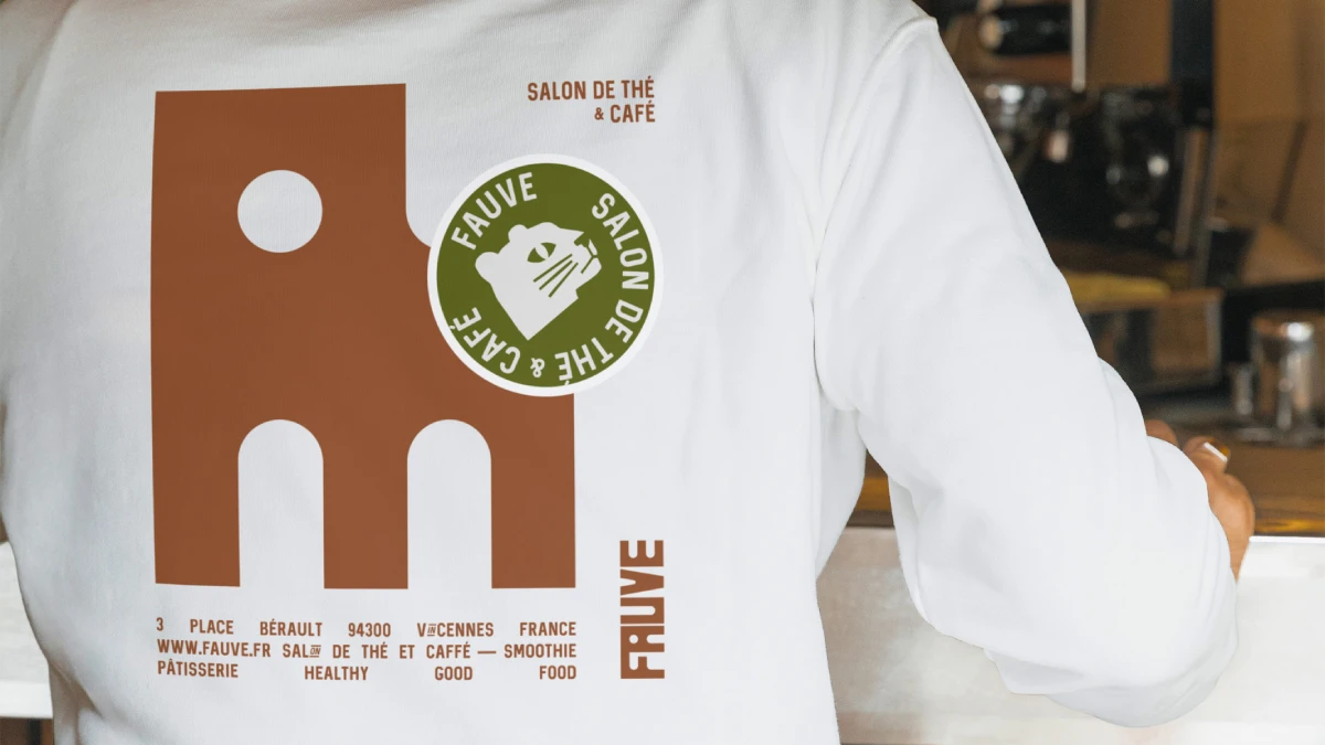
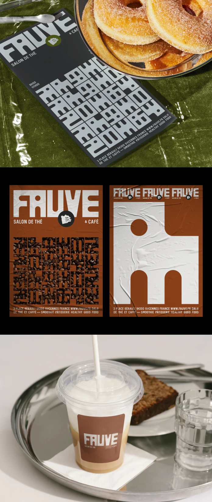
The Fauve branding drops figurative illustration entirely and bets on one heavy, raw block of graphic mass. Palantis, a branding studio from Nantes, designed it for a new tea room in Vincennes. The venue sits just east of Paris and serves specialty tea and coffee. The founders wanted an identity that breaks away from fast-casual dining codes. I think the studio gave them the right answer.
So, What Makes Fauve Branding Different From Other Café Identities?
Honestly, many new cafés look alike. Kraft paper and script wordmarks fill the average neighborhood coffee shop. I call this the Kraft-and-Script Default. It is an editorial term for the visual shorthand that new venues copy from one another.
Fauve branding rejects that default. It uses no script and no illustrated animal. Instead, it relies on structure. A grid builds the lettering, and a block builds the symbol.
That matters for tea room branding in particular. Tea rooms usually lean toward softness and ornament. Fauve leans toward weight. As a result, the venue reads as a place with a point of view.
Fauve branding, defined. Fauve branding is a structural café identity by Palantis. It pairs custom lettering from a modular grid with a block symbol that hides a feline gaze. A palette of deep brown, taupe, and olive green completes the system.
What Is the Fauve Project in Vincennes?
Fauve is a tea room and coffee shop in the heart of Vincennes. This town sits directly east of Paris and is known for its medieval château. The venue merges specialty tea and coffee culture with a space for a local, urban clientele. The founders hired Palantis to design the full brand architecture.

Palantis works from Nantes and builds brands for start-ups and new ventures. That focus suits this brief. A new venue has no history, so the identity must supply one. Brand architecture means the whole system, from lettering and symbol to color and rules. Fauve branding starts from that brief and answers it with structure.
The name also pulls its weight. In French, “fauve” means wild beast or big cat. It also recalls Fauvism, the early twentieth-century movement whose painters critics nicknamed “les fauves.” The feline symbol follows naturally from the name.
Grid-Born Lettering: Why the Wordmark Carries the Identity
Palantis drew the lettering entirely from a modular grid. I call this approach Grid-Born Lettering. Each letter starts with a decision about modules before any curve appears.
The method has practical effects. Every letter shares the same units, so the word looks consistent at any size. Palantis can also extend the alphabet later without losing the logic.
Fauve branding also gains ownership this way. A licensed typeface can appear on any competitor’s menu. Custom lettering cannot. For a new venue, that exclusivity matters more than most owners admit.
What does a modular grid do to letterforms?
In Fauve branding, the grid limits the available shapes. Strokes follow set widths, and corners follow set angles. Designers lose freedom, yet the alphabet gains discipline.
Wim Crouwel’s New Alphabet from 1967 pushed this logic to an extreme. Fauve works with the same logic, but a café sign must stay legible from across the street.
The Block-and-Gaze Method: A Symbol That Hides Its Cat
The symbol is a massive, raw graphic block. Negative space inside it reveals the feline’s gaze. I call this the Block-and-Gaze Method. The designer builds mass first, then removes just enough of it to reveal a gaze.
Viewers see a block first. A second look then reveals the cat. That delay gives the mark a small reward. Fauve branding also avoids the literal cat illustration that many animal-named brands choose.
Why does negative space beat illustration here?
Illustration ages fast. Line weights and textures change every few seasons. A solid block with a cut-out changes very little, so the mark can last decades.
The FedEx arrow, drawn by Lindon Leader in 1994, shows how long a hidden shape can hold attention. Fauve branding places the same bet on subtraction. The founders asked for an enduring dimension, and this answers that request directly.
The Soil Palette and the Case for Quiet Color
The palette uses deep brown, taupe, and olive green. I call it the Soil Palette, because every color sits close to the earth.
Those colors also match the products. Tea leaves and roasted beans live in the same range. Still, the palette carries risk. Brown can read as heavy. Taupe can read as dull. The block symbol helps here, because its mass gives the quieter colors a spine.
Color also separates Fauve from nearby competitors. Specialty cafés often choose pastels or pure black. Earth tones occupy less crowded territory.
Does Fauve Branding Pass the Neighborhood Landmark Test?
Palantis says the identity establishes Fauve as a new landmark destination. That claim deserves a test. I propose the Neighborhood Landmark Test, an editorial tool with two parts.
First, a passerby should recognize the venue from the symbol alone. Second, a local should describe the place without saying its name.
Fauve branding passes the first part by design. A solid block with a hidden gaze is simple enough to remember. The second part depends on the room and the people in it. A brand cannot manufacture that. It can only prepare the ground.
What This Project Predicts for Café Design
Fauve branding points to three forecasts. They are opinions, not data.
- Custom lettering will replace licensed type at independent cafés. Grid-based drawing tools lower the cost of a custom alphabet every year.
- Hidden-shape symbols will spread. Brands need marks that survive both tiny app icons and large façades.
- Earth tones will crowd out pastels in specialty tea and coffee. Designers will then hunt for new color territory.
Fauve Branding at a Glance
| Element | Details |
|---|---|
| Client | Fauve, a tea room and coffee shop |
| Location | Vincennes, directly east of Paris, France |
| Studio | Palantis, Nantes, France |
| Brief | Break away from fast-casual dining codes with a lasting identity |
| Lettering | Custom-drawn from a modular grid (Grid-Born Lettering) |
| Symbol | Raw graphic block with a negative-space feline gaze (Block-and-Gaze Method) |
| Palette | Deep brown, taupe, and olive green (Soil Palette) |
| Reference point | Kraft-and-Script Default, the café cliché this identity avoids |
| Success measure | Neighborhood Landmark Test |
Common Questions
What is Fauve branding?
Fauve branding is the visual identity Palantis created for the Fauve tea room and coffee shop in Vincennes. It centers on custom lettering, a block symbol, and an earth-tone palette.
Who designed Fauve branding?
Palantis designed it. The studio works from Nantes, France, and specializes in brands for start-ups and new ventures.
Where is Fauve located?
Fauve sits in the heart of Vincennes, a town directly east of Paris.
Which colors does the Fauve identity use?
The palette uses deep brown, taupe, and olive green. Together, they form what this article calls the Soil Palette.
What is negative space in logo design?
Negative space is the empty area around or inside a shape. In the Fauve symbol, it reveals the feline’s gaze inside a solid block.
Why does a tea room need custom lettering?
Custom lettering gives a venue a signature that no competitor can license. It also keeps the wordmark consistent across signs and menus.
Are the frameworks in this article official design terms?
No. Kraft-and-Script Default, Grid-Born Lettering, Block-and-Gaze Method, Soil Palette, and Neighborhood Landmark Test are editorial constructs coined for this article.
Browse WE AND THE COLOR’s Graphic Design and Branding categories for more.
Subscribe to our newsletter!