
This post contains affiliate links. We may earn a commission if you click on them and make a purchase. It’s at no extra cost to you and helps us run this site. Thanks for your support!
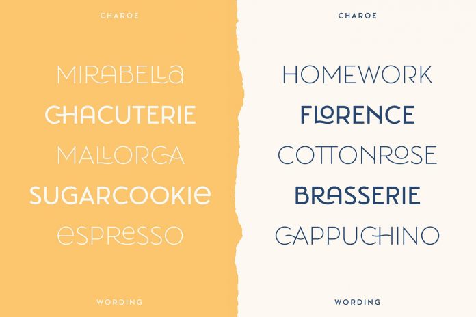
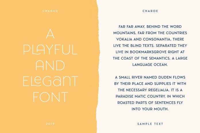
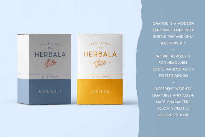
Charoe, a playful and elegant sans serif font with subtle vintage characteristics.
Designed and recently published by Tobias Saul, Charoe is a new sans serif font for different purposes such as branding, headings, posters, and packaging design. The playful and elegant typeface is mainly characterized by subtle vintage characteristics. It’s constructed using straight shapes along with some playful details. On closer investigation, you will notice several subtle connections to vintage type designs from the early 20th century.
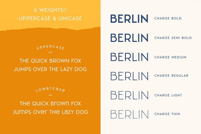
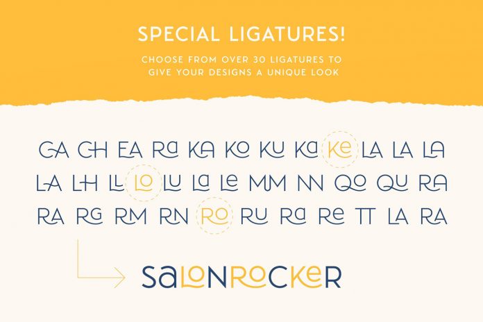
The typeface is equipped with 6 different weights ranging from thin to bold. Furthermore, it comes with more than 30 ligatures and lots of alternate characters to give you diverse design options. As a little bonus, Tobias Saul has included 15 textured paper tears as PNG files. For further information, just follow the link below.
You can purchase the typeface at Creative Market.
Download the font for little money at Creative Market.


")