Color Psychology and the Limbic System: Let’s Explore How Hues Influence Emotion and Behavior
So, you know how certain colors feel different? Like, a bright yellow room might make you feel energized, while a dark blue one might feel calming. It’s not just your imagination. There’s actual science behind that. We call it color psychology. And it’s all tied to a very special part of your brain: your limbic system.
Think of your limbic system as the emotional control center of your brain. It’s not about logic or thinking things through. It’s about gut reactions, feelings, and instincts. It processes a ton of information, and a lot of that involves color. What do you think of when you see the color red? Passion? Danger? It is probably the limbic system at work!
The Limbic System: Your Brain’s Feelings Hub
Before we get into specific colors, let’s talk more about this limbic system. It’s ancient, evolutionarily speaking. It was around long before the parts of your brain were responsible for reasoning. It’s designed to keep you safe and make sure you survive. It’s also the reason you get goosebumps when you hear a scary noise. Or why do you feel that rush of happiness when you see someone you love? Do you see that now? It is quite interesting!
Now, your limbic system doesn’t work in isolation. It’s deeply connected with other parts of the brain. It talks with your visual cortex. Your visual cortex is where you process everything you see. It sees the color. It sends that information right to your limbic system.
The limbic system reacts to that information. It can release chemicals. Those chemicals impact how you feel. It’s like a mini-chemical reaction inside you. Are you starting to get a picture of it? It is complex, isn’t it?
Think of it like this: you see a bright red sign. Maybe a stop sign or a warning label. Your limbic system kicks in. It probably signals some kind of alertness. Your heart rate may even go up a bit. The color is triggering a reaction, isn’t it?
Now, let’s get into some specifics:
Red: The Fiery One
Red is a power color. It’s associated with energy. It’s associated with excitement. It is also associated with danger. It’s used a lot in fast food. Why do you think that is? Is it to make you feel excited and hungry? Maybe! Do you think it’s an accident that so many fast-food logos are red? I wonder. It could also signal urgency. Like, “Buy this now!” Think about it.
Red has a very high wavelength. It’s stimulating. That’s why it can be so good for motivation. Do you have a gym outfit with red in it? Maybe you are using color psychology for your own benefit and don’t know it yet! It also increases your heart rate. That makes you feel more energized. Cool, right?
But remember: too much red can be overwhelming. It can make some people anxious or agitated. It all depends on the context. Think about a fire truck, red is good! Think about a red wall in your bedroom, that may not be a good choice!
Blue: The Soothing One
Blue is the opposite of red. It is calm and peaceful. It’s associated with trust and stability. That’s why so many banks and tech companies use blue in their branding. They want you to feel safe and secure. Do you think about that when you are using an app with blue as its brand color? Maybe, subconsciously?
Blue has a lower wavelength. That is why it promotes feelings of relaxation. It can lower your heart rate. Maybe you can use that to calm yourself down if you’re feeling stressed out. Interesting, huh?
Blue can also feel a bit cold. Too much blue might make a room feel impersonal. It really is about balance, isn’t it? Have you ever painted your wall blue and didn’t quite like the feel of the room? Maybe you can change a few things!
Yellow: The Sunny One
Yellow is the color of sunshine! It’s cheerful. It’s optimistic. It’s associated with happiness and creativity. This may be why children love this color. Yellow can also be used to grab attention. Think of highlighters. They are yellow for a reason. They make the words stand out. Do you find that interesting? I certainly do!
But just like red, too much yellow can be overwhelming. It can lead to feelings of anxiety for some. It really is about finding a balance!
Green: The Natural One
Green is the color of nature. It’s associated with growth. It’s associated with health. It’s very calming and refreshing. Think about walking through a forest. Green is everywhere. How does that make you feel? It’s probably calming, isn’t it?
Green is often used in hospitals. It can be very soothing. It’s linked to balance and harmony. It is a great color to have in a place where you want to feel relaxed. It is interesting that color can impact our emotions so much, isn’t it?
Orange: The Energetic and Friendly One
Orange is a mix of red and yellow. It has a bit of both of their characteristics. It’s energetic but friendly. It can be motivating but not too intense. It’s often associated with creativity and communication. It’s a very inviting color. Isn’t that interesting?
Purple: The Luxurious and Creative One
Purple is the color of royalty. It’s associated with luxury. It’s associated with wisdom. It’s often used to evoke feelings of creativity and imagination. It also can feel a bit mysterious. It is interesting that it has that effect, isn’t it?
Black: The Powerful and Sophisticated One
Black is a very powerful color. It’s associated with sophistication and elegance. It is a very serious color. It can also symbolize mystery and power. Depending on the context, it can have a different effect.
White: The Pure and Clean One
White is the color of purity. It’s associated with cleanliness and simplicity. It is often used in hospitals for that reason. It’s very neutral. It can make a space feel bigger and brighter. Do you find it calming? Or do you find it a bit boring?
How It All Connects
So, how does all of this link back to your limbic system? It’s all about how your brain processes visual information. Colors don’t just look a certain way. They trigger emotional responses. These responses aren’t always conscious. It’s your limbic system at work. It’s constantly processing information in the background.
And remember, it’s not just about the color itself. It’s also about the context. The lighting can change color. The way a color is used in a room. How a color makes you feel really depends on the full environment. You can control the way colors make you feel. If you learn how to apply color psychology correctly. Pretty cool, huh?
So, What Can You Do With This Knowledge?
You can use this knowledge to your benefit. Think about the colors you are surrounded by. Do they make you feel good? You can decorate your workspace with certain colors. You can paint your walls to improve your mood. You can even choose the colors of your clothes. You can even influence other people’s moods using color psychology too!
Are you trying to focus on studying? Consider surrounding yourself with blues and greens. Do you need motivation at the gym? Try some reds and oranges in your workout outfits. It is quite interesting, isn’t it?
Designers, listen up! Understanding color psychology and how it interacts with the limbic system is like having a superpower. You can use this knowledge to intentionally evoke specific emotions in your audience. Want to make a website feel trustworthy and secure? Opt for blues. Need to create a sense of urgency and excitement for a sale? Red and orange can be your best friends. You can also use colors to help people navigate a space, influence their purchasing decisions, and even improve their mood. The strategic use of color can elevate your designs from simply looking good to truly connecting with users on an emotional level, which ultimately makes your work more impactful and effective.
Color psychology is not a magic bullet. It’s not like all blues will make you feel calm or all reds will make you feel energized. People react differently to colors. It is important to learn what your preferences are. Maybe you don’t like the color blue, or maybe you are not too fond of the color red. That is completely fine! You know yourself better than anyone.
And this is just the tip of the iceberg. There’s so much more to explore in color psychology and the limbic system. It’s an exciting field with lots of fascinating insights. What do you think? It is pretty cool, right?
So, next time you see a color, pay attention to how it makes you feel. It’s more than just a visual experience. It’s a complex interaction with your brain. It is all connected! It’s quite amazing when you think about it!
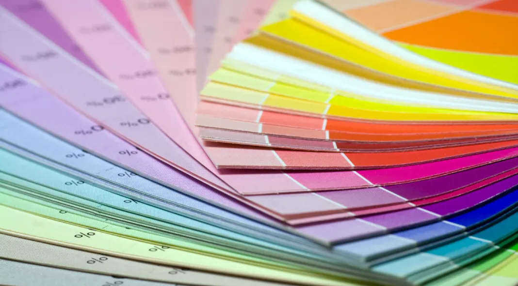
Header image by Skovalsky (via Adobe Stock). Feel free to browse through all the different sections of WE AND THE COLOR to find more inspiring content.
Subscribe to our newsletter!

