This post contains affiliate links. We may earn a commission if you click on them and make a purchase. It’s at no extra cost to you and helps us run this site. Thanks for your support!
Brand Guidelines Are Not a Nice-to-Have. They’re What Keeps a Brand From Becoming a Rumor.
A rebrand can cost a company millions of dollars. Somewhere between the strategy deck and the launch party, most of that budget quietly evaporates, because nobody wrote down the rules for using the new identity. That missing document is brand guidelines, and it’s the cheapest insurance a brand will ever buy.
I’ve watched agencies spend months perfecting a logo system, then hand the client a twelve-page PDF and call it finished. Six months later, the sales team stretches the logo to fit a slide, the social media intern picks a font from a default list, and the printed brochure uses a blue that doesn’t match the website anywhere. None of that is really a design problem. It’s a case of brand guidelines that nobody built properly, or nobody bothered to read.
This article covers what brand guidelines actually are, who needs them, and how to build a set that people will genuinely use. It also breaks down the difference between brand guidelines for print and brand guidelines for screens, because that one distinction trips up more teams than anything else on this list.
So What Are Brand Guidelines, Exactly?
Brand guidelines are the documented rules for how a brand looks, sounds, and behaves across every place people encounter it. Think of them as the instruction manual for a brand identity, written for people who didn’t design it and shouldn’t have to guess at it.
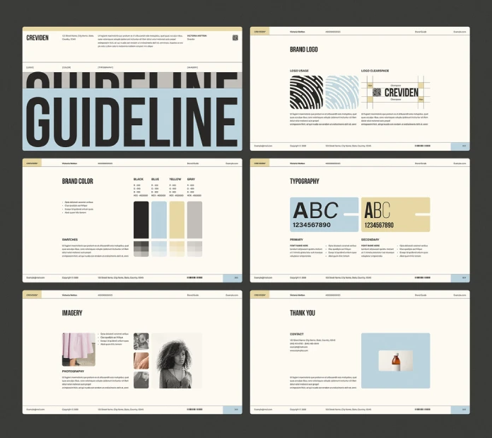
A proper set answers specific, practical questions. How much clear space needs to surround the logo? Which two blues are the brand’s actual blues, and what are their exact codes? What tone does the brand use when responding to a complaint, compared to an Instagram caption? Good brand guidelines leave no room for interpretation on questions like these, and that’s exactly the point of writing them down.

I like to break brand guidelines into four working layers. I call this the Four-Layer Brand Stack, and it’s an editorial framework I use to check whether a guideline document is genuinely complete, rather than just pretty.
The Four-Layer Brand Stack
This is a checklist I built for this article, not a formal industry standard, but it holds up well in practice.
- Identity Layer: the logo, color palette, typography, and iconography. The visual DNA of the brand.
- Application Layer: how that DNA gets used in the real world. Templates, layouts, spacing rules, and file formats for both print and digital.
- Voice Layer: the language. Tone, vocabulary, grammar preferences, and how the brand talks differently across channels.
- Governance Layer: who owns the brand guidelines, how updates get approved, and how violations get corrected before they spread.
Most brand guideline documents I’ve reviewed nail the Identity Layer and mostly ignore the other three. That’s exactly why so many guidelines look impressive and still fail once real teams start using them.
Why Brand Guidelines Matter More Than People Think
Here’s a story worth remembering. In 2010, Gap unveiled a new logo without preparing its internal teams or its customers for the change. The backlash was immediate and loud enough that Gap reverted to its old logo within a week. That’s a rebrand failing, not because the design was bad, but because nobody managed the rollout with real brand guidelines and a plan behind it.
Inconsistency is expensive in ways that never show up on a single invoice. A customer who notices three different shades of the same “brand blue” in one week doesn’t consciously register brand guidelines failing somewhere upstream. They just quietly trust the brand a little less. Recognition gets built through repetition, and repetition only works when everything actually repeats correctly.
There’s a number worth sitting with here. Teams without branding rules waste real hours every single week rebuilding decisions that should already exist on paper. A missing type scale means someone eyeballs a headline size. A missing color spec means someone screenshots the homepage and eyedrops the color by hand. That isn’t creative work. That’s the tax you pay for skipping documentation.

Who Actually Needs Brand Guidelines?
Almost anyone building something people will see more than once. But the shape of brand guidelines should scale with the size of the team behind it.
Solo creators and freelancers need a lightweight version: logo files, two or three colors, one font pairing, and a handful of usage rules. It doesn’t need a cover page. It just needs to exist somewhere.
Startups need brand guidelines the moment a second person starts making anything. That’s usually the exact point where inconsistency begins, often inside the first pitch deck built by someone other than the founder.
Agencies need them for every client they manage, plus a set for themselves. An agency without a documented style looks oddly unfinished to prospective clients, which is an awkward position for a company that sells identity work for a living.
Nonprofits and mission-driven organizations need them arguably more than anyone else, because their credibility depends on consistent, trustworthy communication across a wide network of volunteers and partners.
Enterprises need the deepest version: brand guidelines covering dozens of sub-brands, hundreds of vendors, and every regional market where the company operates. At that scale, they stop being just a document. They become an operating system.
What Belongs Inside a Complete Brand Guidelines Document
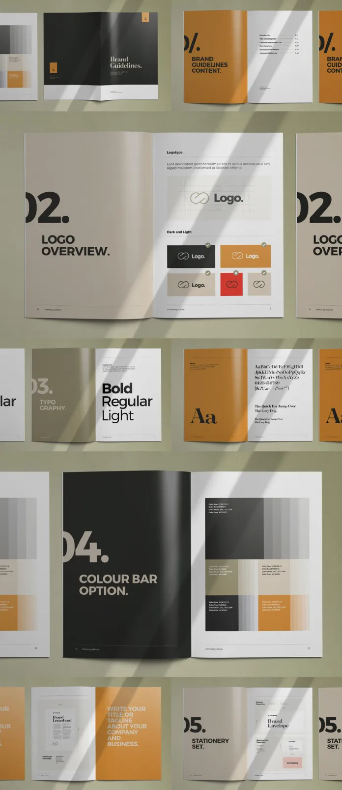
A finished set of brand guidelines is really a checklist dressed up as a design document. Based on the strongest examples I’ve reviewed across agencies and enterprise teams, here’s what a genuinely complete brand guidelines checklist includes.
- Logo system: primary mark, secondary marks, lockups, clear space, minimum size, and a clear list of what never happens to it, no stretching, no rotating, no recoloring, no drop shadow someone added because it “needed depth.”
- Color palette: primary and secondary colors with HEX, RGB, CMYK, and Pantone values, plus rules for tints, gradients, and accessible color pairings.
- Typography: primary and secondary typefaces, a defined type scale, weight usage, and fallback fonts for environments where the brand font simply isn’t available.
- Imagery and photography style: lighting, composition, color grading, and subject matter that fits the brand, along with examples of images that clearly don’t.
- Iconography and illustration: a consistent visual language for icons, line weight, corner radius, and illustration style, if the brand uses one at all.
- Voice and tone: vocabulary the brand uses and avoids, sentence rhythm, grammar preferences, and how tone shifts across different channels.
- Layout and grid systems: margins, spacing units, and grid structures for both print and digital layouts.
- Applied examples: real mockups showing the identity in context. A business card, a social post, a signage panel, a slide deck cover.
Skip any item on this list, and someone downstream will quietly invent the missing rule themselves. That’s how brand guidelines fall apart in practice, one small unofficial decision at a time.
The Two Worlds: Print vs. Digital
This is where most brand guidelines documents fall short. Teams build gorgeous digital-first guidelines and forget that somewhere, someone still needs to print a banner, a business card, or a trade show backdrop. Printed and digital guidelines share the same underlying identity, but the technical rules genuinely diverge, and treating them as one topic causes real problems.
Color Systems: RGB and HEX vs. CMYK and Pantone
Screens create color with light, using red, green, and blue. Printers create color with ink, using cyan, magenta, yellow, and black. Those are two different physics problems, not just two file formats. A brand blue that looks electric on a monitor can turn muddy on a printed flyer if nobody converted it correctly ahead of time.
Complete brand guidelines specify color in four separate ways: HEX and RGB for screens, CMYK for four-color process printing, and Pantone for spot-color accuracy on things like signage or apparel. Skipping the Pantone reference is the single most common gap I see in brand guidelines built by digital-first teams.
Typography: Web Fonts vs. Print Faces
Digital brand guidelines need web font formats, usually WOFF2, plus a fallback font stack for browsers or email clients that can’t load the brand typeface at all. Print versions need the original OpenType or PostScript files instead, with full kerning and ligature support intact, since a print shop can’t quietly substitute a system font the way a browser will.
Logo Behavior: Responsive vs. Fixed
A digital logo often needs to respond to its environment: a full lockup on a homepage header, a simplified mark for a mobile favicon, a light version built for dark mode. Print logos stay fixed once they’re placed, so brand guidelines for print focus more on minimum print size and clear space measured in physical inches or millimeters, not pixels.
Accessibility vs. Legibility
Digital brand guidelines increasingly need WCAG contrast ratios, visible focus states, and semantic markup rules, since accessibility compliance is now a real legal and ethical requirement for most digital products. Print brand guidelines care about legibility instead: type size at reading distance, ink coverage limits, and how color performs differently across paper stocks.
Here’s my honest opinion on this. Any document that only covers one of these two worlds is an incomplete document, no matter how polished it looks on screen. Pick one world to document first if you genuinely have to. Just don’t call the project finished until both actually exist.
Compare Digital and Print Specs at a Glance
- Color: HEX and RGB values, defined for the sRGB color space
- Typography: WOFF2 web fonts with a defined fallback font stack
- Logo behavior: responsive, with simplified marks for small sizes and dark mode
- Accessibility: WCAG contrast ratios, visible focus states, semantic markup
- Resolution: measured in pixels, optimized for screen density
- Color: CMYK for process printing, Pantone (PMS) for spot-color accuracy
- Typography: original OpenType or PostScript files with full kerning intact
- Logo behavior: fixed placement, with minimum print size in inches or millimeters
- Legibility: type size at reading distance, ink coverage limits, paper stock behavior
- Resolution: measured in DPI, typically 300 DPI minimum for print-ready files
Beyond Print and Digital: Other Types of Brand Guidelines
Print and digital cover the basics, but plenty of brands need more specialized brand guidelines for the channels where things tend to go wrong fastest.
- Motion and video guidelines: animation timing, logo reveal rules, transition style, and sound branding for video intros or app interactions.
- Packaging guidelines: die-lines, material specs, how the logo wraps around a curved surface, and color tolerance across different substrates.
- Environmental and signage guidelines: how the brand behaves at building scale, visibility distances, lighting requirements, and wayfinding systems.
- Voice and tone guidelines: often folded into the main brand guidelines document, though large organizations sometimes give this its own guide entirely.
- Social media guidelines: platform-specific crops, caption style, hashtag policy, and community response tone.
- Co-branding and partner guidelines: rules for how the logo appears next to another company’s logo, lockup spacing, and size parity.
Every one of these is still, structurally, brand guidelines. They’re just brand guidelines scoped to one channel instead of the whole identity at once.
Matching Depth to Company Size: The Guideline Depth Tiers Framework
Not every brand needs eighty pages of brand guidelines, and pretending otherwise wastes everyone’s time. I use three tiers to match document depth to actual need. This is another editorial framework built for this article, not a formal industry standard.
- Tier One, the One-Pager: logo files, three colors, one font pairing, and five do’s and don’ts. Right for solo creators, very early startups, and personal brands.
- Tier Two, the Standard Guide: the full component checklist from earlier in this article, roughly fifteen to forty pages, covering both print and digital brand guidelines. Right for small- to mid-size companies and agencies.
- Tier Three, the Living System: a hosted, searchable brand guidelines platform instead of a static file, with role-based access, version history, and downloadable assets. Right for enterprises, franchises, and brands managed by outside vendors.
The mistake I see most often is a five-person startup attempting Tier Three brand guidelines because a template looked impressive online, then nobody ever finished it. Build the tier that matches your actual team, not your ambitions for next year.
How to Create Brand Guidelines, Step by Step
Building brand guidelines from scratch follows a fairly predictable sequence, even though most teams skip steps under deadline pressure.
Step one: audit what exists. Pull together every logo file, every color code anyone can find, and every piece of marketing published in the last two years. This step alone usually surfaces the inconsistency problem you’re trying to solve.
Step two: define the brand strategy. Guidelines document decisions. They don’t make them. Positioning, personality, and target audience all need to exist before anyone opens a design file.
Step three: build the identity toolkit. Finalize the logo system, the color palette, and the typography, then stress-test each one against a genuinely difficult use case: a tiny mobile icon, a black-and-white fax, and a huge printed banner.
Step four: document the specs. This is where the Four-Layer Brand Stack becomes useful again. Write the Identity Layer, then the Application Layer, then the Voice Layer, then the Governance Layer, in that order.
Step five: choose a format. A PDF works fine for a Tier One or Tier Two guide, and a downloadable brand guidelines template can speed up that process, as long as it never replaces real strategy work with generic placeholder content. A living, hosted platform makes more sense once multiple teams and outside vendors need access on their own schedule.
Step six: roll it out and govern it. Brand guidelines that nobody announces might as well not exist. Assign a specific owner, set a review cadence, usually annual, and build a simple way for people to ask questions when the guidelines don’t cover an edge case.
Run the Translation Test Before You Publish
Before publishing anything, I run what I call the Translation Test. Take one asset, usually the logo lockup, and force it through five environments: a black-and-white photocopy, a tiny app icon, a huge printed banner, a dark-mode screen, and a low-resolution projector. If your brand guidelines survive all five without someone needing to improvise, they’re ready to publish. If they don’t, that’s exactly where to add more detail first.

Where Brand Guidelines Break: The Four Drift Points
Even well-written brand guidelines fail at predictable points. I call these the Four Drift Points, the specific places where brand consistency actually erodes over time.
- Freelancer handoffs: a contractor gets a logo file and a five-minute briefing instead of the actual guidelines and improvises the rest of the details.
- Sales decks: sales teams move fast and often build their own slide templates, quietly drifting from brand guidelines because nobody handed them an editable template that already matches.
- Franchisee and reseller materials: local operators adapt corporate assets for local promotions, and small individual edits compound into major inconsistency across the network.
- Social media and community managers: fast-moving channels where speed usually wins over documentation, especially without a lightweight, mobile-friendly version of the guidelines on hand.
Fixing drift isn’t really about writing longer brand guidelines. It’s about putting the right, right-sized guidelines directly in front of the people working at each of these four points.
Brand Guidelines Are Going Digital, and That’s Not Optional Anymore
Static PDFs are losing ground fast. More brands now host their brand guidelines on dedicated platforms such as Frontify, Bynder, or Lingo, where the document updates in real time instead of getting emailed around as version fourteen of a file nobody fully trusts anymore.
That shift matters, because a living brand guidelines platform gives every stakeholder, internal or external, the current version automatically, along with built-in asset downloads instead of a request-and-wait workflow that slows everyone down.
There’s a newer trend worth naming directly too: AI brand governance. As more teams use generative tools to draft copy, mock up layouts, or generate social content, brand guidelines increasingly need explicit rules for AI-generated material, covering what a generative tool is allowed to touch and what still requires a human’s sign-off. I expect this section to become standard inside brand guidelines within the next two years, the same way accessibility rules became standard over the last several.
Brand Guidelines at a Glance
| Guideline Type | Primary Purpose | Core Specs | Typical Owner |
|---|---|---|---|
| Core/Master Brand Guidelines | Establishes the overall identity | Logo, color, typography, voice | Brand or marketing lead |
| Digital Brand Guidelines | Governs screen-based use | HEX/RGB, WOFF2 fonts, WCAG contrast, responsive logo | Digital or web team |
| Print Brand Guidelines | Governs physical materials | CMYK, Pantone, minimum print size, paper stock | Print or production team |
| Motion & Video Guidelines | Governs animated brand use | Timing, logo reveal, sound branding | Video or motion team |
| Packaging Guidelines | Governs physical product packaging | Die lines, material specs, color tolerance | Packaging or product team |
| Voice & Tone Guidelines | Governs written communication | Vocabulary, grammar, tone by channel | Content or copy team |
| Social Media Guidelines | Governs platform-specific content | Crop ratios, caption style, response tone | Social media team |
| Co-Brand & Partner Guidelines | Governs joint-logo use | Lockup spacing, size parity | Partnerships or legal team |
What’s Next for Brand Guidelines
A few predictions worth stating plainly. Static PDF brand guidelines will keep losing ground to hosted, living platforms, especially for any company larger than a small team. AI governance clauses will become a standard section inside brand guidelines within the next two to three years, not an optional extra. And voice and tone guidance will keep gaining weight relative to visual rules, since generative tools make visual consistency easier to enforce automatically, while written voice still depends entirely on documented human judgment.
None of that makes brand guidelines less important. It makes the discipline of writing them clearly more valuable, not less.
Frequently Asked Questions
What’s the difference between a style guide and brand guidelines?
The two terms are often used interchangeably, but a style guide usually covers writing and formatting rules, like grammar and punctuation, while brand guidelines cover the full identity: visual, verbal, and behavioral. Many documents include a style guide as one section inside them.
How long should brand guidelines be?
Long enough to answer every real question your team asks, and not one page longer. A solo creator might need three pages. An enterprise might need eighty. Length should follow complexity, not confidence.
Do small businesses really need brand guidelines?
Yes, even a lightweight version. A five-page document covering logo use, colors, and fonts protects a small business from months of inconsistent marketing, and it costs almost nothing to build early on.
Who should own them inside a company?
Someone specific, not “the team.” Ownership without a name attached to it is how brand guidelines quietly go three years without an update.
How often should brand guidelines be updated?
Review them at least once a year, and update them immediately after any major visual or strategic change: a new product line, a new market, or a logo refresh.
Can brand guidelines be too strict?
Yes. Guidelines that leave zero room for context or creative judgment tend to get ignored entirely. The best set firm rules for the essentials—the logo, the colors, and the core voice—and leave healthy room for expression everywhere else.
Brand guidelines will never be the most exciting document a company owns. But they’re the quiet infrastructure holding every other creative decision together, and that’s worth taking seriously.
Browse WE AND THE COLOR’s Graphic Design, Branding, and Templates categories for more.
Subscribe to our newsletter!