
This post contains affiliate links. We may earn a commission if you click on them and make a purchase. It’s at no extra cost to you and helps us run this site. Thanks for your support!
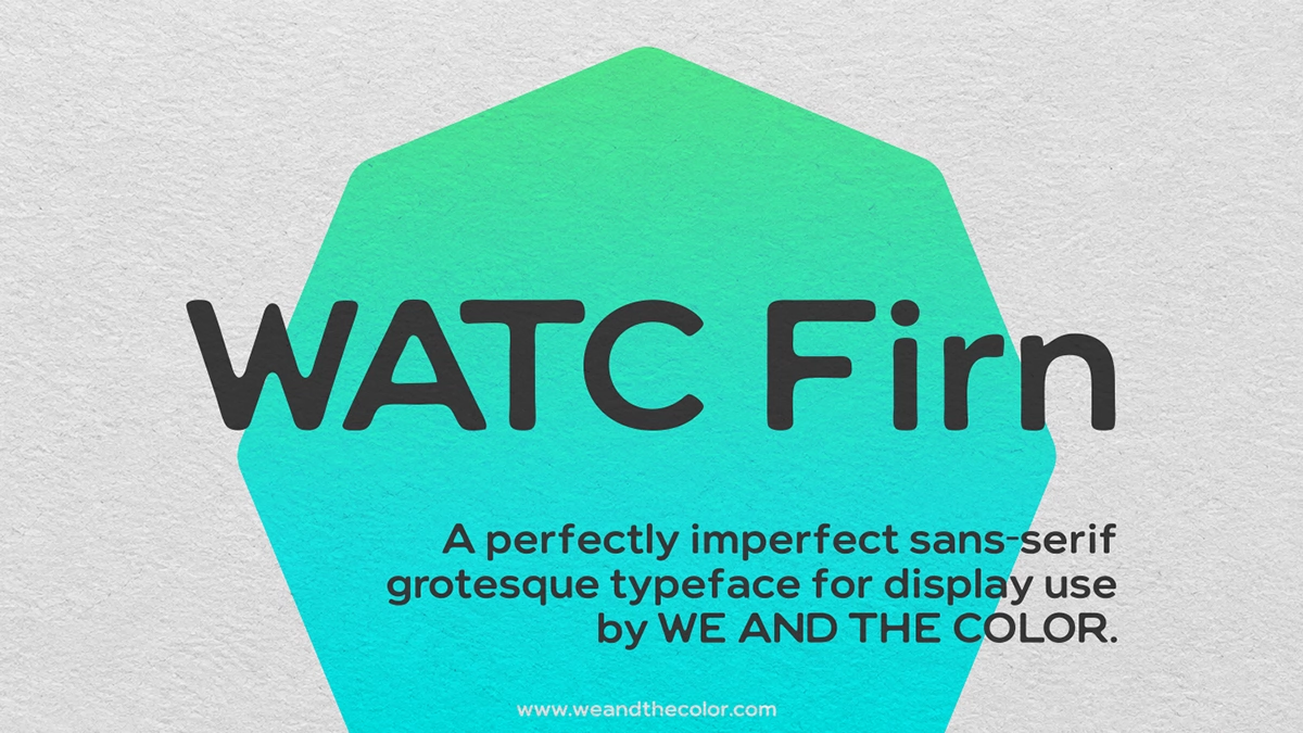
The WATC Firn font makes a headline look printed by hand the moment you type it. It pairs soft, ink-bled contours with one medium weight, and the download includes a commercial license.
Imperfect typefaces are especially popular right now because designers want display fonts with texture and a vintage feeling. Most of those looks depend on filters and overlay textures, which break easily in export. In the WATC Firn font, the look sits in the outlines themselves, so it stays put.
I designed the WATC Firn font myself, and it was published under WE AND THE COLOR. In this article, I tell you what the download contains and how to use it in real layouts. When you are ready, you can purchase the typeface through Gumroad.
What Is the WATC Firn Font, and What Does the Download Include?
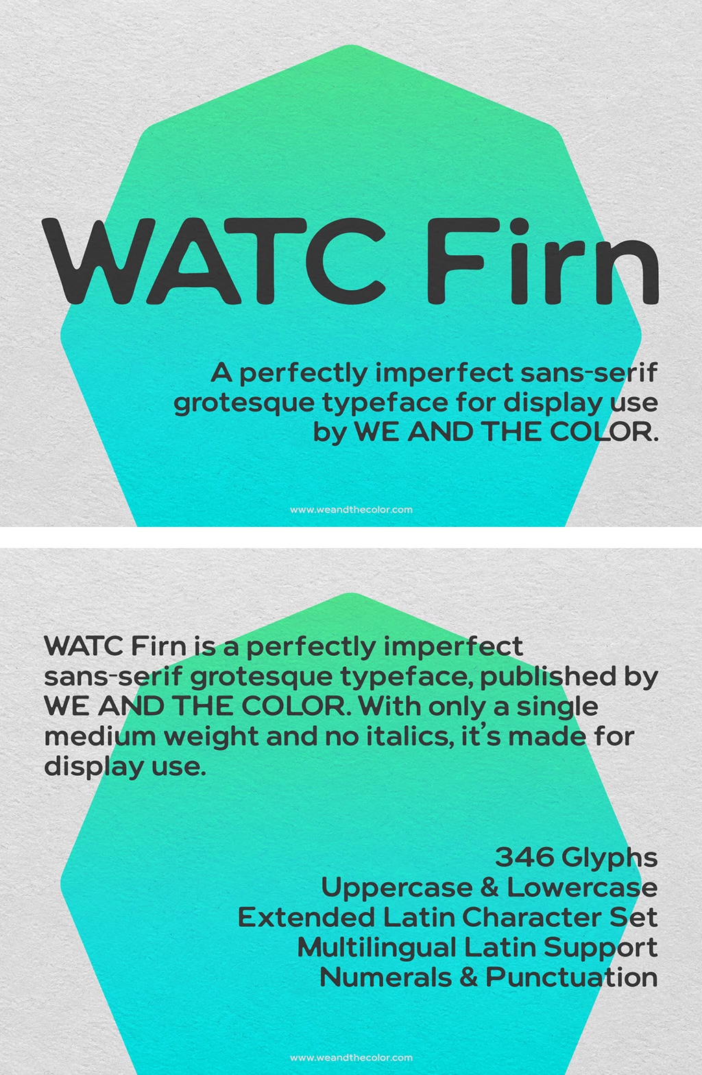
It’s a sans-serif grotesque display typeface that I, Dirk Petzold, created for my design and publication brand, WE AND THE COLOR. It comes in a single upright medium weight, and the character set holds 346 glyphs.
Every download from Gumroad includes two font files and a license text for your records.

- An OTF file for desktop use in design apps on Windows and macOS
- A WOFF2 file for web use through CSS @font-face
- A license text that covers personal and commercial projects
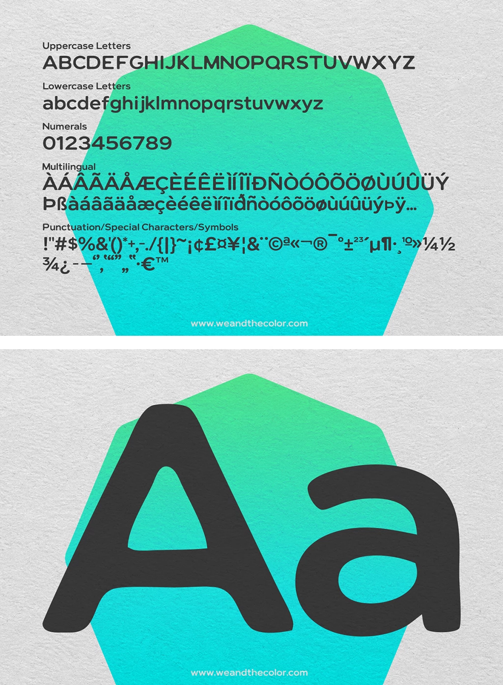
Ink-bleed aesthetic is my term for letterforms whose corners soften as if ink had spread into soft paper. On soft paper, ink spreads into the fibers and rounds every corner that a punch cutter once cut sharp, and the WATC Firn font draws that effect into every glyph so the contours drift slightly from perfect geometry in a controlled way. That unevenness gives the letters a vintage feeling that clean digital type rarely has.
Why Does Imperfect Type Work So Well Right Now?
Generated images now arrive polished by default, so smoothness has lost its value as a signal of care. Designers respond by looking for visible evidence of a human hand in every layout. A rough outline in the WATC Firn font offers that evidence at a glance, even in a thumbnail.
This demand has a practical side, because trends only help when they work in real layouts. A feed graphic competes for attention during a quick scroll, and a distinctive headline face helps it win that moment. The WATC Firn font gives the headline a recognizable shape without extra effects.
How Does the WATC Firn Font Differ From Other Soft Display Fonts?
Soft, rounded display type has a long history in advertising and packaging. Cooper Black, from 1922, made round forms a commercial favorite with a heavy serif. The WATC Firn font brings that warmth to a grotesque skeleton, so headlines feel friendly and a little nostalgic.
VAG Rounded, which Volkswagen used in its corporate design from the late 1970s, takes a more geometric route. Its curves are geometrically exact, so the roundness feels engineered and very clean. The typeface rounds its corners unevenly, and that unevenness gives each headline a human touch.
The WATC Firn font sits between those traditions, with Cooper Black’s warmth and a grotesque’s plain skeleton.
Why Do Designers Pick Simple Rough Typefaces Like WATC Firn for Headlines?
One Weight, One Voice
A single medium weight gives every headline in the WATC Firn typeface the same steady voice. Size and space build the hierarchy, a method I call the One-Weight Hierarchy. A headline at 120 points above a subline at 36 points needs no bold to show readers the order.
A Handmade Signal Without Effects
The imperfection lives in the outlines, so it survives every export and every color. A poster and a feed graphic carry exactly the same character, and neither needs a filter or texture overlay. I call that visible trace of a human decision the handmade signal.
Wide Proportions That Read on a Phone
Wide proportions and rounded outlines keep the letters open and clear on a small screen. Thin hairlines would struggle there, and the WATC Firn font has none. That makes it a strong match for 1080 by 1080 pixel feed graphics.

How Do You Use this Vintage-Inspired Typeface in Real Projects?
Social Media Graphics
Pair WATC Firn with a quiet text face, and you get a layout with two clear voices. I call this pairing the Two-Voice System, an editorial construct of mine. The WATC Firn font speaks up in the headline, and a neutral face such as Helvetica Neue or Inter handles the rest.
Keep headlines short. A few words let the letters stop the thumb before anyone reads the caption.
Posters and Print
Poster scale shows the ink-bleed aesthetic of the WATC Firn font at its best. A single word across an A2 sheet, which measures 420 by 594 millimeters, turns every irregular curve into visible texture. The Calm Partner Rule says that a rough typeface works best beside one quiet element. A flat color field or a clean photograph gives the letters the calm they need.
Logos and Brand Names
A wordmark in the WATC Firn font carries its handmade character into every application, from the favicon to the shopfront. That suits bakeries and record labels, where a hand-made feel is an asset.
Before building a logo file, convert the text to outlines, since the rough contours become the logo. Then place the wordmark on a flat color field, where its edges show best.
Websites With the WOFF2 File
The WOFF2 file loads the WATC Firn font on a website through CSS @font-face. A rule like the one below does the job, and you only need to adjust the file path.
@font-face {
  font-family: "WATC Firn";
  src: url("WATC-Firn.woff2") format("woff2");
  font-weight: 500;
  font-style: normal;
  font-display: swap;
}

h1 {
  font-family: "WATC Firn", sans-serif;
}
Set the font on headlines and keep body copy in a text face. That choice keeps the page fast, and it keeps every headline distinctive.
Each layout above works with the files in one download. The WATC Firn font is waiting on the sales page, together with both font files and the license text.
How Do You Install the WATC Firn Font?
Installation of the WATC Firn font takes about a minute on Windows and macOS. Unzip the download first, and then follow the steps for your system.
- Windows: Right-click the OTF file and choose Install, or install it for all users if you share the computer.
- macOS: Double-click the OTF file, then click Install Font in the Font Book window.
- Design apps: Restart Adobe Illustrator, Photoshop, or InDesign so that the WATC Firn font appears in the font menu.
After that, type a headline and open the glyph panel to see all 346 characters.
What Does the WATC Firn Font Cover?
The set holds 346 glyphs, starting with the full Latin alphabet in upper and lower case, plus numerals and punctuation. A glyph coverage check confirms 30 supported languages for the WATC Firn font.
Those languages include German, French, Spanish, Dutch, Danish, Icelandic, Polish, Croatian, Turkish, Finnish, Estonian, Latvian, Lithuanian, and Maltese. Indonesian, Malay, Afrikaans, and Esperanto belong to the list as well, which widens the reach beyond Europe.
For a client in Gdańsk or Istanbul, that means headlines in the right letters from day one.
Can You Use the Font Commercially?
Yes. The license of WATC Firn covers personal and commercial projects, including client work and merchandise, and it extends to logos and websites. The files themselves stay with me, so resale and file sharing are not part of the license.
Each client who needs the WATC Firn font itself gets a copy through the sales page. That keeps every project cleanly licensed.
The Buy-Ready Checklist for Display Fonts
Designers rarely pick a display font on looks alone, because every project brings practical questions. A clear license and a ready web format often decide the purchase before anyone compares letterforms. I call that list the Buy-Ready Checklist, and the table below applies it to the WATC Firn font.
| Criterion | Question to ask | WATC Firn font |
|---|---|---|
| Character | Does the outline style stand out? | Ink-bled contours with a vintage feeling, one upright medium weight |
| Glyphs | Is the set large enough? | 346 glyphs |
| Languages | Do the client’s letters work? | 30 supported languages |
| Desktop format | Does it install in design apps? | OTF file |
| Web format | Does it load on a website? | WOFF2 file |
| License | Can you use it for paid work? | Personal and commercial use, no resale |
| Source | Who stands behind it? | Dirk Petzold, WE AND THE COLOR |
I expect designers to favor display fonts that bring a clear license and a web format in the same download, because a client rarely wants to hear that the headline font works in print but needs a second purchase for the website. Both matter more every year.
Common Questions About the WATC Firn Font
What is the WATC Firn font?
It’s a sans-serif grotesque display typeface that I designed. The typeface was published by WE AND THE COLOR. It has ink-bled contours and a single upright medium weight, and the set holds 346 glyphs.
Does it include a web font?
Yes, the download includes a WOFF2 file for websites next to the OTF file for desktop use. Load it with CSS @font-face and set the WATC Firn font on your headlines.
Can I use the font for client work?
Yes, the license covers commercial projects, including client work. Each client who needs the font itself gets a copy through the sales page.
Which languages does it support?
The glyph coverage check confirms 30 languages, from English, German, French, Spanish, Italian, and Polish to Turkish, Estonian, and Maltese.
What pairs well with the typeface of WATC Firn?
A neutral text face such as Helvetica Neue or Inter keeps the page calm. WATC Firn then carries the character alone.
Can I resell or share the WATC Firn font?
The license keeps the files with the buyer, so resale and sharing stay off the table. A client who needs the font gets a copy of their own.
How do I install the font?
Unzip the download, then right-click the OTF file on Windows and choose Install. On macOS, double-click the file and click Install Font.
Which sizes suit the WATC Firn typeface?
It works best at headline size, where the ink-bled contours show their full character. A quiet text face handles longer paragraphs.
Where can I get the WATC Firn font?
It is available through Gumroad, where the download includes both font files, the OTF and the WOFF2, plus the license text.
Browse WE AND THE COLOR’s Fonts category or take a look at our selection of the 100 coolest retro fonts for 2027.
Subscribe to our newsletter!