
This post contains affiliate links. We may earn a commission if you click on them and make a purchase. It’s at no extra cost to you and helps us run this site. Thanks for your support!
Zeit, an elegant and functional serif font family from Fenotype.
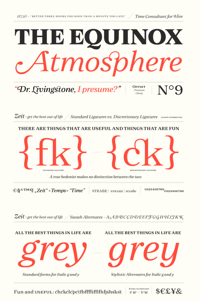
Published just recently by foundry Fenotype, Zeit is an elegant yet timeless serif font family made for a variety of typographic applications ranging from magazines and newspapers to mobile apps, branding, and advertising. The Zeit font family has been designed by Emil Bertell, Erik Bertell, and Teo Tuominen.
It is equipped with numerous OpenType features including small capitals and small capital figures, old-style figures, subscript and superscript figures, and fractions. In addition, the Zeit font family comes with stylish swash alternates that are included in the Italics. The characters ‘g’ and ‘y’ also come with stylish variants. The family has fourteen styles including weights ranging from light to heavy plus true Italics for each weight. If you are looking for a high-quality typeface with an elegant yet timeless appearance, this serif font family is a perfect choice!
Feel free to find more typefaces on WE AND THE COLOR. Our Fonts category includes a wide range of different styles. no matter what you are looking for, a modern sans or classic serif font, you will find the best typefaces on WE AND THE COLOR!

Subscribe to our newsletter!


