This post contains affiliate links. We may earn a commission if you click on them and make a purchase. It’s at no extra cost to you and helps us run this site. Thanks for your support!
Energy design sounds like a job for engineers in hard hats. But Vitra’s Transform! Designing the Future of Energy argues otherwise. Its pages hold a ski slope on a waste incinerator and a rucksack full of biogas. Then there’s a porcelain plate of a shuttered nuclear plant.
The timing helps. Right now, the exhibition behind the book runs at the Biosphere in Montreal until October 4, 2026. After that, it heads to Busan, South Korea, in January 2027. Vitra’s current tour list shows no European stop after Weil am Rhein. So the book is the practical way into this energy design conversation for most readers.
Below, I’ll cover what’s inside, how Vitra built the book, and where it falls short. I’ll also use four editorial tools for judging energy design. They’re the Appetite Test, the Visibility Gap, the Funding Cliff, and the Three Reading Routes. None of them is an industry standard. Instead, they’re my own constructs, and you’re free to borrow them.
Does Better Energy Design Mean Cleaner Power or Less Power?
Most people hear “energy transition” and picture solar panels. Fair enough. Panels photograph well. But Vitra’s energy design framing asks two questions, not one. How can design bring more renewable energy into use? And how can design reduce the energy we consume?
Here’s my working definition. Energy design shapes the products, buildings, and infrastructure that make, store, move, and use energy. Good energy design cuts demand, not only carbon.

So does the book answer “both”? Yes. Still, it leans harder on the second half than its marketing copy admits. That’s my reading, and it makes this energy design book worth your time. Solar panels alone don’t need a whole book. Appetite does.
What Is Transform! Designing the Future of Energy?
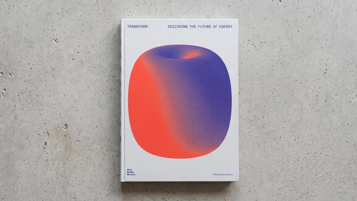
Transform! Designing the Future of Energy is the catalog of a Vitra Design Museum exhibition on energy design. Vitra published it in 2024. Mateo Kries, the museum’s director, and Jochen Eisenbrand, its chief curator, edited it. Eisenbrand also curated the show.
The project section covers around 100 energy design examples across product design, architecture, and urban planning. Roughly 200 images accompany them. Then a reader section follows with essays by Rossi, Rammler, Barber, Germanese, Hein, and Guillaume Lion. It also reprints an excerpt from Ivan Illich.
Why should a design reader care? Because the premise is simple. Designers shape every panel, turbine, and power plant. They pick the form, the site, and the story. That makes every energy project an energy design decision.
The exhibition itself works from small to large. It starts with the human body and ends with cities and infrastructure. In between sit everyday energy tools, buildings, and mobility. So the energy design question changes with every scale.
How Vitra Built the Energy Design Book
Design readers will check the object first, so let’s start there. The English edition comes as a softcover with a linen cover and thread binding. It measures 24 by 32 centimeters, or about 9.5 by 12.5 inches. Amazon lists the weight at 2.31 pounds, so it’s no pamphlet.
Helen Stelthove designed the book. The cover uses Comtesse linen, and the pages use FSC-certified Arena Natural Bulk paper. DZA Druckerei zu Altenburg printed it in Germany. The type is FK Grotesk and FK Grotesk Mono. Květoslav Bartoš drew them, and Florian Karsten Typefaces publishes them.
Kries says in his foreword that the design borrows from manuals of the 1960s and 1970s. Those manuals offered practical ways to build sustainability into daily life. A grotesk and mono pairing suits that idea. It looks like instructions, not a trophy. So I like this choice for an energy design workbook.
The Arrow System
The project entries run in alphabetical order. Still, most entries end with arrows. They point to related projects, figure numbers, and sometimes essays. So this energy design catalog reads by alphabet or by association.
Three Reading Routes for an Energy Design Catalog
A catalog with about 100 entries invites bad habits. You skim the pretty ones and skip the rest. So here’s my first editorial tool. The Three Reading Routes give you a plan for any energy design catalog. They’re my construct, not Vitra’s.
The Alphabet Route
Read front to back. In the first few entries, you meet a solar car with up to 189 thin cells. Right after it comes a 1927 plan to dam the Strait of Gibraltar. The jump in time is jarring. Yet it’s also the point, because some energy design ideas here are older than today’s energy debates.
The Arrow Route
Pick one entry and follow the arrows. For example, Atlantropa points to Eneropa, Honnef Wind Power Plants, and World Game. The Mobility Design Guide points to Energy Shapes the City, then to Rammler’s essay. So you end up building your own energy design chapters.
The Essay-First Route
Read Rossi, Illich, and Barber first. Then hit the entries with their questions in your head. I recommend this route for most designers. After all, the projects read differently once you know what to ask.
The Appetite Test: Does an Energy Design Project Cut Demand or Only Clean Up Supply?
Here’s my second tool. The Appetite Test asks one question of any energy design project. Does it lower our appetite for energy, or does it only change where the energy comes from? Both kinds of energy design matter. But only the first one questions the habit.
Catharine Rossi builds the case for energy design that cuts demand. First, she notes that efficiency gains and cheaper renewables keep running into rising demand, fueled partly by digital devices. Then she cites an estimate that information and communications technology used 4 to 6 percent of global electricity in 2020. Up to 80 percent of that use happens during production.
Daniel A. Barber gives the idea a name. His essay follows the solar house that Aladar Olgyay and Mária Telkes designed around 1960. Here, he separates sufficiency from efficiency. Efficiency delivers the same comfort with less energy. Sufficiency lowers what we expect in the first place. In other words, it’s energy design aimed at the habit, not the meter.
Illich delivers the sharpest version of the energy design argument. His 1970s essay Energy and Equity argues that energy and equity grow together only up to a threshold. Beyond it, more energy erodes equity. Vitra reprints an excerpt, and I think that’s the smartest editorial call in the book. After all, solar cars alone don’t answer his point.
Which Energy Design Projects Pass the Appetite Test?
Let’s score three energy design entries. My scoring is quick and subjective. Still, it shows how the test works.
Solar Protocol Passes
Tega Brain, Alex Nathanson, and Benedetta Piantella created Solar Protocol in 2021. It’s a network of solar-powered servers in Dominica, Australia, Kenya, Canada, Chile, and India. The website runs from whichever server has the most sun at that moment. So the system bends to nature instead of controlling it. The entry also notes that the internet uses 1 to 5 percent of global electricity, depending on the study. That’s demand-side energy design, and it challenges our habit of expecting instant access.
Powerhouse Brattørkaia and P18 Pass, With Honest Math
Snøhetta’s Powerhouse Brattørkaia in Trondheim carries around 2,870 square meters of solar cells. The book says they produce about 460,000 kilowatt-hours a year. It also calls the office the world’s northernmost energy-positive building. Better yet, the accounting includes construction, demolition, and the energy locked in materials. That’s honest energy design math.
Werner Sobek’s PlusenergieQuartier P18 in Stuttgart goes after material demand too. Its 330 apartments sit in six timber-module buildings. The book credits them with 75 percent less building mass than conventional construction. On site, crews finish one storey per day. That’s energy design applied to materials, not only to solar panels.
CopenHill Flunks, and the Book Says So
Ski slope on a trash burner. Only architecture gets away with that pitch. Bjarke Ingels Group’s CopenHill in Copenhagen has a 500-meter ski slope and an 85-meter climbing wall. It also burns 440,000 tons of waste a year and supplies power and heat to 150,000 households.
Here’s the catch. To run at full capacity, the plant imports waste from Germany, Italy, Great Britain, Ireland, and the Netherlands. So a plant that needs other countries’ garbage has an appetite problem. The book says so itself, noting that incineration isn’t inherently sustainable. Credit where it’s due, because few energy design books admit their showpieces have limits.
The Funding Cliff: Why the Book’s Wobbles Make It Better
Here’s my third tool. The Funding Cliff is the point where a good prototype needs money it can’t raise yet. Energy design hits it constantly. After all, turbines and ships cost more than renderings.
The book lets the wobble show, which is rare in energy design publishing. Take the Aptera solar vehicle. It carries up to 189 thin solar cells, and its makers claim up to 40 kilometers of daily solar range. Aptera raised $80 million through crowdfunding by summer 2023 and won a $21 million state subsidy. Even so, the entry lists a $50 million gap before production.
Then there’s EcoClipper500, a sailing cargo ship. The book puts shipping at about 2.6 percent of global CO₂ emissions in 2021. Crowdfunding and member investments pay for the project. Still, the entry admits that it’s uncertain whether the money will cover the new ship.
Solar Turtle, a South African start-up, developed a franchise concept for mobile solar systems. But in 2021, two CEOs, including a co-founder, left. Co-founder Lungelwa Tyali now runs the company alone.
Most exhibition catalogs polish. This energy design catalog records the stumbles. So I’d argue the successes are easier to trust. But status notes age fast. The entries reflect 2023 and early 2024. Check any company’s current status before you quote it. That’s a fair rule for all energy design readings.
The Visibility Gap: Energy Design as Politics
Here’s my fourth tool. The Visibility Gap is the distance between where energy gets made and where anyone can see it. Kries’s foreword calls energy political and invisible. So designers work inside that gap. Sometimes they close it, and sometimes they exploit it. Either way, energy design is never neutral.
Closing the Gap With Plates and Suns
The Atomteller plates show how to close it. Mia Grau and Andree Weißert designed them in 2015, and the Royal Porcelain Factory (KPM) in Berlin produced them. Each plate shows a German nuclear plant inside a pastoral scene. The backlist output, shutdown date, and the number of incidents. Pretty front, honest back. That’s the Visibility Gap in porcelain.
The Smiling Sun shows energy design working from the other direction. Anne Lund sketched it in a letter in 1975. By now, the book has more than 40 language versions. It also notes that Denmark’s parliament decided in 1985 to build no nuclear plants. Today, the book says, half of Danish electricity comes from wind.
Exploiting the Gap With Atoms for Peace
Donatella Germanese’s essay shows energy design making the opposite move. After Eisenhower’s 1953 speech, the United States sent traveling Atoms for Peace exhibitions around the world. The first opened in Rome in June 1954, inside expandable trailers. Later, a 1955 tour of India drew 1.7 million visitors, according to the organizers. Posters by Erik Nitsche and a Disney film joined the campaign.
For graphic designers, I think this is the most useful essay in the book. The same craft that makes a solar shirt lovable once made reactors lovable. So visibility cuts both ways. Ask who’s paying for the poster. That question belongs in every energy design brief.
What I’d Change in This Energy Design Book
No energy design book is perfect, and this one has three weak spots.
First, the alphabet fights the exhibition. The show moves from small to large, but the entries run alphabetically. Unless you follow the arrows, you lose that logic. Second, the status notes freeze in time. A printed catalog can’t update Aptera’s funding gap. Third, Northern and Central European work carries a large share of the entries I checked. Examples run from Copenhagen to Stuttgart to Trondheim. Still, projects from South Africa and Jordan appear too. I’d like more of them.
Who Should Buy This Energy Design Book, and Who Should Skip It?
Buy it if these lines sound like you:
- Designing products, buildings, or exhibitions is your job, and you want references with real numbers.
- Teaching or writing about sustainable design is your beat, and you need citable examples.
- Catalogs that read like workbooks are your favorite kind.
Skip it if these lines sound like you:
- You want a policy roadmap. The essays argue, but they don’t legislate.
- Engineering data is what you need. The entries summarize, but they don’t specify.
- Live project updates matter to you. Print can’t do that.
Three Predictions for Energy Design
These are my forecasts, not Vitra’s.
Sufficiency will replace efficiency as the fashionable word in energy design briefs by 2030. Efficiency sells products. Sufficiency asks clients to want less, and that’s a harder pitch. But the essays in this book make it hard to ignore.
Architects will publish full energy balance sheets. The Brattørkaia numbers in this book point the way. Soon, numbers will become part of the portfolio, just as renderings once did.
Printed catalogs will pair with living online directories. The book’s Mobility Design Guide entry already describes an updatable digital manual. So that format could solve the status-note problem for energy design catalogs.
Is Transform! Designing the Future of Energy Worth Buying?
Yes, if you’ll use it as a workbook. Vitra lists the English edition at 55 euros. For that price, you get around 100 projects and a full reader of essays. You also get a book that looks like a manual.
The exhibition leaves Montreal on October 4, 2026, and reaches Busan in 2027. So most readers will meet these projects on the page. My verdict: this energy design book is worth it for designers, students, and writers. It asks a question most solar coverage skips. Do we need all this power? I think that’s the right question for the next decade.
Transform! Designing the Future of Energy at a Glance
| Detail | Summary |
|---|---|
| Book | Transform! Designing the Future of Energy |
| Topic | Energy design and the energy transition |
| Publisher | Vitra Design Museum, Weil am Rhein, Germany |
| Editors | Mateo Kries and Jochen Eisenbrand |
| Contributors | Daniel A. Barber, Donatella Germanese, Carola Hein, Guillaume Lion, Stephan Rammler, Catharine Rossi, plus an Ivan Illich excerpt |
| Published | 2024 (Amazon US lists June 4, 2024) |
| Format | Linen softcover, thread-bound, 24 by 32 cm (9.5 by 12.5 in) |
| Pages | 195 to 196, depending on the retailer |
| Content | Around 100 projects, roughly 200 images, seven reader texts |
| Editions | English (ISBN 978-3-945852-60-6) and German (ISBN 978-3-945852-59-0) |
| Price | 55 euros for the English edition (Vitra list price) |
| Exhibition tour | Weil am Rhein (2024), Montreal (May 2025 to October 4, 2026), Busan (January to October 2027) |
| Core idea | Energy design should cut demand, not only carbon |
| Editorial tools in this review | Appetite Test, Visibility Gap, Funding Cliff, Three Reading Routes |
| Best for | Designers, architects, students, curators, and writers who follow energy design |
| Skip if | You want policy detail, engineering data, or live updates |
Common Questions About Transform! Designing the Future of Energy
What is Transform! Designing the Future of Energy?
It’s the catalog of a Vitra Design Museum exhibition on energy design and the energy transition. It presents around 100 design, architecture, and urban planning projects. Six authors contribute essays, and Vitra adds an Ivan Illich excerpt.
What is energy design?
Energy design shapes the products, buildings, and infrastructure that make, store, move, and use energy. It aims to cut demand as well as carbon. That’s my working definition, not an official one.
Who edited the book?
Mateo Kries and Jochen Eisenbrand edited it. Eisenbrand also curated the exhibition at the Vitra Design Museum.
Does the book only cover solar and wind power?
No. It also covers wave power, biogas, sailing cargo ships, hydropower plans, nuclear history, and waste incineration. That breadth makes it a solid energy design reference.
Is this a good energy design book for beginners?
Yes, if you already read about design or architecture. The entries are compact, and the essays explain the history. So beginners in energy design should start with the essays.
Why does energy design matter to designers?
Designers shape every panel, turbine, and building. So energy design decides how much energy people use, not only where it comes from.
Where can you see the exhibition?
Vitra’s tour list shows the Biosphere in Montreal until October 4, 2026. Next comes Hyundai Motorstudio Busan, from January to October 2027. Confirm dates with the venues before you travel.
Does the book include failed or struggling projects?
Yes. It notes a funding gap at Aptera, funding doubts at EcoClipper500, and leadership changes at Solar Turtle. That candor makes the book more useful.
Which essay should you read first for energy design basics?
Start with Illich for the sharpest argument. Then read Barber on sufficiency. Designers who work in graphics should add Germanese on Atoms for Peace.
How much does it cost, and what is the format?
Vitra lists the English edition at 55 euros. It’s a linen softcover with thread binding, measuring 24 by 32 centimeters.
Don’t hesitate to find other trending books on art and design here at WE AND THE COLOR.
Subscribe to our newsletter!