This post contains affiliate links. We may earn a commission if you click on them and make a purchase. It’s at no extra cost to you and helps us run this site. Thanks for your support!
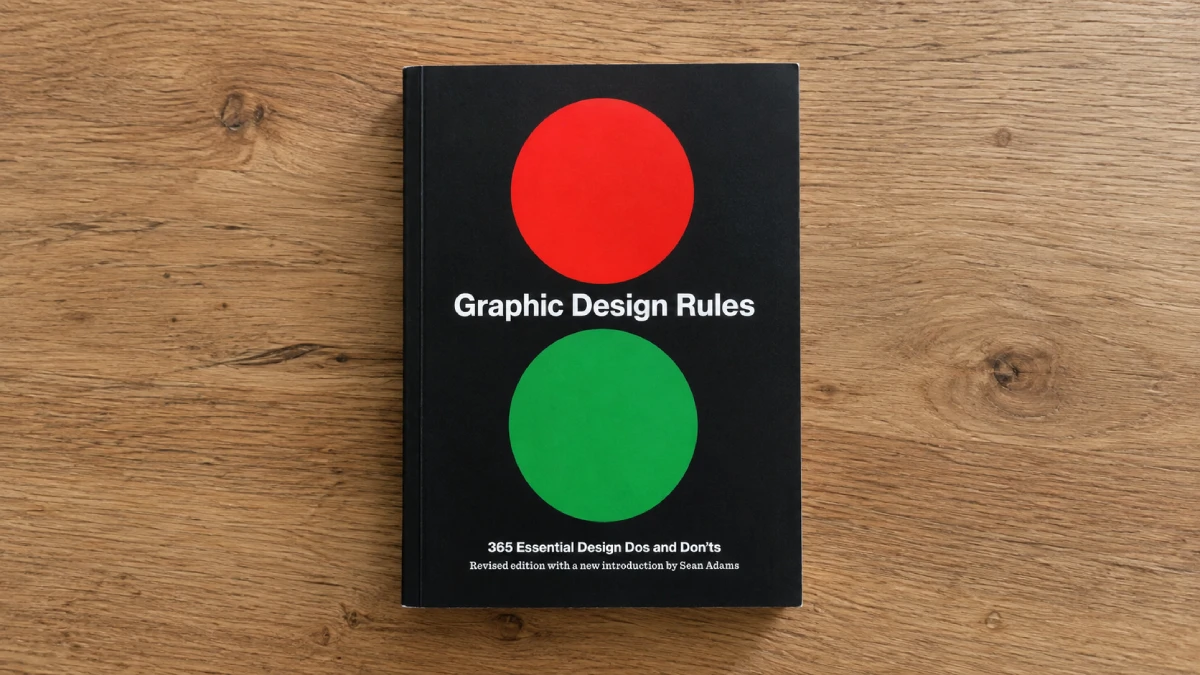
A Chapter-by-Chapter Book Review of Graphic Design Rules by Princeton Architectural Press
Some design books age like Helvetica, while others age like a Comic Sans wedding invitation. Graphic Design Rules: 365 Essential Design Dos and Don’ts is somewhere in between, and that split is exactly what makes it worth talking about. Four authors, one almanac format, 365 entries, and a foreword that admits half the book exists to be argued with. I spent a week reading it the way you’d actually use it: one rule at a time, out loud, with my red pen nearby.
What Is Graphic Design Rules Actually For?
Princeton Architectural Press published this book as a daily-dose reference, not a manual you read front to back. Each entry gets a page or a spread: a rule stated in plain language, a short argument for it, and often a counter-argument buried in the same paragraph. The book is organized into seven sections—The Book of Rules, Type & Typography, Layout & Design, Color, Imagery & Graphics, Production & Print, and The Practice of Design—followed by author biographies. That structure matters more than the marketing copy lets on. It means the book is really two books stitched together: a technical primer for people who don’t yet know what a baseline grid is and a running argument among four working designers who don’t always agree with each other.
Sean Adams, Peter Dawson, John Foster, and Tony Seddon aren’t newcomers padding a resume. Adams chairs the graphic design program at ArtCenter and has designed for Adobe and Sundance. Dawson co-founded Grade Design in London and wrote The Field Guide to Typography. That pedigree shows up in the sharper entries and disappears completely in the weaker ones, which read like they were written to hit a page count rather than say something new.
The Good Rules: Where the Book Is Absolutely Convincing
The typography section is the strongest chapter, and it’s not close. Rules about hierarchy, kerning pairs, and when tracking should be loosened versus tightened are stated with the kind of confidence that only comes from having fixed the same mistake in a junior designer’s file two hundred times. A rule on widows and orphans doesn’t just tell you they’re bad—it explains why a lone word on the last line breaks the reader’s rhythm at exactly the wrong moment, right before they finish the paragraph.
The production and print chapter is the sleeper hit of the book. I’ve seen design guides that skip this entirely, assuming everything ships as a PDF now. This one doesn’t. Bleed, trapping, paper stock, and the difference between coated and uncoated ink absorption get real attention. If you’ve ever sent a file to a printer and gotten it back wrong, this chapter explains why, in a language a non-designer can actually follow.

Where the Almanac Format Breaks Down
Here’s the problem with 365 rules: not every day of the year deserves a rule. Some entries in the color chapter restate the same point about contrast three or four different ways across the book, just with a different color swatch on the page. A few entries in Layout & Design feel like filler—advice so general it would apply to interior design, architecture, or plating a restaurant dish. General advice isn’t wrong. It’s just not a rule, and calling it one undersells the entries that actually are.
I’ll say the unpopular thing: several of the “don’ts” in this book are opinions dressed up as commandments, and the authors know it, because half the entries include a hedge in the second paragraph. A book that titles itself Rules and then spends its foreword warning you the rules are negotiable is having it both ways. That tension is honest. It’s also a little frustrating when you’re looking for a firm answer and get a shrug instead.
Who Should Actually Buy This
Design students and career changers get the most out of this. It compresses years of studio critique into 384 pages, and the almanac format means you can absorb it in small doses without losing the thread. Working designers with five or more years in the field will recognize most of the content already, though the production chapter is worth the cover price on its own if you’ve never worked directly with a print shop.
If you want a systematic textbook, this isn’t it. If you want a book you can open at random on a Tuesday and walk away slightly better at your job, it delivers.
Graphic Design Rules at a Glance
| Detail | Information |
|---|---|
| Authors | Sean Adams, Peter Dawson, John Foster, Tony Seddon |
| Publisher | Princeton Architectural Press (revised edition) |
| Publication date | April 7, 2020 (first published 2012) |
| Length | 384 pages, full color, 365 images |
| ISBN-13 | 978-1-61-689876-2 |
| Chapters | The Book of Rules, Type & Typography, Layout & Design, Color, Imagery & Graphics, Production & Print, The Practice of Design |
| Best for | Design students, career changers, and small business owners doing their own design |
| Weakest for | Senior designers wanting new theory |
Frequently Asked Questions
Is Graphic Design Rules a good book for beginners?
Yes. The almanac format and plain-language explanations make it one of the more approachable entry points into graphic design theory, especially the typography and production chapters.
Does this book cover digital design and UX?
Only lightly. The focus stays on print-rooted fundamentals—typography, layout, color, and production—rather than interface design or digital-first workflows.
Is the 2020 edition different from the original 2012 version?
The 2020 edition is listed as a revised edition with a new introduction by Sean Adams, though the core 365 rules and chapter structure carry over from the original.
Can working designers still learn something from it?
Selectively. Most of the color and layout chapters will feel familiar to anyone with a few years of studio experience. The production and print chapter holds up best for working professionals.
Is it worth buying over just reading design blogs?
The value is in the curation and the print-production depth, not novelty. If you already follow strong design blogs and studios, you’ll recognize a lot of this. If you don’t, the book saves you months of scattered reading.
Browse WE AND THE COLOR’s Graphic Design and Book categories for more.
Subscribe to our newsletter!