Tomás, a traditional tea house – store identity by Savvy Studio from Monterrey, Mexico.
Look at this beautiful branding project! Monterrey, Mexico based Savvy Studio was asked to create a sophisticated store identity for Tomás, a tea house that portrays the history, tradition, and culture of its fine teas.
The name Tomás references to Thomas Sullivan. He was a merchant based in New York City who carefully wrapped tea leaves in fabric sachets in order to offer the first commercial tea bag.
The design team of Savvy Studio came up with a simple and clean store identity. Their goal was to portray tea as an experience through scent and taste. The complete brand design is based on the daily ritual and the associated lifestyle of drinking tea. A complex graphic system has been developed to help identify all products.
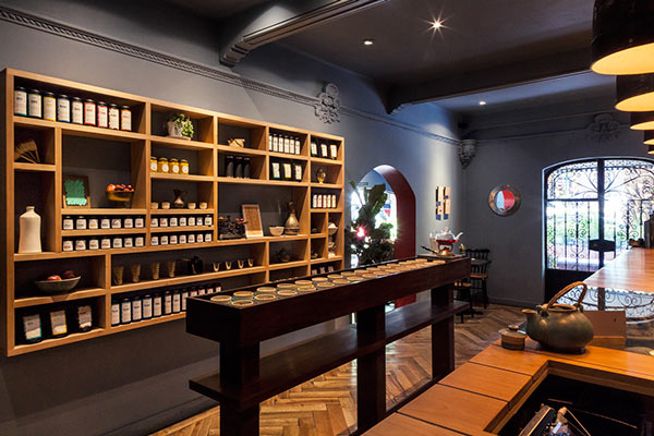
Also the store interior design reflects the culture of drinking tea. They decided to use colors, which seemingly talk about the wide variety of blends and cultural influences. In the main room, customers can find individual teas packaged in large tin containers, which are unified and coded by Savvy Studio’s graphic system. All of the interiors provide a pleasant, home-like feeling. Especially the included tea room offers a cozy atmosphere that invites you to linger and enjoy a cup of tea.
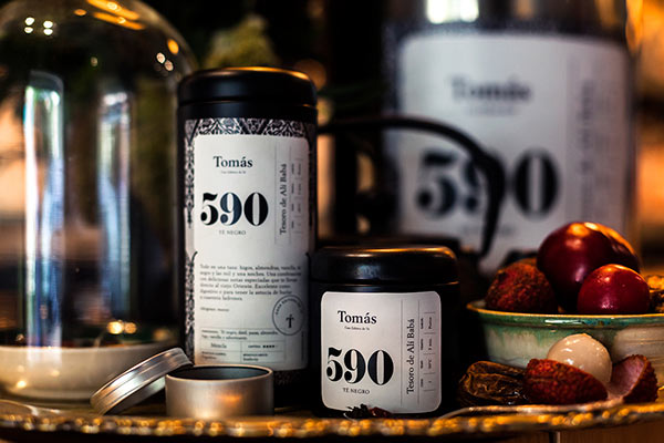
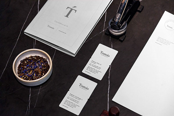


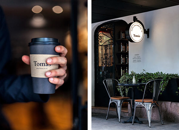

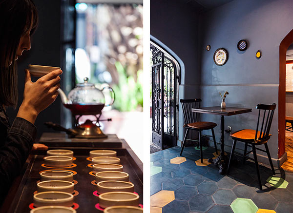
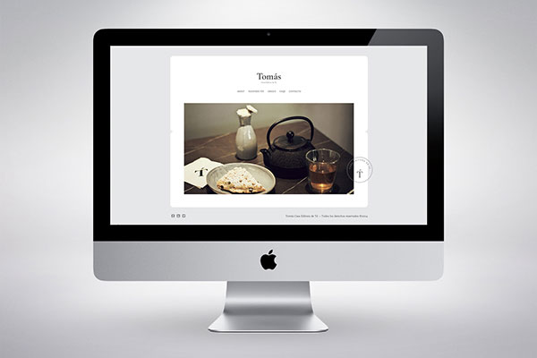
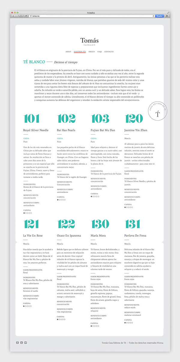










The softness of the rounded corners, fonts, and the background choices work really well to highlight the quaint sophistication of this branding set.
That small notched waist between the “main” label and the description below on the tall tins segregates so subtly–very smart. Lovely work!