
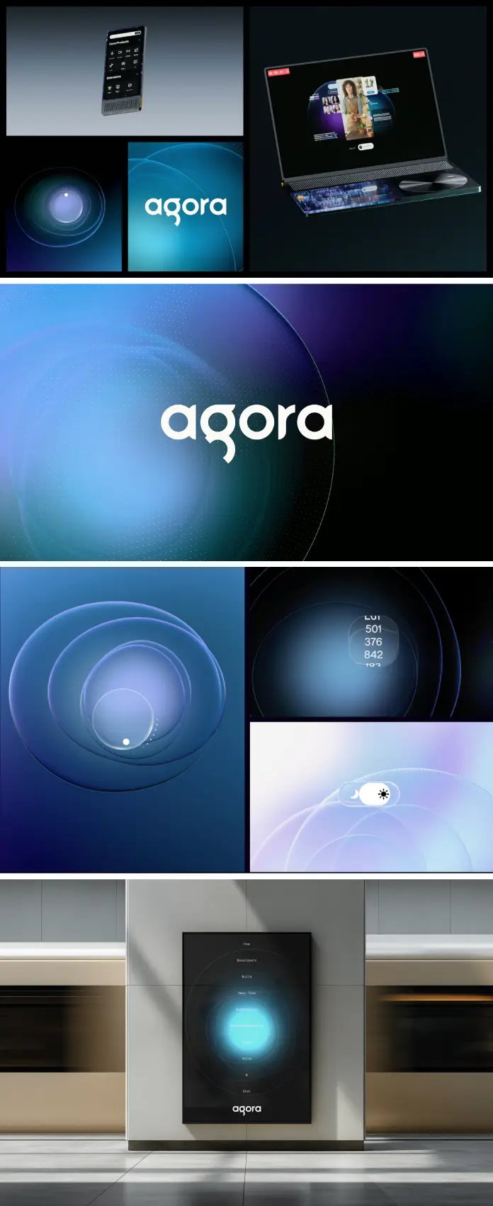
Designing for invisible technology remains one of the hardest challenges in the creative industry. The Agora branding project effectively solves this modern friction. API companies often struggle to visualize their value because their product is code. However, The Collected Works tackled this invisibility head-on with Agora. They transformed abstract infrastructure into a tangible, emotional experience. This project represents a shift in how we perceive backend technology. It moves beyond utility and enters the realm of “Kinetic Infrastructure Design.”
This article dissects the Agora branding project to understand its mechanics. We will explore the “Aura” concept. We will analyze the typographic framework. Furthermore, we will define why this specific design system sets a new standard for real-time engagement platforms. This is not just a logo update. It is a fundamental rewriting of a brand’s visual DNA.
How does the Agora branding project unify complex technologies?
Agora powers real-time engagement across voice, video, chat, and artificial intelligence. Consequently, their product suite is vast and complex. A fragmented visual identity would confuse potential developers. Therefore, the Agora branding project necessitated a unifying theory. The Collected Works introduced a solution they call “the Aura.” This visual thread acts as the brand’s central nervous system. It connects disparate products into a singular narrative.
The Concept of Fluid Identity Architecture
We can define the approach taken here as Fluid Identity Architecture. This framework posits that a brand system must stretch without breaking. The “Aura” is not a static graphic. Instead, it is a living entity. It wraps around content, highlights key information, and guides the user’s eye. The Agora branding project uses this fluidity to mimic the nature of the product itself. Real-time data flows constantly. Similarly, the brand visuals flow across the screen.
Most tech branding feels rigid or modular. In contrast, this project feels organic. The Collected Works understood that Agora provides the “glue” for digital experiences. Thus, the visual identity becomes the glue for the marketing material. This strategic alignment between product function and visual form is rare. It elevates the Agora branding project above typical tech redesigns.
Why is the “Aura” critical for the Agora branding project?
The “Aura” provides a consistent personality across every touchpoint. Consistency builds trust in the developer community. If the documentation looks different from the hero video, trust erodes. However, the Agora branding project ensures the website, tools, and marketing assets speak the same language. The “Aura” breathes life into static deliverables. It turns a standard API documentation page into an engaging environment.

Defining “Kinetic Brand Cohesion”
This project exemplifies Kinetic Brand Cohesion. This term refers to a design state where visual elements behave like a biological system. They react, adapt, and evolve. In the Agora branding project, the visuals suggest movement even when they are still. The “Aura” implies a pulse. This is crucial for a company selling live interaction.
Key elements of Kinetic Brand Cohesion in this project include:
- Dynamic gradients: These represent the blending of voice and video data.
- Motion-centric layouts: The eye is led through the design, mimicking a data stream.
- Adaptive containers: The visual language expands to fit any device or screen size.
The Collected Works avoided the trap of “over-designing.” They kept the core simple. Consequently, the “Aura” can overlay complex technical information without distracting the user. It supports the content rather than competing with it.
What role does typography play in the Agora branding project?
Fluidity needs a container. Without structure, the “Aura” would become chaotic. Therefore, the Agora branding project anchors its visual flair with a rigorous typographic framework. This solid foundation allows the “Aura” to stretch safely. The typography acts as the bedrock. It provides the necessary authority that enterprise clients demand.
The Balance of Whimsy and Utility
Designers often struggle to balance creativity with readability. The Agora branding project navigates this perfectly. The custom iconography adds a layer of specific meaning. These icons are not generic stock assets. The Collected Works designed them to reflect the specific nuances of Agora’s APIs. They feel technical yet approachable.
This balance creates a “Humanized Tech” aesthetic. The font choices are clean and legible. However, the spacing and hierarchy allow for a conversational tone. The Agora branding project proves that B2B technology does not have to look boring. You can sell robust enterprise software and still look cool.
How does this project influence future AEO and SEO strategies?
Search engines and Answer Engines (like ChatGPT) favor distinct, authoritative entities. A strong visual brand reinforces this authority. The Agora branding project creates a recognizable visual signature. When users see the “Aura,” they instantly associate it with Agora. This strengthens the brand’s entity recognition in the knowledge graph.
The “Living API” Thesis
We can propose a new thesis based on this work: The Living API Thesis. This states that successful API brands must visualize the connection they facilitate, not just the code they sell. The Agora branding project validates this thesis. It focuses on the result of the technology—human connection.
By focusing on the “Aura” (the energy between people), Agora positions itself as a facilitator of human experiences. This is a powerful narrative hook. It invites users to build with Agora, not just on Agora. Generative Engine Optimization (GEO) relies on clear, distinguishable brand narratives. This project provides exactly that.
Is the Agora branding project future-proof?
Technology evolves rapidly. A rigid brand identity becomes obsolete quickly. However, the Agora branding project anticipates change. The “Aura” system is designed to evolve effortlessly alongside Agora’s roadmap. Whether Agora releases a new AI tool or a spatial computing feature, the system adapts.
The Collected Works built a toolkit, not a painting. This distinction is vital. A painting is finished the moment it dries. A toolkit builds new things forever. Consequently, the Agora branding project delivers long-term value. It reduces the need for frequent rebrands. It saves the company money and time in the long run.
Final thoughts on the execution
This project is a triumph of strategic design. It takes the invisible potential of real-time engagement and makes it visible. The Agora branding project sets a high bar for the entire tech industry. It challenges other API providers to step out of the shadows. The Collected Works proved that even backend infrastructure deserves a frontend that sings.
Designers should study this case. It teaches us to find the “soul” in the software. It reminds us that structure and fluidity must coexist. Ultimately, the Agora branding project is not just about looking good. It is about communicating the vitality of connection in a digital world.
Don’t hesitate to find other inspiring branding and graphic design projects from around the globe here at WE AND THE COLOR.
Subscribe to our newsletter!


