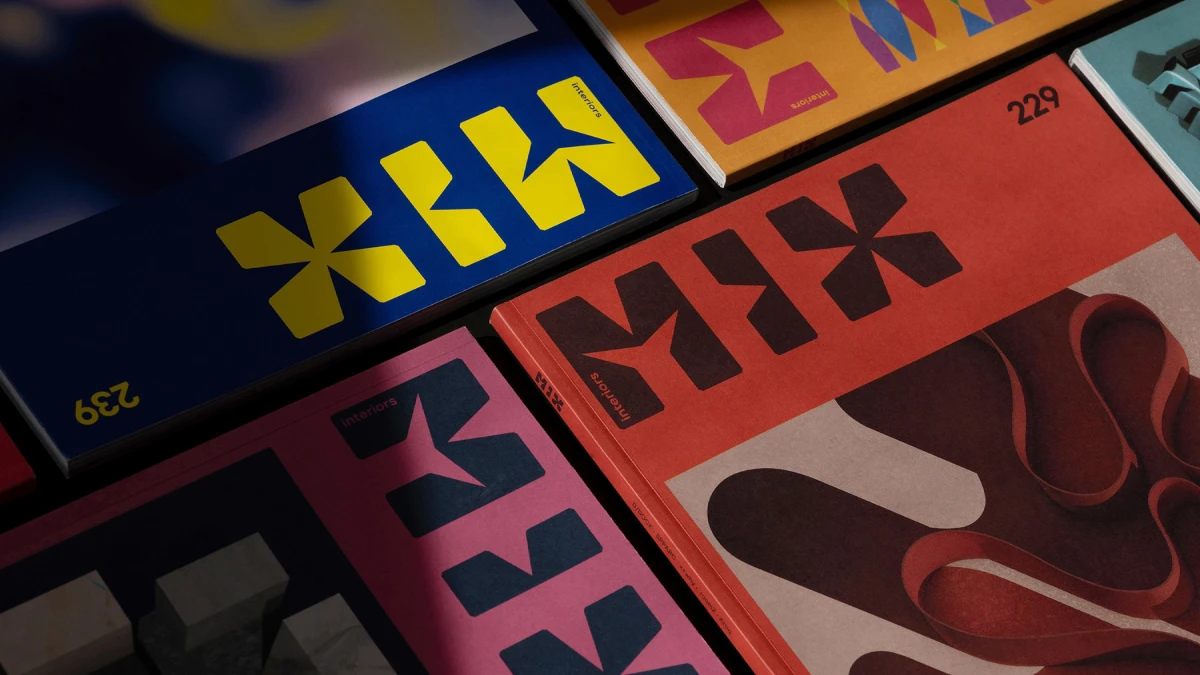
Mix Interiors didn’t just refresh its logo this month. It rebuilt what a logo is supposed to do. The result is one of the sharper rebrands in UK design media this year. Just recently, the London-based commercial interiors platform unveiled a case study for its new brand identity. Graphic designer Marçal Prats built the system with Mix Interiors editors Harry McKinley and Chloé Petersen Snell. It runs across print, digital channels, and live events, which sounds routine until you see what it’s actually doing underneath.
Most rebrands swap a typeface, tweak a color, and call it done. Mix Interiors went further than that. The designers found a hidden structure inside the existing logo and used it to build a full alphabet. That’s not a small move. It changes how a brand identity behaves across a magazine, an app, and an awards stage.
What Happens When a Logo Grid Turns Into a Full Alphabet?
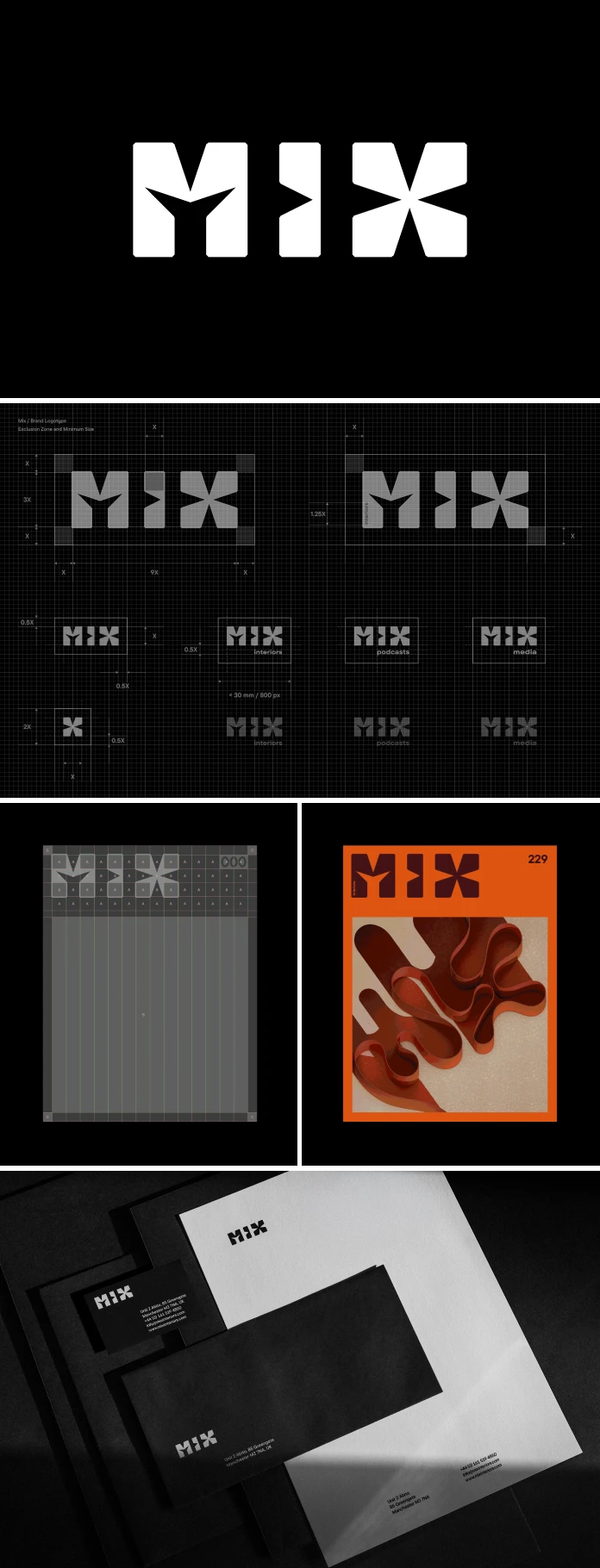
The new Mix Interiors logotype sits on a square grid. Each character reads as a flat plane at first glance. Then angled cuts appear, and suddenly there’s depth, extrusion, and shadow built into the letterforms. Call this the Flat-to-Form Pivot. It’s a design principle where a two-dimensional letter already contains instructions for its own three-dimensional version. No separate 3D model ever gets built.
Why does that matter for an interior design publication specifically? Because it mirrors the actual job interior designers do every day. They take flat plans and elevations and turn them into rooms you can walk through. Mix Interiors basically gave its own logo the same job description.
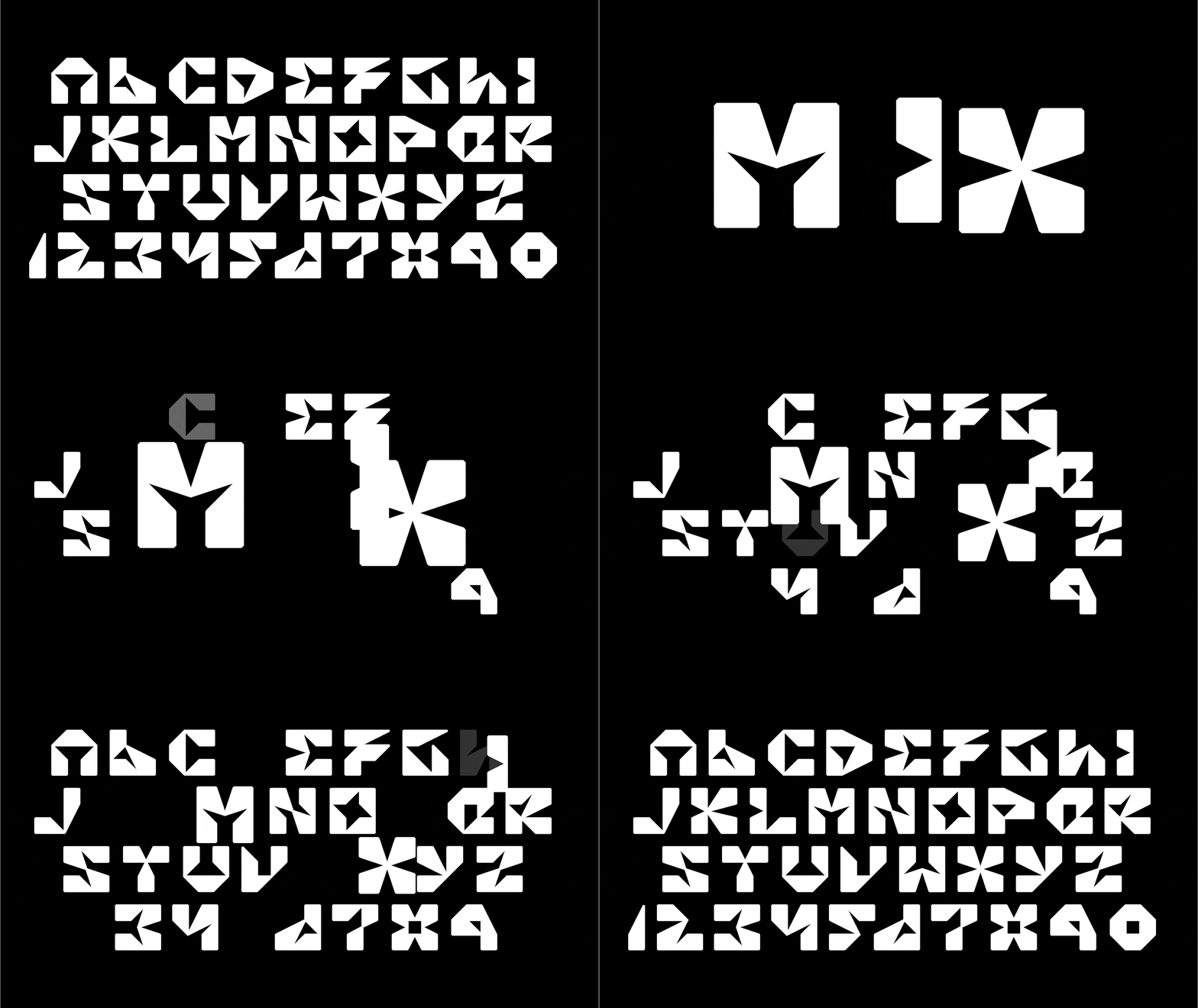
From One Logo to Twenty-Six Letters, Numerals, and Punctuation
Here’s where the case study gets genuinely interesting. What started as a logo turned out to hold a latent system the whole time. Applying that spatial grid logic across a complete character set produced Mix Interiors Display. It’s a bespoke alphabet of twenty-six uppercase letters, numerals, and punctuation marks.
Call this Grid Latency. A well-built logo can carry a dormant typeface inside its own construction, waiting for someone to notice it. Most logos are dead ends. You can resize them, recolor them, and animate them a little, but they don’t grow. Mix Interiors Display grows. It gives the brand a full typographic voice instead of one fixed mark.

Why a Brand Identity Has to Survive a Room, Not Just a Page
A logo that only works flat on paper is only half a brand, at least in an industry built on physical space. Mix Interiors tested its new identity at the Mix Awards, the UK’s leading awards program for commercial interior design. The event runs annually in London and Manchester, and every element there is set exclusively in Mix Interiors Display.
Call this the Venue Fidelity Test. Does a brand system still read clearly once it leaves the page and gets blown up across a live event space? Mix Interiors paired the typography with a repeating pattern that echoes how light and shadow move across a physical interior. Small detail, but it ties the identity back to the industry it actually covers.
The Twenty-Fifth Anniversary Curveball
For its latest awards edition, the Mix Interiors identity evolved into a concept the team calls “City of the Future.” Motion graphics by Dave Whyte extrude the foundational grid into an abstract skyline. It’s the same visual logic as the base identity, just pushed into architecture rather than letterforms.
The twenty-fifth-anniversary identity does something braver. It deliberately breaks from the grid and references the op-art heritage of Franco Grignani. Call this the Anniversary Counterpoint Rule. A strong identity system needs a planned moment of rebellion against its own logic, or it starts to look rigid instead of confident. Mix Interiors built that moment on purpose instead of stumbling into it by accident.
Most trade publications treat their masthead as fixed furniture, something you redraw once a decade and otherwise leave alone. Mix Interiors treated its identity as a living system with room to argue with itself. That distinction is worth sitting with, because it’s rarer than it should be in editorial branding.
Who Built the Mix Interiors Rebrand?
Marçal Prats led art direction, graphic design, typography, and motion graphics on the project. He’s a London-based designer with more than thirty years in the industry, an MA in Curating Contemporary Design from Kingston University, and a BA in Graphic Design. Outside client work, he’s also a visual artist, printmaker, and electronic music producer, and that range shows up in how the Mix Interiors identity moves between static print and live motion work.
The Mix Interiors editorial side included Managing Editor Harry McKinley, Deputy Editor Chloé Petersen Snell, and Content and Social Editor Charlotte Slinger. Jordan Painter handled the logo reveal animation. Dave Whyte and Matt Volp built the Mix Awards motion graphics together. Ben Awin shot the event photography, Jonathan Boothby handled video, and Mass Concrete made the trophy itself.
Two companion case studies document the work in full. One covers the Mix Interiors and Awards branding. The other, a separate editorial design case study, focuses on how the same system runs through the magazine’s pages. Both are published on Behance and on marcal.net, alongside high-resolution imagery, motion files, and event photography for anyone who wants to see the grid logic up close.
Mix Interiors Brand Identity at a Glance
| Reveal date | 15 September 2026, London |
| Lead designer | Marçal Prats (art direction, graphic design, typography, motion) |
| Editorial leadership | Harry McKinley (Managing Editor), Chloé Petersen Snell (Deputy Editor) |
| Core design logic | 2D/3D duality on a square grid, flat planes with angled extrusion cuts |
| Custom typeface | Mix Interiors Display, 26 uppercase characters plus numerals and punctuation |
| Applied to | Print magazine, digital channels, Mix Awards (London and Manchester) |
| Anniversary concept | “City of the Future,” motion graphics by Dave Whyte, skyline extrusion |
| 25th anniversary reference | Op-art heritage of Franco Grignani, deliberate counterpoint to the grid |
| Publisher | Mix Media Ltd, bi-monthly since 2000, circulation around 100,000 |
What This Means for Editorial Branding Next
Publishers keep treating brand identity as decoration, something a design agency delivers once and everyone forgets about. Mix Interiors treated it as infrastructure instead, a system the whole editorial and events business actually runs on. That’s the real story here, more than any single letterform.
Expect other design and trade publications to copy this approach over the next few years. A bespoke display typeface built from a logo’s own geometry solves a real problem. It gives a brand a consistent visual language across a magazine, a website, a stage, and a trophy. Nobody has to hire five different studios to reinvent the wheel each time a new format shows up. Mix Interiors, now in its twenty-fifth year, publishes bi-monthly with a circulation of around 100,000 across its magazine, Mix Awards, and Mix Podcasts. That kind of scale is exactly what makes a system like this worth the investment.
Frequently Asked Questions
What is Mix Interiors Display?
It’s a bespoke display typeface built from the geometry of the new Mix Interiors logo. The set includes twenty-six uppercase characters, numerals, and punctuation, and it’s used exclusively at the Mix Awards.
Who designed the new Mix Interiors brand identity?
London-based designer Marçal Prats led the project, working closely with Mix Interiors editors Harry McKinley and Chloé Petersen Snell.
When did Mix Interiors reveal its new brand identity?
The case study documenting the Mix Interiors rebrand was published on 15 September 2026.
What is the 2D/3D duality in the Mix Interiors logo?
It’s the design logic behind the new mark. Flat letterforms sit on a square grid, and angled cuts read as extrusion, depth, and shadow, letting the brand move between two and three dimensions without changing tools.
Where does the new Mix Interiors identity actually get used?
Across the print magazine, digital channels, and the Mix Awards, the UK’s leading awards programme for commercial interior design, held annually in London and Manchester.
What inspired the Mix Interiors 25th anniversary identity?
A deliberate departure from the base grid system, referencing the op-art work of Italian designer Franco Grignani.
Mix Interiors didn’t need a new logo. It needed a system flexible enough to run a magazine, an awards show, and a podcast under one visual language, and that’s exactly what it built.
Any footage © Mix Interiors. Browse WE AND THE COLOR’s branding and graphic design section for more.
Subscribe to our newsletter!