This post contains affiliate links. We may earn a commission if you click on them and make a purchase. It’s at no extra cost to you and helps us run this site. Thanks for your support!
Tan Jardiniere by TanType is a Chic and Quirky Display Sans Serif with Mid-Century Elegance
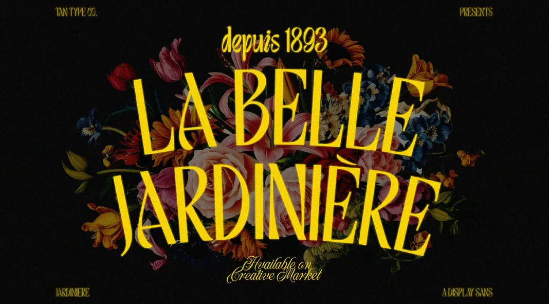
The Tan Jardiniere font by TanType masterfully blends mid-century modern aesthetics with a contemporary twist. This display sans serif font offers a perfect balance between chic elegance and playful quirkiness, making it a versatile option for designers seeking to inject personality into their projects while maintaining an air of sophistication. With its roots in mid-century design, the typeface draws inspiration from the minimalist yet artistic forms of that era, delivering a timeless yet modern appeal.
A Bold Aesthetic with Subtle Whimsy
At first glance, Tan Jardiniere captivates with its tall, slender letterforms that possess a distinct retro charm. The exaggerated curves and subtle angular details give the font its unique flair, setting it apart from more conventional sans serifs. While it maintains the structural simplicity that characterizes mid-century fonts, the addition of quirky, playful elements brings warmth and a sense of wonder to the design, making it suitable for creative and expressive branding, editorial work, or digital displays.
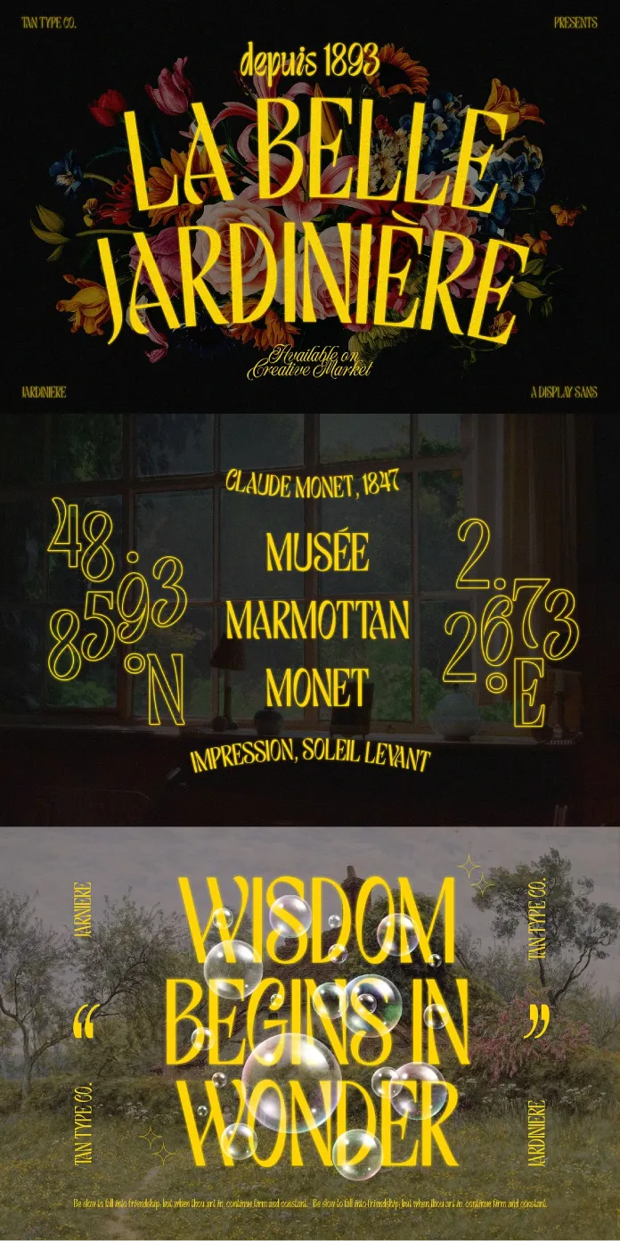
The stylistic choices in Tan Jardiniere evoke a sense of vintage luxury, reminiscent of high-fashion typography from the 1960s. Its letterforms are elegantly proportioned, with wide spaces between letters, enhancing readability without compromising on style. The deliberate design of elements like the capital “A” and lowercase “g” showcase a playful edge, ideal for brands or projects looking to stand out with a bit of eccentricity.
Multi-Language Support for Global Applications
One of the standout features of Tan Jardiniere is its robust support for multiple languages. This expands its utility far beyond English-speaking markets, making it a perfect choice for international projects and brands aiming to reach a diverse audience. Whether for European languages or more complex characters, the font’s adaptability ensures that its charm translates across linguistic borders.
File Formats and Versatility
Tan Jardiniere comes in multiple formats, including OTF, WOFF, and WOFF2, offering flexibility across different platforms and devices. This ensures that the font maintains its visual integrity whether used for print media, web design, or digital branding. The variety of file formats supports efficient loading for web usage, ensuring a smooth user experience without sacrificing quality.
Perfect for Branding and Editorial Design
With its chic and stylish design, Tan Jardiniere is well-suited for a range of applications, from editorial layouts to branding for luxury or lifestyle products. Its mid-century-inspired roots make it an excellent choice for designs looking to evoke nostalgia while still embracing modern aesthetics. The font’s quirky details and high legibility make it equally effective for headlines, posters, or even logos.
Tan Jardiniere by TanType is a sophisticated yet playful sans serif that strikes the perfect balance between vintage and modern styles. With its mid-century-inspired design, multi-language support, and variety of file formats, it’s an excellent choice for designers looking to elevate their projects with a font that is both timeless and trendy. Whether for branding, editorial design, or digital displays, Tan Jardiniere brings a fresh, chic, and quirky flair that will undoubtedly leave a lasting impression.
This font is an essential addition to any designer’s toolkit, especially for those seeking a distinctive and stylish sans serif with character.
All images © by TanType. Feel free to find other trending typefaces in the Fonts section on WE AND THE COLOR.

