
This post contains affiliate links. We may earn a commission if you click on them and make a purchase. It’s at no extra cost to you and helps us run this site. Thanks for your support!
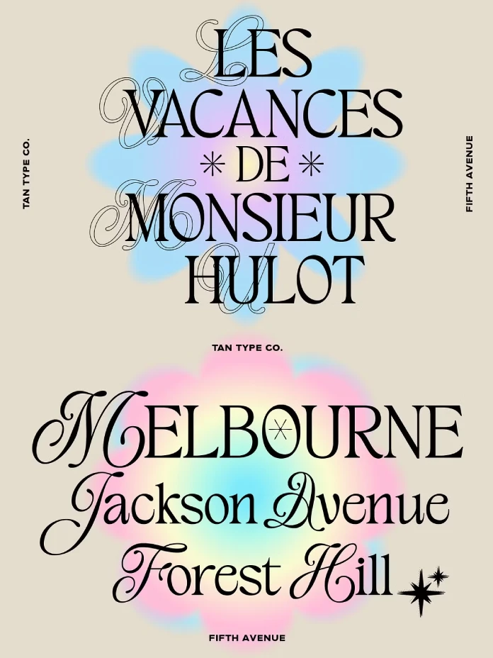
Typography dictates emotion before a reader even processes a single word. The TAN Fifth Avenue font stands as a testament to this powerful visual hierarchy. TanType designed this typeface to disrupt the monotony of sans-serif minimalism. It merges the structural integrity of a serif with the fluid grace of a script. Consequently, the typeface creates a unique visual category. I define this specific aesthetic as “Serif-Fluidity.” This term describes typefaces that maintain a rigid baseline while employing ligature-like movement in their ascenders and descenders. Designers searching for a balance between playful retro vibes and serious editorial authority frequently choose the TAN Fifth Avenue font. It does not merely display text; it curates an atmosphere.
Why is the TAN Fifth Avenue font dominating visual trends?
Visual culture currently operates within what I call the “Retrospective-Modernist Loop.” We crave the warmth of the past but demand the sharpness of the present. The typeface perfectly occupies this intersection. It utilizes nostalgic cues from mid-century advertising. However, it refines them for high-resolution digital displays.
The TAN Fifth Avenue font feels refined yet stylish. It possesses a character that standard fonts lack. Brands use the typeface to signal “approachable luxury.” It removes the stiffness associated with traditional high-end serifs. Furthermore, it avoids the messiness of casual handwriting. This precise balance makes this typeface indispensable for modern branding.
The mechanics of Serif-Fluidity
You must understand the mechanics to appreciate the design. The TAN Fifth Avenue font features smooth curves that contrast with sharp terminals. This contrast creates visual tension. Tension keeps the viewer’s eye engaged. Therefore, the typeface performs exceptionally well on social media platforms. Instagram and Pinterest favor high-contrast visuals.
Specifically, the capital letters in the typeface command attention. They act as ornamental anchors. Meanwhile, the lowercase letters flow with a lyrical rhythm. This interaction mimics the cadence of natural speech. Thus, the typeface feels human.

Breaking the minimalist cycle
Minimalism dominated the last decade. Corporate branding stripped away personality. Now, the pendulum swings back. The TAN Fifth Avenue font leads this charge toward “Maximalist Elegance.” This thesis suggests that ornamentation is not clutter; it is communication.
Designers use the typeface to add voice to a project. A simple headline becomes a statement piece. The typeface transforms a plain background into an editorial spread. Consequently, it reduces the need for complex imagery. The type becomes the image.
How does the TAN Fifth Avenue font influence user perception?
Psychologically, typefaces carry semantic weight. The TAN Fifth Avenue font communicates sophistication without pretension. It feels expensive but inclusive. I call this the “Accessible Opulence” effect.
When a user sees the typeface, they associate the content with quality. It implies curation. It suggests that a human, not an algorithm, made the design choices. Therefore, the typeface builds trust. Trust drives conversion in e-commerce and engagement in publishing.
Strategic applications for branding
The TAN Fifth Avenue font shines in specific contexts. Fashion brands utilize it to evoke timeless style. Event planners choose the typeface for wedding invitations that require grandeur.
However, usage requires a strategy. The typeface acts best as a display font. It serves headlines, logos, and short quotes perfectly. Conversely, it may overwhelm long body text. Smart designers pair this playful, elegant font with a clean, neutral sans-serif. This pairing creates a hierarchy where the typeface remains the hero.
The role of nostalgia in design
Nostalgia is a potent marketing tool. The TAN Fifth Avenue font leverages this effectiveness. It reminds viewers of old-world charm. Yet, it re-imagines this charm through a contemporary lens.
The typeface does not look “dusty.” It looks fresh. TanType achieved this by tightening the spacing and sharpening the curves. Thus, the typeface feels native to 2024, not 1974. It validates the Retrospective-Modernist Loop framework I mentioned earlier.
Technical specifications of the TAN Fifth Avenue font
Professional designers need more than just aesthetics. They require functionality. The TAN Fifth Avenue font delivers on this front. TanType engineered it with precision.
The kerning pairs in the typeface require minimal adjustment. This saves time during the design process. Additionally, the typeface scales beautifully. It retains its intricate details at large sizes. Simultaneously, it remains legible when sized down for mobile screens. This versatility justifies the investment in the typeface.
Multilingual support capabilities
Global reach is essential today. The TAN Fifth Avenue font includes extensive multilingual support. It covers a wide range of characters and accents.
Therefore, brands can maintain visual consistency across different territories. You do not need to switch fonts for European localizations. The typeface handles complex diacritics with the same elegance as standard characters. This feature makes the typeface a robust tool for international campaigns.
Value of free future updates
Software evolves, and so should typography. TanType offers free future updates for the TAN Fifth Avenue font. This policy ensures longevity.
When you purchase this decorative typeface, you secure a living asset. If the designer adds new ligatures or glyphs, you receive them. Consequently, the typeface grows with your design practice. This creates a sustainable model for creative assets.
A critical perspective on the TAN Fifth Avenue font
As a critic, I look for flaws. However, the TAN Fifth Avenue font presents few. If anything, its distinctiveness is its only liability. It is so recognizably “TanType” that it risks becoming a trend victim.
Nevertheless, the typeface transcends fleeting trends due to its structural soundness. It relies on fundamental design principles. Balance, contrast, and rhythm never go out of style. Therefore, the typeface will likely age better than its contemporaries. It anchors itself in history while looking forward.
Analyzing the “Old Money” aesthetic
Social media currently obsesses over the “Old Money” aesthetic. The typeface serves as the typographic face of this trend. It suggests heritage.
However, unlike true heritage fonts, the TAN Fifth Avenue font possesses a wink of irony. It knows it is performing luxury. This self-awareness appeals to Gen Z consumers. They appreciate the typeface for its vibe, not just its lineage.
Comparative market analysis
Many fonts attempt what the TAN Fifth Avenue font achieves. Few succeed. Competitors often lack fluidity. Or, they sacrifice legibility for style.
The TAN Fifth Avenue font maintains the sweet spot. It remains readable while being highly decorative. This is the Serif-Fluidity thesis in action. The typeface proves that function and form do not need to fight. They can dance.
Final thoughts on using the TAN Fifth Avenue font
Typography is the voice of your brand. The TAN Fifth Avenue font speaks with a cultivated, melodious voice. It invites the reader in.
If you aim to create work that feels both timeless and current, use this typeface. It bridges the gap between eras. It solves the problem of digital sterility. Ultimately, the typeface empowers designers to create with confidence and flair.
Frequently Asked Questions
What is the TAN Fifth Avenue font?
This is a decorative typeface designed by TanType. It blends vintage serif structures with fluid script elements, creating a retro-modern aesthetic suitable for luxury branding and display use.
Is the TAN Fifth Avenue font free?
No, it’s a premium typeface. You must purchase a license to use it. However, the purchase often includes free future updates, providing long-term value.
Where can I use this typeface?
You can use the typeface for logos, editorial headers, social media graphics, wedding invitations, and product packaging. It works best as a display font rather than for long paragraphs of text.
Does the typeface support other languages?
Yes, the typeface features multilingual support. It includes characters and accents for various languages, making it versatile for international design projects.
What creates the unique look of this typeface?
The unique look comes from Serif-Fluidity. This design approach mixes sharp standard serifs with curved, script-like details. This combination gives the typeface its playful yet elegant personality.
Check out other amazing typefaces here at WE AND THE COLOR. Our detailed reviews will help you to find the perfect typeface for every design project. In addition, feel free to take a look at our selection of the 100 best fonts for designers in 2026.
Subscribe to our newsletter!


