
This post contains affiliate links. We may earn a commission if you click on them and make a purchase. It’s at no extra cost to you and helps us run this site. Thanks for your support!
Have you ever considered how much they influence what you read and how you feel about it? It’s fascinating, isn’t it? Fonts aren’t just letters on a screen or page; they have personalities. They whisper, they shout, they can feel serious or playful, modern or classic. Choosing the right one is like picking the right outfit – it sets the tone, makes an impression, and communicates a message even before the words themselves sink in. It’s a subtle art, but one that designers pour their hearts into. And sometimes, a truly special typeface comes along, one that just clicks with creatives and brands alike. It becomes more than just a tool; it feels like a partner in design. We’re talking about those rare gems that balance technical perfection with a touch of soul, making them incredibly versatile yet uniquely recognizable. One such standout is the Sofia Pro font family.
If you’ve spent any time in the design world or even just browsed the web, chances are you’ve encountered Sofis Pro’s friendly, geometric charm. It has this wonderful ability to be clear and professional while still feeling warm and approachable. Think of it like that incredibly capable colleague who also happens to be genuinely lovely to chat with. Sofia Pro has built a quiet reputation over the years, becoming a go-to choice for countless projects. But guess what? Something big just happened. The Sofia Pro you know and love has undergone a major transformation, an evolution that takes its inherent strengths and dials them up significantly. It’s like seeing a good friend return after some time away, looking sharper, more capable, and ready for absolutely anything.
This isn’t just a minor tweak; it’s a reimagining that promises to reshape how designers work with this beloved typeface. Ready to see what’s new?
The complete family is available for purchase from these platforms:
The Enduring Charm of the Original Sofia Pro
Before we explore the exciting new developments, let’s appreciate the foundation. The original Sofia Pro, brought to life by the talented Olivier Gourvat at Mostardesign, wasn’t just another geometric sans-serif. It had character. Launched initially in 2009 and then significantly refined in 2012, Sofia Pro quickly distinguished itself.

Drawing inspiration from classics like Paul Renner’s Futura, it carved its own niche. How? By softening the strict geometry just enough. Its harmonious curves and open terminals felt welcoming, almost conversational. This unique blend of modern precision and subtle warmth gave Sofia Pro an affable personality, making it feel both sophisticated and accessible. It’s a quality that’s harder to achieve than it looks, right?
Designers embraced its reliability. With 16 styles, covering 8 weights from a delicate Ultra-Light to a powerful Black (each with matching italics), Sofia Pro offered remarkable versatility. Need a strong headline that commands attention? Sofia Pro Black delivered. Need clear, readable body text for a website or brochure? Its lighter weights were perfect. It adapted effortlessly, always hitting the right note.
But its appeal went beyond mere functionality. There’s an undeniable magnetic quality to Sofia Pro. This wasn’t lost on major global brands. Think about giants like TikTok, Pepsi, Wayfair, and Tim Hortons, or even the magical world of Harry Potter – they all saw something special in Sofia Pro. Its exceptional readability, especially on screens, and its modern yet timeless feel made it a perfect fit for brands aiming to connect with contemporary audiences. It managed to stand out in a crowded digital landscape, proving that simplicity and personality can coexist beautifully. Choosing Sofia Pro felt like choosing a trusted ally, a signature voice that could be charming or bold, but always unforgettable.
The complete family is available for purchase from these platforms:
Unveiling the Evolution: The All-New Sofia Pro Arrives
Fast forward to April 2025, and Mostardesign has gifted the design community with a monumental update to Sofia Pro. This isn’t merely adding a few new weights; it’s a fundamental expansion that elevates the family to a whole new level of utility and creative potential. Get ready for a significantly larger toolkit!
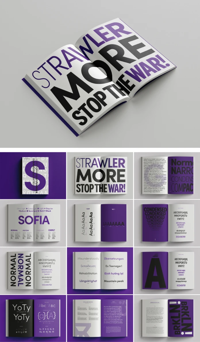
The updated Sofia Pro now boasts an impressive 64 fonts. Yes, you read that right – sixty-four! These are intelligently organized across four distinct width families, offering unprecedented control over horizontal space:
- Normal (100): The classic Sofia Pro width you’re familiar with.
- Narrow (90): Slightly slimmer, perfect for when space is tighter but readability is still paramount.
- Condensed (80): Noticeably narrower, excellent for impactful headlines or fitting more text in constrained areas like tables or mobile interfaces.
- Compact (70): The most space-efficient version, designed for situations where maximum text density is required without sacrificing clarity completely.
What does this mean for you, the designer? Think about the possibilities! Creating complex editorial layouts, designing responsive websites that adapt seamlessly across devices, and crafting intricate packaging information – these tasks just became much easier. These additional widths aren’t just variations; they are precision tools designed to solve specific typographic challenges. Have you ever struggled to make a headline fit just right, or wished you could condense body text slightly without making it unreadable? This expanded Sofia Pro family directly addresses those needs.
Flexibility Meets Global Reach: Variable Fonts and Expanded Language Support
The expansion in widths is just one part of this exciting upgrade. The new Sofia Pro also embraces cutting-edge font technology by incorporating a variable font format. What’s a variable font? Imagine having all those weights and widths, plus everything in between, contained within a single, efficient file.
This gives designers unparalleled flexibility. You can fine-tune the weight or width of Sofia Pro with incredible precision, moving smoothly between styles without being locked into predefined steps. Need something just a bit bolder than Regular but not quite Medium? Or perhaps a width precisely between Normal and Narrow? The variable Sofia Pro font makes it possible. This is revolutionary for responsive design, allowing text to adapt fluidly to different screen sizes and orientations, ensuring optimal legibility and aesthetic balance everywhere. It’s like having a typographic multi-tool at your fingertips.
Furthermore, Mostardesign recognized the need for global communication. The updated Sofia Pro significantly expands its language support. It now includes comprehensive character sets for Cyrillic, Greek, and Vietnamese. This is huge! It means brands and designers can maintain typographic consistency across a much wider range of languages and markets. Imagine rolling out a global campaign using Sofia Pro and having your branding look and feel cohesive, whether it’s presented in English, Russian, Greek, or Vietnamese. This commitment to broader language support makes Sofia Pro an even more powerful and inclusive choice for international projects. This update truly sets a new benchmark for functional, beautiful, and globally-minded type design.
Sofia Pro Gives Back: Supporting the Fight Against Climate Change
Here’s where the story takes a truly inspiring turn. Mostardesign, guided by Olivier Gourvat’s vision, believes that design can, and should, contribute to positive change. With the launch of the new Sofia Pro, they’ve introduced a remarkable initiative rooted in their core values: supporting the fight against climate change.
They state it plainly: “We know that typefaces won’t save the planet. But we believe that, in their own way, they can help make it better.” This reflects a growing sense of responsibility within the creative industry. It’s not just about creating beautiful tools anymore; it’s about considering their impact and how they can be used for good. Mostardesign decided they didn’t want to just offer free fonts indiscriminately. They wanted to direct their support strategically, where it could make a tangible difference.
Therefore, alongside the commercial release of the expanded Sofia Pro family, Mostardesign is making a generous offer. They are providing the Sofia Pro Regular and Light styles completely free of charge to qualified non-profit organizations actively working on ecological transition and combating climate change. Think about the impact this could have. These organizations often operate on tight budgets, and professional design tools can be a significant expense. By providing access to high-quality typography like Sofia Pro, Mostardesign aims to help these vital groups improve their communications – their websites, reports, campaigns, and outreach materials – without adding to their financial burden. It’s a practical way to empower those on the front lines of environmental action.
How Environmental Organizations Can Access Free Sofia Pro Styles
Are you part of an organization dedicated to environmental causes or ecological transition? Do you believe powerful communication can help advance your mission? Mostardesign wants to support your work with Sofia Pro.
Accessing the free Regular and Light styles is straightforward. Mostardesign has set up a dedicated process:
- Visit the Application Page: Interested organizations need to navigate to the relevant section on the Mostardesign website (https://www.motyfo.com/npo-form/).
- Fill Out the Form: Complete the application form, providing details about your organization and its work in combating climate change.
- Careful Review: Mostardesign will carefully review each request. They want to ensure the free licenses go to organizations genuinely aligned with the mission of driving ecological transformation.
- Receive Confirmation: Once approved, the organization will receive access to the specified Sofia Pro fonts.
This initiative demonstrates a thoughtful approach to corporate social responsibility. It leverages the value of their creative work – the appeal and utility of Sofia Pro – to directly support causes they believe in. It sends a message that design and purpose can go hand-in-hand. For environmental non-profits, this is a fantastic opportunity to elevate their visual identity and communication effectiveness using a world-class typeface, generously provided by its creators. Sofia Pro is ready to lend its voice to projects making a real difference for our planet.
Why This Sofia Pro Upgrade Matters
So, what’s the big takeaway from this Sofia Pro evolution? It’s multifaceted.
First, for designers, it represents a massive increase in creative freedom and technical capability. The expanded widths and the variable font option make Sofia Pro more versatile and adaptable than ever before. It solidifies its position as a top-tier choice for almost any design challenge, from complex UIs to global branding.
Second, the expanded language support underscores a commitment to inclusivity and global relevance, making Sofia Pro a truly international typeface ready for diverse audiences.
Third, and perhaps most uniquely, the initiative to provide free styles to climate non-profits adds a layer of purpose and meaning. It reframes Sofia Pro not just as a commercial product, but as a tool that can actively contribute, albeit humbly, to positive environmental action. It invites us to think about the role of design and its resources in addressing urgent global issues.
This update isn’t just about adding more fonts. It’s about refining an already exceptional tool, embracing new technology, extending its reach, and connecting it to a meaningful cause. The reimagined Sofia Pro is more powerful, more flexible, and more purposeful. It continues its legacy as a designer’s reliable friend, an elegant signature for brands, and now, an ally in the crucial effort to protect our planet. Have you considered how the tools you use align with broader values? The new Sofia Pro certainly gives us something to think about.
The complete family is available for purchase from these platforms:
All images © by Mostardesign. Feel free to find other professional typefaces for different purposes in the reviews on WE AND THE COLOR.
Subscribe to our newsletter!


