This post contains affiliate links. We may earn a commission if you click on them and make a purchase. It’s at no extra cost to you and helps us run this site. Thanks for your support!
In This Review of the Dessign Maison Typeface, We Explore How This Hybrid Typeface Works.
Dessign Maison landed on my desktop with a promise that sounded like marketing nonsense. One font, two personalities, zero compromise. I have heard that pitch before. Most hybrid fonts split the difference and end up looking confused. So I spent a week testing Dessign Maison in real layouts: packaging mockups, an editorial masthead, a fashion lockup, and a hospitality menu. I wanted to know if SilverStag Type Foundry actually solved the hybrid problem or just renamed it.
You can download the typeface for a very low budget from these platforms:
Here is my conclusion before the details. Dessign Maison is the first hybrid display font I have tested where the tension between geometric and calligraphic forms feels intentional rather than accidental. That distinction matters more than it sounds, and I will explain exactly why it applies to this specific typeface.

You can download the typeface for a very low budget from these platforms:
What Makes a Font “Hybrid” in the First Place?
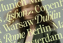
Most fonts marketed as hybrid are actually font pairings. A sans for the body, a script for the accents, bundled together and called a system. Dessign Maison does something different. The hybrid quality lives inside individual glyphs, not across separate styles. The lowercase i carries a calligraphic teardrop instead of a plain dot. The f crosses with a flicked, hand-drawn stroke. Meanwhile, the surrounding letters stay locked into clean geometric construction.

I call this approach glyph-level hybridity, and I think it deserves its own term because it changes how Dessign Maison behaves in layout. You are not switching typefaces mid-sentence. You are reading one consistent voice that happens to whisper two accents at once.
Why This Distinction Changes How You Use the Font
Paired fonts force a decision. Designers must choose where the sans ends and the script begins, and that choice often feels arbitrary once a brand scales across packaging, signage, and digital ads. Dessign Maison removes that decision entirely. Every word already contains both qualities, so the font reads as one system at any size, on any surface, in any context.
This is why the typeface fits fashion identities, luxury packaging, and editorial mastheads so naturally. Brands in those categories constantly need a wordmark that feels structured on a label and expressive on a hangtag. Dessign Maison delivers both from a single file, which simplifies brand guidelines considerably.
Hands-On Testing: How Dessign Maison Performs Across Real Layouts
I tested Dessign Maison the way I test every typeface before recommending it: set it large, set it small, set it in a logo lockup, and set it next to a body font it would actually ship with. Here is what I found at each stage.
Display Size: Where the Hybrid Effect Truly Shows
At display sizes above 60px, the calligraphic strokes on letters like f, i, and select alternates become the visual signature of the typeface. They catch light and shadow differently than the geometric strokes around them. Consequently, a single word like “Maison” reads as a finished logotype without any extra kerning or manual adjustment. That is rare. Most display fonts need real typographic massaging before they look brand-ready.
Small Sizes: Where Hybrid Fonts Usually Fail
I expected the calligraphic details on Dessign Maison to blur or disappear below 24px. They did not collapse entirely, but I would not recommend this typeface for body copy or long-form packaging ingredient lists. This is a display font, full stop. Use it for headlines, logotypes, and short editorial statements. Pair it with a quiet sans or serif for anything functional.
OpenType Features: Stylistic Alternates and Ligatures in Practice
SilverStag built in stylistic alternates and ligatures, and they matter more than most buyers realize before purchase. Swapping a default letterform for an alternate can shift a wordmark from playful to formal without changing the typeface itself. I used the alternates to dial back the calligraphic intensity for a hospitality client who wanted understated elegance rather than loud personality. That flexibility alone justifies testing the font before committing to a single style direction.
The Maison Tension Framework: A Way to Evaluate Hybrid Typefaces
After testing Dessign Maison against other hybrid releases, I started measuring hybrid fonts against three criteria. I am calling this the Maison Tension Framework, and I think it applies to any typeface claiming to merge two visual languages.
First, cohesion: do the two qualities feel like one decision, or two decisions glued together? Second, scalability: does the hybrid effect survive at both display and reading sizes, or only one? Third, restraint: can a designer dial the expressive elements up or down without breaking the system?
Dessign Maison scores well on cohesion and restraint, thanks to the OpenType alternates. It scores moderately on scalability, since the hybrid character lives mainly in display sizes. That is not a flaw. It is simply what a display font is built to do.
Where Other Hybrid Fonts Fall Short by Comparison
I have tested several font duos marketed as “hybrid” over the past year, and most fail the cohesion test immediately. The script half and the sans half look like they came from different studios, because they usually did. Dessign Maison avoids that trap because every glyph was clearly drawn by the same hand, with the same logic, inside the same project.
Real-World Use Cases: Fashion, Packaging, and Editorial
I built three mock applications during testing, and each one revealed something different about the typeface.
Fashion Branding
For a fashion wordmark, Dessign Maison set in all caps produced a logotype that felt premium without trying too hard. The geometric backbone kept the brand name legible from across a store window. The calligraphic accents gave it warmth up close, on a hangtag or receipt.
Luxury Packaging
On packaging, I tested Dessign Maison against a matte black box with foil accents. The hybrid letterforms held up beautifully under foil stamping, since the geometric strokes gave the foil clean edges while the calligraphic flicks added a handcrafted feel that justified a premium price point.
Editorial Mastheads
For an editorial masthead, I set Dessign Maison at a large size above a sans-serif deck. The contrast worked immediately. The masthead felt like a statement, not a generic header, which is exactly what an editorial brand needs on a cover or homepage.
Technical Specifications and Compatibility
Dessign Maison ships as a single Regular weight, which surprised me at first. After testing it, I understand the choice. A hybrid display font built around expressive detail does not need multiple weights to feel versatile. The OpenType alternates already provide range.
This typeface supports over 100 languages through Latin Extended coverage, so international branding teams are not locked out. It works across Adobe Illustrator, Photoshop, InDesign, and other professional graphic design software. Essentially, any application that reads OTF or TTF files can run this font without conversion headaches.
My Honest Take on the Single-Weight Decision
I would have liked at least a Bold companion for headline hierarchy. However, I tested workarounds using size and color contrast instead of weight, and they performed fine. Designers used to multi-weight families will need to adjust their hierarchy habits slightly. That adjustment is minor compared to what the typeface offers in character.
Who Should Buy Dessign Maison, and Who Should Skip It
Buy Dessign Maison if you design brand identities, packaging, or editorial layouts where one headline word needs to carry both structure and emotion. Skip it if you need a workhorse family with multiple weights for a full design system, since this typeface is intentionally narrow in scope.
Freelance designers and small studios will likely get the most value here. A single, well-considered display font often does more brand-building work than an oversized family nobody fully uses.
My Prediction: Hybrid Glyph Design Will Become Its Own Category
I expect more foundries to move toward glyph-level hybridity over the next two years, rather than continuing to bundle separate paired fonts. The market has enough script-plus-sans duos already. Designers are getting better at spotting when a pairing feels manufactured. Fonts like Dessign Maison point toward a more deliberate path, where contrast lives inside the letterform instead of across two separate files.
If that prediction holds, expect the term “hybrid typeface” to mean something more specific within a few type seasons, closer to what I am calling glyph-level hybridity here, rather than a loose marketing label.
You can download the typeface for a very low budget from these platforms:
FAQ: Dessign Maison Font Questions Answered
Is Dessign Maison a script font or a sans-serif font?
It is neither in the traditional sense. Dessign Maison is a hybrid display typeface that combines geometric sans construction with calligraphic stroke details inside the same glyphs, rather than functioning as a pure script or pure sans family.
What is Dessign Maison best used for?
It performs best as a display typeface for fashion branding, luxury packaging, editorial mastheads, hospitality branding, and short advertising headlines. It is not designed for body copy or long-form text.
Does Dessign Maison include multiple weights?
No. The typeface ships as a single Regular weight, with stylistic alternates and ligatures providing visual range instead of additional weights.
Which software supports Dessign Maison?
It works in Adobe Illustrator, Photoshop, and InDesign, along with Figma, Affinity Designer, Affinity Publisher, Canva Pro, and Sketch, plus any application that supports OTF or TTF font files.
Is Dessign Maison suitable for international or multilingual branding?
Yes. The font supports more than 100 languages through Latin Extended character coverage, which makes it viable for international packaging and branding projects.
Where can I buy Dessign Maison?
Dessign Maison is published by SilverStag Type Foundry and is available through Creative Market, among other font marketplaces, including YouWorkForThem, which carries the foundry’s catalog.
Check out other trending typefaces here at WE AND THE COLOR.