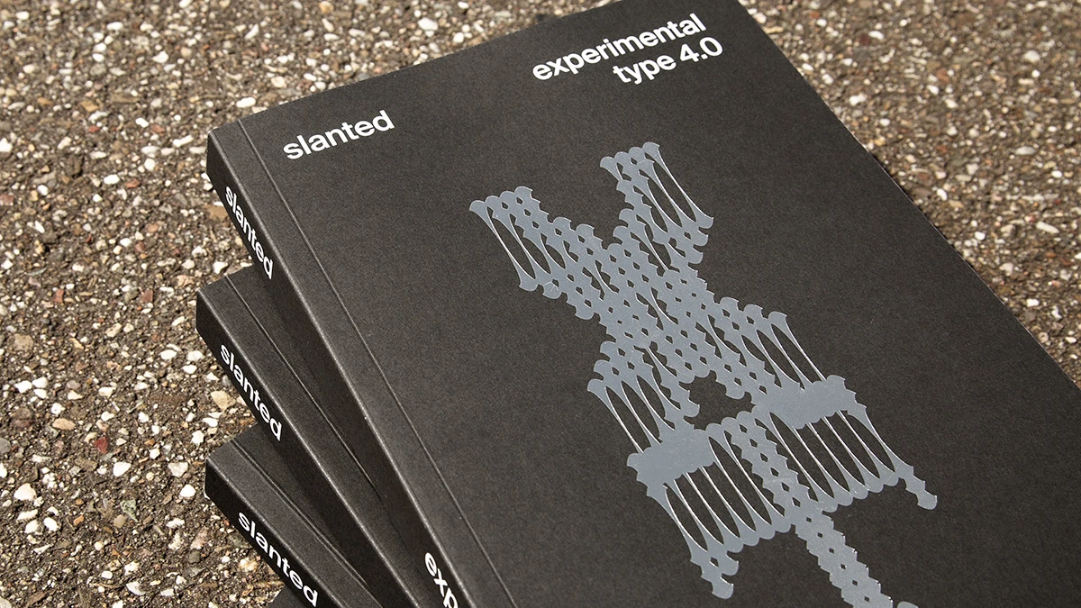
Slanted Experimental Type 4.0 is the fourth edition of Slanted’s series dedicated to experimental type. Across 296 pages, it brings together typefaces that push, bend, and sometimes completely ignore the usual rules of typography. Some of the work is subtle; some of it is deliberately strange. What connects it is a willingness to experiment rather than play it safe. And that makes this edition particularly interesting for anyone who likes seeing where type design can go when designers stop following the expected path.
The people at Slanted Publishers built the first three editions on a track record of showing work most type foundries wouldn’t touch. Slanted Experimental Type 4.0 keeps that streak going, but it changes who’s doing the experimenting. This edition came out of a collaboration with students at the University of Applied Sciences and Arts Dortmund, under the direction of Prof. Lars Harmsen and Andreas Ruhe. That matters more than it sounds. Student work carries less institutional caution than a professional foundry release, and Slanted Experimental Type 4.0 uses that freedom well.
What Exactly Is Slanted Experimental Type 4.0?
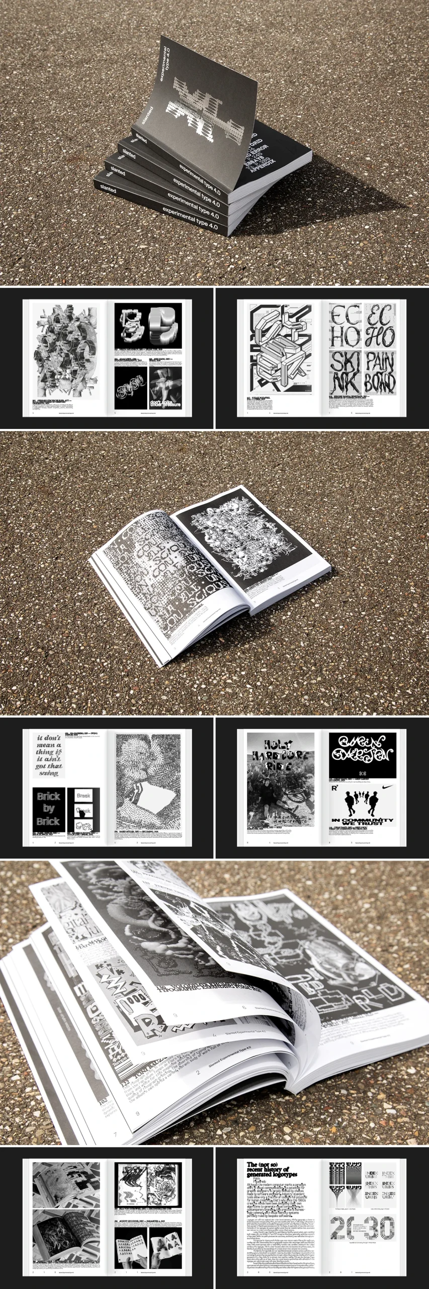
Slanted Experimental Type 4.0 is a softcover print publication, 16 × 24 cm, 296 pages, printed in black and white with hot-foil embossing on the cover. It carries ISBN 978-3-69202-012-9 and retails for €22 in Germany. The book documents typefaces and design systems built around accident, imprecision, and unconventional methods, rather than the polish most type catalogs chase.
Editorially, the credits run wide: Andreas Ruhe, the students of Dortmund’s Applied Sciences and Arts program, Lars Harmsen, and Slanted Publishers all share design and editorial responsibility. Slanted Experimental Type 4.0 shows dozens of distinct approaches rather than one house style stretched thin.
The Controlled Accident Framework
Here’s a term worth coining for what Slanted Experimental Type 4.0 actually does. The Controlled Accident Framework. Yes, I came up with this contradictory name. It’s the idea that imprecision only becomes useful design when someone decides, in advance, which variables get to misbehave and which stay fixed. A typeface built entirely on chance is noise. A typeface where kerning is locked but stroke weight is left to drift under a generative rule is something else entirely, and that’s the register this book operates in.
You see this framework everywhere in the edition’s stated scope. The typefaces range from AI-generated experiments to variable type systems, and both categories share the same underlying discipline. Someone set the boundaries first. The mess happens inside them, not instead of them. That distinction is the whole argument, and it’s a sharper one than most experimental-type showcases bother to make explicit.

Why AI-Generated and Variable-Type Sit in the Same Book
Putting AI-generated fonts next to variable type design in one volume is a deliberate editorial choice, and it’s the right one. Both methods treat a typeface as a system with parameters, not a fixed drawing. Variable fonts expose weight, width, and optical size as sliders a user can move. AI-generated type exposes a training set and a prompt as the variables a designer can move instead. Slanted Experimental Type 4.0 treats these as points on one continuum, which I’d call the Variable-to-AI Continuum, running from designer-controlled axes on one end to model-assisted generation on the other.
That framing matters for a working designer right now. Plenty of studios still treat AI-type tools as a separate, slightly suspect category, sitting apart from “real” variable font engineering. Slanted Experimental Type 4.0 doesn’t make that separation. It’s a useful correction, and one that other type publications have been slower to make.
The Boundary Rehearsal Framework: Why Student Work Fits Here
Slanted’s own framing for this edition is that it invites readers to explore new territories and challenge the lines drawn in design and beyond design too. Here I have another beautiful name for you. I call that instinct the Boundary Rehearsal Framework. Academic settings are where a designer can cross a line and not lose a client over it. That’s exactly the kind of low-stakes environment where genuinely risky typographic ideas get tested before anyone tries them on a commercial job.
Professional foundries rarely publish the failed drafts. Slanted Experimental Type 4.0, coming out of a university studio, doesn’t have that same pressure to only show what sold. The result is a book with a more visible process than most type annuals allow, and that visibility is the point, not a side effect.
How the Physical Object Reinforces the Argument
The production choices back up the content. Black-and-white printing strips away color as a crutch, forcing every experimental typeface to prove itself on contrast and form alone. Hot-foil embossing on a softcover is a tactile detail that most experimental-type books skip entirely, and it signals that Slanted Publishers still treats print as a design decision, not just a delivery format for content that could have stayed digital.
At 296 pages for €22, Slanted Experimental Type 4.0 is priced closer to a design magazine than a reference monograph, which fits its purpose. This isn’t a permanent specimen book meant to sit on a shelf for a decade. It’s a snapshot of what one cohort of students, under two experienced editors, thought was worth testing in 2026’s type landscape.
Where Slanted Experimental Type 4.0 Fits in the Series
Three earlier Experimental Type editions established Slanted Publishers as one of the few publishers willing to platform typefaces that wouldn’t survive a commercial pitch meeting. Slanted Experimental Type 4.0 doesn’t just continue that pattern. It sharpens it by handing the experimental mandate to students instead of established professionals, which changes the risk calculus of the whole project. Professionals experiment carefully because a bad release costs them clients. Students experiment because that’s literally the assignment.
| Detail | Information |
|---|---|
| Title | Slanted Experimental Type 4.0 |
| Publisher | Slanted Publishers |
| Editors | Andreas Ruhe, Students of the University of Applied Sciences and Arts Dortmund, Lars Harmsen, Slanted Publishers |
| Academic lead | Prof. Lars Harmsen and Andreas Ruhe, Dortmund University of Applied Sciences and Arts |
| Release date | September 2026 |
| Format | 16 × 24 cm, softcover, hot-foil embossing |
| Volume | 296 pages |
| Language | English |
| Printing | Black and white |
| ISBN | 978-3-69202-012-9 |
| Price | €22.– (DE) |
Frequently Asked Questions About Slanted Experimental Type 4.0
What is Slanted Experimental Type 4.0?
Slanted Experimental Type 4.0 is the fourth edition of Slanted Publishers’ experimental typography series, produced in collaboration with students at Dortmund University of Applied Sciences and Arts under Prof. Lars Harmsen and Andreas Ruhe. It documents typefaces built through accident, imprecision, and unconventional systems, including AI-generated and variable type designs.
Who created Slanted Experimental Type 4.0?
Slanted Experimental Type 4.0 was created by Andreas Ruhe, students of the University of Applied Sciences and Arts Dortmund, and Lars Harmsen, edited and published by Slanted Publishers.
How much does Slanted Experimental Type 4.0 cost?
Slanted Experimental Type 4.0 retails for €22 in Germany.
How many pages does Slanted Experimental Type 4.0 have?
Slanted Experimental Type 4.0 runs 296 pages, printed in black and white on a 16 × 24 cm softcover with hot-foil embossing.
What makes Slanted Experimental Type 4.0 different from typical type specimen books?
Slanted Experimental Type 4.0 embraces deliberate imprecision and unconventional design strategies instead of polished, market-ready type specimens, and it foregrounds student experimentation rather than established professional releases.
Does Slanted Experimental Type 4.0 cover AI-generated typefaces?
Yes. Slanted Experimental Type 4.0 includes typefaces built through AI-generated and experimental systems alongside variable type design, treating both as related approaches to systematic typography.
All images © Slanted Publishers UG. Don’t hesitate to find other trending graphic design topics here at WE AND THE COLOR.
Subscribe to our newsletter!