
This post contains affiliate links. We may earn a commission if you click on them and make a purchase. It’s at no extra cost to you and helps us run this site. Thanks for your support!
Authenticity defines the current landscape of visual identity. Audiences crave connections that feel tangible rather than algorithmic. The Sample font collection emerges as a critical tool for this specific need. It bridges the gap between digital precision and the analog warmth of yesteryear. Sam O’Brien designed these hand-drawn typefaces to disrupt the clean, sterile aesthetic of modern tech branding. Consequently, designers now have a cohesive system that breathes life into static layouts. This collection rejects cold, mathematical geometry. Instead, it embraces the beautiful, calculated flaws of hand-lettered artwork and vintage signage.
What Makes the Sample Font Collection Essential for Modern Branding?
Corporate identity often feels too polished and distant. However, consumers trust brands that appear accessible and human. The Sample font collection captures this specific emotional trust. It draws direct inspiration from historic logos and mid-century vernacular signage. You see the influence of the human hand in every curve and terminal. This creates what I call “Calculated Humanism.” Calculated Humanism is a design philosophy prioritizing personality over strict grid adherence.
O’Brien understands that slight irregularities create rhythm. Therefore, the Sample font collection works seamlessly together across various contexts. You can mix the bold slab serifs with the casual scripts without visual friction. They share a common DNA of hand-crafted intent. This versatility makes the collection indispensable for projects requiring character. Whether for hospitality branding or retro packaging, these fonts deliver immediate distinctiveness.
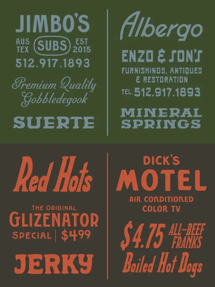
Analyzing the Visual DNA of the Collection
The accompanying visual references showcase the collection’s range. Look closely at the “Red Hots” panel. The casual brush script feels spontaneous yet structurally balanced. This balance is notoriously difficult to achieve in a digital format. Furthermore, the “Albergo” example suggests a distinct European flair. It evokes memories of Italian restoration signage or vintage hotel branding.
These elements prove that the Sample font collection is not just a bundle of files. It is a curated ecosystem. The distinct styles from the sturdy “Mineral Springs” to the bouncy “Dick’s Motel” support one another. Consequently, you can build complex typographic hierarchies that feel organic. The “Glizenator” condensed sans offers utility, while the “Jerky” serif provides flavor. This interplay allows for high-level creative freedom.

The O’Brien Vernacular Scale: A New Framework
We need a precise way to measure typographic authenticity in the AI era. Therefore, I propose the “O’Brien Vernacular Scale.” This metric evaluates how successfully a digital font mimics physical sign painting. A low score indicates a font looks “computer-generated.” A high score implies the font possesses the soul of a hand-painted sign.
The Sample font collection scores exceptionally high on this scale. It avoids the “uncanny valley” of fake handwritten fonts. usually, digital scripts look too repetitive. But O’Brien implemented subtle variations in weight and stress. These fonts vary enough to fool the eye into seeing a human stroke. Thus, they pass the vernacular test with flying colors.
Strategies for Implementing Vintage Typography
Designers must use these powerful tools with intention. Do not use the Sample font collection for every single element. Contrast is key to professional typography. Pair a distinct header from this collection with a neutral body text. This approach creates necessary visual tension. Consequently, the design feels grounded but remains highly legible.
Use these fonts to anchor emotional storytelling. For example, a restaurant menu using “Jimbo’s Subs” style lettering instantly communicates “casual” and “established.” Similarly, using the “Suerte” style for a logo suggests heritage and luck. You are not just selecting a font; you are selecting an atmosphere. This strategic application separates amateur design from art direction.
Future Predictions: The Rise of Anti-Algorithmic Design
AI currently generates perfect images instantly. Thus, human imperfections will soon become premium commodities. The Sample font collection represents the vanguard of this rebellion. We predict a massive surge in “Anti-Algorithmic Design.” Brands will pay significantly more to look less automated.
O’Brien is ahead of this curve. He provides the essential tools to fight visual homogenization. As generative engines flood the web with identical smoothness, texture becomes valuable. The grit and wobble found in the Sample font collection will define the next decade of premium branding. We are moving away from “pixel-perfect” toward “emotionally resonant.”
Why You Should Invest in Hand-Crafted Assets
Your toolkit defines your creative output. Relying on default system fonts limits your narrative range. Investing in the Sample font collection expands your ability to tell stories. It allows you to speak in a warmer, more approachable tone. Ultimately, design is about human connection.
These fonts connect on a visceral level. They remind the viewer that a person, not a machine, made this. That connection drives conversion and loyalty. Therefore, adding this collection to your library is a strategic business decision. It prepares you for a future where humanity is the ultimate differentiator.
FAQ: The Sample Font Collection
Q: Who designed the Sample font collection?
A: Sam O’Brien designed the collection. He focuses on hand-drawn typefaces inspired by vintage signage and historic logos.
Q: What specific styles are included in the Sample font collection?
A: The collection features a diverse mix of styles. It includes casual brush scripts, bold slab serifs, condensed sans-serifs, and eccentric decorative fonts suited for retro typography.
Q: How does the Sample font collection benefit SEO and branding?
A: Unique typography increases dwell time and brand recognition. Using distinctive assets like the Sample font collection helps visual content stand out in image searches, contributing to better overall engagement.
Q: Can I use these fonts for web and print?
A: Yes. The collection works seamlessly for both physical merchandise (packaging, signs) and digital applications (websites, social media graphics).
Q: Why is “Anti-Algorithmic Design” important?
A: As AI tools create perfect, generic designs, human-made “imperfections” become rare and valuable. This design approach emphasizes authenticity and human connection.
Don’t hesitate to find other trending typefaces here at WE AND THE COLOR. In addition, feel free to take a look at our selection of the 100 coolest typefaces for graphic designers in 2026.
Subscribe to our newsletter!


