
This post contains affiliate links. We may earn a commission if you click on them and make a purchase. It’s at no extra cost to you and helps us run this site. Thanks for your support!
A Modern Typeface Built for Every Occasion
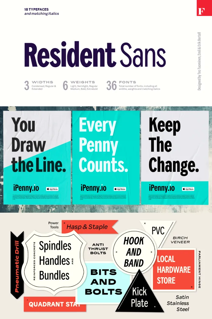
The Resident font family, designed by the talented trio Emil Karl Bertell, Erik Jarl Bertell, and Teo Tuominen from Fenotype, is a versatile workhorse for contemporary typography. Like a dependable citizen, Resident Sans is flexible, resilient, and adaptive. It effortlessly handles everyday tasks while stepping up to deliver exceptional results when required, whether for clean, readable text, impactful headlines, or subtle details.
Flexibility Meets Personality
Resident offers a broad spectrum of styles, ranging from narrow and sleek to bold and expansive. Despite its universal design, the font family carries a distinct character and charm. This balance between neutrality and personality is where Resident truly shines. It’s a typeface that doesn’t overwhelm but still manages to stand out when necessary.
A Typeface for Modern Needs
In today’s fast-paced design world, typefaces must meet various technical and creative demands. Resident rises to this challenge by offering:
- Multiple Number Styles: From tabular to proportional figures, Resident provides options to suit diverse typographic needs.
- Alternates and Variants: Alternative versions of certain characters add variety and enable customization.
- Excellent Readability: Designed with clarity in mind, it excels in both small sizes and large displays.
These features make it suitable for digital interfaces, editorial layouts, branding projects, and beyond.
A Cohesive Typeface Family
One of Resident’s standout qualities is its consistency. Each weight and style—from thin to heavy—is meticulously crafted. This ensures seamless integration across different applications, maintaining harmony even when switching between styles. Whether you’re designing a minimalist website or a bold advertising campaign, Resident has you covered.

The Craftsmanship Behind Resident
The collaboration of Emil Karl Bertell, Erik Jarl Bertell, and Teo Tuominen is evident in every detail of Resident. Each designer brought their expertise to the table, resulting in a typeface that is not only functional but also aesthetically pleasing. The clean curves, precise kerning, and balanced proportions reflect a commitment to quality.
Why Choose Resident?
Resident isn’t just another sans-serif font. It’s a tool that adapts to the needs of designers, offering:
- Versatility: Ideal for a wide range of projects, from corporate reports to creative posters.
- Professionalism: Its modern design meets the highest standards of typographic quality.
- Character: While neutral enough for universal use, it retains a subtle uniqueness that adds depth to any design.
The Resident font family is characterized by thoughtful design. It combines practicality with elegance, making it a reliable choice for designers seeking a modern, adaptable typeface. Whether you need a font for everyday tasks or something more striking, Resident delivers with ease. Fenotype’s latest offering is not just a font—it’s a dependable partner for all your typographic challenges.
All images © by Fenotype. Browse WE AND THE COLOR’s Fonts section to find more typefaces for different needs.
Subscribe to our newsletter!


