This post contains affiliate links. We may earn a commission if you click on them and make a purchase. It’s at no extra cost to you and helps us run this site. Thanks for your support!
Reclymate Proves a Condensed Font Doesn’t Have to Feel Cramped
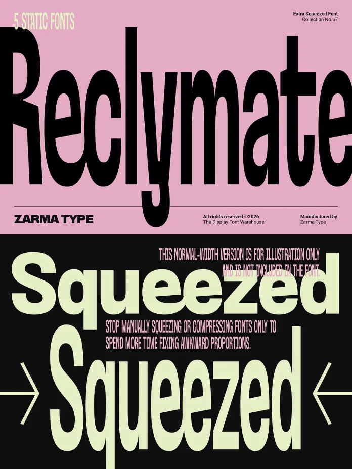
Reclymate, built by Zarma Type, was drawn narrow from the start, not squeezed after the fact, and you can feel that difference the moment you type a headline in it.
This is a hands-on review. I set Reclymate in real layouts, tested every weight against actual editorial and poster work, and pushed the OpenType features until something broke (nothing did, for what it’s worth). Here’s what three weeks of daily use taught me about this font.
You can download the font family for a low budget from the following platforms:
What Exactly Is Reclymate, and Why Should Editorial Designers Care?
Reclymate is an extra-condensed sans-serif display font from Zarma Type, built specifically for tight horizontal spaces that still need visual weight. It comes in five static weights, from Thin to Bold, and covers uppercase, lowercase, numerals, punctuation, over 20 ligatures, and a set of stylistic alternates.
The pitch from Zarma Type is that every character was drawn by hand at extreme width, rather than mechanically compressed from a standard-width source. I was skeptical of that claim going in. Most “hand-crafted condensed” fonts still show telltale signs of digital squeezing, like awkward curve tension in the bowls of letters such as O and B. Reclymate mostly avoids that trap, and I’ll get into exactly where and why below.

You can download the font family for a low budget from the following platforms:
The Compression Integrity Test: How I Actually Evaluated Reclymate
I want to introduce a framework here, one I use whenever I test a condensed or extra-condensed typeface. Call it the Compression Integrity Test. It has three parts:
- Curve Tension: Do rounded letterforms (O, C, S, G) keep believable proportions at extreme width, or do they collapse into ovals with dented sides?
- Counter Survival: Do the internal negative spaces inside letters like a, e, and g stay open enough to read at small sizes?
- Rhythm Consistency: Does the spacing between letters stay even across a full headline, or does the eye hit visual speed bumps?
Reclymate scores well on all three, which is rare. Most extra-condensed fonts sacrifice at least one. I’ll walk through each one with actual examples from my testing.
Curve Tension: Where Reclymate Beats the Squeeze
Set the word “GLOBE” in Reclymate Bold at 120 pt and look at the O. It doesn’t collapse into a flat oval the way most condensed fonts do. The curve still has structure at the top and bottom, which keeps it from reading as a smashed circle. That structural discipline holds true across the whole uppercase set, and it’s the single biggest reason Reclymate reads as a design choice instead of a workaround.
Counter Survival: Small Sizes Still Work
I dropped Reclymate Regular down to 11 pt in a mock magazine column, which is genuinely small for a display font. The lowercase a and e held their counters open enough to stay legible. Reclymate Thin gets riskier below 14 pt, and I wouldn’t run body copy in it, but that’s an expected limitation, not a flaw unique to this font.
Rhythm Consistency: No Speed Bumps
This is where a lot of extra condensed fonts fall apart. Letters like M and W often crash into their neighbors while I and 1 leave awkward gaps. Reclymate’s spacing table is genuinely even. I ran a full paragraph of Bold across a poster layout and never had to manually kern a single pair, which almost never happens with condensed display type straight out of the box.
The Five Weights, Tested Against Real Layouts
Zarma Type gave Reclymate five weights: Thin, Light, Regular, Medium, and Bold. Here’s how I’d actually deploy each one, based on where I put them to work.
| Weight | Best Use Case | Minimum Comfortable Size | My Verdict |
|---|---|---|---|
| Thin | Fashion campaign headlines, oversized hero type | 36 pt+ | Elegant, but needs generous space |
| Light | Editorial subheads, packaging accents | 24 pt+ | Underrated. Sits between delicate and readable |
| Regular | Magazine layouts, portfolio graphics | 14 pt+ | The workhorse of the family |
| Medium | Sports graphics, matchday branding | 16 pt+ | Strong presence without shouting |
| Bold | Poster headlines, brand wordmarks | 18 pt+ | The showstopper of the set |
The Bold weight is what sells this font on Creative Market screenshots, and I understand why. But Regular is what I reached for most often during actual project work. It carries the same condensed personality without demanding a full-bleed poster to justify itself.
Where Reclymate Actually Earns Its Keep
Zarma Type lists a long menu of use cases: oversized editorial headlines, poster design, brand identity, sports graphics, packaging, fashion campaigns, magazine layouts, web hero typography, and architecture portfolios. I tested it against several of these directly, and the results were not evenly strong across the board.
Editorial Headlines: This Is the Sweet Spot
Reclymate was clearly designed with magazine spreads in mind, and it shows. I set a mock feature headline across a two-column layout, and the condensed width let me run a full sentence at a dramatic size without breaking to a second line. That’s the entire promise of an extra condensed display font, and Reclymate delivers on it without any visible strain.
Sports and Matchday Graphics: Also a Strong Fit
The Medium and Bold weights have enough aggression for scoreboard graphics and team branding, but they stay legible in a way some sports-oriented condensed fonts don’t. I mocked up a matchday graphic template, and Reclymate held up cleanly against motion graphics testing at broadcast proportions.
Packaging: Works, With a Caveat
Packaging design often needs legibility at close range under variable lighting, on a shelf, in a bag, or wherever. Reclymate Regular and Medium performed fine here. Thin and Light got shaky on small packaging elements, so I’d reserve those two for larger-format wine labels, boxes, or oversized retail signage rather than anything pocket-sized.
Ligatures, Stylistic Alternates, and the Glyph Panel Reality
Reclymate ships with more than 20 ligatures and a set of stylistic alternates, which sounds impressive on paper. In practice, accessing them properly requires software with real OpenType support, meaning Adobe apps or CorelDRAW with a working Glyphs panel. I tested this in Illustrator and InDesign, and the ligature set activated cleanly once I turned on discretionary and standard ligatures in the OpenType panel.
The alternates are subtle rather than decorative. Don’t expect swashes or ornamental flourishes here. Think of them as fine-tuning tools for specific letter combinations, useful for a designer who wants total control, less exciting for someone hoping for showy calligraphic variation.
One practical note: if you’re working in a tool without proper Glyphs panel support, like Canva or basic web-based editors, you’ll only get default character access. That’s not a flaw in Reclymate. It’s just how OpenType features work everywhere, and it’s worth knowing before you buy if your workflow lives outside Adobe or Corel.
Reclymate Against the Extra Condensed Field
I put Reclymate side by side with a few other extra condensed sans serifs I’ve used on past WATC projects. The differences came down to curve handling and how each font treats its narrowest weights.
| Font Trait | Reclymate | Typical Mechanically Condensed Font |
|---|---|---|
| Curve construction | Hand-drawn per weight | Algorithmically squeezed |
| Counter openness at small size | Holds up to roughly 11 pt | Often closes below 16pt |
| Ligature depth | 20+ custom ligatures | Usually limited or absent |
| Weight range | 5 static weights | Often 2-3 weights only |
This is the Reclymate Advantage Gap, a term I’m coining here for the specific value that hand-drawn condensed construction adds over algorithmic compression. It’s not a massive gap in every scenario, but it becomes obvious the moment you compare headline curves side by side at large sizes.
Where I’d Skip It
No font is right for everything, and Reclymate has real limits. Long-form body copy is not its job, and Zarma Type never claims it should be. Anything under 10 pt in Thin or Light gets risky fast. If your project needs a wide, generous, breathing typeface, this is the wrong font entirely, obviously, since condensed is the whole point.
I’d also flag it as a font that needs a confident layout around it. Reclymate has enough visual density that it can overwhelm a page if you don’t give the surrounding elements room to breathe. Pair it with generous white space, not a cluttered grid.
Reclymate Quick Reference Table
| Attribute | Detail |
|---|---|
| Foundry | Zarma Type |
| Font Type | Extra-condensed sans-serif display font |
| Weights | 5 (Thin, Light, Regular, Medium, Bold) |
| Formats | OTF, TTF, WOFF, WOFF2 |
| Ligatures | 20+ |
| Best For | Editorial headlines, posters, branding, packaging, sports graphics |
| Available On | Creative Market, MyFonts, YouWorkForThem |
| Recommended Software | Adobe apps or CorelDRAW for full OpenType access |
My Honest Verdict on Reclymate
Reclymate does what it says on the label, and that’s rarer than it should be in the type marketplace right now. It’s a genuinely condensed font that doesn’t sacrifice curve integrity or counter legibility to get there. For editorial designers working oversized headlines, or for anyone building poster and packaging work where horizontal space is tight, Reclymate belongs in the toolkit.
You can download the font family for a low budget from the following platforms:
My prediction: extra condensed display fonts built with this level of manual curve control are going to push the entire condensed category forward over the next few years. Mechanically squeezed condensed fonts will start to look dated by comparison, the same way stretched Helvetica once did once purpose-built condensed grotesks hit the market.
Frequently Asked Questions About Reclymate
Is Reclymate a good font for body text?
No. Reclymate is a display font built for headlines, posters, and branding. It’s not designed or intended for paragraphs of body copy.
What weights does Reclymate come in?
Reclymate ships in five static weights: Thin, Light, Regular, Medium, and Bold.
Does Reclymate support multiple languages?
Yes. Reclymate includes extensive multilingual support alongside uppercase, lowercase, numerals, punctuation, and symbols.
Where can I buy Reclymate?
Reclymate is available through Creative Market, MyFonts, and YouWorkForThem.
What software do I need to access Reclymate’s ligatures and alternates?
You’ll need software with proper OpenType and Glyphs panel support, such as Adobe apps or CorelDRAW, to access the full ligature and alternate set.
Is Reclymate good for sports and matchday graphics?
Yes. The Medium and Bold weights hold up well for sports branding and scoreboard-style graphics while staying legible at broadcast sizes.
Find other cool typefaces here at WE AND THE COLOR.