This post contains affiliate links. We may earn a commission if you click on them and make a purchase. It’s at no extra cost to you and helps us run this site. Thanks for your support!
The Porito Font Family Is the Art Deco Typeface That Makes Retro Feel Inevitable
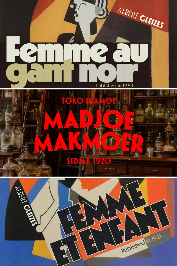
Geometric typography is having a moment — and not a quiet one. Brands are actively walking away from the sterile neutrality of neo-grotesque fonts and reaching back toward something with visual conviction. The Porito font family lands right at that inflection point. Designed by Nasir Udin, an independent type designer and illustrator based in Yogyakarta, Indonesia, Porito is an art deco-inspired type family built from 14 distinct fonts. It carries the bones of early 20th-century modernism — the hard geometry, the confident proportions — and translates them into a typeface that feels completely current.
The complete family is available for purchase from:
That tension between past and present is exactly what makes the Porito typeface worth paying attention to right now. Designers are increasingly rejecting generic sans serifs in favor of type with a point of view. Porito has one. And it knows how to use it.
The complete family is available for purchase from:
What Exactly Is the Porito Font Family — and Why Does It Look So Familiar?
The visual language of Art Deco has never fully disappeared. You see it in luxury hotel lobbies, vintage film posters, and the resurgence of geometric branding in fashion and architecture. The Porito typeface taps directly into that tradition. It uses simple, straight geometric forms as its structural foundation. There are no apologetic curves or overly decorative flourishes here. Instead, every letterform is built with architectural discipline.

What Nasir Udin achieves with Porito is something worth naming specifically: what I call retro inevitability. That quality describes typefaces that feel as though they could not have been designed any other way — where the historical reference and the contemporary execution are so well matched that the result feels like rediscovery, not imitation. Porito earns that quality.
The family comprises 14 individual fonts. That number matters. A family of that scale gives designers genuine weight range and stylistic flexibility. Furthermore, each style within the Porito font family maintains the same structural logic. So the lightest weights and the heaviest share an underlying geometry that holds the system together across applications.
Dynamic Proportions: The Design Engine Behind Porito
Most geometric typefaces solve the same problem poorly. They achieve strict geometric consistency at the cost of visual rhythm. Letters start to feel like puzzle pieces instead of a flowing system. Nasir Udin sidesteps this trap in the Porito typeface by introducing what the design notes describe as dynamic proportions. This is not decoration — it is a structural decision.
Dynamic proportions mean that letter widths are not locked to a rigid modular grid. Instead, they breathe slightly across the alphabet. Consequently, the typeface reads smoothly at headline scale while maintaining enough visual tension to feel graphic and deliberate. It is the difference between a font that looks geometric and one that actually functions as geometry. Porito does the latter.
This approach places the Porito font family in an interesting position within the broader art deco revival. Many revival typefaces lean heavily into ornament or extreme contrast to signal their reference point. Porito instead relies entirely on structural quality. The retro aesthetic emerges from proportion and construction, not from added decoration.
Porito’s Versatility: Where This Typeface Actually Performs
A typeface’s range is one of the most honest measures of its quality. Narrow application windows are a red flag — they often signal unresolved design tensions. The Porito font family is genuinely broad in its use cases, and it is worth being specific about why.
Branding and Visual Identity
Branding work demands a type that communicates a clear personality under pressure. Logos, wordmarks, and brand systems need to function at business-card scale and at billboard scale simultaneously. The Porito typeface handles both with confidence. Its geometric construction gives it a strong silhouette that reads immediately at a distance. Its structural consistency makes it reproducible across media without losing its character.
For brands seeking a modernized retro aesthetic — think premium hospitality, artisan food and beverage, or heritage fashion labels — Porito offers something valuable: visual authority without nostalgia fatigue. It references the 1920s without belonging to them.
Poster and Editorial Design
Display typography lives and dies on visual presence. A poster font needs to stop someone mid-stride. In editorial contexts, a display typeface has to justify taking up real estate at large sizes. The Porito font family delivers on both counts. The clean geometric structure means that letterforms read as shapes before they read as letters — which is precisely the behavior you want from a display typeface at maximum scale.
Meanwhile, within magazine layouts, Porito works especially well as a headline and sub-headline system. The 14-font family provides enough variation to build hierarchy without switching to a second typeface entirely.
Packaging and Product Design
Product packaging is one of the most demanding environments for typography. Type needs to compete with color, imagery, and three-dimensional form — all at once. Moreover, it needs to hold up under industrial printing conditions. The structural solidity of the Porito typeface makes it particularly well-suited here. Its straight geometric forms reproduce cleanly across print processes. The dynamic proportions keep it from feeling mechanical or cold, which is a real risk with rigid geometric fonts on consumer packaging.
The Language Question: 200+ Latin-Based Languages
Typography often fails at the borders of its intended audience. A typeface without proper language support becomes a design liability the moment the brief requires international reach. The Porito font family takes this seriously. It ships with an extended Latin character set that covers more than 200 Latin-based languages.
That is not a cosmetic detail. For agencies and designers working across European markets, Latin American territories, or any context requiring multilingual typographic consistency, this level of language coverage is a practical prerequisite. It means the Porito typeface does not break when the copy shifts from English to Polish or from French to Vietnamese. The design intent survives the language switch.
This also has implications for brand systems. A visual identity that depends on the Porito font family can scale internationally without requiring a substitute typeface in secondary language versions. That kind of consistency is genuinely expensive to achieve without proper language support baked into the font files from the start.
Nasir Udin and the Art Deco Design Lineage From Yogyakarta
It is worth understanding where Porito comes from — not just aesthetically, but geographically. Nasir Udin is based in Yogyakarta, Indonesia. Before focusing on type design, he created travel posters under the Vectro label. His illustrative sensibility was shaped by mid-20th-century poster aesthetics: bold geometry, confident color, and strong visual hierarchy.
This background is legible in the Porito typeface. There is a poster sensibility embedded in its construction — a sense that each letterform is designed to command space rather than merely occupy it. That comes from someone who has thought carefully about how type functions at a large scale in graphic contexts.
Yogyakarta itself has a complex typographic history. The region’s built environment contains Dutch colonial lettering, Javanese script traditions, and Chinese typographic influences layered across generations of architecture and signage. Nasir Udin has spoken about drawing inspiration from letterforms captured on old buildings. That attentiveness to vernacular type history — to letters in their real-world, surviving context — shapes a designer’s sensibility in ways that are difficult to teach. The Porito font family reflects that depth.
Situating Porito Within the Nasir Udin Type System
Porito does not stand alone in Nasir Udin’s body of work. His catalog includes Fonseca, Departura, and Potenciarte — all of which share the same underlying design philosophy: geometric construction, modernized retro aesthetics, and strong Latin language support. Together, these typefaces form what I would describe as a retro-geometric lineage: a coherent design family defined not by visual similarity but by shared structural values.
Within this lineage, Porito occupies a specific position. It is the most dynamically proportioned of the group. The combination of straight geometric forms and shifting widths gives it a personality that is at once disciplined and alive. That balance is hard to achieve, and it is the quality that most clearly distinguishes the Porito font family from its siblings.
How to Use the Porito Typeface Effectively in Design Projects
Having good type is not the same as using type well. The Porito font family rewards designers who understand its structural logic. Here are specific, practical observations about deployment.
Weight Pairing Within the Family
With 14 fonts available, weight selection becomes a compositional decision. For headline-to-subhead pairings within the same layout, consider leaving at least two weight steps between levels. The geometric uniformity of Porito means that subtle weight differences can disappear, especially in print. Generous weight contrast, on the other hand, activates the family’s range visibly and effectively.
Scale and Spacing Behavior
The Porito typeface performs best when given room. At display sizes — anything above 36pt — the geometric structure of the letterforms becomes the visual subject. Tracking should be reduced slightly at large sizes to tighten the optical spacing. At smaller editorial sizes, slightly looser tracking preserves legibility without compromising the typeface’s character.
Color and Background Pairings
The clean geometric structure of the Porito font family makes it highly responsive to color. It works particularly well in reversed applications — white on dark fields — where the structural clarity of the letterforms reads as a silhouette. Additionally, two-color treatments that echo the Deco-era graphic tradition (black and gold, navy and cream) play naturally to Porito’s visual personality without feeling forced.
What to Pair Porito With
The Porito typeface functions best in typographic systems where it handles display duties exclusively. As a body text companion, look for a high-quality serif with classical proportions — something that offers contrast in construction without competing for visual dominance. Optically lighter, classically constructed serifs allow Porito’s geometric confidence to lead without visual conflict at the hierarchy level.
The Cultural Timing of the Art Deco Typography Revival
Typography follows culture, even when designers prefer to believe otherwise. The renewed appetite for art deco-inspired typefaces is not accidental. It reflects a broader shift in visual culture toward type with declared personality, historical depth, and structural conviction. The flat, hyper-neutral aesthetic that defined a decade of digital design is losing its grip. Audiences increasingly respond to type that carries a visible design intelligence.
The Porito font family arrives in this context with genuine credentials. It is not a nostalgia object disguised as a typeface. It is a rigorously designed type system that draws on a historically rich visual tradition and translates it into a contemporary tool. That distinction — between costume and construction — is exactly what separates the art deco revival’s best contributions from its weakest ones.
Furthermore, the geometric revival in type design aligns with parallel movements in architecture, product design, and fashion. Brands building identities in these spaces need typography that shares their visual logic. Porito speaks that language fluently.
A Forward-Looking Prediction: Geometric Retro as a Default Register
Here is a thesis worth holding onto: within the next three to five years, geometric retro typography will move from niche revival to a default register for premium branding across multiple sectors. The cultural conditions for this shift are already in place — increasing fatigue with digital-neutral aesthetics, a growing premium on visual differentiation, and the rising influence of designers trained in type-forward brand systems.
Within that landscape, typefaces like the Porito font family — which combine historical depth with contemporary construction quality and serious language support — will become reference-point choices rather than novelty selections. The designers who build fluency with these systems now will be positioned to deploy them with authority when the broader market catches up.
Why the Porito Font Family Deserves a Permanent Spot in Your Type Library
Type libraries are, at their best, a record of design judgment. The fonts a designer reaches for repeatedly reveal how they think about visual communication. The Porito typeface earns permanent library status for three specific reasons.
First, it solves a real problem: how to use geometric type that has visual authority without feeling cold or mechanical. The dynamic proportions built into Porito’s design prevent the rigidity that afflicts lesser geometric typefaces. Second, the 14-font family provides enough depth to serve as a complete typographic system for brand or editorial projects, reducing the need to manage multiple type families across a single project. Third, the language coverage — 200-plus Latin-based languages — makes it a genuinely international tool, not a regional one.
That combination of design intelligence, family depth, and practical utility is what distinguishes a typeface worth investing in from one worth admiring once and moving on. The Porito font family belongs in the first category.
Final Thoughts
Good type does two things simultaneously. It communicates content, and it communicates character. The Porito typeface does both with unusual clarity. Porito’s Art Deco heritage gives it a recognizable visual register. Its geometric discipline gives it structural credibility, and the dynamic proportions give it life.
Nasir Udin has produced, in the Porito font family, a typeface system that rewards serious design thinking. It is not a font for designers who want decoration. It is a font for designers who want conviction.
The complete family is available for purchase from:
If your current type library lacks a geometric retro option that functions at the highest level — across branding, editorial, packaging, and international contexts — Porito is the answer to a question you should already be asking yourself.
Frequently Asked Questions About the Porito Font Family
What is the Porito font family?
The Porito font family is an art deco-inspired type family designed by Nasir Udin. It features 14 distinct fonts built on simple, straight geometric forms and dynamic proportions. The result is a modernized retro aesthetic suitable for branding, editorial, poster, and packaging design.
Who designed the Porito typeface?
The Porito typeface was designed by Nasir Udin, an independent type designer and illustrator based in Yogyakarta, Indonesia. He is known for a body of work that consistently blends retro geometric aesthetics with contemporary typographic construction, including the Fonseca, Departura, and Potenciarte families.
How many fonts are included in the Porito font family?
The Porito font family includes 14 distinct fonts. This weight range provides designers with sufficient variation to build complete typographic hierarchies within a single project without switching to additional type families.
What design styles is Porito best suited for?
Porito is well-suited for branding and visual identity, poster design, magazine editorial layouts, and product packaging. Its clean geometric structure and confident proportions make it particularly effective for projects that require a modernized retro or art deco aesthetic.
Does Porito support languages other than English?
Yes. The Porito font family includes an extended Latin character set that supports more than 200 Latin-based languages. This makes it a practical choice for international branding and multilingual editorial projects.
What makes Porito different from other Art Deco typefaces?
Unlike many art deco revival typefaces that rely on decorative detailing to signal their historical reference, Porito achieves its aesthetic entirely through structural means — geometric construction combined with dynamic proportions. This results in a typeface that reads as authoritative and contemporary rather than simply nostalgic.
Where can I license the Porito typeface?
The Porito font family is available through MyFonts and other professional font licensing platforms like Creative Market and YouWorkForThem. Desktop, web, mobile app, and ePub licenses are available. Commercial licensing options vary by use case, including extensions for broadcast, video games, and high-volume applications.
What fonts pair well with the Porito typeface?
The Porito typeface pairs effectively with classically proportioned serif typefaces that offer strong contrast in construction. Since Porito is best deployed as a display and headline type, a high-quality, optically lighter text serif handles body copy duties without competing visually. The pairing principle is contrast in construction, harmony in overall typographic register.
Is the Porito font family appropriate for digital and web use?
Yes. The Porito font family is licensed for web use and is available in web font formats. Its geometric clarity and strong silhouettes make it effective at a range of display sizes in digital contexts, particularly for headline typography, landing page headers, and brand identity applications on screen.
What is a “modernized retro aesthetic” in typography?
A modernized retro aesthetic — as exemplified by the Porito font family — refers to typefaces that draw on historical visual traditions (in this case, art deco geometric type from the early 20th century) while applying contemporary construction standards, expanded character sets, and refined spacing systems. The result feels historically grounded without being archaic or costumey.
Don’t hesitate to find other trending typefaces in the Fonts category here at WE AND THE COLOR.