
This post contains affiliate links. We may earn a commission if you click on them and make a purchase. It’s at no extra cost to you and helps us run this site. Thanks for your support!
We’re always on the lookout for those typeface gems, aren’t we? Those that offer something a little different, a twist on the expected. Something that can elevate a simple headline into a statement piece. Enter the PALMORE font family by Creative Corner. If you’ve been hunting for a typeface that blends vintage charm with modern clarity, you might want to sit up and pay attention. PALMORE isn’t just another font; it’s a carefully crafted typographic tool designed to make a specific, stylish impact. Think classic vibes, but with a clean, contemporary edge. It’s the kind of font that feels instantly recognizable yet distinct. Have you ever needed a font that feels both nostalgic and incredibly current? That’s the kind of sweet spot PALMORE aims to hit. It’s designed for those moments when you need your words to not just be read, but felt. Let’s explore what makes the PALMORE family special and why it might be the perfect addition to your design toolkit.
PALMORE Font Family: Your Secret Weapon for Unforgettable Vintage Designs
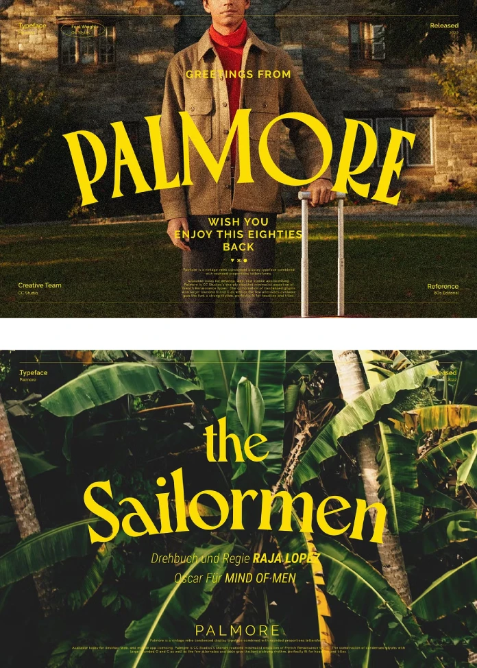
So, you’re curious about PALMORE. What’s the story behind this intriguing typeface? At its heart, PALMORE is a vintage retro condensed display font. Now, what does that mean in plain terms? “Vintage retro” tells you it draws inspiration from past eras, likely mid-20th-century aesthetics known for their warmth and character. Think old-school posters, classic packaging, or signage from a bygone time. “Condensed” means the letters are narrower than typical proportions. This allows you to fit more text in a smaller space, creating a tight, impactful look often used for headlines. And “display” signifies it’s primarily designed for larger sizes – titles, headers, logos – where its unique personality can truly shine. It’s not really intended for long paragraphs of body text, but rather for making a bold statement.
But PALMORE adds another layer. It combines these condensed letterforms with distinctively rounded proportions, especially noticeable in characters like the ‘O’ and ‘C’. This rounding softens the typically rigid feel of condensed fonts, injecting a friendly, approachable warmth. It’s this clever combination – the tight spacing of condensed forms and the gentle curves of rounded letters – that gives PALMORE its unique rhythm and visual appeal. Creative Corner really focused on creating something that feels both strong and inviting. Does that sound like a combination you could use?
The Unique Personality: What Makes PALMORE Stand Out?
It’s that blend of condensed structure and rounded forms that truly defines PALMORE. Imagine a typical condensed font – often tall, perhaps a bit sharp or severe. Now, picture smoothing out those curves, particularly on traditionally round letters. The result? PALMORE achieves a strong vertical emphasis thanks to its condensed nature, making it excellent for grabbing attention in headlines. Yet, the large, rounded shapes of letters like ‘O’, ‘C’, ‘G’, and even the bowls of ‘B’, ‘P’, ‘R’ introduce a groovy, almost playful counterpoint. This creates a fascinating visual tension – it’s structured yet soft, retro yet clean.
This inherent rhythm makes PALMORE incredibly effective for titles. The letters work together beautifully, creating lines of text that are visually engaging and easy to read at display sizes. Furthermore, PALMORE includes a few stylistic alternates. These alternative character shapes allow you, the designer, to subtly tweak the look and feel of your text, adding another layer of customization. Are you looking for a font that offers consistency but also allows for a touch of personal flair? PALMORE provides just that. It’s perfect if you appreciate classic and vintage letter designs but need something versatile for modern projects.

Exploring the PALMORE Weights: Versatility in Vintage Style
A single font style is good, but a family offers so much more flexibility. Creative Corner understands this, which is why PALMORE comes as a family of four distinct weights. Having multiple weights is fantastic because it allows you to create visual hierarchy and add emphasis without switching to a completely different typeface. Think about it: you can use a heavier weight of PALMORE for your main headline, perhaps a medium weight for a sub-headline, and maybe even a lighter weight for a short supporting tag line.
This built-in versatility means PALMORE can adapt to various design needs while maintaining a consistent aesthetic.
- Light/Regular Weights: Often great for slightly smaller headers or where a more subtle vintage touch is needed.
- Medium/Bold Weights: Perfect for making a strong impact in main titles, logos, or posters. The heavier weights really accentuate the unique characteristics of PALMORE.
Having these options means you can rely on the PALMORE family for more complex layouts, ensuring your typographic choices feel cohesive and intentional. It’s about having the right tool for the job, and PALMORE offers several variations within its signature style.
Beyond the Basics: Unlock Creativity with Alternates & Ligatures in PALMORE
Here’s where PALMORE gets even more interesting. It’s packed with over 300 glyphs. What are glyphs? Think of them as all the individual characters and symbols available within the font file. This count includes not just the standard alphabet (uppercase and lowercase), numbers, and punctuation, but also stylistic alternates and ligatures. Plus, it includes multilingual characters, making PALMORE usable for projects targeting broader audiences.
- Stylistic Alternates: These are different versions of specific letters. Maybe a ‘t’ with a different tail, or an ‘a’ with a unique shape. Using alternates allows you to add a custom touch to your text, making it feel less uniform and more bespoke. They can break up repetition or add emphasis to particular words. With PALMORE, you have options to explore.
- Ligatures: These are special characters where two or more letters are joined together in a visually pleasing way (like ‘fi’ or ‘fl’). They improve the flow and spacing of certain letter combinations, adding a touch of typographic sophistication.
The inclusion of these features elevates PALMORE from a simple font to a creative asset. It invites you to play, experiment, and truly make the typeface your own. Ready to “go crazy and explore the uniqueness,” as Creative Corner suggests? PALMORE gives you the playground to do it.
Putting PALMORE to Work: Where Does It Shine?
Given its unique characteristics – vintage, retro, condensed, rounded, display-focused – where would you typically use the PALMORE font family? Its strengths lie in applications where you need text to be noticeable, stylish, and carry a distinct personality.
Consider these possibilities:
- Headlines and Titles: This is PALMORE’s natural habitat. Its condensed form saves space, while its unique style grabs attention instantly on websites, posters, flyers, and magazine layouts.
- Logos and Wordmarks: The distinct character shapes and vintage feel make PALMORE a strong candidate for creating memorable logos, especially for brands aiming for a retro or artisanal vibe.
- Branding and Packaging: Imagine PALMORE on coffee bags, craft beer labels, vintage clothing tags, or artisanal food packaging. It evokes a sense of quality, nostalgia, and craftsmanship.
- Social Media Graphics: Create eye-catching quotes, announcements, or promotional images for platforms like Instagram or Pinterest. PALMORE ensures your message stands out in a crowded feed.
- Poster Design: Whether for events, movies, or decorative prints, PALMORE can set a powerful retro tone.
- Website Banners and Hero Sections: Use it for key messages on web pages to immediately establish a brand’s personality.
Essentially, anywhere you need type to do more than just convey information – anywhere you need it to convey feeling – PALMORE is a compelling choice.
Getting Technical: Formats and Accessing PALMORE’s Special Features
Creative Corner provides PALMORE in the most common and versatile font formats:
- TTF (TrueType Font): A widely compatible format that works on virtually all Windows and Mac systems and is well-supported by most software.
- OTF (OpenType Font): Often preferred by designers, OTF files can contain more features, such as stylistic alternates, ligatures, and the extensive character sets found in PALMORE. It’s the format that unlocks the font’s full potential.
But how do you actually use those cool alternates and ligatures we talked about? Accessing them usually requires software that supports OpenType features. Here’s how Creative Corner recommends doing it in popular Adobe applications:
- In Adobe Photoshop: Go to the Window menu and select Glyphs. This opens a panel showing all available characters in the PALMORE font, including the alternates. You can simply double-click a glyph to insert it into your text layer.
- In Adobe Illustrator: Navigate to the Type menu and choose Glyphs. Similar to Photoshop, this panel lets you view and insert any character from the PALMORE family directly into your artwork.
Many other design programs (like Affinity Designer, Figma, etc.) also have ways to access OpenType features and glyph panels. Just look for options related to Typography, Glyphs, or OpenType in your software of choice. It’s usually quite straightforward once you know where to look!
Why Choose PALMORE by Creative Corner? The Final Word
So, why should the PALMORE font family earn a place in your design resources? Let’s recap:
- Unique Aesthetic: It masterfully blends vintage retro vibes with a clean, condensed structure and inviting rounded forms. It’s distinctive.
- Headline Power: Designed specifically for display use, PALMORE excels at creating impactful titles and headlines that capture attention.
- Versatility through Weights: The four included weights provide flexibility for creating hierarchy and adapting to different design contexts.
- Creative Freedom: With over 300 glyphs, including stylistic alternates and ligatures, PALMORE empowers you to customize your text and add unique flair.
- Professional Quality: Delivered in standard TTF and OTF formats by Creative Corner, ensuring broad compatibility and access to advanced features.
- Evocative Mood: It perfectly suits designs aiming for a classic, vintage, retro, or artisanal feel, adding warmth and character.
If you’re a designer looking for a typeface that’s stylish, functional, and full of personality, PALMORE is absolutely worth exploring. It’s more than just a font; it’s a tool to infuse your designs with a specific, memorable character.
Have you been searching for that perfect retro touch? Could PALMORE be the missing piece for your next project? Give it a look. You might just find your new favorite headline font.
Don’t hesitate to find other trending typefaces in the Fonts category on WE AND THE COLOR.
Subscribe to our newsletter!


