This post contains affiliate links. We may earn a commission if you click on them and make a purchase. It’s at no extra cost to you and helps us run this site. Thanks for your support!
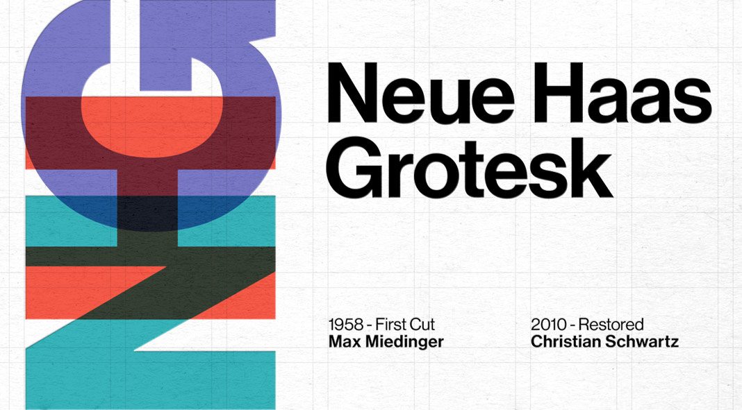
Neue Haas Grotesk, a digital revival of Max Miedinger’s original type design.
Designed originally by Max Miedinger from 1957-1958 for the Haas’sche Schriftgiesserei in Switzerland, the typeface was intended to be the answer to the British and German grotesques. It was soon revised and released by Linotype AG as Helvetica. But Linotype Helvetica has become a heavily transformed version of the original typeface. During the following years, the typeface underwent additional modifications and in the 1980s, Neue Helvetica was produced as a standardized version. In 2004, type designer Christian Schwartz was commissioned to create a digital revival based on the original Neue Haas Grotesk typeface. The whole family has been completed in 2010 for Richard Turley at Bloomberg Businessweek. Its thinnest weight was designed by Berton Hasebe.
You can purchase the family on MyFonts.

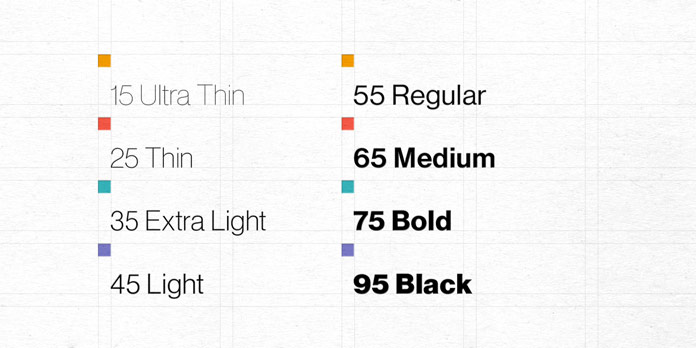
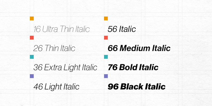
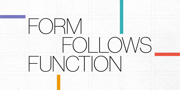


The complete family is available for purchase on MyFonts.
Do not hesitate to have a look at our recommended Fonts category. Our reviews will help you to find the perfect typeface for your next design project. In addition, we show you highly professional graphics in our Templates section.

