
This post contains affiliate links. We may earn a commission if you click on them and make a purchase. It’s at no extra cost to you and helps us run this site. Thanks for your support!
A Definitive Review of Sryga’s Futuristic Brutalist Serif Typeface, Kaguci
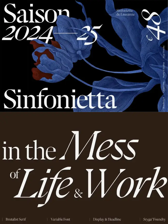
Visual tension defines the most memorable moments in contemporary graphic design. Sryga understands this balance perfectly, and the Kaguci font family emerges as a striking example of this friction. This typeface forces a collision between centuries of heritage and the erratic noise of the digital future. Designers often search for tools that bridge the gap between elegance and aggression. Kaguci fills this void by offering a futuristic brutalist serif that feels both organic and distinctively synthetic. It operates as an organism rather than a static file. Consequently, it evolves within a glitchy landscape while maintaining the skeleton of traditional typography.
You can purchase the complete family from these websites:
What Makes the Kaguci Font Family a Game-Changer for Modern Branding?
You might wonder why another serif enters the saturated market of digital type design. The answer lies in the specific execution of the Kaguci font family. Most serifs aim for perfection, smoothness, and invisibility. Conversely, Kaguci aims for disruption. It respects the rules of typography only to break them deliberately with a glitch from the future. This makes it an essential asset for brands that need to signal innovation without losing authority. Therefore, it appeals to designers who reject safe, predictable choices.
You can purchase the complete family from these websites:
The Fusion of Heritage and Futurism
Kaguci does not simply mimic the past. Instead, it drags the traditional serif aesthetic into a digital, brutalist realm. You see the familiar strokes of a classic Roman typeface. However, sudden digital interruptions distort these strokes. This creates a visual rhythm that feels uneasy yet incredibly satisfying. Sryga has mastered this juxtaposition. The Kaguci font family balances rigid modernity with warmth. Specifically, the bold contrast interacts with organic curves to humanize the digital distortion.

This approach aligns perfectly with the current digital brutalism trend. Designers are moving away from sterile minimalism. They want character. Kaguci delivers this character in spades. Furthermore, it invites the viewer to look closer. The details reveal a sophisticated understanding of typographic history. Yet, the overall impression remains undeniably forward-thinking.
Versatility Through Cuts and Variable Technology
A single weight rarely suffices for complex design systems. Fortunately, the Kaguci font family includes 10 distinct cuts. These range from an ethereal Ultra Thin to a commanding Black. This range allows you to build comprehensive hierarchies within a single project. Moreover, Sryga includes matching true italics for every weight. These italics add speed and urgency to the text. They are not just slanted romans; they possess their own distinct structure.
Additionally, the inclusion of a variable font changes the workflow entirely. You can fine-tune the weight to the exact pixel. This flexibility is crucial for responsive web design and kinetic typography. Variable font technology ensures that the typeface performs flawlessly across different screens and environments. Therefore, Kaguci functions as a responsive design tool, not just a static asset.
Practical Applications in Luxury and Tech
Where does the Kaguci font family perform best? Its high contrast makes it ideal for luxury branding typography. High-end fashion brands often seek fonts that convey both history and edgy modernity. Kaguci fits this brief perfectly. It suggests that a brand has a legacy but also embraces the future.
Simultaneously, the glitch aesthetic suits experimental typography in the tech sector. Tech companies usually default to sans-serifs. However, using a futuristic brutalist serif like Kaguci disrupts this norm. It signals a more sophisticated, human-centric approach to technology. Whether you design a poster for an electronic music festival or a website for an architecture firm, this font commands attention.
A Critical Perspective on Glitch Aesthetics
We must address the longevity of glitch aesthetics. Some critics argue that “glitch” is a passing fad. Nevertheless, the Kaguci font family avoids the trap of feeling temporary. It does this by grounding the glitch effects in solid typographic fundamentals. The distortion feels structural, not decorative. Sryga treats the glitch as an evolution of the form.
Consequently, Kaguci feels like a natural progression of the serif genre. It reflects our current reality. We live in a world where the digital and physical constantly overlap and glitch. Typography should reflect this reality. Therefore, Kaguci serves as a cultural artifact as much as a design tool. It captures the zeitgeist of the mid-2020s perfectly.
Why You Need High-Contrast Serifs Now
High-contrast serif fonts drive engagement. They stop the scroll. In a social media landscape dominated by uniform sans-serifs, Kaguci stands out. Its sharp serifs and varying stroke widths create a texture that the eye loves to follow. This is crucial for editorial design fonts. You need type that holds the reader’s interest.
Furthermore, the Kaguci font family excels in large formats. Use it for headlines. Use it for banners. The details shine when you scale it up. Conversely, it retains legibility at smaller sizes due to its robust structure. However, it truly sings when given space to breathe. White space accentuates its unique silhouette.
The Rise of Bio-Digital Typography
Sryga describes Kaguci as an “organism.” This is a fascinating concept. It suggests that the Kaguci font family is alive. This aligns with a new wave of bio-digital design. We see design elements that mimic biological growth within digital constraints. Kaguci fits this narrative. Its organic curves resist the rigid pixel grid.
This tension creates a dynamic user experience. When you use Kaguci, you inject life into your layout. It feels raw. It feels unpolished in the most professional way possible. This paradox drives modern creativity. We crave things that feel human, even when they are digital. Kaguci provides exactly that feeling.
Integrating Kaguci into Your Design System
Adopting a new typeface requires careful consideration. Start by using the Kaguci font family for primary headings. Let it define the tone of the project. Then, pair it with a neutral sans-serif for body copy. This contrast highlights Kaguci’s unique features. Alternatively, go bold and use the lighter weights of Kaguci for subheads.
Remember to utilize the true italics. They offer a distinct voice for emphasis. The variable font capabilities also allow for animation. Imagine the text growing and glitching in real-time. This adds a layer of interactivity that static fonts cannot match. Kaguci invites you to play.
You can purchase the complete family from these websites:
Final Thoughts on Sryga’s Masterpiece
The Kaguci font family represents a bold step forward. It refuses to choose between the past and the future. Instead, it crashes them together. This collision produces something beautiful and unexpected. Sryga has created a tool that challenges designers to be bolder. It is not for everyone. It is not for safe brands.
However, for those who want to lead rather than follow, Kaguci is essential. It captures the complex, glitchy, beautiful nature of our digital lives. Therefore, it deserves a place in your typographic toolkit. Explore the cuts. Test the variable settings. Let Kaguci disrupt your design process.
Frequently Asked Questions (FAQ)
What is the Kaguci font family?
The Kaguci font family is a futuristic, brutalist serif typeface designed by Sryga. It features a high-contrast design that blends traditional serif aesthetics with a digital glitch style.
How many styles are in the Kaguci font family?
The family contains 10 static cuts ranging from Ultra Thin to Black. It also includes matching true italics for each weight, plus variable font files for flexible use.
Is Kaguci suitable for web design?
Yes, absolutely. Kaguci includes variable font technology. This makes it highly optimized for responsive web design, allowing for seamless weight transitions and faster load times.
What kind of projects suit Kaguci best?
Kaguci excels in luxury branding typography, editorial layouts, music posters, and tech-focused identities. It works best where you need a strong, distinctive visual voice.
Does Kaguci support multiple languages?
While you should check the specific glyph set from Sryga, professional font families like Kaguci typically support a wide range of Latin-based languages for global usage.
Why is Kaguci described as “brutalist”?
It earns the “brutalist” label because it exposes its construction and embraces raw, digital artifacts. It prioritizes bold structural expression over traditional polish or neutrality.
Don’t hesitate to find other trending typefaces on WE AND THE COLOR. In addition, you can find a selection of 100 outstanding typefaces for graphic designers in 2026 here.
Subscribe to our newsletter!


