Nero Scuro – Italian coffee roastery brand identity design.
Manuel Bortoletti is a graphic design student from Venice, Italy. He has created this brand identity and packaging design concept for Nero Scuro, a small Italian coffee roastery. The roastery is based on some simple principles: “Source the best single origins available on the market, roast them at perfection in small batches with a manual machine and pack the coffee straight away to ship it worldwide.”
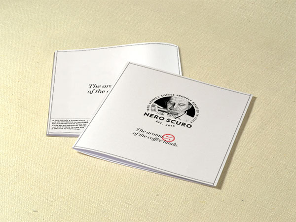
Manuel Bortoletti wanted to communicate the Italian quality and the old school process with a handmade logo of an old roaster, shown while he is smelling the aroma and checking the roast level of the coffee during the roasting process. That is an important step to give the coffee a perfect result. so Manuel Bortoletti tried to visualize this professional behavior through his illustration.
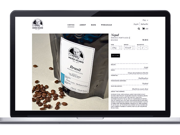
He put the most important information on the front label of the packaging, such as coffee origin and roast color as well as the grind method. On the back he put some secondary information such as varietal and numerous tasting notes. The three coffee collections of organic, reserve, and rare are divided by different colors.
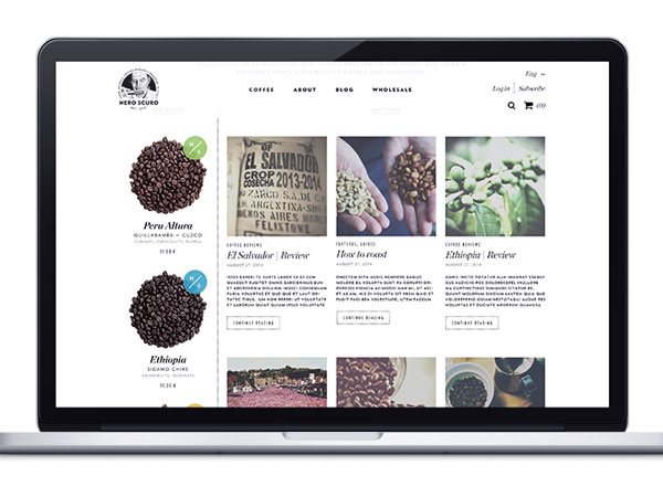
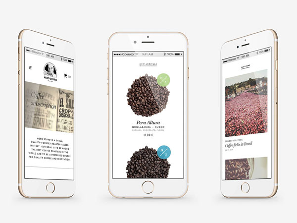
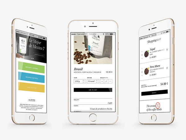
The complete work included the entire communication design, stationery, packaging, and a website with included shop system.


