
This post contains affiliate links. We may earn a commission if you click on them and make a purchase. It’s at no extra cost to you and helps us run this site. Thanks for your support!
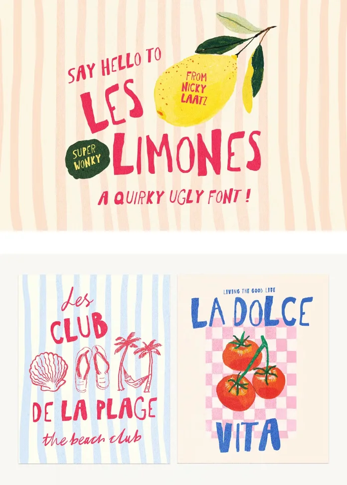
Embrace the Perfectly Imperfect in Typography with the Les Limones Font.
Sometimes, design rules are meant to be broken. The relentless pursuit of clean lines, perfect kerning, and geometric precision can leave a project feeling sterile. But what if the goal isn’t perfection? What if the goal is personality? The Les Limones font, a delightfully quirky and “ugly” hand-drawn sans-serif by designer Nicky Laatz, answers that question with a loud, unapologetic charm. This typeface celebrates the beauty of the imperfect, the energy of a quick sketch, and the authenticity of a human hand. It’s a font that doesn’t just convey a message; it shouts it with a playful, wobbly, and utterly irresistible voice.
The digital landscape is often dominated by crisp, minimalist fonts. Consequently, a typeface like Les Limones feels like a breath of fresh, zesty air. It’s designed to be noticed. Its all-caps letterforms lean and jostle against each other, creating a dynamic rhythm that feels alive. This isn’t a font for a corporate report or a legal document. Instead, it’s for projects that demand a burst of fun, a touch of handcrafted warmth, and a refusal to take themselves too seriously. Are you ready to explore why this “super wonky” font might be exactly what your next project needs?
The Irresistible Charm of a “Wonky” Typeface
So, what exactly makes the Les Limones font so special? At its core, it’s a celebration of wobbles, skewed angles, and inconsistent strokes. Each letter looks as if it were drawn hastily with a thick marker, full of life and spontaneity. This “ugly” aesthetic is entirely intentional. It’s a direct rebellion against the polished, pixel-perfect typefaces that saturate our screens.
Think about it. When you see something that’s too perfect, it can sometimes feel impersonal or corporate. In contrast, the Les Limones font feels human. Its imperfections create a sense of approachability and authenticity.
- Bold and Expressive: The thick, confident strokes give it a strong presence on the page. It’s impossible to ignore.
- All Caps Energy: Being an all-caps font, it naturally commands attention, making it perfect for headlines, titles, and short, impactful statements.
- Hand-Drawn Authenticity: You can almost feel the artist’s hand behind each character. This quality adds a layer of bespoke artistry to any design, making it feel custom-made.
This typeface is a masterclass in controlled chaos. While it appears random and spontaneous, there is a clear and consistent design language that makes it cohesive and readable. It’s the kind of font that makes you smile, and that emotional connection is a powerful tool in design.

Where to Use the Les Limones Font for Maximum Impact
The true power of the Les Limones font shines when it’s used in the right context. Its funky, playful nature makes it a perfect choice for brands and projects that want to appear friendly, creative, and down-to-earth. The provided examples, from fish markets to Italian restaurants, showcase its incredible versatility.
Imagine using this hand-drawn font for menus. For a beach club poster like “Les Club De La Plage,” it instantly evokes a laid-back, sun-drenched vibe. For a vibrant menu headline like “La Dolce Vita,” it promises a delicious, rustic, and joyful dining experience. Its personality is so strong that it does half the branding work for you.
Here are some ideal applications:
- Funky Branding: Perfect for cafes, food trucks, artisanal shops, and creative studios that want to stand out. Think logos, packaging, and social media templates.
- Eye-Catching Posters and Prints: Whether for an event, a market, or just a piece of art for your wall, this font guarantees your message will be seen. The “Maine Lobster Lovers Club” example is a prime illustration of its poster power.
- Engaging Social Media Graphics: Cut through the noise on Instagram and Pinterest with bold, text-based graphics that are full of personality.
- Quirky Greeting Cards and Invitations: Add a personal, handcrafted touch to party invites, thank you notes, and birthday cards.
- Book Covers and Zines: For publications that embrace a DIY or artistic aesthetic, the Les Limones font provides an instant cover star.
Essentially, anywhere you need to inject a dose of pure fun and handcrafted appeal, this font is your new best friend. What project comes to your mind when you see these playful letters?
Behind the Design: The Style of Nicky Laatz
To understand the Les Limones font, it helps to know the creative force behind it, Nicky Laatz. A prolific and celebrated font designer, Laatz is known for her vibrant, textured, and often script-based typefaces that bubble with personality. Her work consistently prioritizes the warmth of the human touch over rigid digital perfection.
The Les Limones font fits perfectly within her portfolio. It embodies her knack for creating tools that empower designers to make work that feels authentic and joyful. Her creations often feel less like digital assets and more like art supplies, ready to be splashed across a creative canvas. This particular font is a testament to her belief that typography can be fun, expressive, and even a little bit silly.
Language Support and Technical Details
Beyond its stunningly quirky aesthetic, the Les Limones font is also a practical and robust tool for designers working on international projects. Its extensive language support is a significant advantage, ensuring your message retains its unique character across different regions.
The typeface includes support for:
Danish, English, Filipino, French, German, Low German, Luo, Luxembourgish, Norwegian Bokmål, Norwegian Nynorsk, Portuguese, Spanish, Swedish, and Swiss German.
This broad compatibility makes it a versatile choice for global branding, multi-language marketing campaigns, and designers with an international client base. It ensures that the wonky, handcrafted feel isn’t lost in translation, allowing the font’s unique personality to shine through, no matter the language.
Why “Ugly” is the New Beautiful in Typography
The rise of fonts like Les Limones is part of a larger design movement. For years, the trend leaned heavily toward minimalism, with clean sans-serifs dominating branding and web design. While elegant and effective, this uniformity created a visual landscape that often felt monotonous.
The “ugly” font trend is a direct and vibrant response. These typefaces, also known as anti-design or brutalist fonts, reintroduce a sense of raw, unfiltered creativity.
- They Stand Out: In a sea of Helvetica and Futura, a wonky, hand-drawn font is immediately disruptive and memorable.
- They Feel Authentic: Their imperfections signal that a real person was behind the design, fostering a connection built on trust and relatability.
- They Convey Emotion: These fonts are not neutral. They are loud, happy, angry, or playful. They bring an emotional tone to the text that a clean sans-serif cannot.
The Les Limones font is a premier example of this trend done right. It’s not ugly for the sake of being ugly; it’s imperfect to be more expressive, more human, and ultimately, more beautiful in its own unique way. It reminds us that design isn’t just about communicating information clearly—it’s about making people feel something. And Les Limones makes you feel the joy of creation.
All images © Nicky Laatz. Feel free to find other trending fonts, even the good-looking typefaces, here at WE AND THE COLOR.


