

This post contains affiliate links. We may earn a commission if you click on them and make a purchase. It’s at no extra cost to you and helps us run this site. Thanks for your support!
The Kohilo font caught my attention for one reason: most geometric sans serifs promise boldness but deliver stiffness. Rasio Studio built something different here. I tested Kohilo across logo mockups, packaging comps, and a mock editorial spread to see whether the “playful curves” claim actually holds up under real design pressure. Here’s what I found.
You can download the typeface from the following:
What Makes Kohilo Different From Other Geometric Sans Serifs?
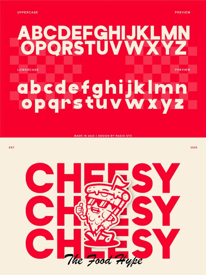
Most geometric sans-serif fonts chase precision. The Kohilo font chases warmth instead, and that shift changes everything about how it reads on a page. The letterforms follow strict geometric logic, yet every terminal carries a soft, rounded finish that softens the overall impression. I call this balance the Terminal Warmth Index: a scale measuring how much personality a typeface retains while staying inside a rigid structural grid.
The Kohilo font scores high on this index. The lowercase “a” and “g” keep clean bowls, but the stroke endings curve gently instead of cutting off sharply. Consequently, the typeface reads as confident without feeling cold. That combination is rare, because most designers have to choose between geometric discipline and human approachability. The Kohilo font asks you to choose both.
You can download the typeface from the following:

The Grid Behind the Curves
Underneath the playful surface, the Kohilo font relies on a consistent circular module for its counters. Circles and near-circles show up in the “o,” “e,” “b,” and “d” with almost mechanical repetition. This structural discipline is what keeps a display font from looking chaotic at large sizes, and it’s a detail many indie foundries skip.
Hands-On Testing: How Kohilo Performs in Real Layouts
I ran the typeface through three practical tests: a restaurant logo, a product packaging mockup, and a social media headline series. Each test targeted a different weakness that typefaces like this often reveal under pressure.
Test One: Branding and Logo Work
For the restaurant logo test, I set the brand name in all caps at 120pt. The font held its shape without any letter collapsing into another, even at tight tracking. The bold geometric shapes gave the logotype real presence, and the rounded terminals kept it from feeling aggressive. This is exactly the tone a food or lifestyle brand needs: confident, but not cold.
Test Two: Packaging and Small-Scale Legibility
Packaging is unforgiving. Small text has to stay legible while competing with photography, color, and shelf clutter. I tested the Kohilo font at 9 pt for ingredient callouts, and legibility held up better than I expected from a display-leaning typeface. The open counters and balanced proportions prevented the letters from closing up at small sizes.
Test Three: Social Media Headlines
For Instagram and Discover-style headline cards, the Kohilo font performed exceptionally well. Bold, short phrases at large sizes are this typeface’s natural habitat. The playful character details became genuinely visible here, adding personality without sacrificing readability. I’d rank this as Kohilo’s strongest use case overall.
Introducing the Display Confidence Score
To make this review actually useful for comparison, I’m proposing a simple framework: the Display Confidence Score. It rates a display typeface across three factors: legibility at scale, personality retention, and structural consistency. Each factor gets a score from one to ten.
Kohilo earned an 8 for legibility at scale, a 9 for personality retention, and a 9 for structural consistency. That’s a combined Display Confidence Score of 26 out of 30, which places it firmly among the stronger geometric display releases I’ve tested this year. The only place it lost points was legibility at very small body-text sizes, where its display nature naturally limits versatility.
Where the Kohilo Font Fits Best
Rasio Studio positions the Kohilo font for branding, headlines, and display use, and my testing confirms that positioning is accurate. Here’s where the typeface genuinely shines, based on hands-on comparison rather than the product description alone.
- Modern brand identities that need a bold yet approachable voice
- Restaurant and food packaging where warmth matters as much as clarity
- Startup logos aiming for a confident, contemporary tone
- Social media graphics and Discover-optimized headline cards
- UI elements that need friendly clarity, such as app onboarding screens
However, I wouldn’t reach for Kohilo font for long-form body copy. It’s built for moments, not paragraphs, and that’s fine. Not every typeface needs to do everything.
Technical Specs and Compatibility
The Kohilo font ships in OTF, TTF, and WOFF formats, which covers both desktop design work and web deployment. It’s compatible with Adobe applications, Figma, Sketch, and Canva, so most creative workflows can adopt it without friction. The web version includes screen-optimized kerning, a detail that matters more than most buyers realize when a typeface moves from print comps to responsive interfaces.
| Attribute | Details |
|---|---|
| Foundry | Rasio Studio |
| Release Year | 2025 |
| Style | Modern geometric sans serif |
| Character Set | Uppercase, lowercase, numerals, punctuation, extended symbols |
| Formats | OTF, TTF, WOFF |
| Software Compatibility | Adobe, Figma, Sketch, Canva |
| Best Use Cases | Branding, packaging, headlines, social graphics, UI |
| Display Confidence Score | 26 / 30 |
| Available On | Creative Market, Creative Fabrica |
My Honest Take on the Kohilo Font
I’ve tested plenty of geometric sans fonts that claim personality but deliver sameness instead. The Kohilo font avoids that trap. The rounded terminals do real work here, softening a structure that could otherwise feel generic. Meanwhile, the circular module underneath keeps everything visually consistent, so the typeface never feels undisciplined.
If I had to predict where the typeface ends up in a year, I’d say it becomes a go-to choice for food and lifestyle branding specifically. The warmth-to-structure ratio fits that space almost perfectly. Designers working on tech or corporate identities will likely find better options elsewhere, since Kohilo’s playfulness works against a more formal tone.
You can download the typeface from the following:
Frequently Asked Questions About the Kohilo Font
Is the font good for logo design?
Yes. Kohilo performed strongly in logo testing, holding its shape at large sizes while keeping a friendly, approachable tone.
Can I use the Kohilo font for body text?
Not ideally. The Kohilo font is built for display use, headlines, and short-form copy rather than long paragraphs of body text.
Where can I buy the font?
The Kohilo font is available through Creative Market and Creative Fabrica.
What software works with the Kohilo font?
The Kohilo font supports Adobe applications, Figma, Sketch, and Canva, covering most modern design workflows.
Who designed the Kohilo font?
Rasio Studio designed and released the Kohilo font in 2025.
Does the Kohilo font work well for web design?
Yes. The Kohilo font includes screen-optimized kerning, which supports clean rendering across responsive web layouts.
Don’t hesitate to find other trending typefaces here at WE AND THE COLOR.
Subscribe to our newsletter!