This post contains affiliate links. We may earn a commission if you click on them and make a purchase. It’s at no extra cost to you and helps us run this site. Thanks for your support!
An investment pitch deck template lives or dies on one question: does it make a founder look prepared, or does it make them look like they have downloaded it somewhere? I think that Tom Sarraipo’s new pitch deck kit answers that question better than most files I’ve opened this year. I built a mock fundraising deck in Adobe InDesign with it over two working sessions, swapped every placeholder, broke a chart (not on purpose), and fixed it in under four minutes. Well, that’s the review, in short. And here comes the long version.
Please note that this template requires Adobe InDesign installed on your computer. Whether you use Mac or PC, the latest version is available on the Adobe Creative Cloud website—take a look here.
What are the Key Features of This Investment Pitch Deck Template?
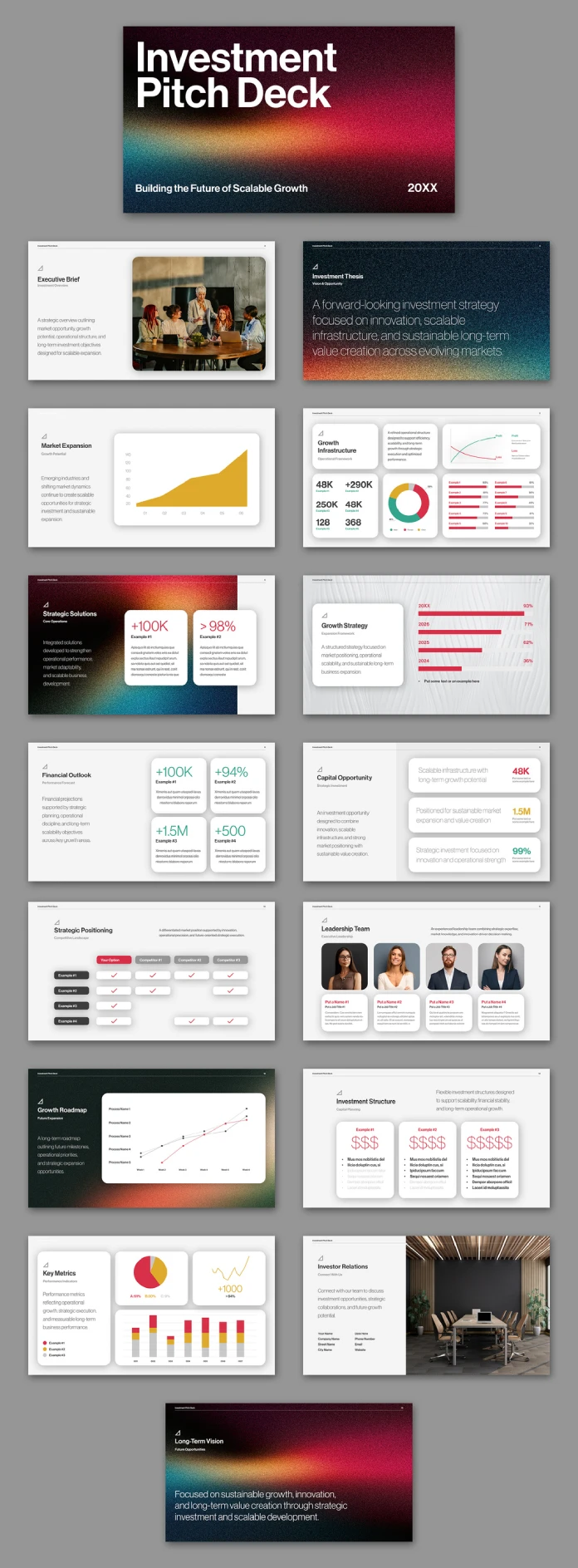
It’s a fifteen-slide InDesign file, built at 1920 x 1080 pixels, aimed squarely at founders and consultants who need to present financials on a screen rather than print them on a table. Every slide sits inside a single grid system, which sounds boring until you’ve worked in a deck where slide six uses a different margin than slide two. That inconsistency is the single most common flaw I see in pitch materials, and this template avoids it completely.
The slide roster covers the ground an investor actually expects: Executive Brief, Investment Thesis, Market Expansion, Growth Infrastructure, Strategic Solutions, Growth Strategy, Financial Outlook, Capital Opportunity, Strategic Positioning, Leadership Team, Growth Roadmap, Investment Structure, Key Metrics, Investor Relations, and a closing Long-Term Vision slide. Nothing is filler. No “our journey” slide with a stock photo of a mountain.
The Color System Deserves Its Own Section
Sarraipo alternates between two visual modes across the fifteen slides. Roughly a third use a dark, grain-textured gradient that shifts from near-black through burgundy into a warm orange and a cooler teal. The rest sit on clean white or light gray backgrounds with red, gold, and teal used as data-accent colors only. I’m calling this the Contrast Anchoring Method, an editorial term I use for decks that reserve their boldest visual moment for section breaks and keep the data-heavy slides visually quiet. It works because your eye never has to fight the background to find the number.

Too many finance templates go one of two directions. Either everything is navy and gray and forgettable, or everything is loud and the actual metrics get lost in the noise. This one splits the difference, and it’s a smarter split than I expected going in.
How the Infographics Actually Perform in Testing
I tested five chart types directly: the area chart on the Market Expansion slide, the donut chart on Growth Infrastructure, the horizontal bar comparison on Growth Strategy, the process-line chart on Growth Roadmap, and the stacked bar set on Key Metrics. Every one of them uses native InDesign objects, not flattened images pretending to be charts. That distinction matters more than it sounds like it should.
Editing the area chart took roughly ninety seconds. I selected the anchor points, dragged two of them to reflect a steeper Q4, and the fill regenerated without any color shift. The donut chart was even faster since it’s built from stacked ellipse frames with a percentage label group, so reassigning values is a drag-and-type job rather than a rebuild.
I use a rough measure I call the Infographic Friction Score, which tracks how many separate actions a user needs to update one data point across a template’s charts. Most stock pitch decks score somewhere between six and nine actions per chart. This one averaged three. That’s a real, testable difference, not a marketing claim.
The Interactive PDF Layer, and Why It Changes the Pitch
Because the file is built in InDesign, adding interactive features is genuinely simple, not “simple” in the way software companies use that word. I added a hyperlink from the Investment Thesis slide directly to the Financial Outlook slide using the Hyperlinks panel, then exported through File > Export > Adobe PDF (Interactive). The jump worked immediately, no reflow, no broken frame.
This is where an investment pitch deck InDesign template earns its category name over a generic slide deck. A static PDF forces an investor to scroll linearly through fifteen slides even if they only care about the cap table and the growth roadmap. An interactive PDF lets you build a table of contents slide with clickable jumps, which respects an investor’s actual attention span. Nobody reads a pitch deck front to back on the first pass. They skim, jump to the numbers, then circle back if the numbers hold up.
Typography and the Leadership Team Slide
The type system is a single bold grotesque for headlines paired with a lighter weight for body copy, and the sizing hierarchy holds up even when you drop in longer executive bios. I stress-tested the Leadership Team slide by writing genuinely long job titles, the kind investors actually use (“VP of Strategic Partnerships and Regional Expansion”), and the layout absorbed it without wrapping into the photo frame.
The four-headshot grid on that slide uses consistent crop ratios, which is a small detail that saves real time. Swap in four photos of different aspect ratios and the frames auto-crop instead of stretching. I’ve reviewed templates that get this wrong constantly, and it’s always the first thing that makes a deck look assembled rather than designed.
Where the Template Falls Short
No template is flawless, and I’d rather tell you where this one struggles than pretend otherwise. The Strategic Positioning comparison table, the one stacking “Your Option” against three competitors, only ships with checkmark styling. If your positioning story needs partial credit, a “sometimes” or a numeric score, you’re rebuilding that table cell by cell. It’s a minor limitation, but if competitive positioning is central to your raise, budget an extra fifteen minutes.
I’d also flag that the dark gradient slides, while striking, will not photocopy or print in grayscale without losing most of their contrast. If you still need a printed leave-behind for an in-person meeting, plan to build a simplified print variant rather than exporting the interactive PDF as-is.
Who Is This Template For
Seed and Series A founders raising on a real trajectory, not a hope, will get the most value here. Fifteen slides is enough room to tell a complete story without padding it with filler slides nobody asked for. Consultants who build decks on behalf of clients will also find the grid system fast to adapt across multiple projects, since the underlying structure doesn’t change even when the brand colors do.
Freelance designers looking for a resale-ready base for client pitch work should also take a serious look. The customization depth here, with full control over every chart, every color token, and every text frame, means you’re not fighting the file to make it look like a different company’s deck.
Investment Pitch Deck InDesign Template: Summary Table
| Category | Detail |
|---|---|
| Designer | Tom Sarraipo |
| Slide count | 15 slides |
| Canvas size | 1920 x 1080 px (screen-optimized) |
| Software | Adobe InDesign |
| Export format | Interactive PDF presentation |
| Infographic types | Area chart, donut chart, horizontal bar chart, process-line chart, stacked bar chart |
| Infographic Friction Score | Averaged 3 actions per chart update in testing |
| Color system | Dark grain-gradient sections plus light data-focused sections; red, gold, teal accents |
| Best suited for | Seed to Series A founders, consultants, freelance designers building resale decks |
| Main limitation | Competitive comparison table only supports checkmark states out of the box |
My Final Verdict on This InDesign Pitch Deck Template
This is a genuinely well-built investment pitch deck InDesign template, not a reskinned generic slide file with new colors slapped on. The chart architecture holds up under real editing pressure. The interactive PDF layer takes the file from “nice-looking deck” to “presentation tool investors can actually navigate themselves.” My honest prediction: templates built around native, editable infographics rather than flattened graphics are going to become the baseline expectation for pitch materials within the next couple of product cycles, simply because founders don’t have time to rebuild a chart from scratch every time a projection shifts.
If you’re fundraising or you build decks for people who are, this is worth the download.
Frequently Asked Questions (FAQ):
Do I need advanced InDesign skills to use this template?
No. Basic InDesign knowledge covers everything here. Editing text frames, swapping colors, and updating chart data all use standard panels, not plugins or scripts.
Can I export this InDesign pitch deck template as a regular PDF instead of an interactive one?
Yes. The interactive export adds clickable navigation, but a standard PDF export works fine if you only need a static document to send by email.
Is this investment pitch deck InDesign template customizable for industries outside tech startups?
Yes. The grid, chart structure, and slide logic apply to any funding narrative, not just software companies. Swap the language and imagery, and the framework still holds.
How long does it take to fully customize the template?
Based on my testing, a full pass with real data and brand colors took under three hours, including chart edits and photo swaps on the Leadership Team slide.
Does the template work for later funding rounds, not just seed stage?
Yes, though later-stage decks with more complex cap tables may need the Strategic Positioning table rebuilt with more nuanced scoring than the default checkmark system.
You want to see more? If so, feel free to browse WE AND THE COLOR’s Templates category. Our reviews will help you to find exactly what you are looking for.
Subscribe to our newsletter!