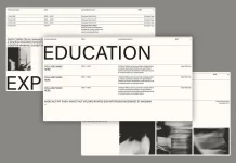
Hyundai Card’s recent publication, Our Typeface, represents a profound exploration of the company’s design and brand identity. This comprehensive archive chronicles the two-decade journey of Hyundai Card’s bespoke font, Youandi, and is a testament to the company’s unwavering commitment to design excellence. The publication marks a significant milestone in the evolution of corporate typography in South Korea, offering a unique lens through which the company’s identity and philosophy can be understood.

Youandi: A Revolutionary Corporate Font
Launched in 2003, Youandi was the first corporate-specific font introduced in the Korean business landscape. At a time when corporate typography was relatively unexplored, Hyundai Card’s decision to develop its own font was nothing short of revolutionary. The creation of Youandi marked a turning point not only for Hyundai Card but also for the broader context of corporate branding in South Korea, paving the way for other custom fonts such as Naver’s Nanum, Baemin’s Hanna, and Amore Pacific’s Arita series.
The Our Typeface publication meticulously documents the evolution of Youandi across three distinct eras: Youandi, Youandi Modern, and Youandi New. Each phase reflects the company’s strategic refinement and adaptation of the font to meet the changing demands of branding, marketing, and digital environments. This continuous evolution underscores Hyundai Card’s dedication to maintaining a coherent and dynamic brand identity.
The Philosophy Behind Hyundai Card’s Design
The true strength of Hyundai Card’s approach to design lies in its philosophical coherence. As Vice Chairman Ted Chung articulates in the publication, the power of a corporate font is intrinsically linked to the strength of the brand identity it represents. This perspective is evident in Hyundai Card’s meticulous development and application of Youandi, which has become a visual shorthand for the company’s identity.
Hyundai Card’s design philosophy transcends aesthetics; it is rooted in a deep commitment to the company’s core values. The font Youandi serves as a potent visual embodiment of these values, reflecting the company’s aspirations, ethos, and its pursuit of excellence. The evolution from Youandi to Youandi New highlights Hyundai Card’s dedication to maintaining relevance in an increasingly digital world while staying true to its foundational identity.
Youandi’s Role in Branding and Beyond
Youandi has evolved from a mere font to a powerful symbol of Hyundai Card’s brand. This transformation is exemplified by the font’s pervasive presence across the company’s branding efforts, from office signage to product designs. The font’s distinctive character, derived from the proportions and quarter-circle arc of the Hyundai Card logo, has played a pivotal role in shaping the company’s corporate identity.
The Our Typeface publication also illustrates how Youandi has become synonymous with Hyundai Card’s brand. A notable example is the 2022 Netflix series The Silent Sea, where the font’s appearance was instantly recognizable to viewers, despite the absence of explicit Hyundai Card branding. This recognition speaks to the font’s powerful association with the brand, a testament to Hyundai Card’s success in cultivating a cohesive and enduring identity.
Hyundai Card’s Broader Design Innovations
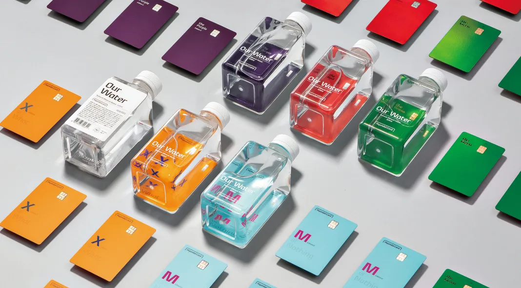
Hyundai Card’s commitment to design extends beyond typography, influencing every facet of the company’s offerings. The design of Hyundai Card’s plate products, for instance, exemplifies the company’s innovative approach. From the introduction of mini cards and transparent acrylic cards to the pioneering use of unconventional materials like titanium and liquid metal, Hyundai Card has consistently pushed the boundaries of design in the credit card industry.
The company’s premium card packages, known as The Books, further reflect Hyundai Card’s design philosophy. These packages are more than mere containers; they are carefully curated collections of content that align with the lifestyles and aspirations of premium cardholders. This approach to design reinforces Hyundai Card’s brand identity, offering consumers a tangible connection to the company’s values.
A Model of Design Continuity and Evolution
Our Typeface is a fascinating archive of a corporate font. Furthermore, it’s a testament to Hyundai Card’s enduring commitment to design and brand identity. The publication highlights the company’s ability to adapt and evolve while maintaining a coherent and distinctive identity. Hyundai Card’s approach to design, characterized by continuity and innovation, serves as a model for other companies seeking to establish and maintain a strong brand presence.
Hyundai Card’s dedication to its design principles has set it apart as a leader in the industry. The legacy of Youandi, as documented in Our Typeface, is a powerful reminder of the impact that thoughtful, strategic design can have on a company’s identity and its relationship with consumers. As Hyundai Card continues to evolve, its design philosophy will undoubtedly remain at the core of its success, offering valuable insights for those in the fields of design and branding.
All images © by Hyundai Card. Feel free to browse through WE AND THE COLOR’s Graphic Design and Branding categories for more inspiring content.

