This post contains affiliate links. We may earn a commission if you click on them and make a purchase. It’s at no extra cost to you and helps us run this site. Thanks for your support!
Most business brochures fail before they’re even printed. The layout looks patched together. The hierarchy feels borrowed. Nothing holds the reader’s eye long enough to matter. Yet the companies that communicate best visually aren’t always the ones with the biggest budgets—they’re the ones with the right foundation. A well-designed corporate brochure template changes the entire starting position. You’re not building from a blank canvas; you’re refining from a point of real craft.
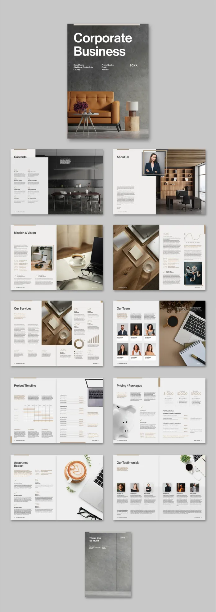
This corporate business brochure template by Adobe Stock contributor Tom Sarraipo is that kind of foundation. It’s 22 pages of structured, print-ready InDesign layout that covers every section a modern company presentation needs—from mission and vision to team profiles, service listings, project timelines, pricing packages, and client testimonials. Furthermore, it ships in CMYK color mode, making it ready for professional offset and digital printing without color surprises.
If you’re searching for a professional InDesign brochure template that actually communicates corporate authority while staying fully customizable, this is worth understanding in detail.
Please note that this template requires Adobe InDesign installed on your computer. Whether you use Mac or PC, the latest version is available on the Adobe Creative Cloud website—take a look here.
What Makes a Corporate Business Brochure Template Truly Professional?
That’s the question most designers stop asking too soon. A template isn’t professional simply because it looks clean. “Professional” means structurally sound—every page has a clear job, and the sequence of pages builds a coherent argument about the company. Sarraipo’s layout follows what I’d call a Narrative Architecture Model: each spread acts as a chapter, and together they build a persuasive company story from identity to evidence.

The cover sets the tone immediately. Bold sans-serif type in high contrast reads at a glance, while the editorial use of full-bleed photography grounds the design in physical credibility. This isn’t decorative minimalism for its own sake—it’s communicative restraint.
Moreover, the contents page does something many brochure templates skip entirely: it treats navigation as a design element. Section dividers, typographic hierarchy, and a structured grid make the spread feel like a quality publication rather than a company handout.
The 22-Page Structure: A Section-by-Section Overview
What separates a thoughtfully scoped brochure template from a generic one is section logic. Each of these 22 pages serves a specific rhetorical function in a corporate presentation:
Cover: Establishes brand tone and first impression. Heavy typographic contrast and full-bleed imagery. Table of Contents: Structured navigation layout with clear hierarchy. About Us: Team-facing portrait photography with editorial text columns. Mission & Vision: Two-page spread with text blocks and supporting imagery—ideal for value communication. Stats and Data Spread: Chart-formatted data visualization for key business metrics. Our Services: Multi-column services layout with supporting photography and percentage indicators. Our Team: Portrait-based grid with role typography—names, positions, brief bios. Project Timeline: Structured Gantt-style timeline layout with milestone entries. Pricing and Packages: Three-tier pricing comparison with feature bullets and clear CTAs. Assurance Report: Data-dense single-page layout for trust signals and compliance details. Our Testimonials: Client quote grid with portrait photos and source attribution. Thank You / Back Cover: Closing spread with contact and brand reinforcement.
Additionally, all text and images are placeholder-based. Consequently, you can drop in your own content without restructuring a single element.
Why CMYK Matters for Professional Business Brochure Design
Color mode is the most frequently overlooked technical detail in template selection—until the print job comes back wrong. RGB is a screen-based color model. Therefore, files built in RGB will produce unexpected color shifts when sent to a commercial printer using CMYK inks.
Sarraipo’s template is built natively in CMYK. That means the warm neutrals in the photography-integrated layouts, the clean whites in the data spreads, and the carefully chosen accent tones will all translate accurately to print. You’re not guessing; you’re working within the same color model your printer uses.
For businesses ordering professional print runs—whether for client pitches, trade shows, investor meetings, or partner presentations—CMYK-native InDesign templates reduce prepress rework substantially. This is not a minor technical footnote; it’s a significant practical advantage for anyone ordering offset printing in quantity.
The Design Language: Editorial Restraint as Corporate Communication
Tom Sarraipo’s visual language throughout this corporate brochure template is what designers describe as editorially restrained. That term deserves unpacking. Restraint in editorial design doesn’t mean sparse or cold—it means every visual decision earns its place.
The color palette is warm and neutral with strategic amber accents. The typographic system pairs a geometric sans-serif for headings with a legible serif or clean body face for body copy. The grid is strict, which paradoxically creates visual freedom—elements aren’t fighting each other for space.
Furthermore, the photography integration throughout the layout follows a Contextual Immersion Principle: images don’t function as decoration but as evidence. The About Us spread uses an in-context portrait—a professional in a designed office environment—rather than a posed headshot against a white background. The “Our Team” spread echoes this with candid-style professional portraiture. These choices communicate a specific brand personality: thoughtful, modern, and grounded.
The stats spread—one of the most challenging page types to design well—handles data visualization with typographic weight rather than chart complexity. Large percentage figures paired with simple bar indicators communicate data without requiring the reader to interpret complex visualizations. That’s a genuinely smart editorial decision.
How to Customize This Corporate InDesign Brochure Template
One of the strongest practical arguments for using an A4 InDesign brochure template like this one is the customization workflow. Adobe InDesign’s paragraph and character styles mean you can update fonts globally from a single panel. Master pages handle repeating elements—page numbers, footers, and section headers—without manual page-by-page edits.
Here’s how to approach customization efficiently:
Step 1—Replace placeholder images first. Use InDesign’s Place command (Cmd/Ctrl+D) to swap in your own photography. Because all image frames are pre-sized and masked, your images drop into an established composition immediately.
Step 2—Update color swatches. Open the Swatches panel and redefine the primary accent color to match your brand. All elements linked to that swatch update automatically across all 22 pages.
Step 3—Replace text content section by section. Start with the cover and work through in page order. Since all text blocks are placeholder copy, each text frame is already sized and styled for the amount of copy each section needs. Don’t overwrite. Match the placeholder’s approximate word count for best visual results.
Step 4—Export to PDF for print using the PDF/X-1a or PDF/X-4 preset. Both presets are designed for CMYK commercial printing and will embed all fonts and flatten transparency correctly.
Who Needs a 22-Page Corporate Business Brochure Template?
The obvious answer is corporations. But the actual range of use cases for a full-scope corporate brochure layout is broader than the label suggests.
Consulting firms, architecture studios, real estate agencies, financial advisory practices, and technology service companies all require presentation documents that do what this template does—communicate capability, credibility, and identity in a single designed object. Similarly, startups approaching investors need the same editorial authority that established corporations project. A well-structured InDesign company brochure template compresses the visual credibility gap considerably.
Marketing agencies producing materials for clients frequently use customizable brochure templates as billable starting points. Rather than building a 22-page layout from scratch, they adapt a proven grid and structure. The design time savings are significant, and the output quality is consistently high.
Additionally, nonprofit organizations preparing annual reports, capabilities statements, or donor presentations share the same structural needs as corporate entities. The sections in this template—team, mission, services, financials, testimonials—translate cleanly to the nonprofit context with minimal adaptation.
What the Corporate Brochure Template Gets Right About Business Communication
I’ve reviewed a significant number of business brochure templates, and the consistent failure mode is what I call visual noise syndrome: too many decorative elements competing with the content, no clear reading path, and section types that feel randomly sequenced. Sarraipo avoids all three.
The reading path through this template is deliberate. You enter through brand identity (cover, contents), move into company character (about us, mission and vision), then into capability proof (services, team, stats), followed by commercial terms (pricing, timeline), and close with trust signals (assurance, testimonials). That sequence mirrors an actual sales conversation. Therefore, this isn’t just good design—it’s persuasive architecture.
The “Thank You” back cover is a detail worth noting specifically. Many brochure templates leave the back cover as an afterthought. Here, it mirrors the front cover in weight and typographic consistency, treating the closing moment of the document as a considered communication rather than a production necessity. Small distinction; real impact.
InDesign Corporate Brochure Template vs. Starting From Scratch
There’s a recurring debate in design communities about whether using templates compromises creative originality. Frankly, it’s a false conflict. Templates don’t replace design thinking—they replace construction time. Furthermore, a template by a skilled designer like Sarraipo brings solved problems to the table: consistent grid proportions, pre-tested typographic hierarchies, and page compositions that have been refined visually rather than generated by algorithm.
Starting from scratch makes sense when a project has highly specific constraints that no template satisfies. For the vast majority of corporate brochure projects—where the goal is professional communication rather than design innovation—a well-built template is the superior starting point. The time saved goes back into content quality, photography selection, and communication strategy.
For designers billing hourly, that time differential is direct profit margin. Furthermore, for in-house marketing teams, it reduces production cycles. And for business owners who are their own designers, it’s a finished document that looks like it came from a professional studio.
Adobe Stock Corporate Brochure Templates: What to Look For
Adobe Stock’s template catalog varies widely in quality. When evaluating InDesign corporate brochure templates specifically, these criteria consistently predict usability:
CMYK color mode—non-negotiable for any print application. Properly organized layers save significant customization time. Paragraph and character style consistency enables global typography changes. Master page setup—running elements should live on masters, not on individual pages. Page count appropriate to scope—22 pages is the right range for a full corporate presentation document. Fewer pages leave out critical sections; more pages often include redundant spreads. Section logic—pages should tell a story in sequence, not just fill a page count.
Sarraipo’s template meets all six criteria. Moreover, all images in the template are placeholder-only—no embedded stock photography that might carry licensing complications in your final document. You supply the actual imagery, and the layout performs the composition work.
The Future of Corporate Brochure Design
Print isn’t dying. It’s differentiating. In a landscape saturated with digital-first company communications—decks, microsites, LinkedIn posts—a well-designed physical brochure has become a higher-signal object. Handing a client or investor a printed brochure with this level of editorial craft communicates intent, resources, and attention to detail in a way a shared Google Slides link does not.
Consequently, the demand for high-quality, print-ready InDesign templates is increasing rather than declining. Designers and brands that invest in strong printed materials now position themselves against a backdrop where most competitors have abandoned the format entirely.
My prediction: companies that maintain polished print collateral alongside their digital-first communications will develop what I term a Tactile Credibility Advantage—a measurable trust differential with clients and partners who receive physical materials. This advantage compounds over time as the printed business document becomes genuinely rare. Therefore, a CMYK-ready, professionally structured corporate brochure template isn’t just a production tool. It’s a strategic communication asset.
Frequently Asked Questions
What software do I need to use this corporate business brochure template?
You need Adobe InDesign. The template is built as an InDesign layout file (.indd), so you need an active Adobe Creative Cloud subscription that includes InDesign. Any recent version of InDesign will open the file. Adobe offers Creative Cloud plans for individuals, teams, and enterprises through Adobe.com.
Is this corporate brochure template print-ready?
Yes. The template is built in CMYK color mode, which is the correct color model for professional printing. Export to PDF/X-1a or PDF/X-4 from InDesign for commercially printable output. The A4 page format is standard for international print production.
Can I use this template for digital distribution as well as print?
Absolutely. InDesign exports to interactive PDF, which works well as an emailed or downloadable digital brochure. For web embedding, you can export to a standard PDF and host it on your website. However, the template is optimized and built for print first, so print output will be the highest-quality application.
How many pages does this corporate InDesign brochure template include?
The template includes 22 pre-designed, fully customizable pages covering a cover, table of contents, about us, mission and vision, stats spread, services, team, project timeline, pricing and packages, assurance report, testimonials, and a closing thank you page.
Are the images and text in the template licensed for commercial use?
All images and text in the template are placeholders only—they are not licensed for final use. You must replace all placeholder images with your own licensed photography and replace all placeholder text with your own content before distributing the brochure commercially.
Can a non-designer customize this corporate brochure template?
Yes, with basic InDesign familiarity. The placeholder structure means you’re primarily replacing content rather than building layouts. If you’re new to InDesign, Adobe offers free tutorials through Adobe Learn that cover the essential skills—placing images, editing text, and exporting to PDF—needed to customize a template like this one effectively.
What is the A4 page format in inches?
A4 is 210 mm × 297 mm, equivalent to approximately 8.27 × 11.69 inches. It’s the standard document size for professional printing in Europe, Australia, and most international markets. For US-based printing, you may need to adjust the page size to US Letter (8.5 × 11 inches) and recheck all margins and bleed settings accordingly.
Who designed this corporate business brochure template?
The template was designed by Tom Sarraipo, a graphic designer and contributor to Adobe Stock. It is available for download through Adobe Stock as a customizable InDesign layout file.
Browse WE AND THE COLOR’s Templates category for more.